Tagged “feedPosts”
Fuzzy Logic show, 7/3/2026 on Radio Buena Vida

I was back playing in the RBV cafe window for the first time since 2023, and it was a blast!
Listen to the show on Soundcloud.
For this mix I ventured from Japanese reggae and electronics via blissed out new Wah Wah Wino gear into my favourite from Tortoise’s amazing Touch LP, before an upbeat finale.
css.properties, a resource from John Kreitlow
A nice modern resource listing the now huge range of CSS properties on one page. There’s a neat search with autosuggest and each listed property links to a page with a short description plus MDN browser support data.
As mentioned on the recent Shop Talk Show episode with Jeremy Keith.
Jeff Mills at SWG3: Live At The Liquid Room 30th Anniversary Tour

There was a heavy whiff of nostalgia about this gig for me. Jeff Mills is currently on a 30th anniversary tour of his mix album Live at the Liquid Room. I bought that album on cassette tape back then and was blown away by it. I subsequently first saw him DJ at the Arena in Glasgow in 1996. Since then I’ve experienced Jeff doing his thing many times and in various places around the world. His sets are the stuff of legend!
What’s an interactive element? by Manuel Matuzovic
Manuel sensed a general misunderstanding of what an interactive element is and what focusable really means. He wasn’t totally sure himself either, so did some research. It’s a long post but the summary is that:
- an important characteristic of all interactive elements is they are natively focusable;
- focusable doesn't necessarily mean sequentially focusable (tabbable). Some interactive elements including
dialogare click-focusable, and these are not tabbable but can be focused programmatically or via click. - it’s also worth knowing that it's perfectly acceptable to place
tabindexon a non-interactive element to aid with accessibility. But prefer applying it to semantic elements rather thandivs.
Recently read: My Phantoms, by Gwendoline Riley
This was a weird, mixed reading experience for me. It’s a short book and it’s good – it had me locked in really quickly and I was finished after a few nights. But it was an uneasy read.
The Ethics of Design Systems (on “The Question”)
This episode of The Question is – like they say during the conversation – one that doesn’t yet have any ready answers. Right now it’s just important that we’re asking the question and starting to move forward, establish goals and build vocabulary.
Radiohead gig in Bologna, November 15th 2025
Great gig abroad for four pals who were equally excited to be there!
Highlights for me included:
- the crackling pre-gig atmosphere: lovely ambient sounds followed by a fun audiovisual performance via motorised black panels that called to mind Close Encounters of the Third Kind;
- when Thom nimbly moved from standing mic to the piano for the chords at the end of All I Need;
- how beautiful the glockenspiel parts sounded throughout;
- Thom’s atmospheric solo effort on Exit Music and the applause from Colin; and
- the amazing The Daily Mail.
Something, Somewhere (mix, Nov 2025)

Over the last few years I’ve played some radio shows but hadn’t done a mix of my own. I managed to rectify that the other night.
Recently read: Piranesi, by Susanna Clarke
I read this book in two days while on holiday in Ibiza. It’s been a while since I’ve finished a book so quickly, but it’s short and once it had me locked in I couldn’t put it down.
The old adage that you shouldn’t judge a book by its cover is definitely true of this one. The cover depicts a faun standing on a marble column and conjures images of fantasy and mythology. There is an element of that, but with constant hints to the modern world. And as clues emerge you start to wonder if you’re really in an another time and space, or in the middle of a dream or some Jacob’s Ladder style trip.
The protagonist, Piranesi, is really likeable and I loved the humour too. The puzzle he’s trying to solve called to mind Memento and the dream-like feel reminded me of the scene in Inception where Cobb meets Saito in Limbo.
I loved it! Thanks to Craigy B for the recommendation.
Animating the dialog element with CSS transition and @starting-style
I’ve written before that CSS transition is great for simple animations triggered by an event. You might want to transition something in response to a focus or hover event. Or, perhaps your use case is that the user activates a button to launch a previously-hidden dialog element and you want to use transition to animate the dialogue’s entrance and exit.
Excerpts for Eleventy, by Keith Carangelo
Recently I updated this website’s git repository README to include a summary of my approach to supporting post excerpts.
I define an initial part of a post as the excerpt by adding a separator string between it and the remaining content. Then in my posts list I grab 11ty’s
post.page.excerptand pass that through a custom markdown-parsing filter.
This works pretty well but sometimes it’s a bit inflexible that the excerpt has to be part of the post. Sometimes you might want to say something different, or shorter and snappier in the excerpt.
Diving into CSS outline
I’m partial to going down the rabbit-hole on a niche aspect of front-end development. For example a few years ago I got the urge to dig into what’s going on with containers and items in Flexbox-powered layouts and noted my findings in Flexbox-fu. I do it to go beyond the thing’s theory and into its practical application for solving real web development challenges; to gain a deeper understanding of why things behave the way they do. These deep dives take time but are rewarding; usually I’ll learn about more than I expected.
Recently I dug into the characteristics and behaviour of the CSS outline property. The catalyst was seeing Heydon Pickering’s clever use of outline to automate divider lines within a flexbox powered navigation menu. I couldn’t fathom how it works so decided to reverse-engineer it. More on Heydon’s trick later, but I’ll start with a recap of what outline is good for.
Writing alt text with AI, by Jared Cunha
A thought-provoking look at how LLMs might lower the burden of writing useful alt text for images, and – given the right prompts – produce better results than humans doing it manually.
It’s far more descriptive than what I would have written without it.
Jared goes on to argue that the benefits really multiply when working at scale. This part made me think of the content team at my work who maintain a customer-facing knowledge base and need to write alt text for hundreds of screenshots.
A huge time-saver is if you’re working with a large set of images. You can write the prompt only once and then say you want the same applied to each image you upload.
Can components conform to WCAG? by Hidde de Vries
Hidde is, like me, both an “accessibility nerd” and “a components enthusiast”. So it’s interesting to see him tackle whether it’s sensible for design systems – even really good ones – to “promise accessibility”.
We should definitely test how accessible components are and document what they can and can't contribute to a website's accessibility. And WCAG requirements can help with this. However, I think claiming WCAG conformance about pages or sets of pages, as we do today, approaches it at the right level. I don't think we should want to claim conformity of components by themselves.
He goes on to say:
There's a real risk in overpromising the value of a component if we say it is accessible or conforms to some accessible standard. It could make people believe that they no longer need to worry about accessibility once they use or buy the component. That creates the wrong expectations: accessibility is a continuous process. Like we want to always iterate on user experience, we want to always iterate on accessibility.
Here are my main takeaways.
Top rankin’
In my recent post Website updates I said:
I’ve added myself to 11ty’s community and am now listed as an Eleventy author. I hope that some day I’ll find that fuzzylogic.me has been added to 11ty’s Speedlify Leaderboard too – that’d be cool!
Well, about a week ago I noticed that I have been added to 11ty’s Speedlify Leaderboard and not only that I’ve gone straight in at the very respectable rank of #23. I’m among some really talented company there so I’m proud of that!
JavaScript-free dialogues
At work, my talented colleague Anda and I have been taking a fresh look at modal dialogues with a view to modernising relevant design system components. During this project I’ve expanded my knowledge of the HTML dialog element, especially the nitty-gritty of using it in practice.
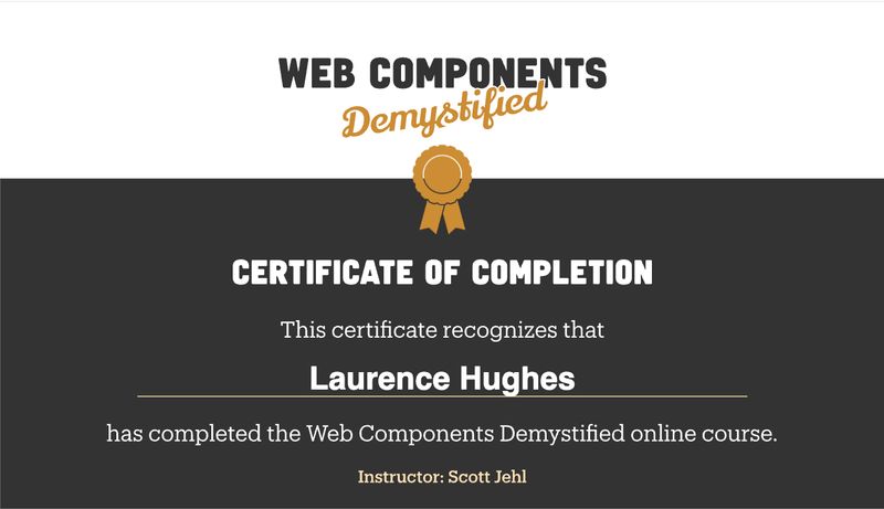
Web Components Demystified: completed
Website updates
I’ve recently been updating my website over a series of nights and weekends. The changes aren’t very noticeable to the eye but involved some careful modernisation and streamlining of back-end features and technology, plus improvements to accessibility and performance. I’m really happy to have made them.
ML Buch – Suntub
Danish composer and producer Marie Louise Buch’s LP from last year is on heavy rotation chez moi at the moment. It’s a chill but heartfelt mix of sun-drenched guitars, electronics and ML’s pure vocals that has elements of The Durutti Column and maybe even The Cocteau Twins… and it’s really hitting the spot for me.
You can preview in full and buy on Bandcamp.
Thanks to Phillip H for the excellent recommendation. And I’m of course now jealous that I wasn’t a fan of ML in time to go to her Glasgow gig last year.
Recently read: Klara and the Sun
I didn’t have the appetite for Kazuo Ishiguro’s latest novel during the pandemic. I started it, but as the underlying sense of melancholy and “something bad around the corner” began to set in – just like it did in Never let me go – I realised I wasn’t in the right frame of mind for it. Cut to 2025 and it was time to give it another go.
I’d read before that Ishiguro is primarily interested in exploring what it is to be human, and uses science and technology elements as a device to support that. In Never let me go the device was cloning. In this book, the narrator is an “artificial friend” named Klara who is an AI-powered, empathetic android, and Ishiguro uses Klara’s unique perspective to shine a light on human behaviour and motivations.
I won’t attempt to properly review the book when others have done it much better. I’ll just say I really enjoyed it and recommend it.
Here are a few scrappy notes about themes I found interesting and jotted down.
- Scientific and technological advancements that present moral questions
- the idea of genetic editing (modification, I guess) to gain advantage, but with risks and side-effects. The gamble this represents.
- human loneliness
- blind faith/religion (which even Klara, as a rational machine, learned)
- Klara’s capacity for innocence, morality, contentment in a way that the humans seemed incapable of
- The idea that we can’t create identical clones of people because it’s not just their makeup that makes them unique; there’s also how others love and perceive them (which can’t be copied)
- the potential dark side-effects of our societal choices and technological advances: environment collapse and pollution; societal divisions (the father Paul’s armed community)
Recently read: The sound of being human, by Jude Rogers
Clair bought me Jude Rogers’ book for Christmas thinking I would enjoy it – and I did. I love the idea of chronicling the milestones of your life using music – music that touched you, that you were obsessed with, or that bonded you with significant others.
I also enjoyed reading the science behind the feelings. As Jude asked in the first chapter:
How do songs affect our emotions so profoundly? How can they activate memories instantly?
It turns out that babies can recall what they heard while in the womb, and are predisposed to get music in a manner beyond advanced computers. The medial prefontal cortex – an area of the brain linked to our sense of self – is involved in tracking melodies. There are lots of these interesting insights.
Jude’s tunes ranged from Abba to Krafterk to Toots and the Maytals, which I found good fun. And as proof of music’s facility for time-travel, her final chapter on Prefab Sprout’s I trawl the megahertz transported me back instantly to my desk at Bright Signals’ office in 2018 during my contract there, where my friend Andy’s playlists introduced me to that unique tune.
Recently read: The Great Gatsby
I’ve just finished reading F. Scott Fitzgerald’s The Great Gatsby. It’s short so was a perfect holiday read.
I enjoyed the ride as the mystery of Gatsby’s identity was revealed. Although it transpired he was no angel, I sympathised with his aspirations to make the most of himself. I felt sorry for him as he pushed against the tide, and others either exploited his generosity or (in the case of the “old money” set personified by Tom Buchanan) blocked him from moving in their circles.
The last passage is pretty thought-provoking:
Gatsby believed in the green light, the orgastic future that year by year recedes before us. It eluded us then, but that’s no matter—tomorrow we will run faster, stretch out our arms farther. . . . And one fine morning——
So we beat on, boats against the current, borne back ceaselessly into the past.
From what I can gather it alludes to the futility of constantly “reaching” in the face of opposition and at the expense of the good opportunities and life you could already have. It’s a path that can lead you to bad morals and values and end in unhapiness. It has special meaning in the context of the American Dream but I think there’s a general theme. Live in the present; learn to value what you have.
Recently read: I’m starting to worry about this black box of doom
I loved Jason Pargin’s I’m starting to worry about this black box of doom.
It’s one of those stories that captures the zeitgeist amazingly well (a bit like The Social Network did back at the time). In this case it captures the tendency for folks online to blow things out of proportion; to catastrophise and to think the worst.
The black box has a boogie-man physical form in the book, but it soon becomes clear that it’s a clever metaphor for perhaps the real source of anxiety and division in the modern culture.
I loved the charcacters, the dialogue and the dark comedy. I especially enjoyed Ether’s vain attempts to make Abbot realise that everything isn’t really terrible and is arguably – arguably! – the best we’ve ever had it.
I 100% recommend this book.
Confessions of a Shinigawa Monkey
Had a great local night out there. After meeting Gillian and Aarti for some lovely food at Lobo, Clair joined us at the local Tramway theatre for the show.
I’ve previously read and enjoyed a couple of Haruki Marukami’s books and from what I’ve learned about his interests I generally like the cut of his jib. So it was great to hear that there’d be a Murakami theatre production on our doorstep, and intriguing to see how they’d pull off the weird, dreamy nature of his stories. As it happens our neighbour Matt is the artistic director of Vanishing Point and he’d already mentioned in passing that they’d been collaborating with Japanese organisation KAAT, so I’d been looking out for this one.
The show didn’t disappoint. The performances (joint Japanese and UK performers, each speaking in their own language), shapeshifting set design and lighting were fantastic. In particular we loved the creative ways they presented the ryokan and onsen (hot springs bath) scenes, which took me and Clair back to our 2016 trip to Kyoto. The theme of losing your identity was interesting too.
At the end we all hung out in the concourse where there were some tasty plates on offer from Sushi Riot.
Shout out to Gillian who got us our tickets for show. We loved it.
Venice, February 2025
Our 2024 Christmas present to each other was to take advantage of cheap winter flights and go somewhere we’d never been for a weekend. We settled on Venice and I’m so glad we did.
We stayed at The Venice Times hotel which was a great choice – well located near Santa Lucia station at the north-west of the island city and friendly, quiet and cosy. It was a little cold while we were there as we’d expected but the sun still shone most of the time and it was warm enough for us to occasionally sit by the Grand Canal to enjoy a spritz or glass of wine.
Among the highlights of our trip were:
- Lunch at Osteria alle Testiere
- The Peggy Gugenheim Collection
- Seeing and hearing Vivaldi’s The Four Seasons played live by string ensemble Interpreti Veneziani at Chiesa San Vidal
- Rialto fish market
- walking the winding streets, through networks of canals
- beautiful bridges, stunning views and the occasional boat-bus
- Ritaridiente mezcal cocktail at Chet’s Bar, Dorsoduro
With more time we would have taken a trip to Burano. But maybe next time.
Lightning Fast Web Performance course by Scott Jehl
I purchased Scott’s course back in 2021 and immediately liked it, but hadn’t found the space to complete it until now. Anyway, I’m glad I have as it’s well structured and full of insights and practical tips. I’ll use this post to summarise my main takeaways.
Having completed the course I have much more rounded knowledge in the following areas:
- Why performance matters to users and business
- Performance-related metrics and “moments”: defining fast and slow
- Identifying performance problems: the tools and how to use them
- Making things faster, via various good practices and fixes
I’ll update this post soon to add some key bullet-points for each of the above headings.
TODS – a typographic and OpenType default stylesheet, by Richard Rutter
I loved books like Tim Brown’s Flexible Typesetting, Jason Santa Maria’s On Web Typography and Richard’s own Web Typography. And I’ve used lots of their tips in my work. But I’ll be honest: they’re esoteric, complicated, hard to remember, changing rapidly with browser support… and the advice varies from one expert to the other. So I’m very grateful that Richard has provided this reusable stylesheet of great typographic defaults, making it easier to handle all the complexities of good web typography.
Testing the 11ty Image plugin
I’m testing out the Eleventy Image plugin. Here’s a post with an image which, if all goes well, will be converted by the plugin from source jpeg into lightweight avif and webp formats and the underlying code transformed from a basic img element into comprehensive modern HTML image syntax.

Tough Luck event at Signal Sounds
Glad I accepted the invite from Jason and Tom to attend their in-store event. After some free beer and pizza, Luke introduced Jordan from Tough Luck, an Instagram account spotlighting up-and-coming youth culture photographers. He interviewed Glasgow photographer Selina Paton (@glesgaonfilm). I ended up sat next to Selina’s Dad for that part!
A book entitled Tough Luck: You out tonight? is out now on Velocity Press. I got a lovely sense of enthusiasm for clubs and club culture from the guests, and enjoyed their analogy about film versus digital photography being a bit like vinyl versus digital audio – it’s just different and you can’t recreate the feel retrospectively.
Aside from Tom and Jason it was also nice to see and chat to folks like Lydia (and her friendly crew of edgelord neighbours), Dom C and Hayley.
Generative (by Ethan Marcotte)
Ethan assembles numerous technology articles, some of which are enthusiastic about generative AI and LLMs while others highlight political, social and health impacts and risks.
I’ve just finished reading Bicycle Diaries City, by David Byrne. It’s a log of Byrne’s observations and insights as he pedals through major cities of the world including Istanbul, London, Berlin, Buenos Aires, San Francisco and Manilla.
It was an enjoyable read that ambled along pleasantly throughout but got much better in the final chapters as he describes his efforts to effect change and his thoughts about how things could be.
Sakamoto: Art is long, life is short (BBC Sunday Feature)
He was a prince.
Alejandro Innaruto’s description of Ryuichi Sakamoto puts it perfectly.
This BBC Sunday feature offers a fascinating insight into an amazing man. I loved it!
It starts with how 1952, the year of Sakamoto’s birth, was an important year in Japan’s post-war transition. It explores his influences including Debussy, his exceptional talent for melody combined with a taste for experimentalism, and how with YMO he satirised anti-Japanese prejudice. It covers his anti-nuclear stance, and how he is a huge icon in Japan where they see him holistically for everything he represented.
Most of all I just marvel at his music – it perfectly captures my taste (and I realise after this documentary that I still have so much of his to explore, which is a happy thought). I loved the parts where the commentators gush at the beauty of his Last Emperor soundtrack (“every note is like paradise”) and when Alejandro Innaruto relates his experience of first hearing the opening two notes of his soundtrack for The Revenant.
Ewan’s celebration
Yesterday was the celebration of the life of Ewan (Ginny). It was a beautiful service held at The Hurlet crematorium then at No 10 Hotel.
His was really a unique life and it was wonderful to hear from Sally and others about his family life, his time at university (we were at Strathclyde Uni at the same time), good times with friends, his love of music, his inspiring career, the way he handled his medical condition and more. I’ve also never heard music I love such as Carl Craig’s A Wonderful Life and Underground Resistance’s Journey of the dragons played in the context of a funeral and I found that aspect (and how Marty had thoughfully chosen those pieces) very moving.
It really was a mixture of sad and happy. I hope Ruth was happy with how everything went – I think she was. A fitting send-off to a great person.
Talking to kids about being a software engineer
I’m not the most confident public speaker these days. So I had mixed emotions when my neighbour asked me to talk about my career at Pollokshields Primary School where he teaches.
However, I liked the theme of helping the kids to expand their horizons. And I’m keen to be involved in the local community, so this was a good opportunity.
I also had my fears dispelled somewhat when I heard that although there’d be lots of kids they were all around 11 years old. I’m working on my presenting and workshop facilitation skills at the moment so again, a good opportunity with – hopefully - a captive and gentle crowd!
I’m pleased to say it went well and generally gave me a warm glow. On reflection I think I prepared well, my nerves were manageable, and I communicated clearly. The kids were lovely and asked lots of questions! What characteristics do you need to be a good software engineer? Did my parents support my career choices? And so on.
They also gave me a lovely certificate and a large Dairy Milk bar (something that’s always welcome in our house).

Visit to Crawick Multiverse
Having a lovely Sunday morning stroll with Clair and Rudy through Crawick Multiverse, a land art installation. Here’s a bit about this interesting place:
Nestled within the rolling hills of Upper Nithsdale in Dumfries and Galloway, this major land restoration project has transformed a former open cast coal mine into a spectacular artland and public amenity.
A renowned cultural theorist, land artist, architectural historian and co-founder of the Maggie’s Cancer Care Centres, Charles Jencks was commissioned by the Duke of Buccleuch in 2015 to design an inspiring landscape on the former open-cast coal mine near Sanquhar in Dumfries and Galloway.
We made our way through the Amphitheatre and between “landforms” with names such as Andromeda, Supercluster of Galaxies and Omphalos. And we stopped to enjoye a lovely wee picnic atop The Milky Way. Most definitely something different, and Rudy seemed to enjoy his first spacewalk too.
This week I used an accordion (by Adam Silver)
I loved this insight into Adam Silver’s thought process. And it came at a timely moment since at work I’m currently trying to promote evidence-based, considered choices regarding user interface patterns.
My summary of Adam’s key points is:
- he found a UI pattern (let’s call it pattern x) in his project and flagged that while it’s not always bad it risks numerous usability problems. He lists these problems.
- he advises that pattern x is beneficial only in very specific situation y
- and that otherwise, pattern x is unnecessary and a more basic solution would not only require less work but provide a better user experience
- given this context, he asks others working on the project the following:
- can they explain why pattern x was used?
- did research (really) indicate a need? (this implicitly also asks if evidence or research was considered at all)
- what else was tried beforehand? (this also subtly checks for awareness of the risks of pattern x and whether other options were even considered)
- even if the use case was appropriate, given the downsides of pattern x were you comfortable the benefits outweigh those?
Adam also mentions how on this occasion, in the end, he had to grudgingly stick with pattern x because even though there were possible alternatives, his team didn’t have time to research or implement them. A familiar dose of real life, there. It’s worth being clear, though, that their implementation of pattern x (an accordion) is at least accessible, since as far as I can tell it uses their modern accordion design system component. If that were not the case, I imagine it’d be even less viable to leave it in place.
Memories of a night at Tresor, 2005
I was recently sorting through some old stuff when I found a tatty old poster I used to love and that brought back good memories. It shows the gated basement vault of the original Tresor nightclub at Potsdamer Platz, Berlin. Smoke is billowing out of the room dramatically and it includes the text The Extremist. I bought or otherwise acquired this poster on a night in 2005 when me and friends Davie and Tom visited the famous club during a trip to Berlin.
That was a great trip. While Davie wasn’t in the best of health at the time, we still got up to a variety of high jinks, including a memorable drinking session with techno legend Dan Curtin who was releasing music on Tom’s label at the time. (I think that was my introduction to strong Belgian beer, and I remember being mightily impressed when Dan cycled off at the end.) I also remember we stayed in Prenzlauer Berg, at Transit Loft if I recall rightly.
Anyway while reminiscing I embarked on a little bit of internet spelunking. It turns out that there is some interesting video and audio footage from the time we were at Tresor.
I remember that the DJs/acts playing in the Globus upstairs area of the club that night included Blake Baxter and Abe Duque. And guess what, here’s a cool video Abe Duque made that very night. It shows him walking through Berlin, arriving at the club (you see that striking Tresor logo projected on the building) then entering. There’s also some cool footage of the vibe in Globus.
One of my strongest memories of the night was hearing Vainqueur’s Lyot while we were downstairs in the basement. The track is a Basic Channel classic and, while on the harder end of their output, it feels to me like it was tailor-made for environs such as the one we were in. What a moment! So imagine my delight when I found a live recording of that set by DJs Julien & Gonzague with Lyot at 46 minutes. So good to be able to relive the moment!
Lastly, here are some excellent articles (with photos) I found on my internet travels which are worth a look.
- Tresor by BLDGBLOG
- Tresor: A History of Berlin’s Iconic Music Venues on the Love from Berlin blog
Boys weekend with Rudy
With Clair off having fun in Skye, the boys (me and Rudy) have been spending some quality time together. On Friday night we watched Dune 11. Rudy wasn’t too bothered but I really enjoyed it. It looks absolutely stunning, especially the all-white gladiator scene. And I thought the heavy, growling soundtrack marked a return to form for Hans Zimmer. While watching I munched on a paneer palak from local heroes Kebabish which, let’s be honest, is inifinitely better than popcorn.
On Saturday with the sun shining and some post-curry guilt, we set off early and walked up Drumgoyne Hill. It was steep but really good fun.
We even made it home just in time to watch Celtic beat Rangers to (just about) clinch the league title.

First time at Homebrew Website Club, Edinburgh
Recently my work colleague Francesco told me about a new Edinburgh branch of Homebrew Website Club. Exciting! I unfortunately couldn’t make their first event but just attended their second event. Here’s how it was billed:
Join us in Edinburgh for demos of personal sites, recent breakthroughs, discussions about the independent web, and to meet IndieWeb community members!
It was good fun! Great to chat about and personal websites and writing with fellow tinkerers. I’m sure I’ll be back.
Features of my personal website
I like the metaphor for personal websites of tending to a digital garden.
Like all gardens, they can become a bit unruly and need some weeding. Right now, as I consider updating some software and freshening things up, I realise that I’ve let it overgrow a tad.
So, here’s a post in which I’ll log my website’s current features. This should be useful in and of itself as a stepping stone to writing a proper readme. However it’ll also help me reflect on my website’s health and maintainability so I can decide which features to nourish and which to prune.
Note: this post will take a bit of time and a few sessions, so please regard it as a work in progress.
What I want
Before getting lost in stuff I have, I thought it’d be good to set out my higher-level goals and what I feel I have the time to sustain. I think I’d like:
- to retain URLs and SEO through updates
- excellent accessibility and performance (four hundos on lighthouse is a good start)
- it to use the best of modern web standards
- simplicity: minimal dependencies, easy to make technical updates
- to maintain some documentation to support ease of updating
- minimal noise: I don’t want a bunch of emails from third parties, nor ongoing dependency update alerts
- sensibly organised content
- a search function
- a way for folks to contact me
- some personality in the design and content
- be able to add and edit content easily (a mobile-friendly CMS rather than via code only)
- be able to insert photos into content easily
And here are a few secondary and lower-level wants:
- code snippets should look good
- images complexities handled behind the scenes
- some indieweb features supporting interactivity with other bloggers and friends
What I actually have
This is gonna be a much lower-level set of features than the above goals, but that’s OK. I can ask myself whether each supports my wider goals and are worth the effort.
Main tech stack
It’s a statically generated site powered by Eleventy.
The code is hosted on GitHub.
I use Netlify for production builds, deployments and hosting.
I’m happy with this stack. The parts play well together, it’s free, and it brings a lot of flexibility and performance benefits.
CMS
I use Decap CMS. It’s free and is working OK, however the UI is rubbish on a small screen.
I previously tried both Netlify CMS and Forestry for a while then gave up on them. I also sometimes use github.com as my CMS. That works but isn’t ideal.
SEO
I provide an XML sitemap which is intended for search engines and a human-readable sitemap.
Key pages
Home
An intro, and a list of latest posts.
About
Some information about me that’s currently split between my interests in the web and music.
Contact
It’s a form, and for its backend I use Netlify Forms. That gives me the server-side handling, database storage and admin management aspects of a form for my otherwise-static site.
Journal Archive
Access to all published posts.
Search
A JS-based form for searching all posts, with an autosuggest function. I use pagefind to power the search.
I don’t like how it’s JavaScript dependant and in future I should look at trying Zach Leatherman’s web component.
404 page
I have a 404.md file which sets a permalink of (i.e. is built as) 404.html. Having made that file available, Netlify does the rest… which is nice!
Detailed features
Avatar
I serve an avatar from a conventional location per Jim Neilsen’s idea – see my avatar.
Environment variables
I set NODE_ENV to production as an environment variable in my Netlify dashboard. This should mean that packages under devDependencies are not built in production which is good because that’d be a waste of time. With the dotenv module installed, if the NODE_ENV variable is present its value is loaded into Node.js’s process.env property. That allows me to check in JavaScript whether or not the current environment is production. With that, I might avoid outputting draft posts to physical files in production, or avoid hitting API resources in local development.
Only JS files can access process.env. So, in order to be able to check “is this production?” in other files such as Nunjucks templates I have an eleventy data file named app.js which makes the environment value available via `production.
Incidentally I used to set another custom environemt variable called ELEVENTY_ENV to production in the source-controlled package.json, within the build NPM script. I think this is now redundant given that I can use NODE_ENV for the same purpose. I previously used it within a Netlify lambda function that posted to the Github API to create new bookmark posts. I don’t do that any more so I can delete this environment variable.
Excerpts
I use gray-matter’s default approach for including, delimiting and parsing excerpts from posts. The excerpt is both part of the post content but also accessible separately, which is useful for showing only the excerpt in post lists.
It’s not perfect. It’d be useful to have a class on the excerpt. It’d be useful to be able to apply different styling to it on-demand and not on every post.
Favicons
To do: write a description.
Image plugin
I use Eleventy Image to perform build-time image transformations. It takes images I’ve added in posts and pages and converts and saves them into multiple formats and sizes, and swaps the original markup for modern, responsive, multi-format image markup using picture and source and pointing to the converted image files.
Linting and code formatting tools
I use a .editorconfig file to set how my editor should handle things like nested line indentation, inserting an end of file newline and so on. I just go pretty much with what the 11ty base blog repo uses, although I haven’t yet switched from spaces to tabs.
I have a .prettierrc config file which sets things like a preference for single rather than double quotes. The idea is that you also have a prettier editor extension enabled (I have one for VS Code enabled) and in your editor settings you set your editor’s default formatter to that prettier extension. It’ll then format files on save.
Netlify config
I have a .netlify.toml file in which I specify the build command (npm run build) and the directory to publish to. I also use it to set far-future expires on custom font .woff2 files. As far as I’m aware, this is still required. Lastly I have some redirects in there too.
Node.js
Eleventy is written in JavaScript and running it requires Node.js, both locally and in production. The minimum Node.js version is set in a .nvmrc configuration file. I do it this way because that’s how it’s done in the Eleventy Base Blog. I’m happy to follow that to avoid confusion when doing future 11ty upgrades, and it also seems sensible to set this value in the project code rather than only in Netlify as the latter could lock me into Netlify and cause confusion in future. Things to remember (from experience) are that this setting in .nvrmc overrides any node version set in Netlify’s Build and deploy settings and also that I should avoid setting a node version in netlify.toml too otherwise they fight with each other.
Readable time
I created this Eleventy filter to show “time of post” on posts of type note. That’s a situation where the readableDate filter included with the Eleventy starter blog wasn’t precise enough.
Tags
When I create a post I apply relevant tags to it. The tag post is applied automatically to all posts. And when I create a note using my custom Decap note template it also applies tag note. (I should do the same for entry and bookmark). But aside from those special tags, I apply tag names arbitrarily.
Each post page shows its associated tags (as links) at the bottom. Each post shows beside its title the “most notable” tag. (Currently it just grabs the third tag since the first tag should automatically be post and in second place should be note, entry or bookmark).
And I have the following tag-related pages and templates:
- an all tags page
- a template for each tag that generates a page listing all posts tagged with that tag
Actions I’ve realised I can take
- rename
eleventy.jstoeleventy.config.jslike in the Eleventy base blog - …
To be continued!
Update 15-08-24
I added Decap CMS.
Update 30-06-24
I’ve addressed the “a means of contacting me” item on my wants list by adding a contact form using Netlify forms.
Update 39-12-24
I recently removed a bunch of features and pages that had gone stale and only served to make my website harder to maintain.
- Photos section, including an 11ty JavaScript data file where I fetched photos from Cloudinary using an 11ty
- Bookshelf
- Inspiration page
- Records for sale page and data file
- Forestry CMS stuff
- Bookmarker script and lambda folder
- DIY search feature
- JavaScript patch for CSS’s
min()for grids, since that now has wide browser support
Big Zuu goes to Mecca (on BBC2)
This was a great watch. Big Zuu (Zubair Hassan) approached his pilgrimage with good humour, curiosity and genenrosity. And I learned lots from it about Islam in general and muslim men and their friendships in particular.
Chef and rapper Big Zuu makes a pilgrimage to Mecca on a personal spiritual journey to try and understand more about his faith and what it means to be 'a good Muslim'.
I really liked some of the contradictory things Big Zuu tried to reconcile. For example could he be a good mulsim but also enjoy some western ways such as alcohol? How would he feel being in Saudi Arabia (Jeddah and Mecca) in light of negative way the region is stereotyped? And is the fee of nearly £8000 paid to the Saudi government the best place to use his money?
In the end there’s a nice theme where Zuu say he’s not perfect nor will he become so… but that understanding his faith is part of striving to become the best version of himself.
Web Component GitHub Starter Template, by David Darnes
David’s template provides not just the starter component code but also a nice readme, issue template, and publish-to-NPM flow.
It’s also always interesting to see how different developers structure their web component JavaScript. David’s code includes a neat and interesting approach to registering the comoponent, and favours setup being written in the connectedCallback().
Here are a couple of his real web components which started from the template:
- link-peek (really nice and here’s David’s corresponding explainer)
- mastodon-post (explainer)
Incidentally, I noticed the comment querying where event listeners should go and referencing Hawk Ticehurst’s article You're (probably) using connectedCallback wrong. While their seems to be a degree of validity there, I’m not going to sweat it. I’ve checked Keith Cirkel’s advice on this, which is:
If your component has additional set up logic, like adding event listeners, then the
constructor()isn't the best place for that - as the Web Component isn't yet inserted into (or connected) to a DOM tree, and so it won't have a parent. For that, you'll need a lifecycle callback.
I note that even Hawk Ticehurst isn’t 100% sure about the constructor approach.
So I’m gonna go with putting event listeners in callbacks per Keith and David’s approach.
Right here, right now (by Martin Gunnarson)
Martin introduces the “Now” page concept and how he adapted it for showing on his homepage.
I quite like the Now concept in general and have already starting tinkering with it. I also really like Martin’s neat, front matter-free solution in Eleventy (single config file plus date-oriented filenames) and could see that being more widely reusable for me for other “light-touch, non-page collections”.
A Global Design System, by Brad Frost
Hard to argue with Brad’s logic.
Right now, vast numbers of human beings are devoting their time and energy to designing, building, documenting, and maintaining the exact same set of common components.
Our efforts to reduce duplicative work at the individual level are resulting in duplicative work at the inter-organization level.
A Global Design System would improve the quality and accessibility of the world’s web experiences, save the world’s web designers and developers millions of hours, and make better use of our collective human potential.
A Global Design System would exist as a standalone library of components that consumers would pull into their projects, style to match their brand/visual language, and integrate into their application’s business logic. Not only would this be far more efficient than having to design, build, test, deploy, and integrate bespoke components from scratch, a Global Design System would give teams added confidence that the components are sturdy and reliable.
On link underlines, by Adrian Roselli
Adrian recommends that we underline links in body copy and provides a host of evidence and rationale to back that up.
WCAG guidelines tell us to make sure we do not rely on color alone to distinguish links and even explicitly suggest underlines.
Usability researchers and practitioners generally suggest that underlines are the most clear way to indicate a link that lives within content.
Academic researchers confirm that … when you have them you can reduce additional cognitive load by making them apparent. Underlines performed well.
There are other sites on the web which have set expectations, but many of them likely do not correspond directly to your own circumstance. Additionally, some of them are already violating WCAG, which removes them from consideration as appropriate analogues.
Other styling options can work, but they are not necessarily universal, sometimes requiring users to learn them. They may also conflict with other styles on your site, increasing the effort (cost) for you to come up with usable, novel and progressive indicators.
Given all these factors, I recommend you underline links in your body content.
Invisible success, by Eric Bailey
Here’s Eric Bailey with some very relatable thoughts on the need to tell design system stories even though it’s difficult.
The component works. And because it works, nobody pays attention to it.
This is the promise of a design system made manifest: Consistent, quality experiences for complicated interactions, distributed at scale with minimal fuss.
This is objectively great. The problem, however, is how we talk, or fail to talk about this type of success.
A lack of bug reports, accessibility issues, design tweaks, etc. are all objectively great, but there are no easy datapoints you can measure here. By this, I mean it is difficult to quantify a void.
Eric advices crafting stories about the important aspects of design system work that are not directly about components:
- Identifying and collecting various ways to weave compelling narratives about the invisible, successful work you’ve done, and then
- Putting those stories in front of the people who need to know them.
At work we are currently working on that very thing as part of a communication strategy.
Sidenote: Eric frames all this in the context of a Data table component he recently worked on for GitHub. It looks good! This is also highly relatable, because I built one of these a few years back, too, and know how much work is involved.
Origami Design System
The FT’s design system Origami not only has a cool name but also some interesting metrics.
Community engagement: We are measuring how many people attend our design system guild meetings. While not a goal in itself, we need an engaged community to help us make the right decisions, and an engaged community is also a sign that we’re solving problems that people want solved!
An interactive guide to CSS Container Queries, by Ahmad Shadeed
This is a wonderful guide that’s choc-full of practical examples.
CSS container queries help us to write a truly fluid components that change based on their container size. In the next few years, we’ll see less media queries and more container queries.
Lots of inspiration here for when I start using Container Queries in earnest.
Building a Good Download… Button? by Eric Bailey
Question: when presenting users with a means of downloading a file, should you use the anchor element or the button element?
Answer: you should use the anchor element.
Eric starts by quoting accessibility expert Scott O’Hara to explain why anchor is the appropriate element:
The debate about whether a button or link should be used to download a file is a bit silly, as the whole purpose of a link has always been to download content. HTML is a file, and like all other files, it needs to be retrieved from a server and downloaded before it can be presented to a user.
The confusion seems to come from developers getting super literal with the “links go places, buttons perform actions.” Yes, that is true, but links don’t actually go anywhere. They retrieve information and download it.
Long story short, the
downloadattribute is unique to anchor links for a reason.downloadaugments the inherent functionality of the link retrieving data. It side steps the attempt to render the file in the browser and instead says, “You know what? I’m just going to save this for later…”
Eric follows up by suggesting that as designers and developers we should make the experience of interacting with a download link as good as possible. To that end:
- Ensure it looks like a link, i.e. underlined. You’re using a link (because it’s semantically appropriate) so now encourage the appropriate perceived affordances via conventional visual design for a link
- Use verb plus noun for the text. For example, Download fonts
- Include the file size (for example 34 MB) to give an indication of the download time
- Consider adding an indicator that the link does something other than take you to another place on your website. A downward-facing arrow is conventional
The reliability of HTML number and date inputs
When asking users for numbers and dates, which HTML form elements should we use?
When asking the user for numeric information it might feel obvious to use the HTML input type meant for that purpose, namely number.
However the UK GDS wrote in 2020 that they had switched to using inputs of type text, with inputmode set to numeric. This was after conducting tests which had revealed a variety of usability and accessibility issues.
In the same article a reader questioned why GDS’s use of text inputs also extended to gathering dates (a subset of numbers) when there is a dedicated input type date for that purpose. GDS answered that there are accessibility and usability problems with browser implementations of <input type"date"> and linked to Hassell Inclusion’s 2019 article on date inputs as evidence.
I love the level of research and detail that the GDS and Hassell articles provide. But the notion of not using the HTML elements meant for the job annoys me. I’m also aware that smart developers like Jeremy Keith note that input type date now has wide browser support and are using it. (Update: it seems Jeremy has found some browser support issues too.)
It’s also worth reiterating that the Hassell article is from 2019 and the GDS one from 2020, and four or five years is a long time in browser support.
So what should we do, and how should we make the decision? I’m gonna circle back to this and update it with some answers soon, once I’ve worked them out.
How would you build Wordle with just HTML & CSS? by Scott Jehl
Scott proposes an interview question relating to web standards and intelligent use of JavaScript.
How would you attempt to build Wordle (...or some other complex app) if you could only use HTML and CSS? Which features of that app would make more sense to build with JavaScript than with other technologies? And, can you imagine a change or addition to the HTML or CSS standard that could make any of those features more straight-forward to build?
Discussing any approaches to this challenge will reveal the candidate's broad knowledge of web standards–including new and emerging HTML and CSS features–and as a huge benefit, it would help select for the type of folks who are best suited to lead us out of the JavaScript over-reliance problems that are holding back the web today.
I hate interviews (and the mere thought of interviews), but I could handle being asked a question like this.
Sakamoto’s Opus at the GFT
Just had a memorable midweek night at the cinema with Craig and Jason.
Opus presents Ryuichi Sakamato at the piano in the final year of his life. It consists of him playing twenty pieces one after the other and is beautifully shot in black and white by his son, Neo Sora.
I found the film’s style and starkness to be quite unusual at first, but once I got into its rhythm it was very immersive. The music and playing were at times just mesmerising and given the circumstances it was quite moving.
It was great to unexpectedly bump into Liam, too. I might have known this film would be up his strasse!
I’ve just read The Inner Game of Tennis, by Timothy Gallwey
This was an interesting read, recommended by some experienced players at my table tennis club. (The book focuses on tennis but most of it is transferable). This tip came at a good time, as I’m looking to reduce tension from my game.
The author presents the following ideas:
You have two selves. Self 1 is your ego. Self 2 is your body and unconscious brain/memory.
Tension with negative impact comes from trying and overthinking – characteristics of Self 1. Let’s avoid this.
Self 2 is amazing. Let it do its thing without ego interference. Don’t “try hard”.
Observe what’s happening during a game without attributing good or bad, criticism or praise.
Learn to concentrate and still the mind. One method is to focus on the ball, both visually and on sonic rhythm. In between points when those aren’t available, just notice your breathing (without trying to breath differently).
During training or before matches, program self 2. This involves visualising (without verbal instructing) a stroke as I want to play it, then let it happen.
When programming Self 2 you can program for:
- results: (visualise the ball arcing over net and onto other side); or
- form: shadow the stroke inc proper start and finish position. Pause and store the visual. Shut eyes and imagine the visual. Do it again and notice how it feels. Then play but don’t “ask” Self 2 to do it, let it happen. Or
- identity: in training pretend I’m an actor playing the role of, say, Timo Boll. Don’t worry about the ball going out. Just play like them and go for it.
Without ego interference, Self 2 will automatically correct things so that the results match the programming.
It occurred to that I could try this programming for some of the harder techniques such as the reverse pendulum serve.
The writing style of this book felt a bit dated (it was written in the seventies so it’s perhaps understandable). However the ideas are really interesting and I’ve been trying things out in training, with some success so far.
Data Visualization Design Guidelines (by Smashing Mag)
Here are a bunch of great tips and resources for creating charts and graphs, condensed into a 6-minute read.
It’d be interesting to look at the key recommendations in this article and compare our web-based charts at work against them.
My thanks to Vitaly and the Smashing team for this roundup.
The Rescue
This retelling of an incredible story featuring unbelievable examples of human skill, endurance and hope is the best TV programme I’ve watched in years.
Chronicling the story that transfixed the world in 2018 – the daring rescue of 12 boys and their coach from deep inside a flooded cave in northern Thailand. This film shines a light on the high-risk world of cave diving, the astounding courage and compassion of the rescuers and the shared humanity of an international community that united to save the boys.
Small changes
Growing up, I recall my Dad often used the old Scots phrase mony a mickle maks a muckle and I’ve always loved it. It’s about the value of taking care of the little things because if you keep it up you get something bigger.
It’s true, and here’s a good example. Over the last six months I’ve made lots of small changes to my life and I’m feeling an overall benefit.
Where I started
It’s useful for me to reflect on what was happening in my life last year. Although there was no particular emergency there were a number of lower-level flags.
I’d taken days off work for stress and mental fatigue triggered by aspects of my job. I often became frustrated by work.
I was pretty obsessive – work projects, web trends, supposedly fun hobbies – you name it. My OCD-like symptoms lead to paralysis and were mentally draining.
My life felt disorganised; cluttered and messy.
I suffered bouts of low mood which affected aspects of personal and home life. I felt tired and disconnected.
I was getting my priorities wrong which wasn’t fair on those closest to me.
During and after lockdown, partly as a result of working from home, I’d developed bad habits. I often stayed up late then struggled to get up, with knock-on effects for the rest of my day. I would only just start work on time each day but without having eaten properly. I would dress lazily due to lack of time and organisation.
I was overweight, and probably drinking a little more than I should when socialising.
This collection of issues had snowballed into a general malaise.
It was while on holiday last August with a chance to reflect that I started making changes.
Eating better
Clair told me about scientist and author Tim Spector’s ideas about diet, avoiding harmful blood sugar spikes, and gut health. Until then I’d thought it was relatively healthy to drink a glass of Tropicana every morning, and did so for years. Upon learning the short and long term sugar-related impacts I decided to cut this out completely… and have stuck to it.
I was pleasantly surprised by Tim’s advice that coffee is good for you! So I now have no OJ but two strong black-ish coffees (minus sugar) with breakfast.
Food-wise I now tend to make a breakfast of eggs with seeded toast on days when I’m working from home. I’ll combine that with oily fish like mackerel. Along with my coffee it’s so tasty – I love it! And it really fuels me for the morning ahead. I still sometimes eat granola but have cut back on the amount and the sugary varieties, introducing more nuts, seeds and proper yoghurt.
Action first (thing)
I used to hit the snooze button on my alarm clock every morning – a terrible habit. It made me late which is a bad start to the day. Worse still, appparently the start-stop-start action also plays badly with your brain and your chances of productivity that day.
Listening to Mel Robbins who espouses the “action first” mantra gave me a nudge to exert some control over the impulse and change the bad habit.
Since deciding to stop hitting the snooze button several months back, I’ve got up straight away every single day. I’ve surprised myself!
It’s a small but mighty change, this one, which feels less about alarm clocks and more generally about better self-awareness and decision-making.
And since it gets me up earlier I often have an opportunity for a few press-ups and sit-ups too, helping keep me in better shape.
Self-respect
I realised that although in years gone by I dressed smartly for work, I had drifted into lazier habits. I think it was partly a legacy of the Covid situation and home-working becoming the norm… although also symptomatic of having less energy. I’d do the morning dog walk and stay in the same clothes, or generally just default to a hoody. Dressing like this for work even when working from home didn’t make make me feel particularly good.
I should say that I think people should dress how they like; if they’re comfortable and happy, great. And I like that my employer provides that freedom. But equally I’ve always admired people who dress well. And I know I personally feel happier and more confident when I make an effort.
So I started to better organise and look after my clothes. I retired some old stuff and bought a few new things. I earmarked some work outfits so I’d look more put-together, less thrown-together. I started to choose and lay out clothes the night before work, as a wee courtesy to my future self.
The overall effect is that I feel I’m now showing myself (and the day ahead) a bit more respect.
Taking sleep seriously
In order to have enough pre-work time for a decent dog-walk and to eat well, I needed an earlier start. And to avoid that urge to snooze the alarm I needed to be well rested.
So I started going to bed for 10pm. I stopped taking my phone into the bedroom. I allowed twenty minutes reading time because it helps my brain wind down naturally.
This particular change has been brilliant and really impactful.
I’ll admit that, as a night owl, it’s a tough one to sustain. Recently I’ve noticed a couple of old habits creeping back in, for example messing about on the internet ‘til late, or taking my laptop (rather than my phone) into bed. But I quickly recognised these were happening, that they’re not conducive to a good night’s sleep, and am working on quitting those too.
A happier workspace
In winter 2023, Harry Roberts posted an image of his new workspace. It struck me how lean and clean it looked and how that clutter-free environment must be doing wonders for his state of mind at work. So I made some changes to my own. It didn’t take long and it’s now a small source of joy each home-working day.
Acknowledging mental health and talking about it
By December 2023 I had already started making a few small changes but there was a bigger fish to fry. The ocurrences of low mood, brought on by work-induced stress or anxiety over other apparent issues, were too frequent to ignore. It wasn’t good for me or anyone.
Clair encouraged me to talk to someone. I agreed, which strangely felt like a small win in itself.
In early 2024 I had a short but productive session with a mental health consultant arranged through a work benefit. I didn’t know what to expect, but the consultant allowed me to talk about frustration, mental fatigue and a sense of disconnection. She encouraged me to reflect on what things gave or sapped energy, and to define my values so that I can ensure to do things that support them.
She also recommended that I read Lost Connections and this was really beneficial in helping me understand what was ailing me and how to go about reconnecting.
Taking care
One thing I’m sure does me no favours is a tendency when socialising to have a few drinks too many. It has various downsides but two of the worst are that it would make me pretty sad and that it would sap my energy to do things.
To address this I’ve been shifting my attitude.
When socialising, drinking alcohol shouldn’t be the default. Doing it on 50% of ocassions would be more sensible.
I’ve been normalising drinking non-alcoholic beers (which most venues sell) either all night, at the start or interspersed.
I’ve been planning the night in advance – how and when I’ll get there, when I’ll eat, what time I should leave and how I’ll get home. This really helps avoid the night going off the rails unnecessarily.
I’ve been gently leaning on close friends to help encourage me in the right rather than wrong directions.
This is a hard one. I’ve long used alcohol for dutch courage and old habits die hard. I live in the west of scotland where it’s part of the culture.
But so far, I’ve been doing pretty well. I think the key for me is to be a bit more planned about things when I’m socialising. That tends to trigger the right thoughts and guardrails. It also helps to think about the real social reason why I’m going out, which helps me realise that it’s more than enough and I don’t need more.
Reconnecting with what’s important
I’ve been making more effort to see and keep up with my (large) family.
I’ve been taking every opportunity to catch up with friends.
Let’s be honest – doing this is a pleasure. I’m lucky to have amazing people in my life. But it’s weird how you can lose your way. In my case, I realise that I previously filled up my bandwidth with other stuff. Not only did this suck time and energy, it led to stress and social anxiety.
Seeing friends and family, and hearing all their news, is a tonic.
So far, so good
This year, 2024, has felt really positive so far. I think those small changes have really helped. My state of mind is good and furthermore I feel like I’m generally putting some better vibes out there. I’m gonna do my best to keep this good thing going!
Thanks for reading. I know that some of the issues that affected me (and I’m still working on) affect others too. If you ever want to talk about it, just shout. It’ll probably be good for both of us.
Recently read: Lost Connections by Johann Hari
When chatting with a consellor in January about some bouts of low mood and mental fatigue, I described one symptom as a strange sense of disconnection. And while the recent lockdowns during the pandemic were obvious contributors to that, they didn’t feel like the full story.
Reassuringly it seems I’m far from alone in feeling this way, since one of her suggestions was to read Johann Hari’s bestselling book Lost Connections: why you’re depressed and how to find hope.
Hari argues that the primary factors causing depression and anxiety are environmental and societal – not the “chemical imbalance” nor the pill-based solution story we’ve been sold for so long.
Hari frames depression and anxiety as natural reactions to and signifiers of an imbalance caused by unmet human psychological needs. The modern world can be lonely and runs on dubious values. We need community, meaningful values, interaction with the natural world, a sense of worth and being respected, a secure future, and release from any shame resulting from previous mistreatment.
On the whole I really enjoyed this book – well, as much as you can enjoy a book about depression!
Live at the Liquid Room, Tokyo (review by Pitchfork)
Pitchfork’s review of Jeff Mills’ seminal mixtape is the best-written and most enjoyable music article I’ve read in years. The mixtape in question is also very close to my heart.
this is a mix without equal, the Techno Bible, unequivocally The One.
Then, as now, Liquid Room stands as a high-water mark of a Black artform built around space travel and the necessity of forward motion: ’90s techno at its most unyielding and free.
Agreed! Fun fact: in 1996, having played the shit out of my cassette copy for a few months, I went to see Jeff DJ at the Arena in Glasgow in 1996 and he signed the inlay! I would normally be embarassed at having done this… but not in this case.
Form accessibility and usability beyond the basics, on popetech
Whitney Lewis covers four accessibility considerations for implementing forms: autofill, error messaging, date fields and auto-formatting fields.
I found the explanatations of the autocomplete attribute and the section on an accessible error message pattern particularly useful. The latter part felt similar to the good advice Adam Silver gives in his book Form Design Patterns.
Weekend in the ‘hood
Last weekend was pretty dull and rainy in Glasgow but Clair and I visited a bunch of great local places to keep the spirits up.
On Friday night we ate at Wasabi for the first time. It’s a lovely little spot on Pollokshaws Road with a nicely-sized menu. Between us we had Chicken Karage, Avocado Maki, King Prawn Tempura and Beef Ramen. We loved it and will be back.
On Saturday early afternoon we took Rudy for a walk around Pollokshields including Maxwell Park. We were then able to leave him nicely tired and chillin’, and headed to the FONDS exhibition at the Tramway.
Next was a visit to Pisces although we were runnning a bit early so stopped for a drink at Heraghty’s. Tom and Nessa have been telling me they do a good pint of Guinness so I gave it a try.
At Pisces (which was once the site of the legendary Greek Golden Kebab) we both tried the Smash burger and fries, and it was pretty tasty.
We’d hoped to visit the ‘hood’s latest cafe, bar and restaurant Henry’s for a nightcap, but on arrival there it was jam-packed so we resolved to come back another time.
Weekend at Charlton Gate cottage, Northumberland
Prior to Christmas we’d been talking about giving ourselves the present of a trip to London. However the train prices were pretty offensive so we opted for a different type of weekend trip – one that was rural, cosy and Rudy-friendly.

Friday’s check-in wasn’t til 4pm so we started with a drive to North Berwick. There, we visited the Lobster Shack. Clair had fish and chips while I had seafood chowder (which Clair admitted was the pick of the dishes). The weather was of the good January sort – chilly but sunny so we had a wee stroll along the beach and let Rudy have a run.
Charlton Gate cottage was perfect. We were in splended isolation, except for the neighbouring sheep and grouse. The cottage itself was comfortable with all the cooking and telly-watching facilities you’d need, plus a comfy bed.
On Saturday we visited Newbiggin-by-the-sea for more beach-walking fun.

Later that day we also paid a brief visit to Morpeth, which is a lovely town.
I really enjoyed my morning walks with Rudy. It was so peaceful and the sky and scenery were beautiful.

Thanks as always to my fam Clair and Rudy for a beautiful weekend.
Bye, Twitter
I just deactivated my Twitter (X) account. Within the wider current context of other small, positive changes I’m making, it feels like the time is right.
I gave it a little thought, but not much. There were plenty of reasons to deactivate (for my own good and because X under Elon is x-crutiating) and not many good reasons to stay.
I used their download your archive feature before deactivating.
I guess I might lose a bit of touch with some web and music folks but I’m sure I’ll catch up with them in other ways.
And I s’ppose someone might try to get in touch via Twitter and find I’m no longer there, but if they want to find me online, I’m sure they will.
One less avenue for procrastination!
January blues-banishing in Edinburgh
I’m starting 2024 as I mean to continue – by seeing and hanging out with friends more often. Yesterday Tom and I had a great day moseying around Edinburgh.
After meeting at Waverley and grabbing a quick coffee and bite, we headed to the Scottish National Gallery on The Mound. Tom was keen to see the Turner watercolours exhibition which is on every January – apparently the ideal time of year to best show off the works. I probably wouldn’t have visited this unprompted but I’m glad I did. My favourites were perhaps The Falls of Clyde and Lake Albano.
From there we made the short walk to Cockburn Street and into an old haunt, Underground Solush’n, for some record shopping. I got a few, with the pick being the album Flying Wig by Devendra Banhart.
Next stop was St Andrew’s Square for a saunter around the menswear floor in Harvey Nichols. Neither of us were in the market for anything in particular but still it was nice to browse their sale including coats by Copenhagen-based brand NN.07 as sported by Jeremy Allen White in The Bear.
We hopped on an Edinburgh tram outside (first time for both of us) headed for Port of Leith. We caught the Leith Saturday market where Tom was beguiled by a purveyor of exotic olive oil (I can't believe I'm typing this) before we stumbled upon a great wee record stall. To my surprise it wasn’t just the usual selection of records no-one wants but instead had plenty of gems. I picked up two LPs from my wishlist – Vangelis's Earth (featuring the glorious Let it happen) and Spacek’s Curvatia.
All that record shopping gives you an appetite so it was off to Teuchter’s Landing for some food and refreshments. With Burns Night just around the corner we honoured the bard by enjoying haggis, neeps and tatties and a dram (Craigellachie 13y).
Our final stop was the Shore Bar where we caught up with a couple of Edinburgh-dwelling pals, Gav and Nick.
After all that I was back on the train home by around 10 pm – mission accomplished.
Sunday dinner at Ox and Finch
My generous nieces and nephews clubbed together to give us the Christmas present of a voucher for Ox and Finch. Keen to use it, we got together with James and Grant for a lovely Sunday dinner.
It’s a “small plates” affair, so sharing is the order of the day. We had sourdough and butter (the bread in good restaurants is always amazing), whipped feta with honey, fried artichokes with garlic yoghurt, and – my two favourites – the crab tubetti and beef tartare. To drink I had a white wine – the ‘le campuget’ grenache viognier – then their px old fashioned (the px standing for pedro ximénez).
We also shared the warm ginger cake with poached pear, while James had the affogato.
It was fantastic and – thanks to that thoughful gift – didn’t cost us a penny. What a great Christmas present.
Teabag on a spoon technique
At work today I mentioned Mr Scruff’s tip for quick tea-making. My teammates laughed and said they felt like they were on an episode of Would I lie to you? I had to prove I wasn’t talking rubbish and went looking for the tip online. It has all but disappeared from the web but thanks to Wayback Machine I was able to find a cache of the page from 2007.
So here is the tea-making tip, listed in full for posteri-tea! (Sorry…)
Mr Scruff starts by saying:
Some people ask me about the teabag on a spoon technique, which I learnt from Peter Parker of Fingathing. Here is the full breakdown of the method for making black tea in a mug with a teabag.
And here are the steps:
- Boil the kettle with fresh water… no reboiling!
- Warm the mug… you can do this by pouring in a little warm water from the kettle while it is boiling, swishing it around & emptying it. This will help keep your brew warm for longer, essential for forgetful types like myself!
- Pour milk into the cup. If this offends you, you can add it later.
- Take a spoon (tablespoons are best, but a teaspoon will do)
- Place the teabag on the spoon, and hold it horizontally over the mug.
- When the kettle has boiled, hold it over the teabag, and pour as slowly as possible from as high as possible, without making the water splash upwards off the teabag. If you are doing this correctly, you will see little bubbles in the teabag, which is a sign of the oxygen in the boiling water doing its job.
- When the cup is full, add the milk if you have not done so, and examine your brew. If your tea is the correct colour (mine is a kind of brick red/malty brown) then you can discard the teabag. If it is not strong enough for your taste, then delicately lower the teabag onto the top of the tea, and slip the spoon out from under it. Leave it there until the brew is strong enough, and gently remove the bag with the spoon. There is no need to stir the bag or squash it in any way..tease the flavour out!
- Add sugar/salt/cheese/pickle to taste.
- Sit down and enjoy your brew!
- Repeat from stage 1.
Cheers!
PS if you don’t already know Mr Scruff I heartily recommend getting acquainted.
My 2023 in review
How was 2023 for you? For me, it was like this.
Music gigs
In welcome contrast to the Covid years I went to a variety of in-person events, including seven gigs:
- Apiento in London,
- Melting Pot at Queen’s Park Rec (where I saw Luke Una and Odyssey),
- Melting Pot vs Let’s Go Way Back at BAAD,
- Om Unit at Sleazy’s,
- Robert Henke at Tramway,
- A Certain Ratio at Stereo in November, and
- Sleaford Mods in December.
Of those, my highlights were definitely Robert Henke and A Certain Ratio.
Music buying, listening and playing
I’m still buying music on vinyl and more, albeit at a slightly reduced rate. My taste continues to shift organically and I really enjoy exploring. My highlights included Skinshape’s Craterellus Tubaeformis, A Certain Ratio’s 1982 and Jamma-Dee’s Perceptions.
I recorded three radio shows and was pretty pleased with them, on the whole.
Seeing friends
My April trip to London with Tom was a real highlight of the year. We went record and clothes shopping, caught up with friends, listened to great music in brilliant venues, and enjoyed some lovely food and drinks. If Carlsberg did weekends, they’d struggle to top that one.
There were lots of other fun get-togethers.
When I look back, I realise that I’ve done not too badly at keeping in touch with friends in 2023. Obviously there are those that I saw too rarely or not at all, and I’ll try to rectify that in the new year.
One sadder entry: in late August, my close pal Simon’s mum died. It was a beautiful ceremony for an inspirational lady.
Travel
Abroad
I travelled to six different countries, if you include England.
First stop was Amsterdam in June for work: I attended the CSS Day conference for the second year running.
Also in June. Clair and I went to Sicily for Fiona’s 40th birthday, staying in Palermo then Taormina.
In August Clair and I enjoyed ten days in Geneva and Annecy.
In November I took my parents for a week in Marbella.
In Scotland
I enjoyed a couple of trips around Scotland.
There was our March weekend at Banchory Farm in Fife.
Then in July I had an overnight stay in Alyth.
Eating out
While in London, Tom and I enjoyed a nice breakfast at Fallow on Clair’s recommendation. (Although she was subsequently horrified at me missing the foodie opportunity by only ordering scrambled eggs on toast! My excuse is I was hungover and needed comfort food). On the same trip we had amazing sushi at Brilliant Corners in Dalston. It really is my happy place.
In Spring, Clair and I had an overdue catchup with Charlie over a lovely lunch at Inver.
I made a first visit to Dishoom in Edinburgh, alongside two good pals, and it lived up to the hype.
In autumn I enjoyed a lovely Saturday afternoon at Crabshakk on Byres Road with Gillian, Tom and Nessa.
On Hogmanay, Clair and I ate at Brett and loved it.
Special mention has to go to our evening at Café du Soleil in Geneva where we both had our first taste of fondue. Cheese heaven.
Family
All the major family-related activity seemed to happen in June. Sadly, my Aunt Elsie died. She was in her nineties and the last ten years had seen a steep decline.
On a happier note my niece Caitlin married her partner Ross in June in a beautiful wedding at Lochside House Hotel.
My niece Charlotte had her second child – Mason, a brother for Marc.
That eventful June aside, everything seems to be ticking along. My mum and dad are well. Clair had a challenging year with work, but the work she does is brilliant and with fantastic clients. She’s generally doing well and happy in her new fitness groove, which makes me happy too.
Rudy, our nervous border terrier, has been a mixed bag behaviour-wise, but mostly good. There are lots of signs of improvement. And regardless of the behavioural issues he is just a wee legend who’s full of love and we adore him.
Books
It wasn’t a productive year for reading; I just couldn’t find the motivation. Still, I read a few.
- Possibilities, Herbie Hancock’s autobiography
- Open, Andre Agassi’s autobiography
- Join the Future
- The Islander
And I started The Candy House.
The good news is that they are all great, and recommended.
Films
Of note were Aftersun and Oppenheimer, the latter of which I saw at the GFT in July.
I also saw Captain Fantastic which isn’t new but is… fantastic!
Other arts
In January we visited the Tramway theatre and checked out two exhibitions. The first was a selection of works by Glasgow artist Norman Gilbert, and the second the installation The Rumble of a Tireless Land by Iza Tarasewicz.
In July I went to Banksy’s Cut and run exhibition at the GOMA, which I loved. Later that month I saw the excellent Moorcroft at the Tron theatre.
In September I went to the Armadillo to see the updated version of The Celtic Story with Marty and Michael (with thanks to Gillian for the tickets). I had first seen this thirty years previous and it was nice to revisit the club’s history.
TV
Back in January I loved Mystery Road – Origin.
Later in the year, the Succession finale really lived up to its billing – a fitting end to a brilliant show.
Latterly I really enjoyed Mr Inbetween. Scott Ryan, the lead, is a talent.
Other noteworthy stuff
I learned to make coffee from whole beans.
I’ve been learning Spanish, using Language Transfer’s course and am enjoying that.
Work
I’m lucky – I have a good job with great benefits. I work with smart and lovely people. Even still, me and my job don’t always see eye to eye.
In the positive column for 2023:
- our team was instrumental in implementing a brand refresh
- we made material progress in promoting company-wide accessible practices
- I began learning how to write documentation more formally, and we have made strides on that front
- at scoring I seem to be progressing and had some nice feedback
- I’m trying to get better at empowering others. I’m having some success but have lots of room for improvement
- I went to three inspiring conferences: CSS Day, Design Systems Day in Edinburgh, and my employer’s own internal staff conference which was excellent.
In the negative column:
- I had at least one mental blowout. It was caused by thinking too deeply about a complex and frustrating area. It left me in pretty bad shape mentally, and needing time off.
- latterly I lost energy and focus. I couldn’t find energy to read the various articles I receive by subscription, nor write on my blog. This marked a change for me – I’m usually pretty motivated in that regard.
Health
My physical health was fine. I’m doing enough exercise to keep my weight in check. I can’t remember being ill very often, although being stuck in bed with the cold on my birthday was no fun. I could always be fitter but generally speaking I’m physically fit and well.
A couple of small but impactful changes of note: after Clair told me about Tim Spector and how we shoud avoid spiking our blood sugar, I cut out the large glass of Tropicana orange juice I drank daily for years. I also cut down the amount of granola I eat at breakfast and swapped in nuts and seeds, or a breakfast of brown toast and eggs. This is no doubt having a positive impact on my weight but also, I hope, keeping me healthier long-term. On a similar note, I now try hard to go to sleep earlier and avoid feeling the need to snooze the alarm.
As for mood and mental stability, that’s less straightforward. Firstly I’ve noticed changes to preferences and comfort zones. There are situations I used to enjoy – such as larger gatherings – and now don’t. Generally I’m OK with this. It could be a post-pandemic effect, or a symptom of ageing. Regardless it feels natural so I’m adapting. As long as I find time to see the important people in my life one way or another, it’s fine.
More concerning were the too-regular occurences of low mood, low energy, frustration and mental fatigue. Working on a Design System team can feel overwhelming or futile or both. Working primarily from home saves time and money but can feel claustrophobic, and mixes parts of life that should be separate. I also generally find too many things vying for my attention and struggle to focus. A big, noticeable change is that my mental resilience isn’t what it was.
While low mood has a significant negative impact on me, it can impact others too. At times I’ve struggled to see the bigger picture and dropped the ball, forgetting people I should prioritise.
In summary my mental health wasn’t always great and it was time to acknowledge that properly. Since then I’ve done this and I feel better for it. There’s a journey ahead. Maybe I’ll write about it more soon.
Let’s go round again
So long, 2023 – you were mostly pretty good and I’m grateful. Even the bad bits have given me helpful pause for thought. I’ve been making positive change already, so onwards and upwards.
Revealing back to top link, by David Darnes
David cleverly uses CSS alone (and only a few lines) to show a “back to top” link only after the user has started scrolling, then pin its position to the bottom-left of the screen.
The clever margin-top: 110vh combined with position: sticky – since 110vh is slightly more than 100% of the page’s height – gives the link a starting position that is not initially visible but becomes visible once the user starts scrolling. The bottom: 0 then ensures that when the user continues scrolling vertically the link “sticks” to the bottom-left of the page.
So little code and so clever!
PS if you’re wondering why you’d want a “back to top” link in the first place, it’s to let a user who has scrolled far down a long page to easily get back to options located at the top. See NN Group’s Back-to-Top Button Design Guidelines.
Hogmanay lunch at Brett
Clair and I just rounded off the year in style with lunch and drinks at Bar Brett on Great Western Road. We had a bird’s eye view too, sat overlooking the pass watching the chefs at work.
Between us we enjoyed a variety of small dishes including oysters, sourdough bread with chicken fat butter, cod toast, smoked beetroot with tahini, clams, lobster ravioli, mushroom XO linguine, Peterhead Coley with curried mussel sauce and a Basque cheesecake.
We tried a few glasses of wine: Veiled Vineyards Old Vine Semillon (white), a Delamotte Blanc de Blancs (champagne), and Le Grand A (Burgundy white) – all lovely.
Brett is fantastic and the staff made us feel very welcome.
Post-Xmas Panzanella
We just enjoyed a lovely festive visit to Doug and Zoe’s house where we hung out with them and their girls Zara and Nina. As an unexpected bonus our friend Pablo also stopped by.
After the rush and stress of organising Christmas it was just what the doctor ordered. Doug made a delicious and light panzanella salad. I taught Zara how to play hangmam on good ol’ pencil and paper. We enjoyed a chat and a laugh.
Cheers, pals!
It's 2023, here is why your web design sucks (by Heather Buchel)
Heather explores why we no longer have “web designers”.
It's been belittled and othered away. It's why we've split that web design role into two; now you're either a UX designer and you can sit at that table over there or you're a front-end developer and you can sit at the table with the people that build websites.
Heather makes lots of good points in this post. But the part that resonates most with me is the observation that we have split design and engineering in a way that is dangerous for building proper websites.
We all lost when the web design role was split in two.
if our design partners are now at a different table, how do we expect them to acquire the deeply technical knowledge they need to know? The people we task with designing websites, I've found, often have huge gaps in their understanding of… the core concepts of web design.
Heather argues that designers don’t need to learn to code but that “design requires a deep understanding of a subject”. Strong agree!
Likewise, the arrival and evolution of the front-end role such that i) developers are separate from designers; and ii) within developers there’s a further split where the majority lack “front of the front-end” skills has meant that:
We now live in a world where our designers aren't allowed to… acquire the technical design knowledge they need to actually do their job and our engineers never learn about the technical design knowledge that they need to build the thing correctly.
Heather’s post does a great job of articulating the problem. They understandably don’t have the answers, but suggest that firstly education gaps and secondly how companies hire are contributing factors. So changes there could be impactful.
Robert Henke CBM 8032 AV at Tramway, 29-09-23
Over the years I’ve seen Herr Henke (of Monolake fame) doing variously-themed live shows and in a variety of locations. I loved this particular show and it was made even better by catching him at The Tramway Theatre, one of my favourite venues and just 10 minutes walk from home.

Here’s a little about CBM 8032 AV in the great man’s own words:
CBM 8032 AV is an exploration of the beauty of simple graphics and sound, using computers from the early 1980’s. Everything presented within the project could have been done already in the 1980, but it needed the cultural backdrop of today to come up with the artistic ideas driving it. On stage are five carefully restored Commodore CBM 8032 computers, running custom software developed by the artist and his team. Three computers create sound, one machine is responsible for the graphics and one is controlling all the others, with their green cathode ray tube displays facing the audience, operated by the artist during the show.
I was there with Tom and Simon. Here’s a little phone recording captured by Tom.
We left in agreement that Robert really is a genius. I’ve always loved his music and he is still doing fresh, inventive and wonderful things.
Additional info:
Celtic FC podcast – John Kennedy interview
This is a great one-hour interview and a fantatic insight into John Kennedy’s brief but eventful career – the highs and the crushing lows.
I already liked John Kennedy but after hearing him speak so candidly and well, and getting more of an insight into his “don’t waste a minute” attitude, he’s gone even further up in my estimations.
Marbella with Mum and Dad
My folks haven’t managed a holiday outside of Scotland in a long time. So it’s been nice to spend a week together in Spain.

Here we are, just about to board the No. 3 bus to Marbella’s old town.
It all means nothing in the end (a talk by Amy Hupe)
In this talk at State of the Browser, Amy offers some suggestions for making work feel more meaningful.
Don’t treat work like an end in itself; treat it as a means to the end of fulfilling your purpose.
What are your key skills, experiences and values? Write them down, them summarise how these come together as your “core perspective” or purpose.
Now, we want to find ways to fulfil that purpose, and to do that we can set goals.
When considering candidate goals, ask:
- Does this connect to my purpose?
- Do I actually care about achieving this goal?
- Is this a goal I can actually achieve?
- How will I know if I’m making progress?
Sicilian-style Pasta Alla Norma with aubergine (and artichoke!)
This recipe from Gousto, with a few tweaks from Clair, is a straight winner. Although I’m sure it’s delicious as they list it, Clair substituted linguine for rigatoni and as a treat added some artichoke hearts which took it to the next level.
Delicious, and a perfect example of a vegetarian meal where I didn’t miss meat at all.
I’ll have a go at this one myself soon. I think most people would enjoy it!
Blog development decisions
Here are some recurring development decisions I make when maintaining my personal website/blog, with some accompanying rationale.
Where should landmark-related HTML elements be in the source?
I set one header, one main and one footer element as direct children of the body element.
<body>
  <header>…</header>
  <main>…</main>
  <footer>…</footer>
</body>
This isn’t arbitrary. A header at this level will be treated as a banner landmark. A footer is regarded as the page’s contentinfo landmark. Whereas when they are nested more deeply such as within a “wrapper” div they are not automatically given landmark status. You’d have to bolt-on ARIA attributes. My understanding is that it’s better to use elements with implicit semantics than to bolt on semantics manually.
How should I centre the main content in a way that’s responsive and supports full-width backgrounds?
My hard-learned approach is to use composition rather than try to do everything with “god” layouts.
I mentally break the page up from top to bottom into slices that correspond to logical groups of content and/or parts that need a dedicated full-width background. I give each slice padding on all sides. The lateral padding handily gives you the gutters you need on narrow screens. (You could use a Box layout for these sections. I tend not to consider them to be “true boxes” because usually their lateral padding differs from their vertical padding. So I just apply their styles on a case by case basis.)
Within each section, nest a dedicated Center layout to handle your fluid width-constraining wrappers.
This approach offers the best of all worlds. It doesn’t constrain your markup, which I find useful for achieving appropriate semantics and accessibility. You don’t need to put a “wrapper div” around everything. Instead you can have landmark-related elements as direct children of body, applying padding to those and nesting centred wrappers inside them.
By making proper use of padding, this approach also avoids problems of “collapsing margins” and other margin weirdness that make life difficult when you have sections with background colours. You don’t want to be using vertical margins in situations where “boxes with padding” would be more appropriate. Relatedly, I find that flow (or stack) layouts generally work best within each of your nested wrappers rather than at the top level.
How should I mark up lists of articles?
Should they be a bunch of sibling articles? Should they be in a list element like a ul?
Different switched-on developers tackle this differently, so it’s hard to offer a definitive best approach. Some developers even do it differently across different pages on their own site! Here are some examples in the wild:
- Leonie Watson’s homepage employs a list of
articleelements with no wrapping list - Manuel Matuzovic’s homepage does the same as Léonie’s
- Adrian Roselli’s posts page uses the same structure as above whereas Adrian’s homepage uses a
ulwith noarticleelements! - Tetralogical’s blog section employs sibling
sectionelements whereas their news section uses anolbut with nothing special nested inside - Ethan Marcotte’s journal uses nested lists to group by years then months, with each teaser marked up as an
articleinside anli
So, clear as mud!
I currently use sibling articles with no wrapping list. Using article elements feel right because each (per MDN’s definition of article) “represents a self-contained composition… intended to be independently distributable or reusable (e.g., in syndication)”. I could be persuaded to wrap these in a list because that would announce to screen reader users upfront that it’s a list of articles and say how many there are. (It tends to make your CSS a tad gnarlier but that’s not the end of the world.)
Should a blog post page be marked up as an article or just using main?
I mark it up as an article for the same reasons as above. That article is nested inside a main because all of my pages have one main element wrapping around the primary, non-repeated content of the page.
To be continued
I’ll add more to this article over time.
Chris Packham interview in The Guardian
The naturalist, TV campaigner and activist on growing up, autism and asking himself “what is the best use of me?”.
He’s such a brilliant, sensitive soul, but it must be hard work being Chris Packham.
Growing up I was never a fan of nature programmes like The Really Wild Show so I didn’t pay Chris Packham too much attention. However in the last few years I've grown really fond of him. That's in part due to his revelations about his punky musical leanings and attitude, but more so due to his candid description of his autism, then his work to bring the true nature of autism and neruodivergency into the public eye and in doing so help others.
He’s also quite inspirational in trying to do the right thing in many ways, despite significant challenges.
This was an enjoyable and insightful interview although some of the parts about his losing beloved animals alongside other dark moments make for tough reading. Still though, I'm now considering reading Fingers in the sparkle jar.
3 questions to evaluate design patterns and avoid unnecessary work that degrades UX (by Adam Silver)
Adam offers tips for how to proceed when we are presented with a request for a shiny new pattern which is not grounded in research but rather follows a fad.
The purpose of design is to solve actual problems. Not made up “I’m bored so I’ll come up with something new” problems.
So how can we evaluate these patterns, avoid unnecessary work and ultimately avoid patterns that degrade UX?
He recommends we should start by asking three questions:
- Does research show this pattern solves a problem?
- Are there any potential usability issues with this pattern?
- How much effort is it to build?
Just normal web things.
Heather suggests that in developers’ excitement to do cool new stuff and use cool new tools and techniques “we stopped letting people do very normal web things”. Things like:
- the ability to copy text so you can then paste it
- ensuring elements which navigate also behave like normal links by offering standard right-click and keyboard shortcut options etc. Which is to say – please use the anchor element and leave it alone to do its thing
- letting people go back using the back button
- letting people scroll with native scrollbars. Relatedly, letting people get to the links at the bottom of the page rather than having infinite scrolling results which mean that the footer is always just beyond reach!
- letting the user’s browser autocomplete form fields rather than making them type it
A blog post which uses every HTML element (by Patrick Weaver)
An interesting article which helps the author – and his readers – understand some of the lesser-used and more obscure HTML elements.
While Patrick confesses he is still learning certain things and therefore I won’t regard his implementations as gospel in the way I might an article by someone with greater HTML and accessibility expertise such as Adrian Roselli, I see this as another useful resource to help me when deciding whether or not an HTML choice is the semantic and or correct tool for a given situation.
Thanks, Patrick!
Shoelace: a forward-thinking library of web components
I’m interested by Shoelace’s MO as a collection of pre-rolled, customisable web components. The idea is that it lets individuals and teams start building with web components – components that are web-native, framework-agnostic and portable – way more quickly.
I guess it’s a kind of Bootstrap for web components? I’m interested to see how well it’s done, how customisable the components are, and how useful it is in real life. Or if nothing else, I’m interested to see how they built their components!
It’s definitely an interesting idea.
I'll delve into Shoelace in more detail in the future when I have time, but in the meantime I was able to very quickly knock together a codepen that renders a Dropdown instance.
Thanks to Chris Ferdinandi for sharing Shoelace.
Progress over perfection: a better way to accessibility (meryl.net)
This post from earlier this year offers a similar encouraging message to Henny Swan’s recent The only accessibility specialist in the room. It contains advice that’s worth remembering when we have one of those ”what’s the point?’ moments!
Advice like:
- Get started; don't wait until everything is done and perfect
- Small steps make a big difference
- Educate, don't berate
- Think of accessibility as an ongoing journey with no finish line
Component specifications, by Nathan Curtis
Nathan on how complex components require comprehensive specifications rather than ill-advised assumptions, and how Figma can be used to guide engineers to reliably build such components.
I’m still amazed when designers schlep together a few pictures, publish a configurable Figma component, point their developer counterparts at the main component and say “Use Figma’s inspect tool.”
Things have changed. Components are more complicated. Designers are delivering to many different developers. Accessibility has risen to the fore. For design systems that scale, teams are finding it necessary to write down all the details again.
At work in our project to improve our component documentation across the component life-cycle, we’ve been following Nathan’s advice and using his plug-in to assist with the “specification” aspect.
Ben Lomond, bagged
Had a great day with Mark and Alan on Saturday climbing Ben Lomond. Although I’m not much of a hill-walker I reckon that’s the third Munro I have bagged.
We were staying overnight at our friend Jim’s family cabin at Rowardennan and it was a short walk from there to the mountain. The start is steep and the weather progressively worsened until the rain was horizontal, but nonetheless we reached the summit (3200 feet above sea level) in around two hours then skipped back down in just one more hour. We were pretty proud of ourselves to complete the walk in just over three hours!
After that we enjoyed steak pie, fish and chips and victory pints at the Rowardennan hotel. A perfect day.
Mind you, over the last couple of days I’ve been feeling pain in muscles I didn’t know existed!
Lately… (08-04-2023)
I’ve been:
- reading The Islander by Chris Blackwell and Paul Morley
- watching Oppenheimer on the big screen and The Bear on TV
- listening to 1982 by A Certain Ratio and Matt Wilde’s Hello World
- out to see Moorcroft at the Tron and thinking about it ever since
- enjoying collaborating and socialising with teammates in the office but not loving the commute
- at one wedding (Lou and Tom) and one funeral (Aunt Elsie)
- losing sleep while Rudy goes through a night-whines phase
- starting to re-find some form at table tennis training
- wanting to write regular posts like this – this is the test run!
Specs and standards
Something Adrian Roselli said recently has stuck with me. The gist was that when developers need definitive guidance they shouldn’t treat MDN as gospel, but rather refer to the proper specifications for web standards.
Note: this post is a work in progress. I’ll refine it over time.
HTML
The Edition for Web Developers version looks handy. It seems to be streamlined and you can also use the forward-slash key to jump straight into a search then type something like “popover” to access that specification quickly.
WCAG Accessibility
How to Meet WCAG (Quick Reference)
Adrian referenced the above in one of his blog articles.
ARIA
Adrian will quote or reference this when talking about roles, landmarks and the like… for example when he tweeted about developers using section.
Note: the above resource somewhat confusingly describes itself as a W3C recommendation. But despite that naming it should be regarded as definitive guidance. That description links to an explainer of W3C recommendation confirming that these are specifications which have been endorsed by W3C, that software manufacturers should implement, and that may be cited as W3C standards. My understanding is that if a specification is at an earlier stage it will be described as a W3C proposed recommendation.
Miscellaneous notes
How useful is MDN? I’ve read before that it’s not definitive. But it has recently had some good people work to improve its references to accessibility
MDN typically references WHATWG HTML, which often gets accessibility… well, not quite right. Part of my efforts included updating the accessibility content to point to the W3C specs wherever appropriate.
Blockquotes in screen readers, by Adrian Roselli
Adrian tests how blockquotes, marked up in a variety of ways, are announced in different screen readers.
He concludes that his personal choice is as follows:
<main>
  <!-- other content -->
  <blockquote>
    <p>A common mistake that people make when trying to design something completely foolproof is to underestimate the ingenuity of complete fools.</p>
    <footer>— <cite>Douglas Adams, <a href="https://en.wikipedia.org/wiki/Mostly_Harmless">Mostly Harmless</a></cite></footer>
  </blockquote>
  <!-- other content -->
</main>
He avoids the cite attribute completely because it creates noise in JAWS, and recommends against using figure with figcaption because it results in unnecessarily verbose and duplicate announcements.
In his chosen approach the footer is used mainly as a sensible styling hook, since in the context of a main (as opposed to as a direct child of body) it is not regarded a landmark and is strictly presentational. The cite element has semantic intent – it’s the element for marking up the title of a cited creative work – even if those semantics are not always exposed to users.
So there’s an action for my team at work, because our blockquote component currently uses figure and figcaption. Perhaps at the time of build we took advice from one of the MDN or W3C pages which Adrian has now shown weren’t ideal.
Use z-index only when necessary
There’s a great section on Source order and layers in Every Layout’s Imposter layout. It’s a reminder that when needing to layer one element on top of the other you should:
- favour a modern layout approach such as CSS Grid over absolute positioning; and
- not apply
z-indexunless it’s necessary.
which elements appear over which is, by default, a question of source order. That is: if two elements share the same space, the one that appears above the other will be the one that comes last in the source.
z-indexis only necessary where you want to layer positioned elements irrespective of their source order. It’s another kind of override, and should be avoided wherever possible.
An arms race of escalating z-index values is often cited as one of those irritating but necessary things you have to deal with using CSS. I rarely have z-index problems, because I rarely use positioning, and I’m mindful of source order when I do.
To delete something, use a form rather than a link
In web-based products from e-commerce stores to email clients to accounting software you often find index pages where each item in a list (or row in a table) has a Delete option. This is often coded as a link… but it shouldn’t be.
I liked this comment by Rails developer Dan where he advises a fellow Rails developer that to create his Delete control he should use a form rather than a link, via Rails’s button_to method.
Dan mentions that in the past Rails UJS set an unsdesirable historical precedent by including a pattern of hijacking links for non-GET reqests.
But per the HTML standard, links are for navigation:
Hyperlinks… are links to other resources that… cause the user agent to navigate to those resources, e.g. to visit them in a browser or download them.
And as Dan goes on to say that’s why links make a GET request.
A GET request is a visit, it says “show me this” and it’s idempotent. When you make the same request it’ll show the same thing.
If on the other hand you want a control that performs an action (in this case request an entity to be deleted) then the appropriate HTML element is usually a button, and in this case a submit button within a form.
Relatedly, Jeremy Keith previously wrote about how to use request methods properly in his excellent post Get safe.
Matt Wilde’s debut LP, Hello World
Love Matt Wilde’s music and his new LP Hello World is even better than expected. Beautiful laid-back and understated vibe from start to finish. Lovely artwork too.
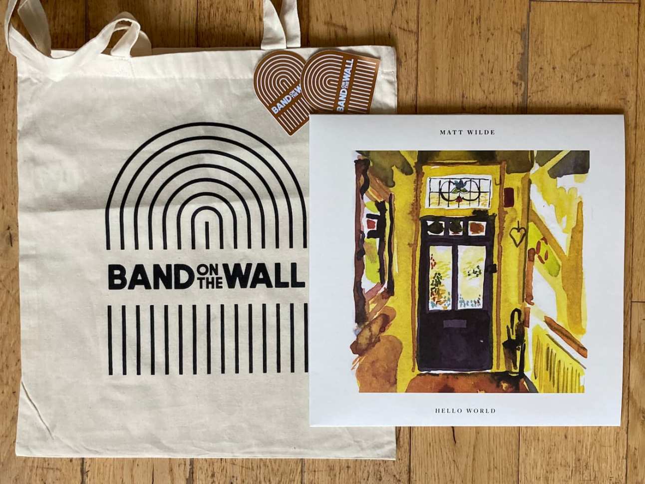
Cheers also to Band on the Wall recordings for the surprise tote bag!
A well known URL for your personal avatar (by Jim Neilsen)
I really like Jim’s idea of putting an avatar file somewhere that’s memorable and easy to access by me wherever I am and that also (in the future) might be automatically grabbable by any platform that needs my avatar.
So I’ve put my avatar at fuzzylogic.me/.well-known/avatar.
Great idea, Jim!
The fear of keeping up (on gomakethings)
Great post by Chris here on the double-edged-sword of our rapidly-evolving web standards, and how to stay sane. On the one hand the latest additions to the HTML, CSS and JavaScript standards are removing the need for many custom tools which is positive. However:
it can also leave you feeling like it’s impossible to keep up or learn it all. And that’s because you can’t! The field is literally too big to learn everything. “Keeping up” is both impossible and overrated. It’s the path to burnout.
Chris’s suggestion – something I find reassuring and will return to in moments of doubt – is that we focus on:
- a good understanding of the fundamentals,
- staying aware of general trends in the industry (such as important forthcoming native HTML elements; and the different approaches to building a website etc),
- problem-solving: being good at “solving problems with tech” rather than just knowing a bunch of tools.
Making coffee with the Sage Barista Touch
Clair recently brought her fancy coffee machine home from work. It’s a Sage Barista Touch. Since then, I’ve been learning what’s involved in making a coffee by grinding fresh from whole beans, barista-style!
It’s more complicated than I would have thought, and has involved lots of learning and trial and error.
Here are my go-to resources and my rules-of-thumb. I’m not saying they’re perfect, but they’re working for me! Any additional tips from people more in the know are, of course, very welcome.
Dialling in: my rule of thumb
Overall I want:
- a good taste, as a result of
- a grind of 18-19g, and
- a pull where liquid flows from 7 seconds or more, and
- a conventional yield such as a 2oz double-espresso.
Once you’ve achieved the above from a process of trial and error, dial in the settings (grind, dose) and log any additional notes so that you can easily repeat the same process achieving the same results.
How it works in practice
If I buy a new bag of coffee beans for a coffee I’m trying for the first time, here’s how I’d set about dialling in.
Note: before you start, you want your coffee’s roast date to be no more than 3 weeks ago and you’ll need coffee scales and one or two espresso shot glasses with measuring lines.
Fill up the tank with fresh water. Use the hot water feature to pour out some hot water into your mug to warm everything up.
Start with a grind size of 12 and a grind time of 20 seconds (they’re sensible middling starting points).
Place your portafilter with funnel attached on your scales (turned off) then turn on the scales so that they’re zeroed appropriately.
Remove the portafilter and grind out coffee based on the previously set grind time. Use the scales to check how much you’ve ground. Remove some, or grind and add more, til you have 18g. Jot down how much time it takes to grind 18g.
Settle, level (roughly) and tamp the coffee in the basket.
Remove the funnel then screw the portafilter in so that it’s ready to brew.
Place your espresso measuring mug under the portafilter, ready to receive brewed coffee.
Start brewing and note the point when liquid starts flowing. If it starts flowing before seven seconds, set the grind size finer. Get this aspect locked down first.
Once we’ve achieved a good begin-flow point and a steady flow, I want to identify the number of seconds it takes to achieve my target yield – meaning the time at which the crema hits the 2oz double espresso line.
Once you’ve hit your yield, and so long as the time was between 25-35 seconds, taste it. If you like it you could dial in that brew time and stop there. If it’s at say 28+ seconds (indicating that the water’s taking a long time to make its way though the coffee) I might also try increasing the grind size by one (larger grind = less dense = water gets through faster) and seeing if I can achieve the target yield within a few less seconds.
Another little tweak I sometimes make to achieve the balance of begin-flow-time, steady flow and yield is to slightly increase or reduce the amount of coffee. For example adding a few milligrams (a dose of 18.5g versus 18g) might start the flow just a little later, when that’s what you need.
If you tried different settings, compare the taste in separate shot glasses. Go with the one you like! Dial in (save/overwrite) your grind size, grind time and brew time. I’ve noticed that the grind size can move a bit of its own accord between uses, so noting the settings for this coffee down somewhere is a good idea too.
Now that you have a good shot of espresso, you could make (for example) a flat white… or add water and a drop of milk for an americano… or just have the espresso itself if you’re feeling Italian.
Resources
Lighter meditteranean veg lasagne recipe, by Gousto
This lasagne was meat-free, fun to cook, easy on the eye and tasted great.
I’ve just read Join the Future, by Matt Anniss
It’s important to set the record straight. Normally when people talk about the early UK scene the same few things get mentioned. The real underground never gets talked about."
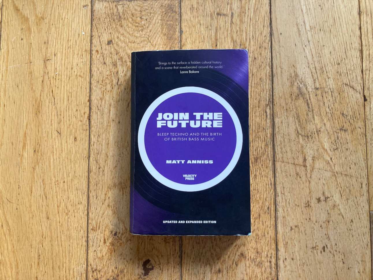
I loved this! It tells the stories behind many of the lesser-reported UK scenes and record labels. And it really helped to join a lot of musical dots for me, covering music I first heard on cassettes as a teenager thirty years ago. (That includes fairly obscure labels such as Chill – that brilliant quote about “setting the record straight” was from their A+R man Tim Raidl).
I also loved Matt’s passion for telling the stories of these people and communities.
Highly recommended.
Banksy’s Cut and Run exhibition
Clair and I, along with our pal Fiona, just went to see Banksy’s Cut and run exhibition at the GOMA in Glasgow. I loved it!
Banksy describes it as follows:
I’ve kept these stencils hidden away for years, mindful they could be used as evidence in a charge of criminal damage. But that moment seems to have passed, so now I’m exhibiting them in a gallery as works of art. I’m not sure which is the greater crime.
He mentions that one of the main reasons he chose Glasgow’s GOMA is because the ever-present cone on the head of the Duke of Wellington statue outside is his favourite work of art in the UK.
…the statue out the front has had a cone on its head continuously for the past 40 odd years. Despite the best efforts of the council and the police, every time one is removed another takes its place."
I really enjoyed the way the exhibition was arranged and presented with the various use of corridors, rooms, concourses and other objects such as elevators and phone booths.
I liked Banky self-effacing introduction saying that really he was cheating and gets (steals) all his inspiration from others, or real artists.
I loved where he talked about the light-switch moment about not needing to add a background but rather to make the real-life location the background, and how that then fires the imagination with the challenge “How much of the environment can you integrate into the piece?”. How much space could there be between the girl and the balloon?
Lastly, the final area is a treat. It simulates Banksy’s bedroom growing up and the music, art and films which influenced him. There’s a great description of how the graffitied sign in Jaws – where a sign presenting Amity Island as a paradise is doctored with a shark fin and “Help!” speech bubble – was an early example of art that really spoke to him. In this graffiti he saw a wonderful combination of satire, powerless people finding a way to make their voice heard, humour, art and rebellion.
How I use github.com as my JAMstack CMS
Here are my quick links and tips for creating a markdown-file-based blog post using only github.com and no CMS. I’ve put these on this site so that they’re on the web therefore I can access them wherever I am.
Why do I create posts this way? Because I’ve tried forestry.io (now Tina) and Netlify CMS and I no longer have the time or inclination to maintain their dependencies, load their JavaScript or make ongoing updates as they evolve. I’ve also found them a little flaky. So instead let’s see how this lo-fi approach works.
This post is mainly for my own reference but who knows, maybe it’ll be useful to someone else too.
Step 1:
Create a new markdown file in my posts directory
Step 2: use one of these previous posts as a template (use the “copy raw file” icon-button then paste into my new markdown file):
- Standard blog entry
- Bookmark
- Short note
- Note with photo
- Book I’ve started reading
- Film I just watched
- (Video of) record I bought/love
- Mix I’ve just recorded
Useful references
- grab current datetime in right format (see the Date/time field under Convert from strings)
- All of my tags
- Images: how I optimise, host, and code for performance and responsiveness
- Set frontmatter date to
Created
Other notes
Reminder to self: create a bookmark for this post on all my devices. Name it “Nu Gh post”.
Secrets To Block Like a Pro Tutorial A-Z
In this tutorial video Seth Pech shares what he’s learned about that most foundational (and important) of table-tennis shots – the block.
Fundamentals:
- keep the racket in front rather than blocking on the side of your body. You can see it better and transition faster
- for the basic block just use the opponent’s energy – don’t add anything
- for backhand, block in your normal backhand posture (rather than a lollipop, or poking) to aid transitioning to attack
- don’t bend your wrist back lots – it’s painful. Bend it back just a little.
- timing: catch it on rise or at top of the bounce, rather than just off the bounce
- against a heavy-spin loop, let the ball come to you and push down on it. Don’t move into it
Backhand punch block:
- have a relaxed wrist
- small backswing – imagine your hand hitting a sheet of paper and getting a nice “smack” on it for a “pop” sound
- catch ball at the top of the bounce. Going early makes it hard to get over the net.
- ascend very slightly through shot for a tiny bit of topspin (but tiny, as it’s still a punch)
Super-reliable forehand loop technique
Nice video here from Tom Lodziak in which coach Emma Harradine demonstrates a forehand loop (against backspin) that just looks so spinny, safe and reliable.
I’ve always liked the idea of this shot – the archetypal third ball in the rally – being like a well-oiled machine, but have never quite nailed it. So I’m gonna study this!
The key points are:
- Drop the right knee and put weight on right foot
- Rotate hips and upper body so that non-playing shoulder, elbow face table and non-playing upper-arm is horizontal like table surface
- Drop bat below height of the ball
- Brush the ball
- Contact ball at top of its bounce – don’t let it drop
- Rotate hips, upper-body
- The key is consistency and spin. This shot is a set-up not a winner
- Next shot can be more direct and faster, but don’t blast it either – there’s no need. Going for position is really effective.
The New CSS (by Mattias Ott)
Matthias feels that the recent slew of additions to CSS have completely changed the game.
this time, something feels different… the changes coming to CSS are so fundamental on so many levels that it almost feels like a singularity. There is now the CSS before and the CSS after the early 2020s.
Want to emulate and confidently design a layout that leverages the potential of CSS Grid in any of the major design tools like Figma, Adobe XD, or Sketch? Not possible. Want to define a color in one of the wide gamut color spaces like OKLCH, which result in more vibrant and natural colors on modern screens, maybe by using a color picker? Not possible. You want to simulate fluid typography that dynamically scales font sizes based on the viewport or container size and also define minimum and maximum values like you can do it in CSS with clamp()? Not possible. Or how about defining a fallback font in case your web font doesn’t load? Good luck using any screen design tool on the market. Not only are all of those things – very clearly – important design decisions, but they are also easily possible with just a few lines of CSS. In this new era of CSS, the design tools are now the limiting factor.
He also hopes and suggests that CSS might become more respected and teams might “shift left” with regard to prototyping in the browser.
What I expect to see overall is that the perception and thus the role of CSS in the design process will change from being mainly a presentational styling tool at the end of the waterfall to a tool that is being used at the heart of making design decisions early on. The value of a designer who knows how to prototype and build web components with modern CSS will therefore increase a lot. As a design engineering freelancer, I’m noticing this already.
Brothy fragrant chicken thigh and spinach noodle soup
A tasty and healthy asian-style recipe from Gousto, which I enjoyed cooking and eating and would like to make again.
Ingredients (for two people)
- Diced chicken thigh (250g)
- Dried chilli flakes (0.5 tbsp)
- Fine egg noodle nests (2)
- Ginger and garilc paste (15g)
- Pho broth base (25g)
- Soy sauce (8ml)
- Spinach (80g)
- Toasted sesame oil (10ml)
- Vegetable oil
Instructions
Take chicken out of fridge, open the packet and let it air.
Boil a full kettle.
Heat a large, wide-based pan with a drizzle of veg oil over a high heat.
Once hot add your diced chicken thigh with your soy sauce and cook for an initial 5-6 min or until beginning to brown.
Was your spinach and pat it dry with kitchen paper.
Dissolve your pho broth paste in 600ml boiled water – this is your stock.
Reboil a kettle.
Add your fine egg noodles to a large bowl, cover them with boiled water and stir for 10 secs to separate the noodles. Set aside to soak for 4 min.
Once te chicken as ad an initial 5-6 min, add your ginger and garilc paste and half your chilli flakes and cook for a further 2-3 min or until fragrant.
Once fragrant add the stock to the pan with the chicken and bring to the boil over a high heat.
Once boiling, reduce the heat to medium and cook for a final 3 min or until the chicken is cooked through (no pink meat!).
Add the spinach to the pan and mix everything together until the spinach has slightly wilted – this is your fragrant chicken thigh and spinach broth.
Drain the soaked noodles.
Add the drained noodles to a bowl and pour in the fragrant chicken thigh and spinach broth.
Drizzle over your toasted sesame oil and sprinkle over the remaining chilli flakes.
Enjoy!
Accessibility Personas
This interesting website from the GDS accessibility team sets out seven personas, each with different access needs.
You can use these profiles to experience the web from the perspective of the personas and gain more understanding of accessibility issues.
The site explains how to set up a device or browser to give each persona its own profile simulating the persona’s condition(s) and runs the assistive technology they use to help them.
The only accessibility specialist in the room – Tetralogical blog
Henny Swan, director at Tetralogical, with some great advice for those whom accessibility responsibility often falls to.
Henny advises:
On responsibility: accessibility is everyone’s responsibility all the time, not just your responsibility all the time. Establish that you can support accessibility, but others also need to do accessibility work and make accessibility-related decisions.
On relationship-building: build relationships with decision-makers with authority to embed accessibility and practitioners ready to build up their skills.
On sustainability and scalability: look for ways to scale what you do through demonstration and documentation.
On expectations: manage expectations and be clear about what you can do. You can give advice, but teams themselves need to make informed decsions. Also – you won’t know everyting, and sometimes you need the help of expert consultancy.
On having support to hand: build a support network through community groups and mentor programmes. I’ve also taken Henny’s advice and subscribed to the WebAIM accessibility discussion list.
Goldman Sachs Design System
This Design System reference website sports a smart architecture with some interesting sections.
The components are neatly organised into categories. And I like the Foundations area which includes a Design System Concepts section serving as a glossary of property and anatomical terms, plus an Accessibility section with neat diagrams.
I think what I like best about this site/system is its organisation and naming.
The web is fundamentally designed to be accessible to all
Working as a web developer, you’ll meet colleagues who don’t realise that accessibility should be non-negotiable. So I’m bookmarking for ready access Tim Berners-Lee’s oft-quoted but still powerful statement of intent from 1997.
The power of the Web is in its universality. Access by everyone regardless of disability is an essential aspect.
This particular W3C WAI page goes on to say:
The Web is fundamentally designed to work for all people, whatever their hardware, software, language, location, or ability. When the Web meets this goal, it is accessible to people with a diverse range of hearing, movement, sight, and cognitive ability.
Thus the impact of disability is radically changed on the Web because the Web removes barriers to communication and interaction that many people face in the physical world. However, when websites, applications, technologies, or tools are badly designed, they can create barriers that exclude people from using the Web.
Accessibility is essential for developers and organizations that want to create high-quality websites and web tools, and not exclude people from using their products and services.
A UX observation regarding good design, by Adam Silver
A spicy but somewhat relatable thought from Adam Silver:
UX observation: I think there might be more devs who care about good design than there are designers. By “good” I mean works for everyone (is accessible) rather than looks nice. What do you think?
The ensuing conversation is pretty interesting. I particularly liked these contributions from Martin Hoyer:
Absolutely. Thinking about the design code-first and understanding how HTML works is so valuable. I don’t think designers should learn HTML but they shouldn’t be the first people to decide how something is built!
He goes on to describe how he thinks design should be done as follows:
In an ideal world (and I don’t think I’ve ever fully achieved this) I’d like to get some requirements (from product I guess), build a prototype in code, then collaboratively iterate on the design from there. Maybe call it a design sprint or whatever!
Add Opacity to an Existing Color (by Chris Coyier)
Applying opacity to an existing colour value is a pretty common design requirement, and here Chris presents five ways to achieve it.
I’ll admit that the explosion of colour models is one aspect of CSS that leaves me dizzy, so this explanation framed around a practical requirement really helps. The main approaches presented by Chris are:
- 8 digit hex code
- relative colour syntax (currently only supported in Safari)
- using a format other than hex such as HSL since it’s easier to apply transparency
- using (in a progressively enanced approach) HDR-display-friendly colours, via a new colour format such as
oklch
Fuzzy Logic show (April 23), Radio Buena Vida
My latest radio show is dedicated to Ryuichi Sakamoto, who sadly died recently. I played a couple of tracks by the great man alongside more of my favourite music.
Listen to the show on Soundcloud.
Here’s the tracklist:
- Ryuichi Sakamoto & Alva Noto - Aurora
- Matt Wilde - Who Cares
- Kaidi Tatham - Funky Fool
- Mac DeMarco - 20180702 2
- Robert Ffrench - I am wondering
- Ryuichi Sakamoto - Plastic Bamboo
- Kraftwerk - Vitamin
- Mac DeMarco - 20180924
- Gal Costa - Relance (Bernhard Pinheiro edit)
- Imagination - So good, so right (12″ mix then dub)
- Romaal Kultan - Between Us, Part One
- Jayme Marques - Berimbao
- Souldrummers - Space And Time
I really enjoyed this one and I’m pleased with how it turned out. Thanks to Susan and Speedy for having me back.
W3C and Smart Interface pattern websites
Two lovely new websites (or website updates) appeared on my radar this last week that I wanted to note here for future front-end inspiration.
Vitaly Friedman’s Smart Interface Patterns has had some lovely animation and component work from Clearleft alumni Cassie Evans and Trys Mudford. Given Vitaly’s obsession with creating accessible, user-friendly components and the collaborators he has on board, I expect this site to be choc-full of well crafted nuggets for reference! It looks ace, too.
I noted a while ago that the W3C had a new Design System, and now the W3C has a new website in beta too. I imagine it might use components from that Design System alongside other carefully-considered patterns of markup, style and behaviour.
Nice job on these sites, to all concerned!
First play with CSS Container Queries
In responsive design we generally want a single component to get different styles in different contexts. Up until recently the prevailing method of context-awareness was to use a CSS media query to query the viewport size. This wasn’t ideal. For example you might want an component to be styled differently when in a narrow context such as a sidebar (regardless of the device size), and viewport-based queries don’t help with that.
But everything has changed. We can now use CSS to query the size of any given container and this feature is supported in all major browsers.
There’s a bit of new syntax to learn, so I recently had my first play with container queries on codepen.
My pen is pretty trivial, but the goal was specifically to do the most minimal test that lets me test-drive the key syntax. It turns out that it’s quite straightforward.
Define an element as a container:
.sidebar {
  container: ctr-sidebar / inline-size;
}
Change the styles of another element (.foo) when it’s inside that container and the container’s inline-size (the logical property name for width) matches a given query:
@container ctr-sidebar (max-width: 300px) {
  .foo {
    // context-specific styles go here
  }
}
Note that you could also omit the ctr-sidebar context in the above query, if you wanted the change to apply in all defined containers.
Collaboration versus handoff, and avoiding broken promises
I’m a fan of web designers and developers collaborating closely rather than designers throwing mock-ups over the wall. Recently I read two newsletters relating to this topic, or perhaps more accurately about perceived divisions between design and development and some better, more modern ways of thinking.
The first, The best handoff is no handoff from Smashing Magazine, presents alternatives to waterfall including The Hot Potato Process espoused by Brad Frost and Dan Mall.
The second, Promises from Clearleft argues that presenting flat designs for sign-off at an early stage of a project doesn’t make sense given the nature of the web, and that it makes promises that can’t be kept.
In practice, sign-off leads to disappointment for everyone involved. A design created in isolation in a graphics-design tool almost never survives contact with the reality of the web. The client is disappointed that the final output doesn’t match what was signed off. The developer is disappointed that they weren’t consulted sooner. The designer is disappointed that the code doesn’t match the design.
Clearleft argue instead for presenting the coded page in the browser because it avoids broken promises and presents reality.
The new HTML search element
My work colleague Ryan recently drew my attention to the new HTML search element. This morning I read Scott O’Hara’s excellent primer. Scott worked on implementing <search>, and his article cleared up my questions around what it is and when we can start using it.
Firstly <search> is not a “search input” – it’s not a replacement for any existing input elements. Instead it’s a native HTML element to create a search landmark, something that until now we could only achieve by applying role="search" to another element.
Landmarks are an important semantic structure allowing screen reader users to orient themselves and jump to important areas of a web page. Existing landmark-signalling elements you might know include <header>, <main>, <footer>. So you would use <search> to wrap around a search function, thus providing additional accessibility. And it lets you do so with a native HTML element instead of re-purposing another element by adding ARIA properties, per the first rule of ARIA use. It’d look something like this:
So as Scott himself admits:
To be brutally honest, this is not the most important element that’s ever been added to the HTML specification. It is however a nice little accessibility win.
Do I have a use for this?
If you have a search function or search page and currently miss the opportunity to offer a search landmark you could do so and improve the user experience.
Can I use the <search> element today?
As Scott mentions, it’s not yet available in browsers (although it likely will arrive soon). So if you added <search> (just as I’ve typed it there) to a page, it wouldn’t currently create a search landmark. So you could wait for a while before using the element. Alternatively, because HTML’s design is intentionally geared toward a progressive enhancement mindset, you could take Jeremy Keith’s approach and safely use the following today:
Jeremy knows that when browsers encounter an HTML element they don’t know, they don’t break but rather treat it as an anonymous element and carry on. So he includes <search> to start adopting the new element today, but bolts on role=search temporarily to manually provide the landmark until browsers understand search. He’ll then remove the role=search part once support for search is widespread.
I’ve been listening to lots of jazz of late and loved seeing Herbie Hancock live in August 22.
So I thought I’d explore further and listen to the audio recording of Herbie’s autobiography Possibilities, narrated by the great man himself.
I really enjoyed it. Herbie’s story is really interesting and entertaining. He’s been at the forefront of so many iconic scenes – from playing in Miles Davis’s band, to writing many classics of his own, to breaking new ground with his Mwandishi sextet and the Headhunters.
I love his carefree and curious spirit and his willingness to experiment with technology (from the fender Rhodes, to other synths, to the internet) and take risks in other aspects of life.
What a talent and what a guy!
Fuzzy Logic show (March 23), Clyde Built Radio
I recorded my second radio show of 2023 live at the Clyde Built Radio studio at the weekend. It was great playing records there on a sunny Sunday with the clocks just gone forward and the Barras buzzing as it hosted a Hong Kong street market.

This month I went for a set of reggae, electronics and other assorted good vibes.
Listen to the show on Soundcloud.
Here’s the tracklist:
- Mali-I - Next Level Intro
- Robert Ffrench - You are so special
- Radio Trip - No Oud
- Lucas Croon - Japon
- Babeth - Orchestra Reggae
- Tyrone Evans - Rise Up (Version)
- Gateway Shuffle - Snapping
- Cloud - Moon Rock
- Azura - Theme from Azura
- Visage - Pleasure Boys
- Romaal Kultan - Meditate
- Language - Tranquility Bass
Thanks to Amy for arranging, and to Matthew, the engineer on the day.
Quick circle (by Adam Argyle)
I’m wary of list-based clickbait – and Adam’s recent 6 CSS snippets every front-end developer should know in 2023 feels like that – however I like this modern and minimal approach to creating a circle. I’ve previously seen aspect-ratio: 1 used to create a square box and it’s a lovely shorthand for “make width and height equal”. It makes sense that you can use it for a circle too, just by adding some border-radius.
.circle { inline-size: 25ch; aspect-ratio: 1; border-radius: 50%; }
Modern Font Stacks
System font stack CSS organized by typeface classification for every modern OS. The fastest fonts available. No downloading, no layout shifts, no flashes — just instant renders.
This is a great resource for when you want a particular style of font (workhorse sans-serif, grotesque, monospace, display slab serif etc) and to favour a system font rather than a custom font to get performance and simplicity benefits allied to having many weights and characters natively available.
To grab a stack, just copy the font-family declaration from its card then paste that into your CSS.
To easily preview how custom text of your choice would look in each stack, use the handy form at the top of the page.
Aside from its utility I also love this page as a learning resource. For each font category, the font and weight your browsing context is currently using is highlighted in blue with a solid underline, while those available but not currently in use and those unavailable are also separately highlighted. This gives you even more information than Firefox’s font panel or the WhatFont extension for Chrome.
Notes:
- if you notice support for a font when you wouldn’t expect it (because your OS doesn’t include it), it’s worth remembering that you may have previously installed it locally. This was the case for me with Inter in the Neo-Grotesque stack. You can click the little “info” icon links beside each stack’s title for detailed info on that stack including which OSs use which font
- the declaration
font-family: system-ui, sans-serifas a means of serving the Operating System’s default sans-serif seemed suspiciously simple given the complicated iterations I’ve seen previously. However after some digging I confirmed that Firefox added support forsystem-uia few years ago so previous, verbose alternatives are no longer necessary.
5 things I learned working on a design system for a year (by Anda Popovici)
I was delighted to discover that my talented colleague Anda has her own website and uses it to write articles like this! This one is obviously pretty relevant to me too, given that I work on the same team.
I particularly liked the fifth lesson – “You are an integral part of the company”. This is an aspect of Design System work that I care about because it’s important to me to work on impactful things that get into a lot of users’ hands.
Design Systems should avoid “God components” and Swiss Army Knives
Something we often talk about in our Design System team is that components should not be like Swiss Army Knives. It’s better for them to be laser-focused because by limiting their scope to a single task they are more reusable and support a more extensible system through composition.
Discussions often arise when we consider the flip-side – components which do too much, know too much, or care too much! When they cover too much ground or make assumptions about their context, things go wrong. Here are some examples.
Card
In websites where many elements have a “rounded panel”-like appearance so as to pop off the background, you can run into problems. Because of the somewhat Card-like appearance, people start to regard many semantically distinct things as “Cards” (rather than limiting the meaning of Card to a more conventional definition). Here are some of the problems this can cause:
- If the name covers a million use cases, then how can you describe it sensibly, or define its boundaries?
- When do you stop piling on different things it can mean? How do you stop it growing? How do you avoid bloat?
- Ongoing naming/confusion issues: you’re setting yourself up for continued confusion and code disparity. If something is “semantically” a note, or a comment, or a message etc then you can expect that future staff are gonna describe it as that rather than a Card! They’ll likely (understandably) write code that feels appropriate too. The problem will continue.
I appreciate that often we need pragmatic solutions, so if our designs have lots of similar-looking elements then there is still something we can do. If the repeated thing is more of a “shape” than a something with common-purpose, then just call it out as that! That could either be by name – for example Every Layout have a Box layout which could be a starting point – or by categorisation i.e. by moving the non-ideally named thing into a clearly demarcated Utilities (or similar) category in your Design System.
Flex
It seems that a number of Design Systems have a Flex component. My feeling, though, is that these represent an early reaction to the emergence of CSS’s Flexbox, rather than necessarily being sensible system-friendly or consumer-friendly components. CSS layout covers a lot and I think breaking this down into different smaller tools (Stack, Inline, Grid etc) works better.
Button
I’ve talked before about the “Everything is a button” mindset and how it’s harmful. Buttons and links are fundamentally different HTML elements with totally different purposes, and bundling them together has various ill effects that I see on a regular basis.
References
SaaS startups will have to care about productivity again, by DHH
Getting to profitability is no longer a distant, post-IPO nice-to-have, but a short-term necessity for survival. But how to do that without cutting off the legs of the product team? By using better tools and techniques, that's how.
DHH of 37 Signals and Basecamp offers three pieces of advice for productivity and profitability.
1: Unless market conditions demand otherwise, delay native app development for as long as possible.
2: Hire full-stack developers, and don't let them split the frontend and backend into separate jurisdictions.
3: Hire designers who work natively with the web.
I’m not a fan of the term “full-stack” and also think it underestimates the complexity/speciality required to work (properly) as a front-end developer. However that aside, I think there is sense in these, even though others I know would disagree.
Weekend at Banchory Farm, Fife
Me, Clair and Rudy just enjoyed a lovely weekend break. We stayed at Drinkbetween cottage on Banchory Farm. While only 70 minutes drive from home it provided some lovely countryside isolation, with the bonus of nice nearby towns to visit nearby too.
The cottage has recently been restored by the farm owners and was the perfect environment to relax.
Our nearest neighbours were some colourful pheasants, a flock of sheep and three highland cows grazing in the fields opposite. Beyond them, there was a view onto the firth of forth and Forth bridges.
On the Saturday we enjoyed a short trip to the nearby towns of Aberdour via Burntisland, and moseyed down to the lovely Silver beach where we stopped for a coffee at Sands.
Clair brought and made beautiful food and at night we watched Captain Fantastic.
It was a reminder of just how great a well-needed change of pace and scenery you can get in a short distance and space of time.
Captain Fantastic
Clair and I loved this story of Viggo Mortensen’s Ben Cash and family temporarily leaving their off-grid existence in the Pacific Northwest to enter civilisation. It poses some interesting questions about parenting, lifestyle and morality but mainly, it’s just a lot of fun.
Judging by his movie review for The Guardian, Mark Kermode seemed to like Captain Fantastic too.
Fuzzy Logic show (Feb ‘23), Clyde Built Radio
Having pre-recorded previous shows, I recently made a first visit to Clyde Built Radio’s station at the Barras market for a live show and really enjoyed it. It’s such a great location and it was a nice change to spin records on a Sunday morning.
I started off gently with atmospheric music from Detroit’s Ian Finklestein followed by a modern take on Steve Reich from Bitchin Bajas. From there it was into some hazy electronics and a dash of 80s boogie before landing on sounds from house music legends Abacus and Larry Heard.
Here’s the tracklist:
- Ian Finklestein – Ago-ra
- Bitchin Bajas – Amorpha
- Isotope 217 – Audio Boxing
- Coral D & PST – Send it
- Komiko – Feel Alright
- Visions of Tomorrow – Galaxy
- Wheelup – Infinity feat. Abacus
- Cy Gorman – Dewy Drip
- Peech Boys – Don’t make me wait (Dub)
- Purelink – Dozen Sunbeams (Nice Girl version)
- Abacus – The Lower End Theory
- Ossie – I hurt you
- Fingers Inc – Bye Bye
Thanks to Amy for the invite, and Brandon, the engineer on the day.
Displaying tables on narrow screens
Responsive design for tables is tricky. Sure, you can just make the table’s container horizontally scrollable but that’s more a developer convenience than a great user experience. And if you instead try to do something more clever, you can run into challenges as I did in the past. Still, we should strive to design good narrow screen user experiences for tables, alongside feasible technical solutions to achieve them.
In terms of UI design, I was interested to read Erik Kennedy’s recent newsletter on The best way to display tables on mobile. Erik lists three different approaches, which are (in reverse order of his preference):
- Hide the least important columns
- Cards with rows of Label-Value pairs
- More radical “remix” as a “Mobile List”
Another article worth checking is Andrew Coyle’s The Responsive Table. He describes the following approaches:
- Horizontal overflow table (inc. fixed first column)
- Transitional table
- Priority responsive table
For the transitional table, Andrew links to Charlie Cathcart’s Responsive & Accessible Data Table codepen. It looks similar (perhaps better looking but not quite as accessible) to Adrian Roselli’s Responsive Accessible Table.
Native CSS Nesting
I’ve started reading some entries from Manuel Matuzovic’s 100 days of (more or less) modern CSS series, and began with the excellent Day 99: Native Nesting. It clearly explains how to use the now-agreed syntax for various common scenarios.
The syntax is pretty close to what we’re used to doing with Sass, which is great!
Also, I’m now also clear that nested selectors must always start with a symbol rather than a letter. Often they would naturally do so anyway, for example when nesting a class since that already starts with a symbol (a full stop). But in cases where they wouldn’t – essentially only when nesting an “element selector” – we start it with an “&”. So:
main { & article { ... } }
Straightforward enough!
Regarding browser support for CSS nesting, at the time of writing it is available in Chrome and Safari Technology Preview only.
I would therefore only use it for demos and for the most non-essential enhancements. We’ll need to hold off any full-scale switch from Sass nesting to CSS nesting for large and important production websites until this is in Firefox and standard Safari, and until a sufficient percentage of users has the up-to-date versions. So a little while away yet, but given the current rate of browser updates, likely sooner than we might think!
No Style Design System
Adam Silver’s collection of accessible form-related components – a companion to his book Form Design Patterns – is a brilliant reference.
In there you’ll find Autocomplete, date fields, validation and lots of other tricky components and patterns.
The Component Gallery
The component gallery is an up-to-date list of interface component examples. It’s really helpful for looking up existing naming conventions. It also contains a list of Design Systems.
Use the dialog element (reasonably), by Scott O’Hara
Here’s an important update on native modal dialogues. TL;DR – it’s now OK to use dialog.
Last year I posted that Safari now supported the HTML dialog element meaning that we were within touching distance of being able to adopt it with confidence. My caveat was:
However first I think we’d need to make an informed decision regarding our satisfaction with support, based on the updated advice in Scott O’Hara’s article Having an Open Dialog.
(Accessibility expert Scott O’Hara has been diligently testing the dialog element for years.)
However the happy day has arrived. The other day Scott posted Use the dialog element (reasonably). It includes this advice:
I personally think it’s time to move away from using custom dialogs, and to use the
dialogelement instead.
That’s an important green-light!
And this of course means that we can stop DIYing modal dialogues from divs plus super-complicated scripting and custom ARIA, and instead let a native HTML element do most of the heavy lifting for us.
From a Design System perspective, I’d previously suggested to my team that when we revisit our Modal component we should err toward a good custom dialogue library first, however I’m now likely to recommend we go for native dialog instead. Which is great!
Web Components Guide
This new resource on Web Components from Keith Cirkel and Kristján Oddsson of GitHub (and friends) is looking great so far.
As I recently tweeted, I love that it’s demoing “vanilla” Web Components first rather than using a library for the demos.
So far I’ve found that the various web component development frameworks (Lit etc) are cool, but generally I’d like to see more demos that create components without using abstractions. The frameworks include dependencies, opinions and proprietary syntax that (for me at least) make an already tricky learning curve more steep so they’re not (yet) my preferred approach. Right now I want to properly understand what’s going on at the web standards level.
Aside from tutorials this guide also includes a great Learn section which digs into JavaScript topics such as Classes and Events and why these are important for Web Components.
I hope that in future the guide will cover testing Web Components too.
Lastly, I like the Embed Mastodon Toot web component tutorial, and to help it sink in (and save the code for posterity) I’ve chucked the code into a pen.
Mystery Road – Origin
This is the best TV I’ve watched in a while, and Clair and I eagerly binged it in two days. I loved how it looked, the atmospheric music, the characters, the acting and the issues. I’ll now need to watch the other two Mystery Road series.
A Designer’s Guide to Documenting Accessibility & User Interactions (by Stephanie Walter)
My teammate Colin just shared this brilliant designers’ guide to documenting accessibility and user interactions. It’s really thorough and includes some pretty clever annotation techniques.
I agree with Stephanie that unless you ask the questions and document the answers regarding how a design will translate to an accessible reality then it can fall short at lots of points from the start to the implementation. This called to mind a similar perspective from Sophie Beaumont on how the BBC shift left regarding accessibility.
This type of annotation and discussion also feels like another healthy way for designers and engineers to talk to (and learn from) each other more.
I really like Stephanie’s conclusion that you won’t always have time for all of the techniques she mentions, so pick your battles.
Lean “plugin subscription form” by Chris Ferdinandi
I enjoyed this two-part tutorial from Chris arising from his critique of a subscription form plugin which includes the entire React library to achieve what could be done with a lightweight HTML and vanilla JavaScript solution. Chris advocates a progressively-enhanced approach. Instead of rendering the form with JavaScript he renders it in HTML and argues that not only is there no need for the former approach – because forms natively work without JavaScript – but also it only introduces fragility where we could provide resilience.
Part one: Using a wrecking ball when a hammer would suffice
Part two: More HTML, less JavaScript
I also recreated the front-end parts in a codepen to help this sink in.
Lastly, as someone who always favours resilience over fragility I wanted to take a moment to consider the part that Chris didn’t cover – why JavaScript is required at all. I guess it’s because, being a plugin, this is intended for portability and you as author have decided you want the error and success messaging to be “white-labelled” on the consuming website rather than for the user to be taken to a separate website. You don’t know the context’s stack so to provide a universally-supported solution you use JavaScript to handle the messaging, which then means you need to use JS to orchestrate everything else – preventing default submission, validating, fetch-based submission and API response handling.
BadBadNotGood at QMU, Glasgow
Went to see BadBadNotGood with Marty, Jenni and Zippy last night, and they were fantastic.
We braved -7° conditions to meet at Tennent’s Bar on Byres Rd where we watched Argentia beat Croatia in the World Cup semi-final. Then onto the QMU, which provided a real nostalgia hit – I think the last time we were there was to see Roni Size and Reprazent in the Brown Paper Bag era.
We wangled a standing position on the balcony which was ideal as we could see the band, the visuals (lovely 16mm and 35mm film projections created specially for the music) and generally hear things much better. Each band member – drummer, bassist, saxophonist and keyboard player – are outstanding musicians, and together they’re incredibly tight. Led by drummer Alex Sowinski’s good vibes on the mic, they finished off their tour hitting all the right notes to send us into Christmas on a high.
Last thing to mention is I have BadBadNotGood to thank for introducing me to the music of Arthur Verocai, via his amazing string arrangements on Talk Memory. And for that I’m very thankful!
Visit to North Berwick
During a recent November week off I enjoyed a first visit to North Berwick. It’s a beautiful seaside town and I was lucky enough to get lovely cold-but-sunny winter weather.
Here are some of the things I did:
- Stayed at the Marine Hotel. This was a treat as it was quite posh, but I save money these days from being at home a lot and it was only for a couple of days so I’m gonna allow myself this one. The breakfast (porridge followed by cooked breakfast) was amazing and I also loved the pool and outdoor jacuzzi!
- Beach walk beside the golf course into town
- A walk around the harbour including great cliff views out to the Firth of Forth
- A visit to the seabird centre where, amongst other things, I learned that gannets inhabit the Bass rock and that a gathering of gannets is called a gannetry!
- Pretty good lil’ shops! I particularly enjoyed the Steampunk coffee shop which also houses the Orange Moon record store.
- Enjoyed a pint at The Ship Inn and The Auld Hoose. It turns out that my friend Kris’s dad (who I knew pretty well) was a regular at the latter.
- A nice frutti de mare pasta dinner at Bella Italia
Next time I visit (hopefully with Clair and Rudy) I should go in summer so I can catch The Lobster Shack open! I’d also like to visit nearby Tantallon Castle.
Getting started with Utopia Figma Plugins (Utopia Blog)
Here’s another tool from the Utopia creators to assist with breakpoint-free fluid responsive design.
Until now, the tooling for Utopia has been predominantly developer-focused, but we know that's only half the story. To start to address this, we've created a pair of Figma plugins to help designers set out Utopian project foundations.
I also really like the idea of having three sets of type styles at both defined viewport sizes.
We typically use a Strong style for headings and other text that we want to visually punctuate our designs. The Prose style is useful for longer-form text which might benefit from a larger, more relaxed line height. The Default style is a catch-all for other snippets of text in our designs, like a standlone link, a short piece of explainer text, or perhaps an image caption. The number and variety of styles required will vary depending on your design's purpose and style but these three serve as a reasonable starting point.
How to set up your Technics 1200 turntable (by Longbox Media on YouTube)
The best SL-1200/10 set-up video I’ve seen.
I especially like the section on testing for channel imbalance by playing a mono record (such as Nat Birchall's Upright Living LP) and comparing the output meter for any differences between left and right, then untightening the relevant tonearm screws in order to make adjustments.
Update 26/10/25:
This one from Resident Advisor and the Hoppetosse nightclub ain’t bad either (although the Longbox tutorial still edges it).
A Long Time Coming - on the AbsoluteLee podcast
At the height of my playing career, David Baddiel wore blackface and put a pineapple on his head to mock me on national television every Friday night. While the chants have remained ever present, and David’s name has become synonymous with mine, it’s taken 25 years for us to finally meet face-to-face. In this episode, I talk with David about the impact his racist sketches had on me, my family and the wider community, and why allyship needs to become a bigger part of football.
While watching David Baddiel's excellent Jews Don't Count documentary on Channel Four I was intrigued by the section in which he spoke to Jason Lee, leading me to seek out this podcast episode.
In the nineties at the height of “lads’ culture”, Baddiel and Frank Skinner essentially bullied and abused footballer Lee, mocking his appearance in particular.
This conversation, difficult as it sounded, is fascinating. It throws up so many moral ambiguities, such as whether or not Baddiel is a fit person to publicly campaign against racism, and related questions around acceptance, rehabilitation and moving on.
It also made me question my own prejudices and behaviours, past and present.
Most of all I was impressed by Jason Lee. His past treatment has meant that he and his family have had a lot to endure, but he speaks with such dignity, positivity and resolve.
The anatomy of visually-hidden - TPGi
This article is not about when or why you would use visually-hidden content. There’s a number of excellent articles that discuss these questions in detail, notably Scott O’Hara’s Inclusively Hidden. But most of them don’t go into much detail about the specific CSS involved — why do we use this particular pattern, with these specific properties? So today I’m going to dissect it, looking at each of the properties in turn, why it’s there, and why it isn’t something else.
Relevant to How to hide elements on a web page.
I also liked this nugget:
it’s often called
.sr-only(screen reader only, but that’s not a good name, because visually-hidden content is not just for screen readers).
Electronic Roots 01: The Story Of Axis, with Jeff Mills by OpenLab Radio (on SoundCloud)
Loved this thoughtful and insightful interview with Jeff Mills by Marcus Barnes.
Among the highlights were Jeff’s thoughts on whether his music could viably still be described as “Detroit” given how long he’s lived away from the motor city, and also his reflections on the impact on his peer group of the 1980 film American Gigolo.
Backhand topspin attack - Amateur vs Pro (Tom Lodziak on YouTube)
Here’s a lovely slow-mo comparison of Liam Pitchford’s backhand technique versus that of an amateur.
The main things I take from it are:
- his posture – really low with weight forward
- how far in front of his body he strikes the ball – it’s way in front of his head and even in front of his non-playing hand, with impact at the back edge of the table
- the bat angle at the start (forehand side facing ceiling like you’re holding a frying pan)
- as he prepares, the bat’s left edge tilts up a bit and he gets slightly lower
- elbow moves forward (helping him rotate wrist back) but only as far as to create a virtual parallel horizontal line with the table’s back edge. This is the perfect stopping point for wrist pivoting (whereas I’ve let the elbow go further forward which is unnatural)
- uses wrist to bring bat tip way back to point back at his belly button – I think this greater “travel distance” might be crucial versus an amateur’s version of a wristy backhand
- then there’s a little forearm forward movement and a lot of wrist rotation to get the bat to the impact point
- stays low and on follow-through the bat only gets as high as his chin
Should I use the HTML title attribute?
People have used the HTML title attribute to achieve a native “tooltip” effect for many years. However accessibility experts have recommended that we should avoid this practice, and here I summarise my research on the topic.
Renowned accessibility solutions provider The Paciello Group recommend the title attribute should almost always be avoided. It causes problems for lots of different usage contexts (keyboard, touch device, screen readers). The only place where I can see that it is still helpful is on iframe. It was beneficial on form inputs in cases where a visible text label would be redundant and we want to provide our control with a programmatically associated label, however we now have aria attributes which do a better job.
So on anything other than iframe the title attribute is undesirable. To back this up, at work my team recently received the following accessibility feedback from Tetralogical when they reviewed one of our tables.
The Edit and Delete links use the
titleattribute to provide additional context for each link. Thetitleattribute can be unreliable (for example, in testing VoiceOver announces the title in French). Provide additional context using thearia-describedbyattribute to reference the name or reference value of the item.
Forthcoming DJ gig on Radio Buena Vida 19/11/22
I’ve been stockpiling good records for a while and it’s time they got an airing. I’ll be playing a few on Radio Buena Vida, Saturday 19/11 at 4–5pm. Tune in or even come hang out in the café, if you’re in the hood.
The “how web requests work” interview question
There’s a classic web developer interview question that goes something like this:
What happens when you type in “bbc.co.uk” into a browser? Describe the journey that results in you seeing a page.
You could answer it like this:
Your browser sends an HTTP request which gets routed through a local modem/router then gets sent to a nameserver. That nameserver routes the request to the correct IP address, which will resolve to some sort of web server. That server will serve up either some static files, or run some backend code in order to generate a resource (probably an html page). When the HTML page is returned, your browser will parse it, which will likely generate more requests, and the cycle will repeat.
To do:
- add something about HTTPS
- add more about the front-end aspects: DOM, CSSOM, Accessibility tree, render blocking resources etc
References:
- My favorite interview question, by Ben McCormick
- How browsers work, on MDN
Nordhealth’s Design System
There’s so much to admire in Nord Health’s Design System and specifically its reference website.
I love the way it looks and is organised.
There’s a fantastic, practical accessibility checklist.
They document their naming conventions and the rationale behind them.
They were a trailblazer in adopting web components and I love the docs explaining why.
We’ve chosen to use Web Components because there is a strong requirement for Nord to be used in many different contexts and with varying technologies — from static HTML pages to server-rendered apps, through to single page applications authored with frameworks such as React and Vue. Web Components work great for Nord, because they:
- Are tech-agnostic instead of tech-specific
- Future proof our system with Web Standards
- Allow us to use any framework or no framework at all
- Provide great encapsulation for styles and functionality
Lastly their components look great and show a really high-level of front-end and accessibility literacy.
Full disclosure
Whether I’m thinking about inclusive hiding, hamburger menus or web components one UI pattern I keep revisiting is the disclosure widget. Perhaps it’s because you can use this small pattern to bring together so many other wider aspects of good web development. So for future reference, here’s a braindump of my knowledge and resources on the subject.
A disclosure widget is for collapsing and expanding something. You might alternately describe that as hiding and showing something. The reason we collapse content is to save space. The thinking goes that users have a finite amount of screen estate (and attention) so we might want to reduce the space taken up by secondary content, or finer details, or repeated content so as to push the page’s key messages to the fore and save the user some scrolling. With a disclosure widget we collapse detailed content into a smaller snippet that acts as a button the user can activate to expand the full details (and collapse them again).
Adrian Roselli’s article Disclosure Widgets is a great primer on the available native and custom ARIA options, how to implement them and where each might be appropriate. Adrian’s article helpfully offers that a disclosure widget (the custom ARIA flavour) can be used as a base in order to achieve some other common UI requirements so long as you’re aware there are extra considerations and handle those carefully. Examples include:
- link and disclosure widget navigation
- table with expando rows
- accordion
- hamburger navigation
- highly custom
selectalternatives whenlistboxis innapropriate because it needs to include items that do not have theoptionrole - a toggle-tip
Something Adrian addresses (and I’ve previously written about) is the question around for which collapse/expand use cases we can safely use the native details element. There’s a lot to mention but since I’d prefer to present a simple heuristic let’s go meta here and use a details:
Use details for basic narrative content and panels but otherwise use a DIY disclosure
It’s either a bad idea or at the very least “challenging” to use a native `details` for:
- a hamburger menu
- an accordion
In terms of styling terms it’s tricky to use a `details` for:
- a custom appearance
- animation
The above styling issues are perhaps not insurmountable. It depends on what level of customisation you need.
Note to self: add more detail and links to this section when I get the chance.
I’ve also noticed that Adrian has a handy pen combining code for numerous disclosure widget variations.
Heydon Pickering’s Collapsible sections on Inclusive Components is excellent, and includes consideration of progressive enhancement and an excellent web component version. It’s also oriented toward multiple adjacent sections (an accordion although it doesn’t use that term) and includes fantastic advice regarding:
- appropriate markup including screen reader considerations
- how best to programmatically switch state (such as open/closed) within a web component
- how to make that state accessible via an HTML attribute on the web component (e.g.
<toggle-section open=true>) - how that attribute is then accessible outside the component, for example to a button and script that collapses and expands all sections simultaneously
There’s my DIY Disclosure widget demo on Codepen. I first created it to use as an example in a talk on Hiding elements on the web, but since then its implementation has taken a few twists and turns. In its latest incarnation I’ve taken some inspiration from the way Manuel Matuzovic’s navigation tutorial uses a template in the markup to prepare the “hamburger toggle” button.
I’ve also been reflecting on how the hidden attribute’s boolean nature is ideal for a toggle button in theory – it’s semantic and therefore programattically conveys state – but how hiding with CSS can be more flexible, chiefly because hidden (like CSS’s display) is not animatible. If you hide with CSS, you could opt to use visibility: hidden (perhaps augmented with position so to avoid taking up space while hidden) which similarly hides from everyone in terms of accessibilty.
As it happens, the first web component I created was a disclosure widget. It could definitely be improved by some tweaks and additions along the lines of Heydon Pickering’s web component mentioned above. I’ll try to do that soon.
Troubleshooting
For some disclosure widget use cases (such as a custom link menu often called a Dropdown) there are a few events that typically should collapse the expanded widget. One is the escape key. Another is when the user moves focus outside the widget. One possible scenario is that the user might activate the trigger button, assess the expanded options and subsequently decide none are suitable and move elsewhere. The act of clicking/tapping elsewhere should collapse the widget. However there’s a challenge. In order for the widget to be able to fire unfocus so that an event listener can act upon that, it would have to be focused in the first place. And in Safari – unlike other browsers – buttons do not automatically receive focus when activated. (I think Firefox used to be the same but was updated.) The workaround is to set focus manually via focus() in your click event listener for the trigger button.
Choosing a date - we want to know your use cases (a discussion re. gov.uk design system)
We want to find out if adding a 'date picker' component to the Design System is a good idea.
We're currently looking for: examples of date pickers in services: screenshots, prototypes, links to live services; use cases: explanations of why a 'date picker' was used in a service instead of a 'date input', or something else; research: how well 'date pickers' tested with users to complete different tasks.
This discussion thread will be really helpful for everyone attempting to create an accessible Date Picker.
How to build an accesssible autocomplete
At work there are plans afoot to reconcile various differing Autocomplete implementations into a single, reusable component. So far there’s been a written audit presenting all instances and how they differ in functional and technical respects. There’s also been design work to identify visual commonalities and avoid future inconsistencies. I’d now like to add another perspective: an investigation into which HTML materials and (if necessary) ARIA supplements are appropriate to ensure we build something accessible and resilient.
My experience is that to achieve the right result, HTML semantics and related concerns can’t just follow and bend to spec and visual design goals, but rather must influence the setting of those goals.
I’ll flesh out my findings in due course, but for now here are the key resources I’ve identified and plan to dig deep into.
Adrian Roselli’s article Stop Using ‘Drop-down’. To summarise the options of interest:
- ARIA Listbox lets you create a DIY thing that has the same roles and semantics as a
<select>but where you have greater stylistic control. There are different ways to implement a Listbox. Datalistis the native HTML version of a combo box. A combo box is essentially a<select>with a text field.Datalistis announced by screen readers in different ways but as far as I can gather these are quirky rather than terrible. I found a nice Twitter thread on DataList which not only shows off its function but also includes a promising accessibility-related comment from Patrick H Lauke of Tetralogical. The drawback, becauseDatalistis native HTML, is that its options are not stylelable.- ARIA Combobox is a pattern that combines ARIA
combobox,textboxandlistboxroles, and the benefit it brings is to allow a level of custom design that you couldn’t achieve withDatalist. Autocomplete(not to be confused with the HTMLautocompleteattribute) describes a control which provides users with suggestions that may not be available in the DOM already… for example when you fetch options via Ajax in reponse to what the user types.
With regard to Autocomplete, Adrian points to Adam Silver’s Building an accessible autocomplete control.
And for advice on whether or not to go with a native select or a custom control, and how best to implement listbox and combobox if that’s your choice, Adrian points to the following resources from Sarah Higley:
<select>your poison part 2 (see the Roll your own section at bottom)- Recommended Combobox Patterns pen
I also see that GOV.UK have marked a possible Autocomplete component as one of their next priorities to review. Their Autocomplete discussion thread includes examples and research and will be really helpful.
Using schema.org to describe your content
I’ve been using schema.org for a few years now, but haven’t yet logged any notes and usage advice. Schema.org gives websites a practical, structured data approach for communicating the meaning of their content in finer detail than they could with native HTML alone. Google etc can then parse this and use it in their interfaces to offer users a richer view of your data.
Schema.org lets you pick from different types of properties for describing your content, such as book, person, place or event. Alternatively a more generic article you might use BlogPosting.
Schema.org is still current and celebrated its ten year anniversary in 2021.
One bit of troubleshooting advice worth mentioning is to validate your page using validator.schema.org. Thanks to Liam who recently pointed out a schema issue on my site, which reminded me I need to use the validator any time I make changes to the relevant markup.
The organisation of work versus the job itself
Here’s a half-formed thought (the sort of thing personal websites that nobody else reads are perfect for). As a web developer, something I’ve noticed when interviewing candidates and hearing how they do things, or when I myself am being assessed in expectations reviews is that our industry seems obsessed with discussing the organisation of work. You know – PR review protocol, agile ceremonies, organising a Trello board, automation, linters. All of which is really important, of course. But the amount of airtime that gets leaves me frustrated. What about the actual job?
Are responsive strategy, web typography, layout, interactive JS components, animation (to name but a few very high-level topics) not interesting, complex and impactful enough as to warrant a higher percentage of the conversation? I want an insight into other folks’ knowledge of and opinions on how best to build things, and feel it gets relegated behind organisational topics.
Or do people just see the nitty-gritty stuff as the domain of enthusiasts on Twitter and personal blogs, or as “implementation details” that are secondary to the organisation of something – anything – that will “get the job done”?
As I say, a half-formed thought and probably just reveals my leanings! But writing it helps me gather my thoughts even if I eventually decide I’m in the wrong.
Let's talk about web components (by Brad Frost)
Brad breaks down the good, bad and ugly of web components but also makes a compelling argument that we should get behind this technology.
I come from the Zeldman school of web standards, am a strong proponent of progressive enhancement, care deeply about accessibility, and want to do my part to make sure that the web lives up to its ideals. And I bet you feel similar. It’s in that spirit that I want to see web components succeed. Because web components are a part of the web!
I’m with you, Brad. I just need to find practical ways to make them work.
WebC
WebC, the latest addition to the Eleventy suite of technologies, is focused on making Web Components easier to use. I have to admit, it took me a while to work out the idea behind this one, but I see it now and it looks interesting.
Here are a few of the selling points for WebC, as I see them.
With WebC, web components are the consumer developer’s authoring interface. So for example you might add a badge component into your page with <my-badge text='Lorem ipsum'></my-badge>.
Using web components is great – especially for Design Systems – because unlike with proprietary component frameworks, components are not coupled to a single technology stack but rather are platform and stack-agnostic, meaning they could be reused across products.
From the component creator perspective: whereas normally web components frustratingly require writing accompanying JavaScript and depending on JavaScript availability even for “JavaScript-free” components, with WebC this is not the case. You can create “HTML-only” components and rely on them to be rendered to screen. This is because WebC takes your .webc component file and compiles it to the simplest output HTML required.
WebC is progressive enhancement friendly. As mentioned above, your no-JS HTML foundation will render. But going further, you can also colocate your foundational baseline beside the scripts and CSS that enhance it within the same file.
This ability to write components within a single file (rather than separate template and script files) is pretty nice in general.
There are lots of other goodies too such as the ability to scope your styles and JavaScript to your component, and to set styles and JS to be aggregated in such a way that your layout file can optionally load only the styles and scripts required for the components in use on the current page.
Useful resources:
The ARIA presentation role
I’ve never properly understood when you would need to use the ARIA presentation role. This is perhaps in part because it is often used inappropriately, for example in situations where aria-hidden would be more appropriate. However I think the penny has finally dropped.
It’s fairly nuanced stuff so I’ll forgive myself this time!
You might use role=presentation in JavaScript which progressively enhances a basic JS-independent HTML foundation into a more advanced JS-dependent experience. In such cases you might want to reuse the baseline HTML but remove semantics which are no longer appropriate.
As an example, Inclusive Components Tabbed Interfaces starts with a Table of Contents marked up as an unordered list of links. However in enhanced mode the links take on a new role as tabs in a tablist so role=presentation is applied to their containing <li> elements so that the tab list is announced appropriately and not as a plain list.
Thoughts on HTML over the wire solutions
Max Böck just tweeted his excitement about htmx:
htmx (and similar "HTML over the wire" approaches) could someday replace Javascript SPAs. Cool to see a real-world case study on that, and with promising results
There’s similar excitement at my place of work (and among the Rails community in general) about Turbo. It promises:
the speed of an SPA without having to write any JS
These new approaches are attractive because they let us create user interfaces that update the current page sans reload – usually communicating with the server to get swap-in content or update the database – but by writing HTML rather than JavaScript. Developers have long wished for HTML alone to handle common interactive patterns so a set of simple, declarative conventions really appeals. Writing less JavaScript feels good for performance and lightening maintenance burden. Furthermore the Single Page App (SPA) approach via JS frameworks like React and Vue is heavier and more complicated than most situations call for.
However I have some concerns.
I’m concerned about the “no javascript” language being used, for example in articles titled Hotwire: reactive Rails with no JavaScript. Let’s be clear about what Turbo and htmx are in simple material terms. As Reddit user nnuri puts it in do Hotwire and htmx have a commitment to accessibility? the approach is based on:
a JavaScript library in the client's browser that manipulates the DOM.
Your UI that uses htmx or Turbo is dependent on that JS library. And JS is the most brittle part of the stack. So you need to think about resilience and access. The htmx docs has a section on progressive enhancement but I’m not convinced it’s part of the design.
Secondly if you have client-side JS that changes content and state, that brings added accessibility responsibilities. When the content or state of a page is changed, you need to convey this programatically. We normally need to handle this in JavaScript. Do these solutions cover the requirements of accessible JS components, or even let you customise them to do add the necessary state changes yourself? For example when replacing HTML you need to add aria-live (see also Léonie Watson on accessible forms with ARIA live regions).
Another concern relates to user expectations. Just because you can do something doesn’t mean you should. For example, links should not be used to do the job of a button. If you do, they need role=button however this is inadvisable because you then need to recreate (and will likely miss) the other features of a button, and will also likely confuse people due to mismatches between perceived affordance and actual functionality. Additionally, as Jeremy Keith has written, links should not delete things.
In general I feel the message of the new HTML over the wire solutions is very weighted toward developer experience but doesn’t make user experience considerations and implications clear. Due to unanswered questions regarding accessibility I worry that firstly they’re not natively mature in their understanding and approach on that front, and secondly that their framing of benefits is likely to make accessibility ignored due to engineers thinking that they can totally rely on the library.
I’d be really pleased if my concerns could be allayed because in general I like the approach.
Update 30/1//22
I decided to revisit a book I read back in 2007 – Jeremy Keith’s Bulletproof Ajax. I had forgotten this, but it actually contains a section titled “Ajax and accessibility”. It acknowledged that reconciling the two is challenging and despite listing ideas for mitigating issues, it admitted that the situation was not great. However since 2007 – specifically since around 2014 – WAI-ARIA has been a completed W3C recommendation and provides a means of making web pages more accessible, particularly when dealing with dynamic content.
I don’t often have cause to use more than a few go-to ARIA attributes, however here’s my understanding of how you might approach making Ajax-driven content changes accessible by using ARIA.
To do: write this section.
References:
Accessibility drives aesthetics by Alex Chen (on UX Collective)
This article is a couple of years old but just popped up on my radar again. UX Designer Alex Chen asserts that arguments which pit accessibility against aesthetics create a dangerous false equivalence… and I agree.
The article claims that if we are “too accessible” we will meet the needs of the minority but end up hurting those of the majority. This creates a false equivalence between having legitimate access needs and having a preference for a certain aesthetic.
Alex goes on to praise examples where accessibility is used to drive aesthetics – such as the Eames leg splint and GOV.UK’s design system – as opposed to considering the two ideals opposites or that one needs sacrificed for the other.
inline-block versus flexbox for horizontal arrangements
Something I’ve found interesting while reviewing recent code test submissions (within job applications) at work is that more developers than I’d expect still use display: inline-block when they need to lay out multiple elements horizontally such as the items in a navigation menu. It’s interesting because Flexbox – which has now been around for almost 10 years – gives you a modern, purpose-built solution to that.
Of course, there is no crime in taking the inline-block approach. It’s an option. And I did take a moment just to challenge my assumptions. But having given it a little thought, I am pretty convinced that Flexbox is the better approach and so I think their choice is worth a query.
Here’s why I think Flexbox is much better:
- Modern CSS layout is purpose-built for constructing multi-element layouts. Older methods were lacking, quirky and slightly hacky. Using (and knowing to use) purpose-built tools is generally a good thing for reliability, predictability and scalability.
- Modern CSS layout provides more control, because it’s fundamentally different. You get a parent context (the flex container or grid) that lets you style the context (with
gap, for example). We didn’t have this before. - Styling a context rather than individual items plays better with modern component-oriented organisation and ideas. It‘s good to keep components encapsulated and context-agnostic, handing off layout to separate, fit-for-purpose tools.
- Flexbox is built for responsiveness, i.e. built for the modern era.
inline-blockwas not. - the default
align-items:stretchmeans that items laid out in a row are automatically full parent-height which is often desirable for larger touch targets and achieving hover styles. inline-blockretains some of the properties ofinlinethat are undesirable for this type of use-case. Who can be bothered with whitespace in the code appearing on the screen, or having to work withvertical-alignwhen you don’t need to.
I also don’t see any reason to not use Flexbox. It’s conventional (see for example navigation menus on BBC, Tetralogical), recommended by CSS experts (Rachel Andrew, Jen Simmons etc), performant and well-supported by browsers. You are not going “fancy”, “cutting edge” or “overkill” by using Flexbox. For the “horizontal menu” use case, it’s simply a more suitable choice than the older alternatives.
Related: Chris Coyier’s article When do you use inline block is an excellent investigation into whether any necessary uses for inline-block remain. I reserve the right to change my mind on this, but aside from the “apply transform to an inline element” use case I can’t really see any that have not now been superseded.
Should I use a button or a link?
I’ve written previously about the important differences between buttons and links. While reviewing some “component refresh” design mocks at work yesterday I noticed the designs were a bit unclear in this regard so I sent the designers a little decision-tree, which I’m noting here for future reference.
It’s important both for our users and for us as practitioners to distinguish between links (the <a> element) and the <button> element. The reason I push this is because they’re fundamentally different functionally, which has important usability implications. Users expect to use mouse, keyboard, browser back-button and assistive tech differently for links than they do for <button>s. And if they can’t visually distinguish one from the other, they’ll try things they expect to work then get confused when they don’t work.
I think this is an area where design and materials can’t be considered separately and need a joined-up approach.
Here’s a flow I hope is helpful.
Ask: does it…
- take the user to another page? Then it’ll be a link – the
<a>(anchor) element. - cause something to change on the current page, or submit a form? Then it’ll be a button – i.e. the
<button>element.
If it’s a link (<a>):
- it should be underlined so people know it’s a link
- it should have a hover state, for example stay underlined but change colour
- in cases where it’s a CTA you might choose to design it to look button-like and remove some standard link affordances. Just be aware you’re only “calling” it a button. In real user-experienced terms, it’s still a link.
- it does not natively have a disabled state. We shouldn’t be disabling links.
If it’s a button (<button>):
- it should look like a button, i.e. like a pill or rectangle
- It should not look like a link – that’d confuse users into thinking it takes them to another page.
- So it shouldn’t be underlined by default or on hover. It should have some other hover state.
Testing the decision tree
Let’s take the example of a control for launching a modal dialogue.
The obvious choice is a button, because the control causes something to change on the current page. In this case it causes a dialogue to appear on the current page.
Some might argue that it could be a link. This is usually influenced by the fact that dialogues are often (perhaps inadvisably) used as a kind of “fake page”. And to get someone to a “page” we use a link, right? Advocates of the link option might also have progressive enhancement in mind. If they present a link either to a named fragment further down the page or to a separate page, that offers a resilient baseline experience regardless of whether or not JavaScript is available. The idea is that they also have JavaScript to enhance the link when the user’s environment supports it, perhaps adding role=button.
However a button is the more accessible and user-friendly approach for launching the modal.
Better accessible names | hidde.blog
Accessible names are used by assistive technologies to refer to elements on a web page. Hidde tells us how to word them so that they are more useful.
Because of how we use accessible names, we want to keep them functional and avoid naming controls after what they look like. Ideally, you do this in the imperative form, that makes it easiest to quickly grasp what a thing is going to do.
My summary of Hidde’s top tips is:
- Name after function rather than form (“Open navigation” over “Hamburger”)
- Put the most unique part first as this makes it more easy to distinguish between elements (so “Midnight Marauders - Album” rather than “Album - Midnight Marauders”)
- Be concise – keep a name to the most important 1-3 words
- No roles as part of the name (for example don’t include the word ‘button’ or
nav. The browser already handles this part so it’d be redundant and annoying) - Start names with a capital letter and don't end with a full stop, because a name is not a sentence
- Avoid ARIA if you can just use good element text content
Using the :has pseudo-class for real
By day I’m currently working on our Design System’s Table component. In order to achieve a design spec where the table has no bottom-border I needed to set:
- all cells in the final row of the
<tfoot>to have no bottom-border; but also - if there is no
<tfoot>then set all cells in the final row of the<tbody>to have no bottom-border.
Modern CSS’s support for writing selectors which traverse the DOM up, down and sideways is pretty amazing here.
I’ve gone with:
tfoot > :last-child td, tbody:not(:has(+ tfoot)) > :last-child td { border-bottom-width: 0; }
(Some BEM stuff renamed for brevity but that’s the gist of it)
In the past we’ve had to bloat the backend layer with complex and awkward logic that adds “convenience classes” like .fe-Table-bodyLastRow but as Eric Meyer has been saying :has() in particular is going to remove the need for those convenience classes.
Hat-tip to Jhey Tompkins for his excellent recent article on :has which was a great help.
How to Fix Common iOS Accessibility Issues | Deque
Although I don’t work on native apps, I’ve recently been wondering about how accessibility considerations for them compare to those for websites. So this is a timely and useful reference.
iOS provides a lot of accessibility behavior for free, so it’s a great start to making a mobile application accessible. Unfortunately, accessibility is more complicated than the iOS behavior can address, and using only default behavior can actually cause the app to have additional issues.
Tabs: truth, fiction and practical measures
My colleague Anda and I just had a good conversation about tabs, and specifically the company’s tabs component. I’ve mentioned before that our tabs are unconventional and potentially confusing, and Anda was interested to hear more.
What’s the purpose of a tabbed interface?
A tabbed interface is a space-saving tool for collapsing parallel content into panels, with one panel visible at a time but all accessible on-demand. While switching between tab panels the user is kept within the same wider context i.e. the same page, rather than being moved around.
Conventional tabbed interfaces
Here are some great examples of tabs components.
- Inclusive Components – Tabbed Interfaces
- Tabs component in GOV.UK Design System
- ARIA Tabs by Adrian Roselli
Tabs are a device intended to improve content density. They should deliver a same-page experience. Activating a tab reveals its corresponding tab panel. Ideally the approach employs progressive enhancement, starting as a basic Table of Contents. There’s quite a lot of advanced semantics, state and interactivity under the hood.
Faux tabs
But in our Design System at work, ours are currently just the “tabs” with no tab panels, and each “tab” generally points to another page rather than somewhere on the same page. In other words it’s a navigation menu made to look like a tabbed interface.
I’m not happy with this from an affordance point of view. Naming and presenting something as one thing but then having it function differently leads to usability problems and communication breakdowns. As the Inclusive Components Tabbed Interfaces page says:
making the set of links in site navigation appear like a set of tabs is deceptive: A user should expect the keyboard behaviors of a tabbed interface, as well as focus remaining on a tab in the current page. A link pointing to a different page will load that page and move focus to its document (body) element.
Confused language causes problems
One real-life problem with our tabs is that they have been engineered as if they are conventional tabs, however since the actual use case is often navigation the semantics are inappropriate.
We currently give each “tab” the ARIA tab role, defined as follows:
The ARIA
tabrole indicates an interactive element inside atablistthat, when activated, displays its associatedtabpanel.
But our tabs have no corresponding tabpanel; they don’t use JavaScript for a single-page experience balancing semantics, interactivity and state as is conventional. They’re just navigation links. And this mismatch of tabs-oriented ARIA within a non-tabs use case will do more harm than good. It’s an accessibility fail.
A stop-gap solution
If content for one or more tabpanel is provided, apply the complicated ARIA attributes for proper tabs. If not, don’t. This means we allow component consumers to either create i) a real tabbed interface, or ii) “a nav menu that looks like tabs” (but without any inappropriate ARIA attributes). I don’t agree with the latter as a design approach, but that’s a conversation for another day!
Tabs in the future
Some clever people involved with Open UI are using web components to explore how a useful tabs element could work if it were an HTML element. Check out the Tabvengers’ spicy-sections component. Again, this is based on the conventional expectation of tabs as a same-page experience for arranging content, rather than as a navigation menu. And I think it’d make sense to stay on the same path as the rest of the web.
Editable table cells
Yesterday the Design System team received a tentative enquiry regarding making table cells editable. I’m not yet sure whether or not this is a good idea – experience and spidey sense tell me it’s not – but regardless I decided to start exploring so as to base my answer on facts and avoid being overly cautious.
In my mind’s eye, there are two ways to achieve this:
- on clicking the cell, the cell content is presented in an (editable) form input; or
- apply the
contenteditableattribute
In both cases you get into slightly gnarlier territory when you start considering the need for a submit button and how to position it.
I don’t have anything further to add at the moment other than to say that if I had to spike this out, I’d probably start by following Scott O’Hara’s article Using JavaScript & contenteditable.
I’d probably also tweet Scott and ask if he can say anything more on his closing statement which was:
I have more thoughts on the accessibility of contenteditable elements, but that will also have to be a topic for another day…
Update 27-09-22: I’ve also remembered that (if I were to pursue Option 1: input within cell) Adrian Roselli has an article on Accessibly including inputs in tables.
Building the main navigation for a website (on web.dev)
learn about semantic HTML, accessibility, and how using ARIA attributes can sometimes do more harm than good.
Alongside all the sound accessibility and hiding-related advice, I also found Manuel’s approach to progressive enhancement interesting. Rather than i) include a hamburger button directly in the DOM and set its initial state to hidden; or ii) create the button element with JavaScript, he instead nests the button in a template element then clones that element with JavaScript. He later tweeted his rationale for this approach:
If JS doesn't work, the markup inside the template won't be rendered on screen and it's more convenient to prepare the markup upfront instead of using document.createElement().
The ability to prepare complex, JS-dependent component markup upfront in declarative HTML rather than recreating it in JavaScript is a compelling argument for his approach. Especially so if you don’t work in JS framework-based systems therefore your components are not written in JavaScript.
Brilliant first day at We Out Here 2022
Had such a good day yesterday @weoutherefest with Tom, Jason and Craig. In the afternoon we checked Enny, Sally Rodgers (A Man Called Adam) and Aletha. We then stopped for a short break to sample the food and drink (Char Sui Vermicelli from the NAM stall and a break from beer for a cracking coffee). Our nighttime choices were Bake, Charlie Dark, Pearson Sound and Alex Nut.
The absolute highlight was Charlie Dark in the forest. Amazing woodland setting and a killer set! Charlie has such great energy both on the decks and on the mic. He played a mix of house, techno, disco and broken biznizz – right up my street! Great mixing too (aided by his old-school lollipop headphone).
Time for Round Two!
Use CSS :has to set root-level styles based on a button’s state
Great tip here from Jhey. He advises using a button with ARIA and a little JavaScript for your dark-mode toggle. And to apply the dark styles, use a CSS selector which targets the :root parent of the button when in “pressed” state and sets a root-level custom property to “on”.
:root:has([aria-pressed=true]) {
  --dark:1;
}
Seriously clever stuff!
And aside from the CSS, I really like the way Jhey advocates using a button rather than a form element such as a checkbox for this kind of interface, much like Léonie did recently.
Experimenting with CSS cascade layers
Back in June I attended CSS Day in Amsterdam. One of my favourite talks was The CSS Cascade – A Deep Dive by Bramus van Damme. Bramus covered everything we wanted to know about the cascade but were afraid to ask! And that included an introduction to CSS Cascade Layers – the latest game-changing CSS feature.
I previously enjoyed Stephanie Eckles’s article Getting Started with CSS Cascade Layers so my interest was already piqued. However seeing Bramus’s talk in person really helped bring home the practical benefits of CSS layers.
For example, currently if we have the selectors ul[class] defined early in the “reset” section of our styles and .nav defined later in a “components” section, the former selector wins due to its higher specificity. That’s not what we want – we want our component styles to override our global styles. This has previously led people to hack around the problem by adding extra specificity to the latter selector, or by wrapping :where() around the former to decrease its specificity, neither of which are desirable. With layers we can do:
@layer reset, components;

@layer reset {
  ul[class] {
    /* set margin to 0 here */
  }
}

@layer components {
  .nav {
    /* give .nav ul custom margins */
  }
}
And .nav gets that higher specificity that we want.
I also like that layers align well with an ITCSS approach.
Taking layers for a spin
Cascade Layers are relatively newly-supported in browsers but pretty all-or-nothing in CSS terms to the extent that using them in a progressively-enhanced approach isn’t really an option. So I wouldn’t yet advocate using Layers on an important production website. However there’s nothing to stop me test-driving them on my personal site. Users on old browsers still get the essential content (although very few styles) and for this site, that’s good enough. So I’ve taken the plunge.
And it’s working really well already! Recently while rewriting some CSS I found that if the top of my styles featured a reset which disabled margins on h2 but I also wanted an h2 to take on margins when used within a low-specificity flow utility, the reset style was winning and that was frustrating. But when I moved my reset styles into a reset layer and my layout styles into a layouts layer with the layer order set as reset, layouts then the layout styles win! Really cool.
We use too many damn modals (modalz modalz modalz dot com)
At our fortnightly Accessibility Forum at work, we just had a great discussion about modal dialogues. We started by discussing whether focus should be completely trapped within the modal or if the user should at least have access to the browser toolbar (we decided on the former). We then moved onto a general discussion on the pros and cons of modals, which led me to share MODALZ MODALZ MODALZ with the team.
Adrian Egger’s website presents some interesting suggestions, which I’ll summarise below:
Have you considered using the following alternatives to modals?
- Non-modal dialogs (e.g. toasts): for non-critical interactions that don’t block the user, use these rather than modals
- New page: lead the user to a different page to isolate the interaction without losing access to functionality such as navigation.
- Go inline: present your content inline to be less disruptive.
- Expanding elements: Use expanding elements such as accordions, toolbars, tooltips, or sliding sidebars (or other modeless elements).
- “Undo” patterns: instead of confirmation modals, consider using inline “Undo” option to speed up the user’s interactions.
When all else fails here’s how to get modals right:
Do:
- Make it easy to close: make it simple to get rid of ‐ by escape key, clicking outside the modal window, and a clearly labelled close button.
- Single purpose: limit the interaction to one, straightforward task.
- Keep it short: be brief and concise in your content
- Accessibility: this is fairly self-explanatory — if you can’t make it accessible, don’t use a modal.
Do not:
- Modal inception: avoid opening a modal from a modal.
- Fullscreen modals: you might as well navigate to a new page.
- Multi-step modals: never create a multi-step modal. That way madness lies.
- Self-spawning modals: never present modals unless prompted by the user.
- Marketing modals: seriously, nobody wants that sh*t — especially not your newsletter.
Modals are so hard to do well and present so many possible issues that I think before diving into designing/building one, it’s worth questioning if a modal is really appropriate for your use case.
Putting a full stop on truncation
At work we’ve recently been shown a couple of design proposals where truncation was presented as a solution to the perceived problem of long and unwieldy content, for example a long description in a table cell. However following good discussions, as a wider team we’re now leaning towards avoiding truncation as an approach. Truncation can present accessibility issues and as Karen McGrane says truncation is not a good content strategy. I reckon we should just let long content wrap, and design for that to look OK.
And when natural wrapping doesn’t cut it – like when you’re tackling very long words in confined spaces – reach for overflow-wrap: break-word as suggested in Ahmad Shadeed’s excellent Handling Short And Long Content In CSS.
These 3 Pro Tips Saved My Backhand (from Table Tennis Daily on YouTube)
In this video we go over the 3 pro tips from Liam Pitchford that helped transform Dan’s backhand!
My backhand is kinda shaky at the moment and I struggle with correct elbow and wrist position so this tutorial video is timely and helpful.
:has(): the family selector (Chrome developers blog)
The :has() CSS pseudo-class represents an element if any of the selectors passed as parameters match at least one element. But, it's more than a "parent" selector. That's a nice way to market it. The not so appealing way might be the "conditional environment" selector. But that doesn't have quite the same ring to it. How about the “family” selector?
The CSS :has() pseudo-class is a game-changer and can do more than act as a parent selector, as Jhey illustrates.
Inclusive user research: recruiting participants (by Ela Gorla on Tetralogical’s blog)
Tetralogical are doing a great series of articles on running inclusive research. Their latest is about recruiting participants and covers whether you should recruit people with disabilities as part of your testing and if so who, and how many, and how to recruit them.
Previous articles addressed moderating usability testing sessions with people with disabilities, and analysing findings from inclusive user research.
Herbie Hancock in Edinburgh
Just had a memorable experience with Jason and Tom catching Herbie Hancock at the Edinburgh Festival. At 82 years old he still has amazing energy and capped his performance with a tour of the stage playing his keytar followed by a scissor jump!
Herbie’s piano playing was mesmerising – the solos really took me to another place and if this is how he plays in his eighties I can only imagine how good his gigs were in his prime. I also loved his warm anecdotes, including one about his friend Wayne Shorter just before treating us to a rendition of Footprints.
Other highlights included Cantaloupe Island, the mindbending Actual Proof and hearing guitarist Lionel Louke coax sounds from a guitar that you wouldn’t think possible.
Post-COVID holiday in Provence, July 2022
Like most folks we didn’t holiday abroad during 2020 and 2021, when COVID was at its height. Trips abroad are a luxury and privilege so this was no hardship. However I’ll admit that once restrictions were lifted and things felt safer, we were pretty excited to head for some sun and good food, and set our sights on a first trip together to the south of France.
The location
We spent seven nights at Désir de Provence, hosted by owners Sylvie and Igor.
Dining out
La Bastide Bleue restaurant, Séguret.
Hotel Montmirail in Vacqueyras.
Beautiful local wine at Domaine Mathiflo in Suzette (right in the heart of the countryside).
Les Ramparts in Venasque – incredible nighttime view over the mountains
Monsieur Tu at L’isle sur la Sorgue, where we had a lovely meal of fish and wine by the canal.
Chez Serge in Carpentras.
Other highlights
Antiques market at Carpentras.
A day walking around the towns of Gigigondas, Seguret and Vaison La Romagne.
St Remy de Provence on a Wednesday morning for a fantastic market.
Carrieres Lumieres (caves featuring art installations) which was amazing.
Aix en Provence. Vasarely Foundation for Kinetic art. Lovely shops and vibe.
Chateau du Barroux was a stunning hilltop location with a castle, cobbled streets, a chapel and incredible panoramic views of the surrounding region including Mont Ventoux.
L’isle sur la sorgue – a lovely town which had an antiques market that blew Clair’s mind!
If we had more time
Hopefully on a future stay in the area we can visit Gord, Russelet (“the Colorado of Provence”), and Nimmes.
Custom multi-checkbox and multi-radio controls
Our Design System team has recently received “new component requests” for some custom filtering controls. These look like custom-styled <select>s however their “options” appear more like checkboxes and radio buttons. I think the inspiration was Carbon Design System’s Dropdown component and the idea is to bring consistency to filtering controls in forms. Although it’s not yet time to fully explore this and make a yay/nay decision on the request, I’ve been doing some initial thinking.
(Note: this post is kinda a journey and work-in-progress. I’ll return to complete it and tidy up. For now it serves as a handy log of my research.)
When this was first mooted without guide designs, I assumed we’d be making a custom select. Filament Group have previously shown how to style one of those, although that only affects the “trigger” part. CSS can’t yet style the options. That then led me to check in on the progress of Open UI’s selectmenu element which does support styling the options however it appears that it’s far from road-ready.
However then I saw the designs and realised that while the outside looks like a select, the options look like a group of checkboxes or (kinda) like radio buttons, rather than typical <select> options. And of course the checkboxes and radio buttons themselves are custom-styled.
This led me to reading the following resources.
- Under-engineered multi-selects
- Under-engineered select menus
- Under-engineered custom radio buttons and checkboxen
- Inclusively Hiding & Styling Checkboxes and Radio Buttons
Léonie Watson’s post Perceived affordances and the functionality mismatch is also looming large in the back of my mind.
Simple input[type=range] styling, by Ana Tudor
Ana demonstrates how to achieve a range slider effect accessibly, using web standards and without needing to reach for libraries.
As Ana’s tweet explains, this offers a number of features and benefits:
- can drag thumb with JS disabled
- receives focus
- keyboard navigation
- clicking track moves thumb there and changes slider value
- seen as slider in Accessibility panel
- no library needed, so less code in total
Thoughts on The 15-Minute City (the book and the concept)
I really enjoyed The 15 Minute City by Natalie Whittle.
It presents the idea of modern cities in which residents can reach everything they need – shopping, work, school, green space, transport, exercise, culture etc – within 15 minutes on foot or by bike.
This idea is already working (or making good progress) in cities like Amsterdam and Paris.
And during periods of restriction during the Covid-19 pandemic it’s a way of life that people around the world have been forced to try.
There are numerous potential benefits of the idea – for example for physical and mental health, the environment, gaining more family and social time from less commuting, boosting neighbourhood economies through shopping local and so on.
On the other hand the 15-minute idea arguably favours the middle-class over the working-class, leads to diminished interpersonal skills, and ignores the important role of cities (such as London) in performing a wider, globally-connected role.
I enjoyed the thoughtful exploration of what are the important factors that give somewhere a sense of place. And I loved the chapter on Glasgow – Natalie’s home of the last 3 years and mine for much longer. It considers how past planning decisions in relation to new towns and the M8 motorway have become problematic for the city. It also looks at exciting modern projects such as the bridge to better connect the Sighthill estate on the outskirts to the city centre, and initiatives to revitalise the Clyde riverside.
Since reading this book I’m noticing more and more these matters being “in the air”. Just recently The Guardian’s Big Idea feature asked Should cars be banned from cities? If that gave one perspective on traffic in cities, I recently spoke to a taxi driver who offered another. Taxi drivers are being made to change their cars to hybrid models soon, but feel that the combination of increased outlays and lack of necessary technology and infrastructure make the move prohibitive. It was a reminder that we have to consider the potential effects on lots of different people when planning change.
Perceived affordances and the functionality mismatch (by Léonie Watson)
Léonie tackles the prickly subject of “element re-purposing” in web development. This post follows a fantastic Twitter exchange started by Lea Verou regarding whether the common visual design request for “adjacent but mututally exclusive buttons” should be built as radio buttons or using <button> elements.
Using one element or set of elements (usually because of their functionality) and styling them to look like something else is a common pattern […but…] it creates a mismatch between the actions people expect they can take and the ones they actually can.
Relatedly, Lea has also gathered her post-discussion thoughts and decisions into a blog post What is the best way to mark up an exclusive button group? and shared a new button-group web component!
Meanwhile, Léonie already has a theme-toggle web component on her personal website which demonstrates the use of buttons and aria-pressed.
Thank you so much, Lea and Léonie.
Update July 19/7/22
I just had a twitter conversation with Adrian Roselli where I suggested that the reasons for developers considering radio inputs over buttons for Lea’s use case might be more nuanced than simply misunderstanding HTML. I’m not sure we agreed on that one in the end, however Adrian shared some helpful heuristics when choosing betweeen JS-powered buttons and forms:
A checkbox, radio button, select menu are meant to gather information. The submit button sends the form (whether get, post, or an AJAX call). A button (non-submit) causes a change on the page, such as toggling a control, showing or hiding something, etc. Different context/use.
I think it would help to think of form fields as for forms. Forms that users intentionally submit (no matter if processed client- or server-side). Forms that gather info. Buttons that have states (expanded, pressed, etc) are for manipulation of the current view.
Takeaways:
- Pick the HTML solution that is generally intended for your use case.
- Use a form if you’re gathering information but if you’re not, don’t. There will be exceptions like “filter forms” but that’s an edge case and most forms are not like that.
- Forms are ideally things that users intentionally submit, via a submit button. This helps rule out “clever forms” as an option.
- Use a button to cause a change on, or manipulate, the current page.
My new syntax for modern, responsive blog images
I’ve started trialling different HTML and technologies for the “simple” responsive images (i.e. not art-directed per breakpoint) used in blog articles on this site. I’m continuing to lean on Cloudinary as my free image host, CDN and format-conversion service. But at the HTML level I’ve moved from a complicated <img srcset> based approach that includes many resized versions of the same image. I now use a simpler <picture> and <source> based pattern that keeps the number of images and breakpoints low and instead – by using the source element’s type attribute – takes advantage of the performance gains offered by the new avif and webp image formats.
My new approach is based on advice in Jake Archibald’s brilliant article Halve the size of images by optimising for high density displays. Jake explains that the majority of your traffic likely consists of users with high density screens so when we can combine optimising for that and making performance gains in a progressively enhanced way, we should!
Jake offers a “lazy but generally good enough” approach:
Here's the technique I use for most images on this blog: I take the maximum size the image can be displayed in CSS pixels, and I multiply that by two, and I encode it at a lower quality, as it'll always be displayed at a 2x density or greater. Yep. That's it. For 'large' images in blog posts like this, they're at their biggest when the viewport is 799px wide, where they take up the full viewport width. So I encode the image 1,598 pixels wide.
<picture>
  <source type="image/avif" srcset="red-panda.avif" />
  <source type="image/webp" srcset="red-panda.webp" />
  <img src="red-panda.jpg" width="1598" height="1026" alt="A red panda" />
</picture>
So, if you want your images to be as sharp as possible, you need to target images at the user's device pixels, rather than their CSS pixels. To encode a 2x image, I throw it into Squoosh.app, and zoom it out until it's the size it'll be displayed on a page. Then I just drag the quality slider as low as it'll go before it starts looking bad.
Taking Jake’s guidance and tweaking it for my Cloudinary-based context, my recent post April 2022 mixtape included its image like so:
<figure>
  <picture>
    <source type="image/avif" srcset="https://res.cloudinary.com/…/f_avif,q_auto,w_1292/v1654433393/mato_1500_squooshed_mozjpg_xjrkhl.jpg" />
    <source type="image/webp" srcset="https://res.cloudinary.com/…/f_webp,q_auto,w_1292/v1654433393/mato_1500_squooshed_mozjpg_xjrkhl.jpg" />
      <img class="u-full-parent-width" src="https://res.cloudinary.com/…/f_jpg,q_auto,w_1292/v1654433393/mato_1500_squooshed_mozjpg_xjrkhl.jpg" width="1292" height="1292" alt="Side A of the 7-inch vinyl release of Mato’s “Summer Madness" loading="lazy" decoding="async" />
  </picture>
  <figcaption>Mato’s “Summer Madness”, as featured on the mix</figcaption>
</figure>
And my process was as follows:
- Take a photo (for me, that’ll be on my phone). Without doing anything special it’ll already be wide enough.
- Apple use the HEIC format. To get around that, do: Share, Copy, open Files > HEIC to JPG, paste and it’ll save as JPG.
- Drop it into Squoosh and do the following:
- rotate it if necessary
- resize it to 1300 wide (in my current layout
1292is twice as wide (2 × 646) as the image would need to go, and I just round up to 1300) - reduce its quality a bit (stopping before it gets noticeably bad)
- Encode that as a
mozjpgwhich gave the best size reduction and as far as I can tell, is a safe approach to use. - Upload to my Cloudinary account then copy its new Cloudinary URL.
- Prepare the image HTML per the above snippet. The first
sourcetells Cloudinary to use formatavif, while for the second source it’swebp, and for the fallbackimgit’sjpg. - Check the rendered image in a browser to confirm that the modern formats are being used.
I’ll DRY-up that HTML into an 11ty shortcode in due course.
I’ve no doubt that I’ll be getting some of this wrong – this stuff gets pretty complicated! For example I note my image file size is still quite large so I wonder if I should be manually creating the avif and webp versions in Squoosh myself to ensure getting the savings that make this approach worthwhile, rather than handing the conversion off to Cloudinary. (However this would mean having to host more images…)
In the meantime however, I’m happy that this approach has simplified the mental overhead of handling modern, responsive blog images, and optimising it can be a work in progress.
Additional references
Avoiding img layout shifts: aspect-ratio vs width & height attributes (on Jake Archibald's blog)
Recently I’ve noticed some developers recommending using the CSS aspect-ratio property directly on images. My understanding of aspect-ratio was that it’s not so much intended for elements like img which already have an intrinsic aspect ratio, but rather for the likes of div which do not. Furthermore, when the goal is to prevent the layout shift that can occur after an image loads we should supply our images with width and height HTML attributes rather than using CSS.
In this timely post, Jake helpfully explains how width and height attributes are used by CSS as presentation hints to automatically set an aspect-ratio that will also, in cases where the attributes were set wrongly, fall back to the image’s intrinsic aspect ratio. Therefore, concentrating on HTML alone is ideal for our content images. My previous approach seems sound but I now know a little more about why.
If I'm adding an image to an article on my blog, that's content. I want the reserved space to be the aspect ratio of the content. If I get the width and height attributes wrong, I'd rather the correct values were used from the content image. Therefore, width and height attributes feel like the best fit. This means I can just author content, I don't need to dip into inline styles.
If it's a design requirement that the layout of an image is a particular aspect ratio, enforcing that with aspect-ratio in CSS can be appropriate. For example, a hero image that must be 16 / 9 – if the image isn't quite 16 / 9 I don't want it messing up my design, I want the design to take priority. Although, if the image isn't actually that aspect ratio, it'll either end up stretched (object-fit: fill), letter-boxed (object-fit: contain), or cropped (object-fit: cover). None of which are ideal.
A local’s guide to… (on The Guardian)
For a while now I’ve been enjoying this series of bite-sized travel guides from The Guardian, which puts the spotlight on a European town or city and hands over to a switched-on local to share food, shopping, cultural and green space highlights.
Some are more suited to my tastes and budget than others, but overall they’ve been good. And not just for far-flung places – on a recent day-trip east I checked out a number of the stops on their Edinburgh guide and it gave me a great basis for further exploration.
Sites which don’t work without JavaScript enabled still benefit from progressive enhancement
At work I and our team just had an interesting realisation about a recent conversation. We had been discussing progressive enhancement for custom toggles and a colleague mentioned that the web app in question breaks at a fundamental level if the user has disabled JavaScript, displaying a message telling them to change their settings in order to continue. He used this to suggest that any efforts to provide a no-JavaScript experience would be pointless. And this fairly absolute (and on-the-surface, sensible) statement caught me off-guard and sent me and the others down a blind alley.
I remember replying “yes, but even still we should try to improve the code by introducing good practices” and that feeling a little box-ticky.
However in retrospect I realise that we had temporarily made the mistake of conflating “JavaScript enabled” with “JavaScript available” – which are separate possibilities.
When considering resilience around JavaScript, we can consider the “factors required for JavaScript to work” as layers:
- is JavaScript enabled in the user’s browser?
- is the JavaScript getting through firewalls? (it recently didn’t for one of our customers on the NHS’s network)
- has the JavaScript finished loading?
- does the user’s browser support the JavaScript features the developers have used (i.e. does the browser “cut the mustard”?)
- is the JavaScript error-free? It’s easy for some malformed JSON to creep in and break it…
And the point my colleague made relates to Layer 1 only. And that layer – JavaScript being disabled by the user – is actually the least likely explanation for a JavaScript-dependent feature not working.
So it's really important to remember that when we build things with progressive enhancement we are not just addressing Layer 1, but Layers 2—5 too (as well as other layers I’ve probably forgotten!)
Safari is getting Web Push! (on the Webventures blog)
Roderick E.J.H. Gadellaa, author of the Webventures blog writes that at their June 2022 Worldwide Developers Conference (WWDC) Apple announced that it will bring Web Push (web-based push notifications) to Safari, including iOS Safari.
MacOS is going to get it first and iOS will receive it in a later iOS 16.x update, sometime in 2023.
This could be a big deal, because…
The lack of the web being able to do push notifications on iOS is probably the biggest reason why web developers see a potential project end up being built as a native app instead of a web app
…and…
Web Push on iOS will change the “we need to build a native app” decision.
I don’t like the idea that native mobile apps are superior to mobile web experiences, nor the notion that by having a native app you can ignore your small-screen web experience. PWAs and native apps can co-exist in harmony and address different use cases. But also web APIs are becoming more powerful all the time, and this announcement by Apple provides fuel for the argument that “you might not need a native app for that!”
I’ve started reading The New Breed: How to think about robots, by Kate Darling.
How we think about browsers, on GitHub’s blog
Keith Cirkel of Github has written about how they think about browsers and it’s interesting. In summary Github achieve:
- improved performance;
- exploiting new native technologies; and
- universal user access/inclusion
…via a progressive enhancement strategy that ensures a basic experience for all but delivers an enhanced experience to most. Their tooling gets a bit deep/exotic in places but I think the basic premise is:
- decide on what our basic experience is, then use native HTML combined with a bare minimum of other stuff to help old browsers deliver that; and
- exploit new JS features in our enhanced experience (the one most people will get) to make it super lean and fast
Pretty cool.
Using accessibility literacy to counter accessibility ignorance, by Devon Persing
The idea of accessibility literacy (having the right vocabulary, knowing the trustworthy info sources etc) makes sense.
The section on Accessibility ignorance and ableism presents some home truths about organisational attitudes to accessibility that need addressed.
Accessibility ignorance actually goes beyond just a lack of accessibility literacy. Accessibility ignorance is a facet of ableism, since it causes people to make decisions that actively harm disabled people.
- Accessibility ignorance isn't usually malicious.
- It's assuming that accessibility is taken care of because your organization has an accessibility specialist on staff, or has accessibility "baked in" to a design system.
- It's providing accessibility training for only teams that build products and not people that work in support, legal, operations, leadership, or other parts of the organization.
- It's expecting accessibility work to happen without impacting schedules and roadmaps that didn't originally take accessibility work into account.
- It's assuming disabled people don't use your product.
- It's not hiring disabled people.
- It's hiring disabled people but only to do accessibility work.
- …
The article wraps up with some great advice on cultivating accessibility literacy, and the senior buy-in needed to support it.
Getting Started With CSS Cascade Layers, by Stephanie Eckles
Yesterday I read Eric Meyer discussing CSS Cascade Layers and commenting that the speed at which it had transitioned from first public working draft to shipping as a full public release in every major desktop and mobile browser had made his head spin. Amazing stuff and an indicator of the turbo-boosted pace at which modern CSS is now evolving.
It also made me want to properly read up on Cascade Layers, because I knew some of the theory but now wanted to consider using it in practice. I’m no great fan of “cascade-taming” CSS frameworks like BEM and SUIT (although I acknowledge why we have them) so I’m interested to know if Cascade Layers can replace them. Stephanie Eckles’ article is an excellent primer.
I liked the idea of a specifying a stack like this:
@layer reset, base, theme, components, utilities;You can then write styles into any of those layers at any point in a stylesheet, safe in the knowledge that the original stack definition sets the order of priority rather than the sequence in which we wrote specific styles.
Stephanie also addresses the question of whether we should write every component as a layer, which is something I’ve been considering. She advises that you could… but it’s probably not going to achieve the scoping effect that you want.
layers are not intended to solve scoping or encapsulation of styles. For that, keep an eye on another spec also being authored by Miriam Suzanne for actual native CSS scoping.
Lastly, Stephanie tackles how ready Cascade Layers are to use right now. At the time she wrote the article – January 2022 – the feature wasn’t widely supported, so wasn’t an option. Additionally Cascade Layers can’t really be used as a progressive enhancement because its nature is so all-encompassing and because testing for feature support using @supports isn’t an option.
However like Eric Meyer mentions, a few months is a long time in CSS support! And as I write in June 2022 the browser support picture is currently looking quite healthy. However given that the first browsers to add support were only released a few months ago in February or March of this year, I think we might need to wait a bit longer – maybe til the percentage of users on non-supporting browsers is negligible – before using this on larger, higher-traffic sites.
Nothing to stop us experimenting on our smaller and intranet-based sites, though!
Refactoring a modal dialogue in 2022
My team will soon be refactoring our modal dialogue component. Ours has a few deficiencies, needs better developer experience and documentation, is not built to our Design System component standards, and could use a resilience boost from some progressive enhancement.
For a long time the best – meaning accessible, framework-agnostic, feature-packed – modal implementations were custom. Specifically:
However with recent browser advances (especially from Safari), there’s an argument that the time has now come that we no longer need custom solutions and can go native. So we might reach for the native <dialog> HTML element.
However first I think we’d need to make an informed decision regarding our satisfaction with support, based on the updated advice in Scott O’Hara’s article Having an Open Dialog.
Additionally we should definitely be keeping one eye on proposals around the exciting new togglepopup and popup attributes which promise the holy grail of entirely HTML-powered modal dialogues with no JavaScript dependency.
Does the HTML details element solve progressively-enhanced disclosures?
The HTML details element continues to gain fans and get developers’ juices flowing. Scott Jehl recently tweeted:
I love the details/summary HTML elements. So versatile. My favorite part is being able to show a collapsed state from the start without worrying about potential operability issues if JavaScript fails to run (since its behavior doesn't need it).
Scott goes on to describe how creating disclosure widgets (controls that hide and show stuff) with resilience in mind is so much more difficult when not using <details> since it can require complex progressive enhancement techniques. At the very least these involve making content available by default in case JavaScript fails, then hiding it when the disclosure widget script loads successfully, ideally without a jarring flash of content in between.
Like Scott says, the <details> element is different because you can have the content collapsed (hidden) by default without worrying about JavaScript and workarounds since the hidden content can be toggled open natively. That‘s a real superpower… and also makes you wonder: how many different places and different ways might we use this super-element?
GitHub’s use of details
Back in 2019, GitHub caused a flutter by going all-in on <details> to make various interesting UI elements interactive without JS. Muan has co-created a number of components for Github where <details> is used to, for example, open menus. They also shared notes from a talk on this subject. And Chris Coyier for one was impressed and intrigued.
Zach Leatherman’s details-utils
I’ve previously noted Zach Leatherman’s details-utils – a great example of using a web component to enhance an existing HTML element, in this case <details>. The enhancements include:
- animated open/close
- a quantum aspect ideal for responsive design – closed by default on narrow screens, open by default on wide
- and more
And Zach has already used it on the navigation menus on jamstack.org and netlify.com, amongst other use cases.
Notes of caution
- The details element and in-page search by Manuel Matuzovic
- A details element as a burger menu is not accessible on Cloud Four’s blog
- The details and summary elements, again by Scott O’Hara
- Disclosure widgets by Adrian Roselli
- Details and summary are not…
- Details content showing up in find (Ctrl+F)
Alternative approaches
Using a custom disclosure widget put together with JavaScript and ARIA is not the end of the world. In fact I recently tried my hand at a disclosure widget web component and early impressions are that the combination of fast, async ES modules plus native DOM discovery (which you get with web components) might alleviate the “flicker of content” issue I mentioned at the start.
Summing up
I’d been cautious about using details for more than cases matching its intended usage but had started thinking the time was right to take it further – possibly using Zach’s web component. However based on the findings shared in the above Notes of caution section I’ve decided to stay safe to keep the user experience predictable and accessible. The behaviour when the user does an in-page search, and the current browser inconsistencies in announcing the summary as an expand/collapse button tell me that a custom JS and ARIA disclosure widget is better for the custom UI cases.
Min-Max clamp calculator, by 9elements
Here’s a handy tool from the smart folks at 9elements for making a value – such as a font-size, or margin – fluidly responsive. In their words the tool…
calculates the CSS clamp formula to interpolate between two values in a given viewport range.
It’s inspired by Utopia but is for situations when you only need a single clamp formula rather than one for each interval in a type or spacing scale.
Beyond that, the website for this tool just looks great and is choc-full of tricks. It uses some snazzy CSS, includes Zach Leatherman’s details-utils web component for animated disclosures and is made with Astro, Svelte and PostCSS.
A better birthday input, by Vitaly Friedman
I recently signed up to Vitaly from Smashing Mag’s Smart Interface Design Patterns newsletter. This latest edition regarding “date of birth” inputs was interesting, and well timed as my work colleagues and I are about to revisit our form patterns. It’s a nice explainer on why we should approach UI for dates the user knows differently from UI for dates the user will choose.
Vitaly recommends that when asking the user for a very specific date that they already know without needing to consult a calendar, drop-downs and calendar look-ups are unnecessary. And avoiding them is probably ideal, because <input type=date> and <select> based interfaces have some usability and accessibility kinks, as do many date-picker libraries.
It’s better to rely on three simple, adjacent text input fields with a label above each field. See GOV.UK’s Date input component for a great example.
Date pickers should only be required when you’re asking for a date that the user will choose (say, booking a holiday or appointment) rather than one they’ll know. Vitaly doesn’t recommend a date picker, but I reckon the date-picker web component from the clever folks behind the Duet Design System could be a good option.
Oh, and this also reminds me that I need to get the finger out and pick up a copy of Adam Silver’s Form Design Patterns.
Interactive type tutorial, from Erik Kennedy
Here’s a handy interactive tool for learning “the logic of great typography” from Erik Kennedy, the man behind the Learn UI Design course.
Tables and pseudo-tables: lessons and tactics
At work I have to think about complex HTML tables a lot. The challenge with doing tables well is that 99% of online table tutorials use fairly simple examples… whereas in reality design and product teams often want to squeeze in lots more. It’s really hard to balance those needs against accessibility, systemisation, styling and responsiveness.
Heads up: I’ve published this post early while it’s still a work in progress because it’s better for me to have it available for reference than languishing in drafts and forgotten. Apologies if you read it in a temporarily rough state.
Following a lot of work on tables I’ve recently gained additional insight into the possibilities and constraints, thanks to an accessibility review by Tetralogical and some great articles by Adrian Roselli.
Here are my new rules of thumb.
Avoid complex recreations of tables with alternate elements
In addition to developing a component wrapping the HTML table element to handle simple data tables, I recently created an alternate component for “tables with bells and whistles”. It used a combination of the HTML description list element plus CSS Grid plus some display: contents in lieu of the currently poorly supported subgrid. This approach allowed recreating a table-like appearance but facilitating much more responsive layout flexibility, amongst other benefits.
Unfortunately this resulted in an accessibiliy fail around using the description list in this way. Popular combinations of browsers and assistive technologies do not support description lists sufficiently to convey the intended crucial relationships between the faux table headers and faux table cells.
Note: I think it’s OK to use the description list element in general – just not for such an unconventional and complex use case.
ARIA Grid role: an alternative in theory (if not in practice)
I noted that Github handle their “repository directory indexes” using the ARIA grid role. Their HTML is like this (I’ve abbreviated it a touch):
<div role="grid" aria-labelledby="files" class="…">
<div class="sr-only" role="row">
<div role="columnheader">Type</div>
<div role="columnheader">Name</div>
<div role="columnheader" class="d-none d-md-block">Latest commit message</div>
<div role="columnheader">Commit time</div>
</div>
<!-- interesting 'fake' row here -->
<div role="row" class="…">
<div role="rowheader" class="…">
<a rel="nofollow" title="Go to parent directory" class="…" href="…"><span class="…" style="…">. .</span></a>
</div>
<div role="gridcell" class="…"></div>
<div role="gridcell"></div>
</div>
<!-- first real row -->
<div role="row" class="Box-row Box-row--focus-gray py-2 d-flex position-relative js-navigation-item navigation-focus">
<div role="gridcell" class="…"><svg …></svg></div>
<div role="rowheader" class="…">
<span class="…"><a class="…" href="…">my-file-name.md</a></span>
</div>
<div role="gridcell" class="…">
<span class="…"><a href="…">The commit message</a></span>
</div>
<div role="gridcell" class="…">
<time-ago datetime="2021-06-17T16:45:42Z">11 months ago</time-ago>
</div>
</div>
<!-- more rows go here -->
</div>I like the idea of looking at alternatives to tables but don’t think I’d take this approach right now. Where there are lots of focusable elements it turns those multiple tab-stops into one (the grid is a single widget) which is perhaps useful for some cases, but I’ve yet to encounter them. It’d also require you to do manual focus management within the widget.
It’s an interesting approach though, and one I’ll keep in the back of my mind.
You can achieve “bells and whistles” within a table accessibly
Here are some handy techniques – done accesibly – courtesy of Adrian Roselli:
- Accessibly including inputs in tables
- Under-engineered responsive tables
- Responsive accessible tables – this more complex approach employs JavaScript to i) apply appropriate ARIA roles to existing table HTML, and ii) create clever alternate labelling using pseudo elements. It uses CSS to change the
displayof the table and its children to create a small-screen-friendly layout. The JS-applied roles serve to maintain the necessary semantics that would otherwise be lost when applying the radical CSS changes. - Charlie Cathcart’s responsive table is similar to the above although perhaps less comprehensive. However it might have other interesting aspects.
- Clip long, overflowing content
- Expandable rows
- Fixed headers
References
- Grids pt1: To grid or not to grid by Sarah Higley
- ARIA Grid as an anti-pattern by Adrian Roselli
Layering elements with Grid rather than positioning
A while back I bookmarked Michelle Barker’s CSS Grid based overlay technique which neatly allows layering one element atop another using CSS Grid rather than absolute positioning. Now, Stephanie Eckles has taken the idea a step further with her Smol Stack Layout which offers a more flexible markup structure, some intuitive grid area naming and a neat aspect-ratio API.
Stephanie’s component is feature-packed and opinionated to the extent that it took me a while to understand all the moving parts. So for simplicity I’ve created a pared-back version on CodePen: see Layering utility with CSS Grid.
While Michelle’s utility kept the markup really simple with the container doubling-up as the first visual “layer in the cake”, I think for flexibility and robustness I prefer Stephanie’s approach where the container only serves to set the aspect ratio, with the layers represented by two or more child elements.
Layering text upon images
In Smol background picture, Stephanie goes further, leaning on her layering utility to cleverly layer text upon images. This is a modern alternative to the type of effect we previously achieved with background images. It uses a content image marked up using <picture> to progressively enhance the format (heavier-weight jpg for old browsers, lightweight webp for new browsers) and is styled with object-fit: cover in order to perfectly span its container.
This modern approach is great because often from an accessibility perspective our background images should really be content, described properly with alt, to provide equivalent visual and non-visual experiences. Furthermore using a content image tends to be better for performance with there now being so many new image techniques and attributes at our disposal when compared to background images. Lastly, handling the image as content makes it more flexible for styling.
Using Grid for a “Hero” Banner
Another noteworthy member of this family of techniques from Stephanie is her Hero with CSS Grid. Here she uses the same idea of a single grid-template-area with child content and image stacked up in layers, alongside some nifty use of grid positioning properties to align elements within that. This one is very flexible, very responsive, and super-useful.
Summing up
I really like this move away from absolute positioning because it always felt brittle. It doesn’t play well with responsive layouts, and isn’t resilient to cases where adjacent elements could overlap. Furthermore you often see absolute positioning used in conjunction with pseudo elements and while I’ve occasionally taken this approach (and appreciate the creativity behind these techniques) I’ll admit I find it much easier to read and maintain CSS that relates to actual structural elements rather than “magical” CSS elements. I much prefer these simple, modern and fit-for-purpose CSS Grid based approaches.
Improved focus indicators for keyboard navigation (on GitHub’s blog)
GitHub have recently done some good work on improving keyboard navigation for (and general usability of) their focusable elements such as links, buttons and form controls by improving focus indication. And then they wrote a short-but-sweet article about it, then tweeted to share that and their work is getting lots of positive recognition from all the right people. Nice job all round, GitHub!
Incidentally, that article they wrote really is very short. Maybe they’ll add to it later. The animated gif they include is very descriptive, mind you. And I noticed that they added the following alt text to it:
Animated gif of a customer using their keyboard to navigate a pull request, interactive UI elements receive a blue focus outline to show current location on the page. Key presses are shown in the bottom center of the image.
That feels like a good non-visual alternative description to me.
Web components as progressive enhancement, by Cloud Four
By enhancing native HTML instead of replacing it, we can provide a solid baseline experience, and add progressive enhancement as the cherry on top.
Great article by Paul Herbert of Oregon’s Cloud Four. Using a web component to enhance an existing HTML element such as <textarea> (rather than always creating a custom element from scratch) feels very lean, resilient and maintainable.
Off the top of my head I could see this being a nice approach for other custom form controls.
Zach Leatherman also took this approach with the <details> element in quite exciting ways and is using it in production on Netlify’s marketing websites. I’m a bit cautious of jumping on that one just yet, though, because it’s plays more fast-and-loose with the intended purpose of the element and in so doing probably might present some accessibility issues. Still really interesting though.
A front-end developer’s job
Recently I’ve been reflecting on what we front-end developers do in the modern era. Working on a design system in 2022, I feel now more than ever that my job represents a convergence of a range of interesting disciplines, goals, skills and experiences. These include UX knowledge and usability testing, a degree of design savvy, systems and atomic thinking, accessibility knowledge and strong skills with the core web standards. That’s my understanding of front-end development.
Yet not long ago a colleague recalled the time a teammate teased him that front-end developers “put the froth on the cappuccino”. While this gave us all a laugh, I imagine it also reflects one common misunderstanding and undervaluing of our role.
Meanwhile there’s another image of front-end development that’s very engineering rather than user experience oriented. This focuses on JavaScript and tooling and arose in the era of NPM and JavaScript frameworks. In this definition, front-end developers spend their time wrangling JavaScript, configuring build tools and manipulating API data.
I’m conscious of the great divide and while my career has straddled that divide, I’ll freely admit that at heart I’m a front of the front-ender.
Here’s a description of a “Design System engineer” that I recently compiled during while my team were recruiting for a software engineer:
- Very strong knowledge and understanding of the core web standards: HTML, CSS and JavaScript
- Strong appreciation of the need for appropriate HTML semantics to achieve resilience and accessibility
- Understands component-based architecture and delivery including concepts like atomic design, composition, variants and versioning
- Advanced understanding of web accessibility including how to create accessible interactive components
- Excellent attention to detail in implementing designs in code
- Strong appreciation of responsive / multi-device considerations
- Comfortable in modern CSS including BEM-like methodologies, ITCSS architecture, and modern approaches such as Flexbox, CSS Grid, custom properties
- Some experience in testing JavaScript and/or server-side components - Comfortable with Git
- Committed to constantly learning and improving technical knowledge and skills
Something else I remember noting down was that:
User interfaces should be user-centric, purpose-driven, appropriate, accessible and consistent (not arbitrary).
I guess my point there was that good front-end developers build user interfaces in a very considered manner.
Areas of interest
Here are some of the key areas I find myself thinking about or working on regularly.
Accessibility
I list this first not due to alphabetical order, but because it’s arguably the cornerstone of our job. That’s for two reasons. Firstly, because the web was designed to be accessible to all therefore it’s incumbent on us to uphold that. (Of course it’s not just our job, however we tend to be both the primary evangelists and last line of defence). Secondly, so many other aspects of front-end development can only be done well when you start from an accessible foundation. This is something that becomes clearer and clearer the longer you do this job.
Resilience
I might add more about this later.
Performance
I might add more about this later.
UX
I might add more about this later.
Documentation
I might add more about this later.
Adaptability
I might add more about this later.
Design System considerations
- Componentization
- Creating component APIs
- Composition
- Documentation
Scalability
At scale, you can’t just write new code for everything. You have to focus on creating reusable things.
Maintainability and sustainability
I might add more about this later.
Integration into the company’s language framework
This can be challenging. I might add more about this later.
Adding interactivity
I might add more about this later.
Adherence to designs, and making things look good.
I might add more about this later.
April 2022 mixtape
I put together a fairly spacey and mellow selection of laidback electronic sounds with a little nod to summer.
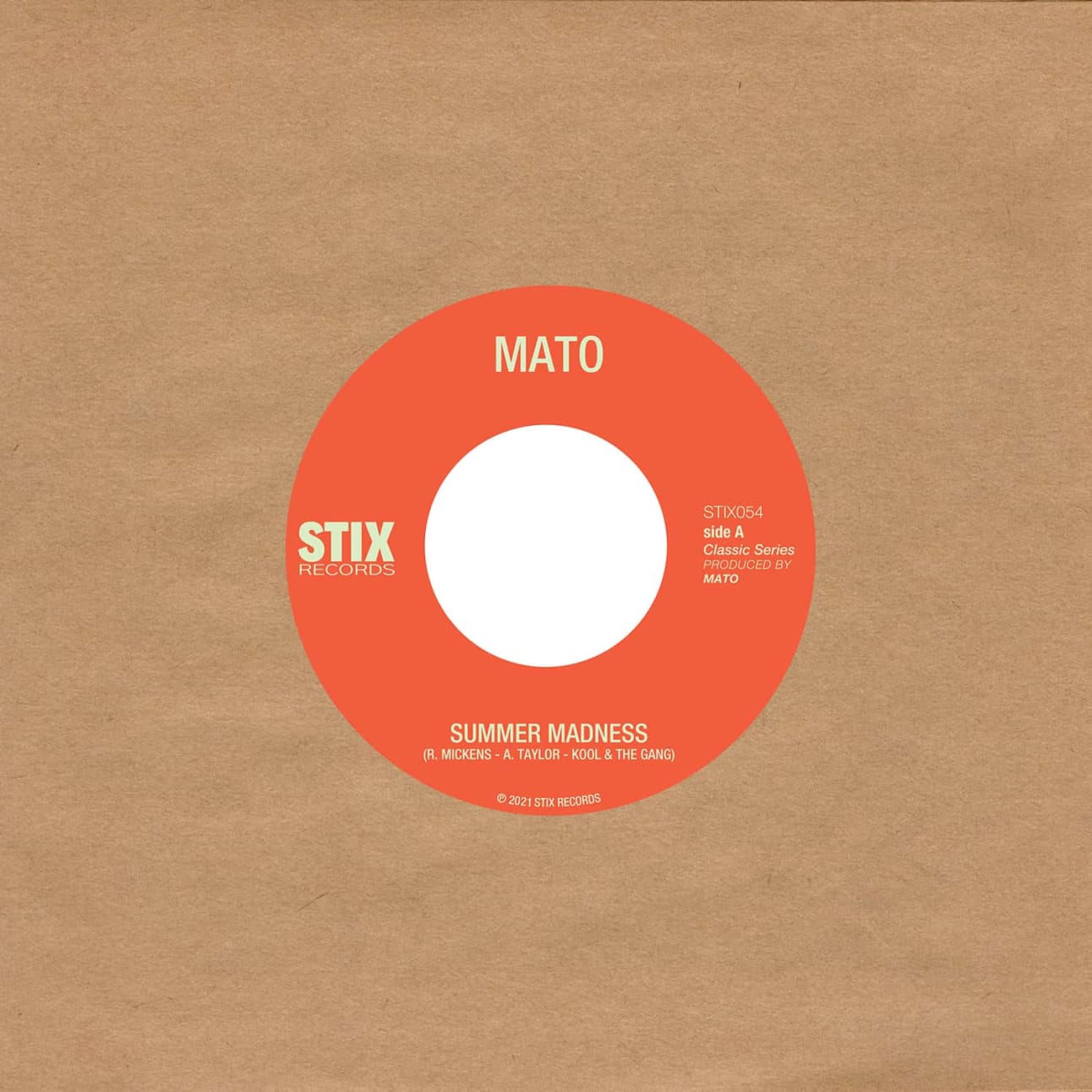
Download my April 2022 mixtape.
Here’s the tracklist:
- Nale Sinephro - Space 1
- Culross Close - To Belong
- Other Lands - Matter (Reshaped)
- Mato – Summer Madness
- Desmond Chambers – Haly Gully
- Tom Churchill – Cast adrift
- Bright & Findlay — Slow Dance
- Quiet Force — Listen To The Music (Apiento & Tepper Mix)
- Fuga Ronto – Columbo De Domingo
- dreamcastmoe — l foot right
- Lord of the isles — Novwo
- Kofi B - Mmobrowa (Hagan Edit)
- State of grace — That’s when we’ll be free
This was a nice opportunity to get back into the rhythm of programming music of varying styles and tempos. Kit-wise, I used two Technics 1210s, a Pioneer XDJ-700, an Isonoe 420 mixer and an Eventide Timefactor delay.
I’ve started reading The 15 Minute City, by Natalie Whittle.
Improving alternative text for images
Some colleagues at work have recently been asking interesting questions about “good/appropriate alternative text for images”. I definitely reckon it’s a topic worth revisiting because it feels like the landscape has changed a bit on this front over the years.
I think the web design industry has traditionally been:
- lacking knowledge of how to write good alternative text.
- too quick to decide which images are “purely decorative”, or accurately described by a matter-of-fact short label when maybe they actually should convey their inherent tone and emotion to all users rather than only those with no visual impairments.
But as inclusion-centric practioners we can probably do better. In his blog post Writing great alt text Jake Archibald breaks down the considerations. I reckon it’d be useful for us to dissect this post and try to boil it down to some practical rules-of-thumb for our teams.
But also, I’ve just noticed a couple of interesting developments at the big players. Firstly, Twitter have upped their image alt game and are encouraging their users to try doing so, too.
And hot on the heels of Twitter’s announcement, I now see in Slack an Edit file details option for adding image descriptions. It’s great that Twitter and Slack are doing this… and also serves as a reminder that tools such as Slack and Twitter are consumed on the web and so accessible best practices apply when you’re writing content on them, too!
SVG: collected tips
SVG is an amazing technology which I regularly use for icons and occasionally for logos and illustrations. I’ve also dipped my toe into animated SVG. But if I’m honest I still find some SVG concepts confusing so I’ve gathered some useful tips here for future reference. Note: this is a living document which I’ll expand over time.
Table of contents
- Introduction to SVG
- Canvas, viewport and viewbox
- Arranging elements on a grid
- Inline SVG for icons
- Choose an SVG embedding technique that suits the task
- Choose the best-performing format
- Exporting and optimising SVG in design tools
Introduction to SVG
It’s an image format (like jpg and png) but also an XML-based markup language. So it’s a bit like HTML in that you can “compose a whole from a bunch of parts” – but it is focused on graphics. As a web graphics technology it has many benefits, for example:
- scalable,
- manipulable by CSS and JS,
- has a small file-size if well-optimised, and
- can be made accessible.
- It’s built for drawing in a way HTML and CSS are not.
- It can guide users, reduce their cognitive load, and provide personality and moments of fun.
Here’s a classic example: Log-in Avatar
Canvas, viewport and viewBox
Let’s break down the key elements of the SVG coordinate system.
Canvas
The canvas is the area where the SVG content is drawn. It’s infinite in both dimensions therefore the SVG can be any size.
Viewport
Although the canvas is infinite, the SVG is rendered on the screen relative to a finite region known as the viewport. Areas of the SVG that lie beyond the boundaries of the viewport are not visible. This is similar to a browser viewport. On a long page you don’t see all the content; just a portion of it.
Specify the viewport size by giving your <svg> element a width and height, e.g.:
<svg width="600" height="400">
  <!-- svg content -->
</svg>
We could specify units (such as em or px) but don’t need to. Unitless values are regarded as being set in user space using user units which effectively equate to pixels so our example above renders a 600px by 400px viewport.
The width of the viewport can also be set in CSS. Setting width:100% makes the SVG viewport fluid in a given container.
Viewbox
The viewport coordinate system starts at the top left (0, 0) corner of the SVG viewport. The user coordinate system is by default identical to that of the viewport, starting in the same place and with equal dimensions and units, however it can be modified using the viewBox attribute.
viewBox takes a value in the format: x y width height. The first two values set the upper-left corner of the viewbox and the second two its dimensions.
You can set the aspect ratio of the viewbox to the same as for the SVG viewport, or differently.
You might (optionally) use the viewBox attribute to transform the SVG graphic by scaling or translating it, or to crop it.
Specifying a smaller viewbox than viewport results in cropping the graphic to those dimensions and then zooming it in i.e. scaling it up so that it fills the entire viewport area.
Arranging elements on a grid
Cassie Evans recommends that when planning an arrangement of elements it’s nice to start with a simple grid using nice round numbers such as 100×100 – per the following <svg> – making it easy to then plot elements on top. You might even start by sketching with paper and pencil.
<svg viewBox="0 0 100 100">
  <!-- svg content, perhaps <rect>s -->
</svg>
Inline SVG for icons
Having tried various icon systems including using <symbol> and <use>, Chris Coyier advocates that it’s perhaps simpler and better to just include the icons inline. Perhaps use the appropriate include technique for your stack to keep the code maintainable.
Choose an SVG embedding technique that suits the task
There are a variety of flavours and uses of SVG, including:
- icons
- infographics
- illustrations
- SVG that include text
- SVG that include animation.
As Sara Souidean covers in her talk “A Smashing Case Study”, your choice of SVG embedding technique depends on the nature of the project and the specific use case.
To do: summarise Sara’s technique for SVG with illustration and accessible text.
Choose the best-performing format
When you’re tasked with coding an illustration-based image, it’s tempying to automatically see that as a job for SVG. However keep in mind that for some images the SVG file size will be massive and PNG will perform much better, so compare the two options.
Exporting and optimising SVG in design tools
To export an SVG in Figma, right-click it (or select it on the left hand side) then select “copy as SVG”. There’s also an “export as SVG” option on the right.
References
- Understanding SVG Coordinate Systems by Sara Soueidan
- Swipey image grids by Cassie Evans
- A pretty good icon system by Chris Coyier
- A Smashing Case Study recorded presentation by Sara Souidean
Web Components with Declarative Shadow DOM via Lit and Eleventy
Here’s a new development in the Web Components story, and one that may have positive implications for resilience, performance and progressive enhancement.
Declarative Shadow DOM is a new way to implement and use Shadow DOM directly in HTML rather than by constructing a shadow root in JavaScript.
But some people including Chris Coyier and Brad Frost) reckon that writing that looks horrible. Brad said:
Declarative Shadow DOM always looked gross to me and I felt it almost defeats the purpose of web components.
And Chris added:
the server-side rendering story for Web Components, Declarative Shadow DOM, doesn’t feel very nice to me if you have to do it manually.
However Lit, a library which makes working with Web Components easier, are now providing ways to make this easier when Lit is used with Eleventy.
With tools like this (especially this @lit-labs/ssr project), we can have our cake and eat it too: use web components in a dev-friendly way, and then have the machines do the heavy lifting to convert that into a grosser-yet-progressive-enhancement-enabled syntax that ships to the user.
using JavaScript frameworks in an entirely-client-side rendered way isn’t nearly as good for anything (users, SEO, performance, accessibility, etc) as server-side rendering (the effects of hydration are still debatable, but I view as largely worth it) … [but] the server-side rendering story for Web Components, Declarative Shadow DOM, doesn’t feel very nice to me if you have to do it manually. So… don’t do it manually! Let Eleventy do it!
As an additional footnote, perhaps we can make frameworks other than Eleventy (such as Rails) create server-rendered custom elements with Declarative Shadow DOM in a similar way. One to explore.
Fuzzy Logic show, November 2022 on Radio Buena Vida
Had a lot fun playing records live from the window of my local radio station.
This selection kicked off with some deep jazz and boogie, worked through the gears with brazilian sounds and electro, then finished with some heads-down house, techno… and Rick James, mofo!
Listen to the show on Soundcloud.
Here’s the tracklist:
- Lonnie Liston Smith - Saiz
- Charles Stepney - On your face
- Metropolis – Every time I see him
- Kaidi Tatham – Don't Rush The Process
- Admin – Step into light
- Charles Stepney – Denim Groove
- Thundercat – Thousand Knives (tribute to Ryuichi Sakamoto)
- Eraan – Enough
- Fudge Fingas vs. Vin Landers – Sum Background
- Marcos Valle – Estrelar
- Nahash – Terry
- Gary Gritness – Lithium Polymer
- Pépé Bradock – El Pescador
- Mafikizolo – Loot
- Rick James – Dance wit’ me
Thanks to Speedy, Susan and the RBV team for having me.
Minimum Viable Web Component (by Zach Leatherman)
Zach tweeted last year to share a codepen which illustrates the very simple boilerplate needed for a minimum viable web component. Note: his example is so simple that in this case the JavaScript isn’t actually needed for the custom element to work, however the provided JS is a starting point for when you do actually intend to add JS-driven features.
The HTML:
<foo-component>Hello, world</foo-component>The CSS:
foo-component {
  font-size: 4em;
}
The JS:
customElements.define("foo-component", class extends HTMLElement {
  constructor() {
    super();
    // Add your custom functionality.
  }
});
I’ve started, so I’ll panic: what it’s really like to go on Mastermind (on The Guardian)
When Mastermind comes on TV, Clair and I always enjoy competing against each other to see who’s most intelligent / least stupid and always jokingly say we’d fancy our chances in real life (although we really wouldn’t). So I enjoyed Sirin Kale’s amusing memoir on what it’s really like to get in the famous black chair!
It is spotlit, well worn, imposing. Its leather has been burnished by the arses of minds far greater than mine, minds capable of retaining all manner of trivia while staying cool under pressure and not panic-sweating profusely via their bum cheeks on to the seat; cellulite-free grey matter, crammed full of general knowledge like a suitcase you have to sit on to close. My mind, by comparison, is a duffel bag containing a single pair of socks.
GOV.UK visitor stats for January 2022
Thanks once again to Matt Hobbs and GOV.UK for sharing their website visitor stats publicly so that we can learn from them. As ever, lots of juicy detail in Matt’s thread.
GOV.UK stats for January (1-31):
- Chrome - 45.08%
- Safari - 36.82%
- Edge - 7.38%
- Samsung Internet - 7.08%
- Firefox - 1.35%
- Android Webview - 0.72%
- Safari (in-app) - 0.61%
- Internet Explorer - 0.5%
100% = 187,969,863
—Matt Hobbs, @TheRealNooshu
In particular, their “usage by device type” stats see mobile at ~67%, Desktop at ~30.5%, Tablet at ~2.5%.
In terms of comparative traffic, according to Simliar Web’s Top 10 most visited UK websites list they’re hovering around #10.
Skip to Content: Online Accessibility Insights from Léonie Watson
Here’s a lovely, short (13 min) interview from an accessibility expert with a really positive outlook—highly recommended.
Q: What’s just one thing that every single person can do in the progression toward an accessible internet?
A: When you’re talking to colleagues, peers… promote the notion that accessibility is just part of what we do because we’re good at our job. It’s not extraordinary, it’s not unusual, it’s not something you can drop because you’re pushing for launch.
Division and construction in design systems
Over the last couple of days I’ve been watching an interview with Brad Frost on Storybook’s channel. I’m still only halfway through but it’s great so far.
One part I’m loving is, from about 25 mins in, when Brad talks abut how Atomic Design crucially includes the notion of not only “breaking interfaces down” (like every DS does) but also “building them back up”. It’s not just the atoms and molecules that are important, but also combining them into (in Atomic Design parlance) organisms and templates, too. For example when using Storybook as an internal workshop (in my team our equivalent is LookBook), he makes a point of it not just including components but also templates, so that:
we can internally test with a high degree of confidence before handing over to our user-consumers that when our components are assembled together, they work”.
I like the idea of our workshop containing not just components but also multicomponent arrangements, or even full page templates. It’d mean less need to go arrange this stuff in the consuming application all the time. Brad’s chat also chimes with some recent thoughts I’ve been having about Patterns and also a tweet from Heydon Pickering regarding a catalogue vs a system.
Essentially, I think that in component libraries, notions of hierarchy and composition are really important. Simply having “a catalogue of components” (including lots that are common to all Design Systems) might not hugely separate your library from Bootstrap or Material. However it’s our ability to combine our custom legos into specific higher order arrangements, and our care for making sure they combine together harmoniously that creates our own special sauce.
My talk, “Hiding elements on the web” for FreeAgent’s tech blog
I recorded a talk on “Hiding elements on the web” for @freeagent’s tech blog. It’s a tricky #FrontEnd & #a11y topic so I try to cover some good practices and responsible choices. Hope it helps someone. (Also it’s my first video. Lots of room to improve!)
---What open-source design systems are built with web components?
Alex Page, a Design System engineer at Spotify, has just asked:
What open-source design systems are built with web components? Anyone exploring this space? Curious to learn what is working and what is challenging. #designsystems #webcomponents
And there are lots of interesting examples in the replies.
I plan to read up on some of the stories behind these systems.
I really like Web Components but given that I don’t take a “JavaScript all the things” approach to development and design system components, I’ve been reluctant to consider that web components should be used for every component in a system. They would certainly offer a lovely, HTML-based interface for component consumers and offer interoperability benefits such as Figma integration. But if we shift all the business logic that we currently manage on the server to client-side JavaScript then:
- the user pays the price of downloading that additional code;
- you’re writing client-side JavaScript even for those of your components that aren’t interactive; and
- you’re making everything a custom element (which as Jim Neilsen has previously written brings HTML semantics and accessibility challenges).
However maybe we can keep the JavaScript for our Web Component-based components really lightweight? I don’t know. For now I’m interested to just watch and learn.
My first Web Component: a disclosure widget
After a couple of years of reading about web components (and a lot of head-scratching), I’ve finally got around to properly creating one… or at least a rough first draft!
Check out disclosure-widget on codepen.
See also my pen which imports and consumes the component.
Caveats and to-dos:
- I haven’t yet tried writing tests for a web component
- I should find out how to refer to the custom element name in JavaScript without repeating it
- I should look into whether
observedAttributesandattributeChangedCallbackare more appropriate than the more typical event listeners I used
References
I found Eric Bidelman’s article Custom Elements v1: Reusable Web Components pretty handy. In particular it taught me how to create a <template> including a <slot> to automatically ringfence the Light DOM content, and then to attach that template to the Shadow DOM to achieve my enhanced component.
Saving CSS changes in DevTools without leaving the browser
Browser devtools have made redesigning a site such a pleasure. I love writing and adjusting a CSS file right in the sources panel and seeing design changes happen as I type, and saving it back to the file. (…) Designing against live HTML allows happy accidents and discoveries to happen that I wouldn't think of in an unconstrained design mockup
I feel very late to the party here. I tend to tinker in the DevTools Element Styles panel rather than save changes. So, inspired by Scott, I’ve just tried this out on my personal website. Here’s what I did.
- started up my 11ty-based site locally which launches a
localhostURL for viewing it in the browser; - opened Chrome’s DevTools at Sources;
- checked the box “Enable local overrides” then followed the prompts to allow access to the folder containing my SCSS files;
- opened an SCSS file in the Sources tab for editing side-by-side with my site in the browser;
- made a change, hit Cmd-S to save and marvelled at the fact that this updated that file, as confirmed by a quick
git statuscheck. - switched to the Elements panel, opened its Styles subpanel, made an element style change there too, then confirmed that this alternative approach also saves changes to a file.
This is a really interesting and efficient way of working in the browser and I can see me using it.
There are also a couple of challenges which I’ll probably want to consider. Right now when I make a change to a Sass file, the browser takes a while to reflect that change, which diminishes the benefit of this approach. My site is set up such that Eleventy watches for changes to the sass folder as a trigger for rebuilding the static site. This is because for optimal performance I’m purging the compiled and combined CSS and inlining that into the <head> of every file… which unfortunately means that when the CSS is changed, every file needs rebuilt. So I need to wait for Eleventy to do its build thing until the page I’m viewing shows my CSS change.
To allow my SCSS changes to be built and reflected faster I might consider no longer inlining CSS, or only inlining a small amount of critical stuff… or maybe (as best of all worlds) only do the inlining for production builds but not in development. Yeah, I like that latter idea. Food for thought!
Partnering with Google on web.dev (on adactio.com)
At work in our Design System team, we’ve been doing a lot of content and documentation writing for a new reference website. So it was really timely to read Jeremy Keith of Clearleft’s new post on the process of writing Learn Responsive Design for Google’s web.dev resource. The course is great, very digestible and I highly recommend it to all. But I also love this new post’s insight into how Google provided assistance, provided a Content handbook as “house style” for writing on web.dev and managed the process from docs and spreadsheets to Github. I’m sure there will be things my team can learn from that Content Handbook as we go forward with our technical writing.
Theming to optimise for user colour scheme preference
“Dark mode” has been a buzz-phrase in web development since around 2019. It refers to the ability provided by modern operating systems to set the user interface’s appearance to either light or dark. Web browsers and technologies support this by allowing developers to detect whether or not the OS provides such settings, and if so which mode the user prefers. Developers can create alternate light and dark themes for their websites and switch between these intelligently (responsively?) to fit with the user’s system preference.
I’ve been meaning to do some work on this front for a while and finally got around to it. (You might even be reading this post with your computer’s dark colour scheme enabled and seeing the fruits of my labour.) Here’s how I set things up and the lessons I learned along the way.
Switching your computer’s appearance
On a Mac:
System Preferences > General > Appearance
On Windows:
Colors > Choose your color
On iOS:
Settings > Display & Brightness > Appearance
On Android:
Settings > Dark Theme
Emulating this in browser DevTools
In Chromium-based browsers you can open DevTools, then open the Rendering tool (which might be hidden behind More Tools). In the Emulate CSS media feature prefers-color-scheme dropdown, select prefers-color-scheme: dark or prefers-color-scheme: light.
The theme-color HTML meta tag
You can use the theme-color HTML meta tag to indicate to the browser a colour it can use to customise the display of the page and surrounding elements such as the address bar. The reason we have a meta tag solution to this rather than leaving it to CSS is performance; it allows the browser to make the relevant updates immediately.
In practice you might specify your “highlight colour”—Clearleft currently use their signature green. Alternatively you could specify both your light theme and dark theme background colours, using the media attribute to associate each with the user colour scheme preference it is optimised for. This is the approach I chose.
<!-- Set theme color to white when user prefers light mode -->
<meta name="theme-color" content="rgb(255,255,255)" media="(prefers-color-scheme: light)">
<!-- Set theme color to a custom black when user prefers dark mode -->
<meta name="theme-color" content="rgb(38,38,38)" media="(prefers-color-scheme: dark)">
The theme-color meta tag has mixed support. It works well in Safari and iOS Safari. Meanwhile Chrome only applies the colour on installed progressive web apps (PWAs).
This had me considering PWA matters again for the first time in a while. I previously definined a PWA “theme colour” for my website in my manifest.manifest file. However unlike in the theme-color meta tag approach, the manifest allows defining one theme colour only. While I don’t think there’d be any issue in having both the meta tag and manifest value in play simultaneously (my understanding is that the HTML would take priority over the manifest), I decided to keep things simple and removed theme_color from my manifest file for now.
Note: the w3c manifest spec may support multiple theme colours in future.
The color-scheme meta tag
The color-scheme meta tag is used to specify one or more color schemes/modes with which the page is compatible. Unlike theme-color you don’t provide an arbitrary colour value, but rather one of light or dark or both in combination. This tells the browser whether it can change default background, foreground and text colours to match the current system appearance. As Jim Nielsen notes in Don’t forget the color-scheme property, it gives the browser permission to automatically change standard form controls, scroll bars, and other named system colors.
I include this meta tag on each page (just after my theme-color meta tags). I indicate that my styles have been prepped to handle the browser applying either light or dark colour schemes and—via the order of values in the content attribute—that I prefer light.
<meta name="color-scheme" content="light dark">Notes:
- I’ve also seen
<meta name="supported-color-schemes">however Thomas Steiner explained that this is an old syntax and has since been standardised as<meta name="color-scheme">; - There is also a
color-schemeCSS property, which I’ll come to later. Once again though, having an HTML meta tag helps browsers to apply things faster; - although I’m currently intimating that I prefer light, in future I might update this to dark first (assuming I don’t hear of any reasons against it). The dark colour palette is really growing on me!
Ensuring colours are accessible
While working on a new dark colour palette and tweaking my light palette I made sure to check that colour contrast met accessibility requirements.
Useful tools on this front include:
- Activating Chrome’s element inspector (the “box with arrow at bottom-right” icon) enables hovering an element to check the contrast of text against background;
- Erik Kennedy’s Accessible Color Generator provides slightly modified colour alternatives when contrast is insufficient—really handy and I used this a couple of times;
- Are my colors accessible? is another great “check contrast, digest results, then tweak” tool which provides more detailed information than the Chrome inspector, especially regarding the impact of small text on contrast.
Design Tokens
It quickly became clear that I’d need global colour settings that I could use across multiple technologies and multiple files. For example, I’d want to reuse the same custom background colour value in an HTML theme-color meta tag, in CSS, and perhaps also in a JSON-based manifest file.
I’d previously bookmarked Heydon Pickering’s article on design tokens in Eleventy and now was the time to give it a spin.
I created _data/tokens.json in which I defined raw tokens such as colorDark, colorDarker and colorLight.
Then in my Nunjucks-based HTML templates I could access that token data to define meta tag values using {{ tokens.colorLight }}. These values would be interpolated to the real CSS colour values during build.
I also created a new Nunjucks file, theme_css.njk, adding permalink: "css/theme.css" in its frontmatter so that it’d generate a CSS file. This file maps my design tokens to custom properties set on the root element, something like this:
:root {
  --color-dark: {{ tokens.colorDark }};
  --color-darker: {{ tokens.colorDarker }};
  --color-light: {{ tokens.colorLight }};
  --color-grey: {{ tokens.colorGrey }};
  --color-highlight: {{ tokens.colorHighlight }};
  --color-highlight-dark: {{ tokens.colorHighlightDark }};
  --color-highlight-darker: {{ tokens.colorHighlightDarker }};
  --color-text: {{ tokens.colorText }};
}
Custom properties FTW
Using custom properties allowed me to do the hard work of preparing my light and dark themes upfront and removed the need to constantly duplicate values and write code forks throughout my CSS.
Having previously created a base layer of reusable custom property representations of my design tokens, I began creating more specific custom properties to serve different contexts.
:root {
  --color-page-bg-light: var(--color-light);
  --color-page-bg-dark: var(--color-dark);
  --color-ink-dark: var(--color-text);
  --color-ink-light: var(--color-light);
}
CSS for default and dark-mode contexts
Now to set my light-mode defaults and fork these when the user prefers dark-mode.
Here’s my CSS:
:root {
  color-scheme: light;

  --color-highlight: var(--color-highlight-darker);
  --color-page-bg: var(--color-page-bg-light);
  --color-band: var(--color-darker);
  --color-ink: var(--color-ink-dark);
  --color-ink-offset: var(--color-grey);

  @media (prefers-color-scheme: dark) {
    color-scheme: dark;

    --color-highlight: var(--color-highlight-dark);
    --color-page-bg: var(--color-page-bg-dark);
    --color-band: var(--color-darker);
    --color-ink: var(--color-ink-light);
    --color-ink-offset: var(--color-grey);
  }

  accent-color: var(--color-highlight);
}

body {
  background-color: var(--color-page-bg);
  color: var(--color-ink);
}
Let’s break that down.
The color-scheme property allows us to specify one or more colour schemes/modes with which an element is compatible. I’m defining it on the root element i.e. for the whole page. My approach was to start by specifying support for a light colour scheme only, then define background and text colour custom properties with values optimised for light colour scheme.
Using @media (prefers-color-scheme: dark) {…} we can check the user’s colour scheme preference. When the user prefers dark, I change color-scheme to dark to let the browser do its “set sensible defaults” thing, and I update the custom property values to those optimised to blend with a dark appearance.
The reusable, theme-sensitive custom properties I’ve plumped for are:
- highlight colour: really just my brand colour, although lightened a touch in dark mode for better contrast;
- page background colour;
- “band” background colour: something I’d use as a band of alternative background colour to distinguish special sections like the header or footer;
- ink colour: my default text colour;
- “offset” ink colour: a grey for little bits of meta text like dates and categories.
I’m sure I’ll evolve these over time.
Lastly, the accent-colour CSS property is used by some form controls e.g. radios and checkboxes. I set that to my highlight colour with the intention of creating a more branded experience.
SVG considerations
My SVG-based logo didn’t look right in dark mode, however the fix was pretty simple. I applied BEM-style element classes to any problematic path elements of the SVG then wrote CSS for those. The CSS tests for prefers-color-scheme: dark and updates the path’s fill or stroke colour as necessary.
What about leaving everything to the browser?
Having read Jim Nielsen’s brilliant article on CSS System Colors I tried feeding the browser color-scheme: light dark, removing my arbitrary dark theme colours, and leaving the colour palette entirely up to the browser. Along the way I learned some interesting lessons on system colours—which we can also choose to use as valid CSS colours in our custom components—such as Canvas and CanvasText.
I love this idea in principle! However in practice:
- only Safari’s colour palette looks consistent with the rest of the Mac OS. The palette applied by Chrome doesn’t; it has its own, different “black”. So for the control you’ve given away, you don’t necessarily achieve that nice “consistency with the OS” reward in return;
- as far as I know you can’t lighten or darken the system colours so it’s hard to create a multi-tone, complimentary palette, and also be confident in achieving sufficient colour contrast. That’s fine if you only need a single background colour for the entire page with no alternate bands of colour (like on Jim’s blog) however I think that’s a little restrictive. (Maybe I’m getting too hung up on control here though, and introducing additional arbitrary colours would work fine alongside a variable “system black”);
- Firefox and iOS Safari are a little problematic in their support for the technologies involved, leading to writing a few hacky workarounds.
For the combined reasons above I’m sticking with manually defined colours for now (however I have a pull request I can revisit later if the mood takes).
What could I do better?
With extra time, I might:
- think more deeply about dark theme design, perhaps following some of the tips regarding shadows, depth and colour contrast in CSS Tricks’ A complete guide to dark mode on the web;
- consider providing a theme switcher control to allow the user to choose the website theme they want regardless of the current OS appearance. (But I probably won’t; I’m not sure it’s necessary)
References
- Theming, from Jeremy Keith’s excellent Learn Responsive Design
- Design Tokens in Eleventy by Heydon Pickering
- CSS System Colors by Jim Nielsen
Building a toast component (by Adam Argyle)
Great tutorial (with accompanying video) from Adam Argyle which starts with a useful definition of what a Toast is and is not:
Toasts are non-interactive, passive, and asynchronous short messages for users. Generally they are used as an interface feedback pattern for informing the user about the results of an action. Toasts are unlike notifications, alerts and prompts because they're not interactive; they're not meant to be dismissed or persist. Notifications are for more important information, synchronous messaging that requires interaction, or system level messages (as opposed to page level). Toasts are more passive than other notice strategies.
There are some important distinctions between toasts and notifications in that definition: toasts are for less important information and are non-interactive. I remember in a previous work planning exercise regarding a toast component a few of us got temporarily bogged down in working out the best JavaScript templating solution for SVG icon-based “Dismiss” buttons… however we were probably barking up the wrong tree with the idea that toasts should be manually dismissable.
There are lots of interesting ideas and considerations in Adam’s tutorial, such as:
- using the
<output>element for each toast - some crafty use of CSS Grid and logical properties for layout
- combining
hsland percentages in custom properties to proportionately modify rather than redefine colours for dark mode - animation using
keyframesandanimation - native JavaScript modules
- inserting an element before the
<body>element (TIL that this is a viable option)
Thanks for this, Adam!
(via Adam’s tweet)
There’s some nice code in here but the demo page minifies and obfuscates everything. However the toast component source is available on GitHub.
Related links
- A toast to accessible toasts by Scott O’Hara
Web animation tips
Warning: this entry is a work-in-progress and incomplete. That said, it's still a useful reference to me which is why I've published it. I’ll flesh it out soon!
There are lots of different strands of web development. You try your best to be good at all of them, but there’s only so much time in the day! Animation is an area where I know a little but would love to know more, and from a practical perspective I’d certainly benefit from having some road-ready solutions to common challenges. As ever I want to favour web standards over libraries where possible, and take an approach that’s lean, accessible, progressively-enhanced and performance-optimised.
Here’s my attempt to break down web animation into bite-sized chunks for ocassional users like myself.
Defining animation
Animation lets us make something visually move between different states over a given period of time.
Benefits of animation
Animation is a good way of providing visual feedback, teaching users how to use a part of the interface, or adding life to a website and making it feel more “real”.
Simple animation with transition properties
CSS transition is great for simple animations triggered by an event.
We start by defining two different states for an element—for example opacity:1 and opacity:0—and then transition between those states.
The first state would be in the element’s default styles (either as explicitly-defined property values or existing implicitly based on property defaults) and the other in either its :hover or :focus styles or in a class applied by JavaScript following an event.
Without the transition the state change would still happen but would be instantaneous.
You’re not limited to only one property being animated and might, for example, transition between different opacity and transform states simultaneously.
Here’s an example “rise on hover” effect, adapted from Stephanie Eckles’s Smol CSS.
<div class="u-animate u-animate--rise">
  <span>rise</span>
</div>
.u-animate > * {
--transition-property: transform;
--transition-duration: 180ms;
transition: var(--transition-property) var(--transition-duration) ease-in-out;
}
.u-animate--rise:hover > * {
transform: translateY(-25%);
}Note that:
- using custom properties makes it really easy to transition a different property than
transformwithout writing repetitious CSS. - we have a parent and child (
<div>and<span>respectively in this example) allowing us to avoid the accidental flicker which can occur when the mouse is close to an animatable element’s border by having the child be the effect which animates when the trigger (the parent) is hovered.
Complex animations with animation properties
If an element needs to animate automatically (perhaps on page load or when added to the DOM), or is more complex than a simple A to B state change, then a CSS animation may be more appropriate than transition. Using this approach, animations can:
- run automatically (you don’t need an event to trigger a state change)
- go from an initial state through multiple intermediate steps to a final state rather than just from state A to state B
- run forwards, in reverse, or alternate directions
- loop infinitely
The required approach is:
- use
@keyframesto define a reusable “template” set of animation states (or frames); then - apply
animationproperties to an element we want to animate, including one or more@keyframesto be used.
Here’s how you do it:
@keyframes flash {
  0%    { opacity: 0; }
  20%   { opacity: 1; }
  80%   { opacity: 0; }
  100%  { opacity: 1; }
}

.animate-me {
  animation: flash 5s infinite;
}
Note that you can also opt to include just one state in your @keyframes rule, usually the initial state (written as either from or 0%) or final state (written as either to or 100%). You’d tend to do that for a two-state animation where the other “state” is in the element’s default styles, and you’d either be starting from the default styles (if your single @keyframes state is to) or finishing on them (if your single @keyframes state is from).
Should I use transition or animation?
As far as I can tell there’s no major performance benefit of one over the other, so that’s not an issue.
When the animation will be triggered by pseudo-class-based events like :hover or :focus and is simple i.e. based on just two states, transition feels like the right choice.
Beyond that, the choice gets a bit less binary and seems to come down to developer preference. But here are a couple of notes that might help in making a decision.
For elements that need to “animate in” on page load such as an alert, or when newly added to the DOM such as items in a to-do list, an animation with keyframes feels the better choice. This is because transition requires the presence of two CSS rules, leading to dedicated JavaScript to grab the element and apply a class, whereas animation requires only one and can move between initial and final states automatically including inserting a delay before starting.
For animations that involve many frames; control over the number of iterations; or looping… use @keyframes and animation.
For utility classes and classes that get added by JS to existing, visible elements following an event, either approach could be used. Arguably transition is the slightly simpler and more elegant CSS to write if it covers your needs. Then again, you might want to reuse the animations applied by those classes for both existing, visible elements and new, animated-in elements, in which case you might feel that instead using @keyframes and animation covers more situations.
Performance
A smooth animation should run at 60fps (frames per second). Animations that are too computationally expensive result in frames being dropped, i.e. a reduced fps rate, making the animation appear janky.
Cheap and slick properties
The CSS properties transform and opacity are very cheap to animate. Also, browsers often optimise these types of animation using hardware acceleration. To hint to the browser that it should optimise an animation property (and to ensure it is handled by the GPU rather than passed from CPU to GPU causing a noticeable glitch) we should use the CSS will-change property.
.my-element {
  will-change: transform;
}
Expensive properties
CSS properties which affect layout such as height are very expensive to animate. Animating height causes a chain reaction where sibling elements have to move too. Use transform over layout-affecting properties such as width or left if you can.
Some other CSS properties are less expensive but still not ideal, for example background-color. It doesn't affect layout but requires a repaint per frame.
Test your animations on a popular low-end device.
Timing functions
- linear goes at the same rate from start to finish. It’s not like most motion in the real world.
- ease-out starts fast then gets really slow. Good for things that come in from off-screen, like a modal dialogue.
- ease-in starts slow then gets really fast. Good for moving somethng off-screen.
- ease-in-out is the combination of the previous two. It‘s symmetrical, having an equal amount of acceleration and deceleration. Good for things that happen in a loop such as element fading in and out.
- ease is the default value and features a brief ramp-up, then a lot of deceleration. It’s a good option for most general case motion that doesn’t enter or exit the viewport.
Practical examples
You can find lots of animation inspiration in libraries such as animate.css (and be sure to check animate.css on github where you can search their source for specific @keyframe animation styles).
But here are a few specific examples of animations I or teams I’ve worked on have had to implement.
Skip to content
The anchor’s State A sees its position fixed—i.e. positioned relative to the viewport—but then moved out of sight above it via transform: translateY(-10em). However its :focus styles define a State B where the intial translate has been undone so that the link is visible (transform: translateY(0em)). If we transition the transform property then we can animate the change of state over a chosen duration, and with our preferred timing function for the acceleration curve.
HTML:
<div class="u-visually-hidden-until-focused">
  <a
    href="#skip-link-target"
    class="u-visually-hidden-until-focused__item"
  >Skip to main content</a>
</div>

<nav>
  <ul>
    <li><a href="/">Home</a></li>
    <li><a href="/">News</a></li>
    <li><a href="/">About</a></li>
    <!-- …lots more nav links… -->
    <li><a href="/">Contact</a></li>
  </ul>
</nav>

<main id="skip-link-target">
  <h1>This is the Main content</h1>
  <p>Lorem ipsum <a href="/news/">dolor sit amet</a> consectetur adipisicing elit.</p>
  <p>Lorem ipsum dolor sit amet consectetur adipisicing elit.</p>
</main>
CSS:
.u-visually-hidden-until-focused {
  left: -100vw;
  position: absolute;

  &__item {
    position: fixed;
    top: 0;
    left: 0;
    transform: translateY(-10em);
    transition: transform 0.2s ease-in-out;

    &:focus {
      transform: translateY(0em);
    }
  }
}
To see this in action, visit my pen Hiding: visually hidden until focused and press the tab key.
Animating in an existing element
For this requirement we want an element to animate from invisible to visible on page load. I can imagine doing this with an image or an alert, for example. This is pretty straightforward with CSS only using @keyframes, opacity and animation.
Check out my fade in and out on page load with CSS codepen.
Animating in a newly added element
Stephanie Eckles shared a great CSS-only solution for animating in a newly added element which handily includes a Codepen demo. She mentions “CSS-only” because it’s common for developers to achieve the fancy animation via transition but that means needing to “make a fake event” via a JavaScript setTimeout() so that you can transition from the newly-added, invisible and class-free element state to adding a CSS class (perhaps called show) that contains the opacity:1, fancy transforms and a transition. However Stephanie’s alternative approach combines i) hiding the element in its default styles; with ii) an automatically-running animation that includes the necessary delay and also finishes in the keyframe’s single 100% state… to get the same effect minus the JavaScript.
Avoiding reliance on JS and finding a solution lower down the stack is always good.
HTML:
<button>Add List Item</button>
<ul>
  <li>Lorem ipsum dolor sit amet consectetur adipisicing elit. Nostrum facilis perspiciatis dignissimos, et dolores pariatur.</li>
</ul>
CSS:
li {
  animation: show 600ms 100ms cubic-bezier(0.38, 0.97, 0.56, 0.76) forwards;

  // Prestate
  opacity: 0;
  // remove transform for just a fade-in
  transform: rotateX(-90deg);
  transform-origin: top center;
}

@keyframes show {
  100% {
    opacity: 1;
    transform: none;
  }
}
Jhey Tompkins shared another CSS-only technique for adding elements to the DOM with snazzy entrance animations. He also uses just a single @keyframes state but in his case the from state which he uses to set the element’s initial opacity:0, then in his animation he uses an animation-fill-mode of both (rather than forwards as Stephanie used).
I can’t profess to fully understand both however if you change Jhey’s example to use forwards instead, then the element being animated in will temporarily appear before the animation starts (which ain’t good) rather than being initially invisible. Changing it to backwards gets us back on track, so I guess the necessary value relates to whether you’re going for from/0% or to/100%… and both just covers you for both cases. I’d probably try to use the appropriate one rather than both just in case there’s a performance implication.
Animated disclosure
Here’s an interesting conundrum.
For disclosure (i.e. collapse and expand) widgets, I tend to either use the native HTML <details> element if possible or else a simple, accessible DIY disclosure in which activating a trigger toggles a nearby content element’s visibility. In both cases, there’s no animation; the change from hidden to revealed and back again is immediate.
To my mind it’s generally preferable to keep it simple and avoid animating a disclosure widget. For a start, it’s tricky! The <details> element can’t be (easily) animated. And if using a DIY widget it’ll likely involve animating one of the expensive properties. Animating height or max-height is also gnarly when working with variable (auto) length content and often requires developers to go beyond CSS and reach for JavaScript to calculate computed element heights. Lastly, forgetting the technical challenges, there’s often no real need to animate disclosure; it might only hinder rather than help the user experience.
But let’s just say you have to do it, perhaps because the design spec requires it (like in BBC Sounds’ expanding and collapsing tracklists when viewed on narrow screens).
Options:
- Animate the
<details>element. This is a nice, standards-oriented approach. But it might only be viable for when you don’t need to mess with<details>appearance too much. We’d struggle to apply very custom styles, or to handle a “show the first few list items but not all” requirement like in the BBC Sounds example; - Animate CSS Grid. This is a nice idea but for now the animation only works in Firefox*. It’d be great to just consider it a progressive enhancement so it just depends on whether the animation is deemed core to the experience;
- Animate from a max-height of 0 to “something sufficient” (my pen is inspired by Scott O’Hara’s disclosure example). This is workable but not ideal; you kinda need to set a max-height sweetspot otherwise your animation will be delayed and too long. You could of course add some JavaScript to get the exact necessary height then set it. BBC use
max-heightfor their tracklist animation and those tracklists likely vary in length so I expect they use some JavaScript for height calculation.
* Update 20/2/23: the “animate CSS Grid” option now has wide browser support and is probably my preferred approach. I made a codepen that demonstrates a disclosure widget with animation of grid-template-rows.
Ringing bell icon
To be written.
Pulsing “radar” effect
To be written.
Accessibility
Accessibility and animation can co-exist, as Cassie Evans explains in her CSS-Tricks article Empathetic Animation. We should consider which parts of our website are suited to animation (for example perhaps not on serious, time-sensitive tasks) and we can also respect reduced motion preferences at a global level or in a more finer-grained way per component.
Notes
transition-delaycan be useful for avoiding common annoyances, such as when a dropdown menu that appears on hover disappears when you try to move the cursor to it.
References
- Inspiration: the animate.css library
- animate.css on github (good for searching for keyframe CSS)
- CSS transitions and transforms on Thoughtbot
- CSS Transitions by Josh Comeau
- Keyframe Animations by Josh Comeau
- Transition vs animation on CSS Animation
- Keyframe animation syntax on CSS-Tricks
- CSS animation for beginners on Thoughtbot
- Using CSS Transions on auto dimensions on CSS-Tricks
- Jhey Tompkins’s Image fade with interest codepen
Limbo
Enjoyed this funny and touching film about a Syrian asylum seeker searching for happiness on a remote Scottish island.
I’ve started reading Station Eleven, by Emily St. John Mandel.
GOV.UK introduce an experimental block link component
Here’s an interesting development in the block link saga: GOV.UK have introduced one (named .chevron-card) on their Homepage, citing how it’ll improve accessibility by increasing mobile touch targets. It’s not yet been added to their Design System while they’re monitoring it to see if it is successful. They’ve chosen the approach which starts with a standard, single, non-wrapping anchor then “stretches” it across the whole card via some pseudo elements and absolute positioning magic. I’m slightly surprised at this choice because it breaks the user’s ability to select text within the link. Really interested to see how it pans out!
Lovely write-up, & great rationale re. larger mobile tap targets! I’ve wrestled with “block links” & found that each approach has issues so it’s v. interesting that you chose the route that impacts text selection. Is that the lesser of the evils? Keen to hear how it pans out!
— Laurence Hughes (@fuzzylogicx) December 13, 2021
Front-end architecture for a new website (in 2021)
Just taking a moment for some musings on which way the front-end wind is blowing (from my perspective at least) and how that might practically impact my approach on the next small-ish website that I code.
I might lean into HTTP2
Breaking CSS into small modules then concatenating everything into a single file has traditionally been one of the key reasons for using Sass, but in the HTTP2 era where multiple requests are less of a performance issue it might be acceptable to simply include a number of modular CSS files in the <head>, as follows:
<link href="/css/base.css" rel="stylesheet">
<link href="/css/component_1.css" rel="stylesheet">
<link href="/css/component_2.css" rel="stylesheet">
<link href="/css/component_3.css" rel="stylesheet">
The same goes for browser-native JavaScript modules.
This isn’t something I’ve tried yet and it’d feel like a pretty radical departure from the conventions of recent years… but it‘s an option!
I’ll combine ES modules and classes
It’s great that JavaScript modules are natively supported in modern browsers. They allow me to remove build tools, work with web standards, and they perform well. They can also serve as a mustard cut that allows me to use other syntax and features such as async/await, arrow functions, template literals, the spread operator etc with confidence and without transpilation or polyfilling.
In the <head>:
<script type="module" src="/js/main.js"></script>In main.js
import { Modal } from '/components/modal.js';

const Modal = new Modal();
modal.init();
In modal.js
export class Modal {
  init() {
    // modal functionality here
  }
}
I’ll create Web Components
I’ve done a lot of preparatory reading and learning about web components in the last year. I’ll admit that I’ve found the concepts (including Shadow DOM) occasionally tough to wrap my head around, and I’ve also found it confusing that everyone seems to implement web components in different ways. However Dave Rupert’s HTML with Superpowers presentation really helped make things click.
I’m now keen to create my own custom elements for javascript-enhanced UI elements; to give LitElement a spin; to progressively enhance a Light DOM baseline into Shadow DOM fanciness; and to check out how well the lifecycle callbacks perform.
I’ll go deeper with custom properties
I’ve been using custom properties for a few years now, but at first it was just as a native replacement for Sass variables, which isn’t really exploiting their full potential. However at work we’ve recently been using them as the special sauce powering component variations (--gap, --mode etc).
In our server-rendered components we’ve been using inline style attributes to apply variations via those properties, and this brings the advantage of no longer needing to create a CSS class per variation (e.g. one CSS class for each padding variation based on a spacing scale), which in turn keeps code and specificity simpler. However as I start using web components, custom properties will prove really handy here too. Not only can they be updated by JavaScript, but furthermore they provide a bridge between your global CSS and your web component because they can “pierce the Shadow Boundary”, make styling Shadow DOM HTML in custom elements easier.
I’ll use BEM, but loosely
Naming and structuring CSS can be hard, and is a topic which really divides opinion. Historically I liked to keep it simple using the cascade, element and contextual selectors, plus a handful of custom classes. I avoided “object-oriented” CSS methodologies because I found them verbose and, if I’m honest, slightly “anti-CSS”. However it’s fair to say that in larger applications and on projects with many developers, this approach lacked a degree of structure, modularisation and predictability, so I gravitated toward BEM.
BEM’s approach is a pretty sensible one and, compared to the likes of SUIT, provides flexibility and good documentation. And while I’ve been keeping a watchful eye on new methodologies like CUBE CSS and can see that they’re choc-full of ideas, my feeling is that BEM remains the more robust choice.
It’s also important to me that BEM has the concept of a mix because this allows you to place multiple block classes on the same element so as to (for example) apply an abstract layout in combination with a more implementation-specific component class.
<div class="l-stack c-news-feed">
Where I’ll happily deviate from BEM is to favour use of certain ARIA attributes as selectors (for example [aria-current=page] or [aria-expanded=true] because this enforces good accessibility practice and helps create equivalence between the visual and non-visual experience. I’m also happy to use the universal selector (*) which is great for owl selectors and I’m fine with adjacent sibling (and related) selectors.
Essentially I’m glad of the structure and maintainability that BEM provides but I don’t want a straitjacket that stops me from using my brain and applying CSS properly.
Enhance! by Jeremy Keith—An Event Apart video (on Vimeo)
A classic talk by Jeremy Keith on progressive enhancement and the nature of the web and its technologies.
Learn Responsive Design (on web.dev)
Jeremy Keith’s new course for Google’s web.dev learning platform is fantastic and covers a variety of aspects of responsive design including layout (macro and micro), images, icons and typography.
Life lessons from Larry David and Adam Buxton
Recently, during a period when pandemic woes were taking their toll and likely making me a little cranky at home, I found some funny and helpful words of wisdom on Adam Buxton’s podcast and when re-watching Ricky Gervais’s interview with Larry David.
On sustaining a happy marriage, Buxton said:
Every now and then you think “they’re not doing what I want them to do and I think it’s important that they do do this thing that I want them to do! (But) you have to think really hard: is this thing actually important? Is it worth getting bent out of shape about?
It’s good advice. He mentioned that he’s slowly getting better at that, and I’m trying my best to, too.
Meanwhile, on the reasons why he got into acting, Larry David said:
it gets you out of the house!
So simple but true—it’s good to get out of the house! We’re now emerging from a period of sustained isolation and I should probably avoid being completely remote (and going stir crazy) and get back into the office occasionally.
Resources for learning front-end web development
A designer colleague recently asked me what course or resources I would recommend for learning front-end web development. She mentioned React at the beginning but I suggested that it’d be better to start by learning HTML, CSS, and JavaScript. As for React: it’s a subset or offshoot of JavaScript so it makes sense to understand vanilla JS first.
For future reference, here are my tips.
Everything in one place
Google’s web.dev training resource have also been adding some excellent guides, such as:
Another great one-stop shop is MDN Web Docs. Not only is MDN an amazing general quick reference for all HTML elements, CSS properties, JavaScript APIs etc but for more immersive learning there are also MDN’s guides.
Pay attention to HTML
One general piece of advice is that when people look at lists of courses (whether or not they are new to web development) they ensure to learn HTML. People tend to underestimate how complicated, fast-moving and important HTML is.
Also, everything else – accessibility, CSS, JavaScript, performance, resilience – requires a foundation of good HTML. Think HTML first!
Learning CSS, specifically
CSS is as much about concepts and features – e.g. the cascade and specificity, layout, responsive design, typography, custom properties – as it is about syntax. In fact probably more so.
Most tutorials will focus on the concepts but not necessarily so much on practicalities like writing-style or file organisation.
Google’s Learn CSS course should be pretty good for the modern concepts.
Google also have Learn Responsive Design.
If you’re coming from a kinda non-CSS-oriented perspective, Josh W Comeau’s CSS for JavaScript Developers (paid course) could be worth a look.
If you prefer videos, you could check out Steve Griffith’s video series Learning CSS. Steve’s videos are comprehensive and well-paced. It contains a whole range of topics (over 100!), starting from the basics like CSS Box Model.
In terms of HTML and CSS writing style (BEM etc) and file organisation (ITCSS etc), here’s a (version of a) “style guide” that my team came up with for one of our documentation websites. I think it’s pretty good!
CSS and HTML Style Guide (to do: add link here)
For more on ITCSS and Harry Roberts’s thoughts on CSS best practices, see:
- Manage large projects with ITCSS
- Harry’s Skillshare course on ITCSS
- Harry’s CSS Guidelines rulebook
- Harry’s Discovr demo project
Learning JavaScript
I recommended choosing a course or courses from CSS-Tricks’ post Beginner JavaScript notes, especially as it includes Wes Bos’s Beginner JavaScript Notes + Reference.
If you like learning by video, check out Steve Griffith’s JavaScript playlist.
Once you start using JS in anger, I definitely recommend bookmarking Chris Ferdinandi’s Methods and APIs reference guide.
If you’re then looking for a lightweight library for applying sprinkles of JavaScript, you could try Stimulus.
Learning Responsive Design
I recommend Jeremy Keith’s Learn Responsive Design course on web.dev.
Lists of courses
You might choose a course or courses from CSS-Tricks’ post Where do you learn HTML and CSS in 2020?
Recommended books
- Resilient Web Design by Jeremy Keith. A fantastic wide-screen perspective on what we’re doing, who we’re doing it for, and how to go about it. Read online or listen as an audiobook.
- Inclusive Components by Heydon Pickering. A unique, accessible approach to building interactive components, from someone who’s done this for BBC, Bulb, Spotify.
- Every Layout by Heydon Pickering & Andy Bell. Introducing layout primitives, for handling responsive design in Design Systems at scale (plus so many insights about the front-end)
- Atomic Design by Brad Frost. A classic primer on Design Systems and component-composition oriented thinking.
- Practical SVG by Chris Coyier. Learn why and how to use SVG to make websites more aesthetically sharp, performant, accessible and flexible.
- Web Typography by Richard Rutter. Elevate the web by applying the principles of typography via modern web typography techniques.
Collected web accessibility guidelines, tips and tests
At work, I’m sometimes asked accessibility questions or to provide guidelines. I’m with Anna Cook in considering myself an accessibility advocate rather than an expert however I have picked up lots of tips and knowledge over many years of developing websites. So I thought it’d be useful to gather some general web accessibility tips and tests in one place as a useful reference.
Caveats and notes:
- this is a living document which I’ll expand over time;
- I’m standing on the shoulders of real experts and I list my references at the foot of the article; and
- if I’ve got anything wrong, please let me know!
Table of contents
- If you only had 5 minutes
- Content structure
- Semantic HTML and ARIA
- Favour native over custom components except where they have known issues
- Make custom components convey state accessibly
- Forms
- Links and buttons
- Ensure keyboard support
- Content resizing
- Better link text
- Supporting high contrast mode
- Skip links
- Navigation and menus
- Modal dialogues
If you only had 5 minutes
If someone had a web page and only had 5 minutes to find and tackle the lowest hanging fruit accessibility-wise, I’d probably echo Jeremy Keith’s advice to ensure that the page covers the following:
- uses heading elements sensibly
- uses landmarks (representing roles like
banner,navigation,main,contentinfo) - marks up forms sensibly (for example using labels and appropriate buttons)
- provides images with decent text alternatives
(Note: headings and landmarks are used by screen reader users to get a feel for the page then jump to areas of interest.)
Spending just 5 minutes would be bad, of course, and you shouldn’t do that. The point is that if pushed, the above give good bang-for-your-buck.
Content structure
The page’s content should be well structured as this makes it easier to understand for all, especially people with reading and cognitive disabilities.
It should consist of short sections of content preceded by clear headings. Use the appropriate heading level for the place in the page. Don’t use an inappropriate heading level to achieve a given appearance such as a smaller size. Instead use the appropriate heading element then use CSS to achieve your desired style.
It should employ lists where appropriate. It should place the most important content at the beginning of the page or section to give it prominence.
Check your page for any long passages of text with no structure. Ensure that sufficient prominence is given to the most important information and calls to action.
Semantic HTML and ARIA
While there are generic HTML elements like div and span, there are many more HTML elements that perform a specific role and convey that role to browers and other technologies. Choosing and using semantic HTML elements appropriately is a very good practice.
Also, using semantic HTML elements is preferable to bolting on semantics via attributes since the semantics are conveyed natively avoiding redundancy and duplication. As Bruce Lawson says, “Built-in beats bolt-on, bigly”.
Apply ARIA carefully. No ARIA is better than bad ARIA.
Landmarks
Create a small number of landmarks using the appropriate HTML elements.
For some landmark-generating elements it’s appropriate to bolster them with a label or accessible name. For example with nav and aside, i) there’s a decent chance there might be multiple on the page; and ii) each instance creates a landmark even when it’s nested within a deeper HTML element. So it’s helpful to distinguish each different landmark of the same type by using sensible accessible names otherwise you’d get multiple navigation menus all represented by the same “navigation” in the Landmarks menu. In the case of the section element it needs an acessible name in order for it to act as a region landmark. For all of these you can use aria-labelledby set to the id of an inner heading, or use aria-label.
Note that when using multiple <header> (or footer) elements on a page, where one and one only is a direct child of body while the others are used within article or similar elements, there’s perhaps less need to add custom accessible names. That’s because only a direct child of body will be treated as a landmark and the others won’t, therefore they won’t be butting against each other in a screen reader’s Landmarks menu and need distinguished.
Correct use of aria-label and aria-labelledby
Use the aria-label or aria-labelledby attributes (only when necessary) on interactive elements – buttons, links, form controls – and on landmark regions. Don’t use them on <div>s, <span>s, or other elements representing static/noninteractive text-level semantics, such as <p>, <strong>, <em>, and so forth, unless those elements’ roles have been overridden with roles that expect accessible names.
Favour native over custom components except where they have known issues
Native components require very little work, are familiar to users, and are generally accessible by default. Custom components can be built to appear and behave as designers want, but require much more effort to build and are challenging to make accessible.
There are exceptions. Since the native options are flawed across browsers, accessibility experts recommend using custom solutions for:
- form error field messages
- focus indicator styles
Make custom components convey state accessibly
Now that you’re building a custom component you don’t get accessibility out of the box. Whether it’s a Like button or a disclosure widget, you can’t rely on a visual change alone to convey a UI change to all users. You’ll need to use the right element (note – it often starts with a button) and then use ARIA to convey states such as pressed or expanded to screen reader users.
Forms
Because in the industry form fields are often handled with JavaScript and not submitted, people sometimes question whether form fields should live inside a form (<form>). My answer is yes, and here’s why.
Using the form element improves usability and accessibility
Using a <form> provides additional semantics allowing additional accessibility. It helps assistive devices like screen readers better understand the content of the page and gives the person using them more meaningful information.
By putting form fields inside a form we also ensure we match user expectations. We support the functionality (such as the different ways of submitting a form) that users expect when presented with form fields.
If you’re thinking “but what about form fields that don’t look like form fields?” then you’ve entered the problem territory of “deceptive user interfaces” – the situation where perceived affordances don’t match actual functionality, which causes confusion for some people. This is to be avoided. We shouldn’t use form fields (nor a <form>) when they are not appropriate. A checkbox, radio button, or select menu is meant to gather information. So if your goal is instead to let the user manipulate the current view, use a button rather than checkboxes or radio buttons.
References:
- Why use a form element when submitting fields with JavaScript
- Lea Verou and Leonie Watson’s discussion regarding Toggles
- My conversation about forms with accessibility expert Adrian Roselli
Using the form element simplifies your JavaScript for event handling
Using the form element can also make it easier for you to meet user expectations in your JS-powered experience. This is because it gives you a single element (form) and event combination that allows listening to multiple interactions. With a form element you can add a listener for the submit() event. This event fires automatically in response to the various ways users expect to submit a form, including pressing enter inside a field.
Anchors and buttons
To let the user navigate to a page or page section, or download a file, use an anchor element.
To let the user trigger an action such as copying to clipboard, launching a modal or submitting a form, use a button element.
Anchors should include an href attribute otherwise the browser will treat it like a non-interactive element. This means the link will not be included in the expected focus order and will not present a pointer to mouse users like it should. These days there is no remaining use case for an anchor without an href. We no longer need named anchors to create link-target locations within the page because we can use the id attribute (on any element) for that. And if you want an interactive element that does not link somewhere, you should use button.
Do not remove the focus outline from links and buttons in CSS, unless it’s to provide a better version.
Ensure you always give links and buttons an accessible name, even when they use icons rather than text. This might be through visually hidden text or perhaps using an ARIA-related attribute.
Ensure keyboard support
Web pages need to support those who navigate the page by keyboard.
Use the tab key to navigate your page and ensure that you can reach all actionable controls such as links, buttons and form controls. Press the enter key or space bar to activate each control.
If during your test any actionable control is skipped, receives focus in an illogical order, or you cannot see where the focus is at any time, then keyboard support is not properly implemented.
Content resizing
Try zooming your page up to 400%. In Chrome, Zoom is available from the kebab menu at the top-right, or by holding down command with plus or minus.
Content must resize and be available and legible. Everything should reflow.
Relative font settings and responsive design techniques are helpful in effectively handling this requirement.
Relatedly, setting font-sizes in px should be avoided because although a user can override the “fixed-ness” with zoom, it breaks the user’s ability to choose a larger or smaller default font size (which users often prefer over having to zoom every single page).
Better link text
Blind and visually impaired users use a screen reader to browse web pages, and screen readers provide user-friendly access to all the links on the page via a Links menu. When links are encountered in that context, link text like “Click here” and “Read more” are useless.
Check your web page to ensure that links clearly describe the content they link to when read out of context.
Better link text also improves the flow and clarity of your content and so improves the experience for everyone.
Supporting high contrast mode
Some people find it easier to read content when it’s in a particular colour against a specific background colour. Operating systems provide options to allow users to configure this to their preference. Websites must support support the user’s ability to apply this.
On a Windows computer go to Settings > Ease of access and turn on High contrast mode. On macOS go to System preferences > Accessibility settings > Display and select “Invert colours”.
Having changed the contrast, check that your web page’s content is fully visible and understandable, that images are still visible and that buttons are still discernible.
Skip links
Websites should provide a “Skip to content” link because this provides an important accessibility aid to keyboard users and those who use specialised input devices. For these users, having to step through (typically via the tab key) all of the navigation links on every page would be tiring and frustrating. Providing a skip link allows them to bypass the navigation and skip to the page’s main content.
To test that a website contains a skip link, visit a page then press the tab key and the skip link should appear. Then activate it using the enter key and check that focus moves to the main content area. Press tab again to ensure that focus moves to the first actionable element in the main content.
Navigation and menus
When developing a collapsible menu, place your menu <button> within your <nav> element and hide the inner list rather than hiding the <nav> element itself. That way, we are not obscuring from Assistive Technologies the fact that a navigation still exists. ATs can still access the nav via landmark navigation. This is important because landmark discovery is one of the fundamental ways AT users scan, determine and navigate a site’s structure.
Modal dialogues
You probably don’t want to set the dialogue’s heading as an <h1>. It likely displays content that exists on the page (which already has an <h1>) at a lower level of the document hierarchy.
References
- Using HTML landmark roles MDN article. And Adrian R’s suggested additions
- Navigation (landmark) role, on MDN
- Tetralogical’s Quick Accessibility Tests video playlist and Tetralogical’s accompanying article
- Basic accessibility mistakes I often see in audits by Chris Ferdinandi
- Sara Soueidan’s video tutorial Practical tips for building more accessible front-ends
- Adrian Roselli’s Responsive type and zoom
- Heydon Pickering’s tweet about buttons in navs and Scott O’Hara’s follow up article Landmark Discoverability
- Tetralogical’s Foundations: native versus custom components
- Ben Myers on where to use aria labelling attributes
Collapsible sections, on Inclusive Components
It’s a few years old now, but this tutorial from Heydon Pickering on how to create an accessible, progressively enhanced user interface comprised of multiple collapsible and expandable sections is fantastic. It covers using the appropriate HTML elements (buttons) and ARIA attributes, how best to handle icons (minimal inline SVG), turning it into a web component and plenty more besides.
Icon has Cheezburger (a Clearleft dConstruct newsletter)
Jeremy Keith deconstructs the cheeseburger icon and—referencing Luke Wroblewski’s Obvious Always Wins mantra—argues that while icons alone look tasty they risk users failing to understand and engage.
BBC WebCore Design System
Here’s the BBC’s Storybook UI explorer containing the components and layouts for making the front end of a BBC web experience.
From designing interfaces to designing systems (on The history of the web)
A history of Design Systems by Jay Hoffman taking in (amongst other milestones) the notion of Front-end Style Guides, followed by the arrival of Bootstrap, then Brad Frost’s Atomic Design, culminating in the dawn of the Design System movement with Jina Anne’s Clarity Conference.
Buttons and links: definitions, differences and tips
On the web buttons and links are fundamentally different materials. However some design and development practices have led to them becoming conceptually “bundled together” and misunderstood. Practitioners can fall into the trap of seeing the surface-level commonality that “you click the thing, then something happens” and mistakenly thinking the two elements are interchangeable. Some might even consider them as a single “button component” without considering the distinctions underneath. However this mentality causes our users problems and is harmful for effective web development. In this post I’ll address why buttons and links are different and exist separately, and when to use each.
Problematic patterns
Modern website designs commonly apply the appearance of a button to a link. For isolated calls to action this can make sense however as a design pattern it is often overused and under-cooked, which can cause confusion to developers implementing the designs.
Relatedly, it’s now common for Design Systems to have a Button component which includes button-styled links that are referred to simply as buttons. Unless documented carefully this can lead to internal language and comprehension issues.
Meanwhile developers have historically used faux links (<a href="#">) or worse, a DIY clickable div, as a trigger for JavaScript-powered functionality where they should instead use native buttons.
These patterns in combination have given rise to a collective muddle over buttons and links. We need to get back to basics and talk about foundational HTML.
Buttons and anchors in HTML
There are two HTML elements of interest here.
Hyperlinks are created using the HTML anchor element (<a>). Buttons (by which I mean real buttons rather than links styled to appear as buttons) are implemented with the HTML button element (<button>).
Although a slight oversimplification, I think David MacDonald’s heuristic works well:
If it GOES someWHERE use a link
If it DOES someTHING use a button
A link…
- goes somewhere (i.e. navigates to another place)
- normally links to another document (i.e. page) on the current website or on another website
- can alternatively link to a different section of the same page
- historically and by default appears underlined
- when hovered or focused offers visual feedback from the browser’s status bar
- uses the “pointing hand” mouse pointer
- results in browser making an HTTP
GETrequest by default. It’s intended to get a page or resource rather than to change something - offers specific right-click options to mouse users (open in new tab, copy URL, etc)
- typically results in an address which can be bookmarked
- can be activated by pressing the return key
- is announced by screen readers as “Link”
- is available to screen reader users within an overall Links list
A button…
- does something (i.e. performs an action, such as “Add”, “Update” or "Show")
- can be used as
<button type=submit>within a form to submit the form. This is a modern replacement for<input type=submit />and much better as it’s easier to style, allows nested HTML and supports CSS pseudo-elements - can be used as
<button type=button>to trigger JavaScript. This type of button is different to the one used for submitting a<form>. It can be used for any type of functionality that happens in-place rather than taking the user somewhere, such as expanding and collapsing content, or performing a calculation. - historically and by default appears in a pill or rounded rectangle
- uses the normal mouse pointer arrow
- can be activated by pressing return or space.
- implictly gets the ARIA button role.
- can be extended with further ARIA button-related states like
aria-pressed - is announced by screen readers as “Button”
- unlike a link is not available to screen reader users within a dedicated list
Our responsibilities
It’s our job as designers and developers to use the appropriate purpose-built element for each situation, to present it in a way that respects conventions so that users know what it is, and to then meet their expectations of it.
Tips
- Visually distinguish button-styled call-to-action links from regular buttons, perhaps with a more pill-like appearance and a right-pointing arrow
- Avoid a proliferation of call-to-action links by linking content itself (for example a news teaser’s headline). Not only does this reduce “link or button?” confusion but it also saves space, and provides more accessible link text.
- Consider having separate Design System components for Button and ButtonLink to reinforce important differences.
- For triggering JavaScript-powered interactions I’ll typically use a
button. However in disclosure patterns where the trigger and target element are far apart in the DOM it can make sense to use a link as the trigger. - For buttons which are reliant on JavaScript, it’s best to use them within a strategy of progressive enhancement and not render them on the server but rather with client-side JavaScript. That way, if the client-side JavaScript is unsupported or fails, the user won’t be presented with a broken button.
Update: 23 November 2024
Perhaps a better heuristic than David MacDonald’s mentioned above, is:
Links are for a simple connection to a resource; buttons are for actions.
What I prefer about including a resource is that the “goes somewhere” definition of a link breaks down for anchors that instruct the linked resource to download (via the download attribute) rather than render in the browser, but this doesn’t. I also like the inclusion of simple because some buttons (like the submit button of a search form) might finish by taking you to a resource (the search results page) but that’s a complex action not a simple connection; you’re searching a database using your choice of search query.
References
- Get safe, by Jeremy Keith
- Buttons vs. Links, by Eric Eggert
- The Button Cheat Sheet, by Manuel Matuzović
- A complete guide to links and buttons on CSS-Tricks
- The Links vs Buttons Showdown, by Marcy Sutton
HTML with Superpowers (from Dave Rupert)
Here’s a great new presentation by Dave Rupert (of the Shop Talk show) in which he makes a compelling case for adopting Web Components. Not only do they provide the same benefits of encapsulation and reusability as components in proprietary JavaScript frameworks, but they also bring the reliability and portability of web standards, work without build tools, are suited to progressive enhancement, and may pave the way for a better web.
Dave begins by explaining that Web Components are based on not just a set of technologies but a set of standards, namely:
- Custom Elements (for example
<custom-alert>) - Shadow DOM
- ES Modules
- the HTML
<template>element
Standards have the benefit that we can rely on them to endure and work into the future in comparison to proprietary technologies in JavaScript frameworks. That’s good news for people who like to avoid the burnout-inducing churn of learning and relearning abstractions. Of course the pace of technology change with web standards tends to be slower, however that’s arguably a price worth paying for cross-platform stability and accessibility.
Some of Web Components’ historical marketing problems are now behind them, since they are supported by all major browsers and reaching maturity. Furthermore, web components have two superpowers not found in other JavaScript component approaches:
Firstly, the Shadow DOM (which is both powerful and frustrating). The Shadow DOM provides encapsulation but furthermore in progressive enhancement terms it enables the final, enhanced component output which serves as an upgrade from the baseline Light DOM HTML we provided in our custom element instance. It can be a little tricky or confusing to style, however, although there are ways.
Secondly, you can use web components standalone, i.e. natively, without any frameworks, build tools, or package managers. All that’s required to use a “standalone” is to load the <script type=module …> element for it and then use the relevant custom element HTML on your page. This gets us closer to just writing HTML rather than wrestling with tools.
Dave highlights an education gap where developers focused on HTML, CSS, and Design Systems don’t tend to use Web Components. He suggests that this is likely as a result of most web component tutorials focusing on JavaScript APIs for JavaScript developers. However we can instead frame Web Component authoring as involving a layered approach that starts with HTML, adds some CSS, then ends by applying JavaScript.
Web Components are perfectly suited to progressive enhancement. And that progressive enhancement might for example apply lots of complicated ARIA-related accessibility considerations. I really like the Tabs example where one would create a <generic-tabs> instance which starts off with simple, semantic, resilient HTML that renders headings and paragraphs…
<generic-tabs>
  <h2>About</h2>
  <div>
    <p>About content goes here. Lorem ipsum dolor sit amet…</p>
  </div>

  <h2>Contact</h2>
  <div>
    <p>Contact content goes here. Lorem ipsum dolor sit amet…</p>
  </div>
</generic-tabs>
…but the Web Component’s JavaScript would include a template and use this to upgrade the Light DOM markup into the final interactive tab markup…
<generic-tabs>
  <h2 slot="tab" aria-selected="true" tabindex="0" role="tab" id="generic-tab-3-0" aria-controls="generic-tab-3-0" selected="">About</h2>
  <div role="tabpanel" aria-labelledby="generic-tab-3-0" slot="panel">
    <p>About content goes here. Lorem ipsum dolor sit amet…</p>
  </div>
  <h2 slot="tab" aria-selected="false" tabindex="-1" role="tab" id="generic-tab-3-1" aria-controls="generic-tab-3-1">Contact</h2>
  <div role="tabpanel" aria-labelledby="generic-tab-3-1" slot="panel" hidden>
    <p>Contact content goes here. Lorem ipsum dolor sit amet…</p>
  </div>
</generic-tabs>
The idea is that the component’s JS would handle all the complex interactivity and accessibility requirements of Tabs under the hood. I think if I were implementing something like Inclusive Components’ Tabs component these days I’d seriously consider doing this as a Web Component.
Later, Dave discusses the JavaScript required to author a Custom Element. He advises that in order to avoid repeatedly writing the same lengthy, boilerplate code on each component we might use a lightweight library such as his favourite, LitElement.
Lastly, Dave argues that by creating and using web components we are working with web standards rather than building for a proprietary library. We are creating compatible components which pave the cowpaths for these becoming future HTML standards (e.g. a <tabs> element!) And why is advancing the web important? Because an easier web lowers barriers: less complexity, less tooling and setup, less gatekeeping—a web for everyone.
How to debug event listeners with your browser’s developer tools (on Go Make Things)
On the page, right-click the element you want to debug event listeners for, then click Inspect Element. In chromium-based browsers like MS Edge and Google Chrome, click the Event Listeners tab in Developer Tools. There, you’ll see a list of all of the events being listened to on that element. If you expand the event, you can see what element they’re attached to and click a link to open up the actual event listener itself in the JavaScript.
Conditional border-radius in CSS (by Ahmad Shadeed via CSS-Tricks)
Here’s a “media query free” CSS one-liner which lets you set an element to have no border-radius when it is the full width of the viewport, but otherwise to have a border-radius.
It uses the same 9999 multiplication technique as Every Layout do to create a toggle.
Great for Card components which need to be full-width and non-rounded only on narrow viewports.
I’ve started reading Uncanny Valley, by Anna Wiener.
Thanks for the recommendation, @mrtomchurchill.
Design Engineering, on the Clearleft Podcast
Loved this short listen from Clearleft, on a subject close to my heart! New job titles can feel a bit “emperor’s new clothes” but with Design Engineering I think Clearleft, GitHub et al. might be onto something. It was fascinating hearing people from both design and engineering backgrounds give their perspectives, and how ultimately they’re addressing the same thing—the need to “finesse the overlaps/gaps” between design and the realisation of that design in engineering, especially in light of the complexities of the modern front-end.
(via @Stugoo)
Broken Copy, on a11y-101.com
Here’s an accessibility tip that’s new to me. When the content of a heading, anchor, or other semantic HTML element contains smaller “chunks” of span and em (etc), the VoiceOver screen reader on Mac and iOS annoyingly fails to announce the content as a single phrase and instead repeats the parent element’s role for each inner element. We can fix that by adding an inner “wrapper” element inside our parent and giving it role=text.
Make sure not to add this role directly to your parent element since it will override its original role causing it to lose its intended semantics.
The text role is not yet in the official ARIA spec but is supported by Safari.
(via @Seraphae and friends on Twitter)
Motion One: The Web Animations API for everyone
A new animation library, built on the Web Animations API for the smallest filesize and the fastest performance.
This JavaScript-based animation library—which can be installed via npm—leans on an existing web API to keep its file size low and uses hardware accelerated animations where possible to achieve impressively smooth results.
For fairly basic animations, this might provide an attractive alternative to the heavier Greensock. The Motion docs do however flag the limitation that it can only animate “CSS styles”. They also say “SVG styles work fine”. I hope by this they mean SVG presentation attributes rather than inline CSS on an SVG, although it’s hard to tell. However their examples look promising.
The docs website also contains some really great background information regarding animation performance.
Testing ES modules with Jest
Here are a few troubleshooting tips to enable Jest, the JavaScript testing framework, to be able to work with ES modules without needing Babel in the mix for transpilation. Let’s get going with a basic set-up.
package.json
…,
"scripts": {
  "test": "NODE_ENV=test NODE_OPTIONS=--experimental-vm-modules jest"
},
"type": "module",
"devDependencies": {
  "jest": "^27.2.2"
}
Note: take note of the crucial "type": "module" part as it’s the least-documented bit and your most likely omission!
After that set-up, you’re free to import and export to your heart’s content.
javascript/sum.js
export const sum = (a, b) => {
  return a + b;
}
spec/sum.test.js
import { sum } from "../javascript/sum.js";

test('adds 1 + 2 to equal 3', () => {
  expect(sum(1, 2)).toBe(3);
});
Hopefully that’ll save you (and future me) some head-scratching.
(Reference: Jest’s EcmaScript Modules docs page)
Harry Roberts says “Get Your Head Straight”
Harry Roberts (who created ITCSS for organising CSS at scale but these days focuses on performance) has just given a presentation about the importance of getting the content, order and optimisation of the <head> element right, including lots of measurement data to back up his claims. Check out the slides: Get your Head Straight
While some of the information about asset loading best practices is not new, the stuff about ordering of head elements is pretty interesting. I’ll be keeping my eyes out for a video recording of the presentation though, as it’s tricky to piece together his line of argument from the slides alone.
However one really cool thing he’s made available is a bookmarklet for evaluating any website’s <head>:
— ct.css
The accessibility of conditionally revealed questions (on GOV.UK)
Here’s something to keep in mind when designing and developing forms. GOV.UK’s accessibility team found last year that there are some accessibility issues with the “conditional reveal” pattern, i.e. when selecting a particular radio button causes more inputs to be revealed.
The full background story is really interesting but the main headline seems to be: Keep it simple.
- Don’t reveal any more than a single input, otherwise the revealed section should not be in a show-and-hide but rather in its own form in the next step of the process.
- Conditionally show questions only (i.e. another form input such as Email address)—do not show or hide anything that’s not a question.
Doing otherwise causes some users confusion making it difficult for them to complete the form.
See also the Conditionally revealing a related question section on the Radios component on the GDS Design System
W3C Design System
The W3C have just published a new Design System. It was developed by British Digital Agency Studio 24, who are also working (in the open) on the redesign of the W3C website.
My initial impression is that this Design System feels pretty early-stage and work-in-progress. I’m not completely sold on all of the technical details, however it definitely contains a number of emergent best practices and lots of interesting parts.
I particularly liked the very detailed Forms section which assembles lots of good advice from Adam Silver and GOV.UK, and I also found it interesting and useful that they include a Page Templates section rather than just components and layouts.
It’s cool to see an institution like the W3C have a Design System, and I’m looking forward to seeing how it evolves.
I’ve started reading Kindred, by Octavia E. Butler.
Accessibility Testing (on adactio.com)
In this journal entry, Jeremy Keith argues that when it comes to accessibility testing it’s not just about finding issues—it’s about finding the issues at the right time.
Here’s my summary:
- Accessibility Audits performed by experts and real Assistive Technology users are good!
- But try to get the most out of them by having them focus on the things that you can’t easily do yourself.
- We ourselves can handle things like colour contrast. It can be checked at the design stage before a line of code is written.
- Likewise HTML structure such as ensuring accessible form labels, ensuring images have useful
altvalues, using landmarks likemainandnav, heading structure etc. These are not tricky to find and fix ourselves and they have a big accessibility impact. - As well as fixing those issues ourselves we should also put in place new processes, checks and automation if possible to stop them recurring
- As for custom interactive elements (tabs, carousels, navigation, dropdowns): these are specific to our site and complicated/error-prone by nature, so those are the things we should be aiming to have professional Accessibility Audits focus on in order to get best value for money.
Practical front-end performance tips
I’ve been really interested in the subject of Web Performance since I read Steve Souders’ book High Performance Websites back in 2007. Although some of the principles in that book are still relevant, it’s also fair to say that a lot has changed since then so I decided to pull together some current tips. Disclaimer: This is a living document which I’ll expand over time. Also: I’m a performance enthusiast but not an expert. If I have anything wrong, please let me know.
Inlining CSS and or JavaScript
The first thing to know is that both CSS and JavaScript are (by default) render-blocking, meaning that when a browser encounters a standard .css or .js file in the HTML, it waits until that file has finished downloading before rendering anything else.
The second thing to know is that there is a “magic file size” when it comes to HTTP requests. File data is transferred in small chunks of about 14 kb. So if a file is larger than 14 kb, it requires multiple roundtrips.
If you have a lean page and minimal CSS and or JavaScript to the extent that the page in combination with the (minified) CSS/JS content would weigh 14 kb or less after minifying and gzipping, you can achieve better performance by inlining your CSS and or JavaScript into the HTML. This is because there’d be only one request, thereby allowing the browser to get everything it needs to start rendering the page from that single request. So your page is gonna be fast.
If your page including CSS/JS is over 14 kb after minifying and gzipping then you’d be better off not inlining those assets. It’d be better for performance to link to external assets and let them be cached rather than having a bloated HTML file that requires multiple roundtrips and doesn’t get the benefit of static asset caching.
Avoid CSS @import
JavaScript modules in the head
Native JavaScript modules are included on a page using the following:
<script type="module" src="main.js"></script>Unlike standard <script> elements, module scripts are deferred (non render-blocking) by default. Rather than placing them before the closing </body> tag I place them in the <head> so as to allow the script to be downloaded early and in parallel with the DOM being processed. That way, the JavaScript is already available as soon as the DOM is ready.
Background images
Sometimes developers implement an image as a CSS background image rather than a “content image”, either because they feel it’ll be easier to manipulate that way—a typical example being a responsive hero banner with overlaid text—or simply because it’s decorative rather than meaningful. However it’s worth being aware of how that impacts the way that image loads.
Outgoing requests for images defined in CSS rather than HTML won’t start until the browser has created the Render Tree. The browser must first download and parse the CSS then construct the CSSOM before it knows that “Element X” should be visible and has a background image specified, in order to then decide to download that image. For important images, that might feel too late.
As Harry Roberts explains it’s worth considering whether the need might be served as well or better by a content image, since by comparison that allows the browser to discover and request the image nice and early.
By moving the images to <img> elements… the browser can discover them far sooner—as they become exposed to the browser’s preload scanner—and dispatch their requests before (or in parallel to) CSSOM completion
However if still makes sense to use a background image and performance is important Harry recommends including an accompanying hidden image inline or preloading it in the <head> via link rel=preload.
Preload
From MDN’s preload docs, preload allows:
specifying resources that your page will need very soon, which you want to start loading early in the page lifecycle, before browsers' main rendering machinery kicks in. This ensures they are available earlier and are less likely to block the page's render, improving performance.
The benefits are most clearly seen on large and late-discovered resources. For example:
- Resources that are pointed to from inside CSS, like fonts or images.
- Resources that JavaScript can request such as JSON and imported scripts.
- Larger images and videos.
I’ve recently used the following to assist performance of a large CSS background image:
<link rel="preload" href="bg-illustration.svg" as="image" media="(min-width: 60em)">Self-host your assets
Using third-party hosting services for fonts or other assets no longer offers the previously-touted benefit of the asset potentially already being in the user’s browser cache. Cross domain caching has been disabled in all major browsers.
You can still take advantage of the benefits of CDNs for reducing network latency, but preferably as part of your own infrastructure.
Miscellaneous
Critical CSS is often a wasted effort due to CSS not being a bottleneck, so is generally not worth doing.
References
- Inlining literally everything on Go Make Things
- MDN’s guide to native JavaScript modules
- How and when browsers download images by Harry Roberts
Doppler: Type scale with dynamic line-height
line-height on the web is a tricky thing, but this tool offers a clever solution.
It’s relatively easy to set a sensible unit-less default ratio for body text (say 1.5), but that tends to need tweaked and tested for headings (where spacious line-height doesn’t quite work; but tight line-height is nice until the heading wraps, etc).
Even for body text it’s a not a one-size-fits-all where a line-height like 1.5 is appropriate for all fonts.
Then you’ve got different devices to consider. For confined spaces, tighter line-height works better. But this can mean you might want one line-height for narrow viewports and another for wide.
Then, factor in vertical rhythm based on your modular type and spacing scales if you really want to blow your mind.
It can quickly get really complicated!
Doppler is an interesting idea and tool that I saw in CSS-Tricks’ newsletter this morning. It lets you apply line-height using calc() based on one em-relative value (for example 1em) and one rem-relative value (for example 0.25rem).
In effect you’ll get something like:
set line-height to the font-size of the current element plus a quarter of the user’s preferred font-size
The examples look pretty promising and seem to work well across different elements. I think I’ll give it a spin.
Big list of http static server one-liners
Lots of different options for running a local web server. Choose from npx, ruby, python and many more.
I also like Ritwick Dey’s Live Server extension for VS Code.
Accessible Color Generator
There are many colour contrast checking tools but I like this one from Erik Kennedy (of Learn UI Design) a lot. It features an intuitive UI using simple, human language that mirrors the task I’m there to achieve, and it’s great that if your target colour doesn’t have sufficient contrast to meet accessibility guidelines it will intelligently suggest alternatives that do.
I’m sure everyone has their favourite tools; I just find this one really quick to use!
SVG Gobbler
SVG Gobbler is a browser extension that finds the vector content on the page you’re viewing and gives you the option to download, optimize, copy, view the code, or export it as an image.
This is a pretty handy Chrome extension that grabs all the SVGs on a webpage and lets you see them all in a grid.
Progressively enhanced burger menu tutorial by Andy Bell
Here’s a smart and comprehensive tutorial from Andy Bell on how to create a progressively enhanced narrow-screen navigation solution using a custom element. Andy also uses Proxy for “enabled” and “open” state management, ResizeObserver on the custom element’s containing header for a Container Query like solution, and puts some serious effort into accessible focus management.
One thing I found really interesting was that Andy was able to style child elements of the custom element (as opposed to just elements which were present in the original unenhanced markup) from his global CSS. My understanding is that you can’t get styles other than inheritable properties through the Shadow Boundary so this had me scratching my head. I think the explanation is that Andy is not attaching the elements he creates in JavaScript to the Shadow DOM but rather rewriting and re-rendering the element’s innerHTML. This is an interesting approach and solution for getting around web component styling issues. I see elsewhere online that the innerHTML based approach is frowned upon however Andy doesn’t “throw out” the original markup but instead augments it.
Should I use the HTML5 section element and if so, where?
Unlike other HTML5 elements such as header, footer and nav, it’s never been particularly clear to me when is appropriate to use section. This is due in large part to many experts having expressed that it doesn’t quite work as intended.
I like HTMHell’s rule-of-thumb regarding section:
If you’re not sure whether to use a
<section>, it’s probably best to avoid it.
They go on to recommend that it’s much more important to create a sound document outline. That phrase can be confusing because of the related history of the browser document outline algorithm (or lack thereof) but I think what the author means here is to use and nest headings logically because that alone will give you a “document outline” and also helps AT users scan and skip around the page.
Relatedly: don’t let the original intended use of section tempt you to put multiple H1s on a page in the vain hope that browsers and assistive technology will interpret their nesting level to handle hierarchy appropriately. That would rely on on a document outline algorithm but no browser implements document outlining.
One sensible application of section is to provide additional information to screen reader users about the semantic difference between two adjoining content areas, when that distinction is otherwise only being made visually with CSS.
Here’s an example. Smashing Magazine’s blog articles begin with a quick summary, followed by a horizontal line separating the summary from the article proper. But the separator is purely decorative, so if the summary were wrapped in a div then a screen reader user wouldn’t know where it ends and the article begins. However by instead wrapping the summary in <section aria-label="quick summary">:
- our wrapper has the built-in ARIA role of
region. Aregionis a type of generic landmark element, and as a landmark a screen reader user will find it listed in a summary of the page and can navigate to it easily. - by giving it an accessible name (here via
aria-label) it will be announced by a screen reader, with “Quick summary region” before and “Quick summary region end” after.
Update 07/11/22
Adrian Roselli’s twitter thread on section is gold. Here’s what I’ve gleaned from it:
The reason you would use a section element for accessibility purposes is to create a region landmark. If you are using headings properly, in most cases your content is already well-structured and will not require a region landmark. If you do need a section, note that from an accessibility perspective using the section tag alone is meaningless without providing an accessible name. To provide this, ensure your section has a heading and connect the section to that using aria-labelledby.
You can use section without the above measures and it will not harm users. But be aware it’s aiding your developer experience only, because it’s not helping users. And it may also mislead you and others into thinking you are providing semantics and accessibility which in reality you are not.
References:
- Accessibility of the section element, by Scott O’Hara
- Why you should choose HTML5
articleoversection, by Bruce Lawson
Use Eleventy templating to include static code demos
Here’s a great tutorial from Eleventy guru Stephanie Eckles in which she explains how to create a page that displays multiple code demos, similar to SmolCSS.dev.
It’s interesting that Stephanie uses 11ty shortcodes over other 11ty templating options and that she sometimes declares a variable (via Nunjucks’s set) at the top of the page then intentionally reuses it unchanged in repeated shortcode instances… the example being times where you want to illustrate the same HTML code (variable) being styled differently in progressive demos.
I also like the Open in CodePen feature and section on scoped styling.
Reusable code snippets and components in Eleventy
There are (at least) three cunning ways in Eleventy to get “reusable snippet” or “reusable component” functionality.
- Nunjucks’s
include: Great for just including a common, static element in your template, say aheaderorfooterpartial. (Note that while you canseta variable just before yourincludeline to make that variable available to the included partial, it’s not really “passing in” and scoping the variable like a parameter, so it’s best to reserveincludefor simple stuff.) - Nunjucks’s
macro: Takes things up a notch by supporting passing in parameters which are then locally scoped. You could use this to create a simple component. See Trys Mudford’s article Encapsulated 11ty Components. - 11ty Shortcodes and Named Shortcodes: Shortcodes feel to me pretty much like a wrapper for
macro, whilst also supporting the inclusion ofnpmpackages and the use ofasyncfunctions. However with Named Shortcodes, unlikemacroyou can also pass in ablockof content (rather than arguments alone). This would be handy for any component or layout into which you nest lots of varied content (such as a Stack, for example). See 11ty docs on paired shortcodes for more details.
Hat tip to Jérome Coupé who recently tweeted on this topic and prompted me to gather my thoughts too.
I’ve started reading Stories of your life and others by Ted Chiang.
Crafting Component API, Together (by Nathan Curtis, on Medium)
Nathan (of EightShapes) discusses how to unify anatomy and props across code and design tools.
I love this article. It tackles some difficult, real problems that occur during the process of trying to align design and development but proposes interesting ways of mitigating them.
I particularly like the idea of adding a formal “API planning” step to the component creation process, and that it’s carried out by a designer and engineer pair, and that it’s documented using a standardised template that can be iterated.
This idea not only tackles those difficult language and conceptual discrepancies between design and code perspectives on a component, but also provides a means through which:
developers and designers naturally connect
I’d like to explore this idea further at work in our Design System team.
Manage Design Tokens in Eleventy
One interesting aspect of the Duet Design System is that they use Eleventy to not only generate their reference website but also to generate their Design Tokens.
When I think about it, this makes sense. Eleventy is basically a sausage-machine; you put stuff in, tell it how you want it to transform that stuff, and you get something new out the other end. This isn’t just for markdown-to-HTML, but for a variety of formatA-to-formatB transformation needs… including, for example, using JSON to generate CSS.
Now this is definitely a more basic approach than using a design token tool like StyleDictionary. StyleDictionary handles lots of low-level stuff that would otherwise be tricky to implement. So I’m not suggesting that this is a better approach than using StyleDictionary. However it definitely feels pretty straightforward and low maintenance.
As Heydon Pickering explains, it also opens up the opportunity to make the Design Tokens CMS-editable in Netlify CMS without content editors needing to go near the code.
So you’d have a tokens.json file containing your design tokens, but it’d be within the same repo as your reference website. That’s probably not as good as having the tokens in a separate repo and making them available as a package, but of course a separate 11ty repo is an option too if you prefer.
For a smaller site at least, the “manage design tokens with 11ty” is a nice option, and I think I might give it a try on my personal website.
Duet Design System
Here’s a lovely Design System that interestingly uses Eleventy for its reference website and other generated artefacts:
We use Eleventy for both the static documentation and the dynamically generated parts like component playgrounds and design tokens. We don’t currently use a JavaScript framework on the website, except Duet’s own components.
I find Duet interesting both from the Design System perspective (it contains lots of interesting component techniques and options) but also in terms of how far 11ty can be pushed.
Favourite Eleventy (11ty) Resources
Here are my current go-to resources when building a new site using Eleventy (11ty).
Build an Eleventy site from scratch by Stephanie Eckles. As the name suggests, this is for starting from a blank canvas. It includes a really simple and effective way of setting up a Sass watch-and-build pipeline that runs alongside that of Eleventy, using only package.json scripts rather than a bundler.
Eleventy Base Blog from 11ty. If rather than a blank canvas you want a boilerplate that includes navigation, a blog, an RSS feed and prism CSS for code block styling (among other things) then this is a great option. Of course, you can also just cherry-pick the relevant code you need, as I often do.
Eleventy Navigation Plugin. This allows you to set a page or post as a navigation item. It handily supports ordering and hierarchical nesting (for subnavigation). You can then render out your navigation from a layout in a one-liner or in a custom manner.
Eleventy Cache Assets Plugin. This is really handy for caching fetched data so as not to exceed API limits or do undue work on every build.
11ty Netlify Jumpstart is another from Stephanie Eckles but this time a “quick-start boilerplate” rather than blank canvas. It includes a minimal Sass framework, generated sitemap, RSS feed and social share preview images. The About page it generates contains lots of useful info on its features.
forestry.io settings for 11ty Base Blog and forestry.io settings for Hylia (Andy Bell’s 11ty starter)
Add Netlify CMS to an 11ty-based website
More to follow…
Adapting Stimulus usage for better Progressive Enhancement
A while back, Jake Archibald tweeted:
Don't render buttons on the server that require JS to work.
The idea is that user interface elements which depend on JavaScript (such as buttons) should be rendered on the client-side, i.e. with JavaScript.
In the context of a progressive enhancement mindset, this makes perfect sense. Our minimum viable experience should work without JavaScript due to the fragility of a JavaScript-dependent approach so should not include script-triggering buttons which might not work. The JavaScript which applies the enhancements should not only listen for and act upon button events, but should also be responsible for actually rendering the button.
This is how I used to build JavaScript interactions as standard, however sadly due to time constraints and framework conventions I don’t always follow this best practice on all projects.
At work, we use Stimulus. Stimulus has a pretty appealing philosophy:
Stimulus is designed to enhance static or server-rendered HTML—the “HTML you already have”
However in their examples they always render buttons on the server; they always assume the JavaScript-powered experience is the baseline experience. I’ve been pondering whether that could easily be adapted toward better progressive enhancement and it seems it can.
My hunch was that I should use the connect() lifecycle method to render a button into the component (and introduce any other script-dependent markup adjustments) at the earliest opportunity. I wasn’t sure whether creating new DOM elements at this point and fitting them with Stimulus-related attributes such as action and target would make them available via the standard Stimulus APIs like server-rendered elements but was keen to try. I started by checking if anyone was doing anything similar and found a thread where Stimulus contributor Javan suggested that DIY target creation is fine.
I then gave that a try and it worked! Check out my pen Stimulus with true progressive enhancement. It’s a pretty trivial example for now, but proves the concept.
Astro
Astro looks very interesting. It’s in part a static site builder (a bit like Eleventy) but it also comes with a modern (revolutionary?) developer experience which lets you author components as web components or in a JS framework of your choice but then renders those to static HTML for optimal performance. Oh, and as far as I can tell theres no build pipeline!
Astro lets you use any framework you want (or none at all). And if most sites only have islands of interactivity, shouldn’t our tools optimize for that?
People have been posting some great thoughts and insights on Astro already, for example:
- Chris Coyier’s review
- Review in CSS-Tricks Newsletter #255 including links to Chris’s Astro demo site
- The web is too damn complex, by Robin Rendle
- Astro’s introductory blog post
(via @css)
GDS on Twitter: The GOV.UK Design System is turning 3 years old!
The GOV.UK Design System is a nice Design System success story. At 3 years old it’s reporting high traffic, usage and satisfaction ratings. GDS do so much great, thoughtful and inclusive work (which they also share with the community) and it’s inspiring to see it being a success.
There are now more than 900 live cross-government services using the GOV.UK Design System - 75% more than a year ago. It’s being used in more than 2,600 repositories on GitHub and has been forked more than 200 times.
clipboard.js - Copy to clipboard without Flash
Here’s a handy JS package for “copy to clipboard” functionality that’s lightweight and installable from npm.
It also appears to have good legacy browser support plus a means for checking/confirming support too, which should assist if your approach is to only add a “copy” button to the DOM as a progressive enhancement.
(via @chriscoyier)
Inclusive language around buttons
@Amy_Hupe recently posed a great question on Twitter regarding inclusive language for buttons:
What's an inclusive way to describe what you do to a (digital) button, given it might be pressed with a mouse click, a screen tap, a key on a keyboard, and so on? I've tended to use "select" but wondering if that's right?
There are a lot of good suggestions and my current feeling is that:
- it depends. What’s right for one context may not be for another; and
- there are a few good ones.
My favourites are:
- use;
- “click or tap”; and maybe
- press (which may work as a common abstraction).
I also offerered this alternative/remix:
Could another way to do this / work around the awkwardness be via the pattern “Do thing X by using the Y button”? i.e. describe the action/result, making the button itself less important so you can just use “using” as your verb. So… “Submit the form using the “Submit” button”.
“via” is another word/pattern that’d similarly allow less need to worry about physical stuff. So “Launch a preview via the “Preview” button”. Same idea as “using”.
And I liked Craig Abbot’s observation:
it’s actually a bit weird to describe the physical interactions anyway. It should be intuitive. If a button says continue, it’s pretty obvious you need to interact with it. If you need to explain the UI usually there’s a bigger problem.
I’m not such a fan of these suggestions:
- select; and
- activate
I’ve just finished reading Never Let Me Go by Kazuo Isihiguro.
Afterwards I was also keen to see the film, which I enjoyed. It featured great performances by Carey Mulligan and Andrew Garfield in particular, and a haunting score. Although I enjoyed the book, I found it a little slow-paced and so watching the film helped bring it all together (despite taking a few liberties with the plot).
Lastly, I enjoyed this short interview with the author in which he interestingly remarked that the sci-fi element was just a device to support the primary topic of managing friendship and loving relationships within our short lifetimes.
Lightning Design System
I should have bookmarked it long before now, but just revisiting the Lightning Design System I’m reminded that is really well organised and executed.
SLDS saves time and energy, freeing designers and developers to focus on larger issues of usability and meaning. Standardized, reusable components support collaboration, reinforce branding, and provide a consistent look and user experience.
Plant43 – Light Pollution
Having a nice moment revisiting this amazing 2006 Ai records double-header from @datassette and @plant43_ and remembering pre-lockdown Glasgow life.
Inspire.js
Lean, hackable, extensible slide deck framework
I’ve been on the lookout for a lightweight, web standards based slide deck solution for a while and this one from Lea Verou could well be perfect.
It has keyboard navigation, video and code demo support, an index page and much more… and it’s all powered by straightforward HTML, CSS and JavaScript. I need to give this a spin!
Shifting left: how introducing accessibility earlier helps the BBC’s design system (by Sophie Beaumont)
Absolute gold here regarding accessibility, bloated components, and purpose versus appearance.
It’s easy for a component to become bloated and its purpose increasingly ambiguous.
The article also makes a fundamental point.
When you need a new UI element, just because an existing component looks similar does not mean it’s appropriate. It’s tempting to think that way—especially when you prioritise reusability—however on the web the way something looks is only part of the story.
A well-built component that was made to handle whatever is thrown at it will convey meaning and purpose at a lower-level than the visual (CSS) level, so that it is understandable in both non-visual and visual environments.
That’s why sometimes the existing component is not a good fit because the purpose of the new thing, and the user’s intent when using it, are different to that of the existing thing. And bloating the existing component to change or muddy its purpose is bad for maintainability and reusability.
I loved this nugget on shifting left during design:
One of the things I’ve really pushed for in the most recent features is UX accessibility documentation during the design phase. What does that mean? Well, it means that when we are designing a new feature, we request that our UX designers and architects chat with our developers early and draft a basic semantic HTML structure and any specific accessibility behaviours. Think landmarks, headings, buttons, links, and careful focus management, to name a small selection.
I did this recently when working on a Data Table component with Zita. We found that early discovery of user intent allied to coding early semantic markup prototypes really informed our understanding of constraints, opportunities and architecture for the remainder of the process.
Additionally, this is great advice for comparing and choosing between components:
Focus on what components achieve rather than their appearance
To me this also highlights one of the key benefits of modern micro-layouts. Separate the content (and purpose) from the layout…then you get maximum reusability from those common, workhorse layouts because they are meaning-agnostic.
Dragula - Browser drag-and-drop so simple it hurts
Here’s a nice, lightweight and framework-free drag and drop UI solution, that’s sure to come in handy.
Drag and drop so simple it hurts
(via @mxbck)
Container Queries in Web Components | Max Böck
Max’s demo is really clever and features lots of interesting web component related techniques.
I came up with this demo of a book store. Each of the books is draggable and can be moved to one of three sections, with varying available space. Depending on where it is placed, different styles will be applied to the book.
Some of the techniques I found interesting included:
- starting with basic HTML for each book and its image, title, and author elements rather than an empty custom element, thereby providing a resilient baseline
- wrapping each book in a custom
book-elementtag (which the browser would simply treat like adivin the worst case scenario) - applying the
slotattribute to each of the nested elements, for exampleslot="title" - including a
templatewithid="book-element"at the top of the HTML. This centralises the optimal book markup, which makes for quicker, easier, and less disruptive maintenance. (Atemplateis parsed but not rendered by the browser. It is available solely to be referenced and used by JavaScript) - including slots within the
template, such as<slot name="title"> - putting a
styleblock within thetemplate. These styles target the book component only, and include container query driven responsiveness - targetting the
<book-element>wrapper element in CSS via the:hostselector, and applyingcontainto set it as a container query context - targetting a
slotin the component CSS using (for example)::slotted(img)
Thoughts
Firstly, in the basic HTML/CSS, I might ensure images are display: block and use div rather than span for a better baseline appearance should JavaScript fail.
Secondly, even though this tutorial is really nice, I still find myself asking: why use a Web Component to render a book rather than a server-side solution when the latter removes the JS dependency? Part of the reason is no doubt developer convenience—people want to build component libraries in JavaScript if that’s their language of choice. Also, it requires less backend set-up and leads to a more portable stack. And back-end tools for component-based architectures are generally less mature and feature-rich then those for the front-end.
One Web Component specific benefit is that Shadow DOM provides an encapsulation mechanism to style, script, and HTML markup. This encapsulation provides private scope that both prevents the content of the component from being affected by the external document, and keeps its CSS and JS from leaking out… which might be nice for avoiding the namespacing you’d otherwise have to do.
I have a feeling that Web Components might make sense for some components but be neither appropriate nor required for others. Therefore just because you use Web Components doesn’t mean that you suddenly need to feel the need to write or refactor every component that way. It’s worth bearing in mind that client-side JavaScript based functionality comes with a performance cost—the user needs to wait for it to download. So I feel there might be a need to exercise some restraint. I want to think about this a little more.
Other references
Ruthlessly eliminating layout shift on netlify.com, by Zach Leatherman
I love hearing about clever front-end solutions which combine technologies and achieve multiple goals. In Zach’s post we hear how Netlify’s website suffered from layout shift when conditionally rendering dismissible promo banners, and how he addressed this by rethinking the problem and shifting responsibilities around the stack.
Here’s my summary of the smart ideas covered in the post:
- decide on the appropriate server-rendered content… in this case showing rather than hiding the banner, making the most common use case faster to load
- have the banner “dismiss” button’s event handling script store the banner’s
hrefin the user’s localStorage as an identifier accessible on return visits - process lightweight but critical JavaScript logic early in the
<head>… in this case a check for this banner’s identifier existing in localStorage - under certain conditions – in this case when the banner was previously seen and dismissed – set a “state” class (
banner--hide) on the<html>element, leading to the component being hidden seamlessly by CSS - build the banner as a web component, the first layer of which being a custom element
<announcement-banner>and the second a JavaScript class to enhance it - delegate responsibility for presenting the banner’s “dismiss” button to the same script responsible for the component’s enhancements, meaning that a broken button won’t be presented if that script were to break.
So much to like in there!
Here are some further thoughts the article provoked.
Web components FTW
It feels like creating a component such as this one as a web component leads to a real convergence of benefits:
- tool-free, async loading of the component JS as an ES module
- fast, native element discovery (no need for a
document.querySelector) - enforces using a nice, idiomatic class providing encapsulation and high-performing native callbacks
- resilience and progressive enhancement by putting all your JS-dependent stuff into the JS class and having that enhance your basic custom element. If that JS breaks, you still have the basic element and won’t present any broken elements.
Even better, you end up with framework-independent, standards-based component that you could share with others for reuse elsewhere, just like Zach did.
Multiple banners
I could see there being a case where there are multiple banners during the same time period. I guess in that situation the localStorage banner value could be a stringified object rather than a simple, single-URL string.
Setting context on the root
It’s really handy to have a way to exert just-in-time control over the display of a server-rendered element in a way that avoids flashes of content… and adding a class to the <html> element offers that. In this approach, we run the small amount of JavaScript required to test a local condition (e.g. checking for a value in localStorage) really early. That lets us process our conditional logic before the element is rendered… although this also means that it’s not yet available in the DOM for direct manipulation. But adding a class to the HTML element means that we can pre-prepare CSS to use that class as a contextual selector for hiding the element.
We’re already familiar with the technique of placing classes on the root element from libraries like modernizr and some font-loading approaches, but this article serves as a reminder that we can employ it whenever we need it.
Handling the close button
Zach’s approach to handling the banner’s dismiss button was interesting. He makes sure that it’s not shown unless the web component’s JavaScript runs successfully which is great, but rather than inject it with JavaScript he includes it in the initial HTML but hidden with CSS, and his method of hiding is opacity.
We use opacity to toggle the close button so that it doesn’t reflow the component when it’s enabled via JavaScript.
I think what Zach’s saying is that the alternatives – inserting the button with JS, or toggling the hidden attribute or its CSS counterpart display:none – would affect geometry causing the browser to perform layout… whereas modifying opacity does not.
I love that level of diligence! Typically I prefer to delegate responsibility for inserting JS-dependent buttons to JavaScript because in comparison to including a button in the server-rendered HTML then hiding it, it feels more resilient and a more maintainable separation of concerns. However as always the best solution depends on the situation.
If I were going down Zach’s route I think I’d replace opacity with visibility since the latter hiding method removes the hidden element from the document which feels more accessible, while still avoiding triggering the reflow that display would.
Side-thoughts
In a server-side scripted application – one using Rails or PHP, for example – you could alternatively handle persisting state with cookies rather than localStorage… allowing you to test for the presence of the cookie on the server then handle conditional rendering of the banner on the server too, rather than needing classes which trigger hiding. I can see an argument for that. Thing is though, not everyone’s working in that environment. Zach has provided a standalone solution.
References
- Zach’s Herald of the dog web component
- CSS Triggers of reflow and repaint
- Minimising layout thrashing
One web component to rule them all? (on Filament Group, Inc.)
Scott Jehl has taken a refreshingly Progressive Enhancement -centric look at Web Components.
this pattern provides a nice hook for adding progressive enhancements to already-meaningful HTML contained in these custom elements, leaving them resilient in the case of of script loading failures and allowing the page to start rendering before the JS happens to run.
He goes further and creates a factory for creating Web Components which allows adding to a single element many small behavioural script enhancements that may or may not relate to each other.
There are also some great notes on polyfilling and the performance upgrade provided by lifecycle callbacks.
And Scott’s wc-experiments repo contains some interesting demos.
Changes at Basecamp
Basecamp—makers of project management, team communication and email software—have taken a controversial new stance against (amongst other things) political discussion at work, “paternalistic benefits” and 360 performance reviews.
These are difficult enough waters to navigate in life, but significantly more so at work. It's become too much. It's a major distraction. It saps our energy, and redirects our dialog towards dark places. It's not healthy, it hasn't served us well.
On the surface I can see the appeal of “keeping it simple” in the modern workplace where so many different things vie for our attention. However the move to “silence conversation” feels out of step with a moment when—as a society—we’re trying hard to correct institutional, longstanding inequalities. Perhaps the channels where political/societal discourse can happen need better demarcated and the “house rules” properly set. But especially after the year we’ve just had it also feels wrong to take a dictatorial approach toward staff.
It seems that many departing employees feel the same way.
Changing visual order with CSS
When considering using Flexbox or CSS Grid to change the visual order of elements, remember that “with great power comes great responsibility”.
Flexbox and CSS Grid have given us new powers to shuffle the visual order of elements on a web page such that it is different to the element order in the source code.
However many smart developers have rightly pointed out that although this is really convenient and can help in conquering gnarly design and responsive challenges, it’s often not a good idea. Rachel Andrew in particular has regularly offered the following advice:
Don’t fix source problems with Grid or Flexbox.
See Rachel’s talk Grid, content re-ordering and accessibility for more detail.
So, what’s the problem?
Essentially we cause people problems when we create a disconnect between tabbing order and visual order.
Let’s dig into the detail.
People browse web pages in different ways
We know that a web page’s visitors are likely to have a range of different abilities. While some experience the full extent of our visual design, others are visually-impaired or blind. Others still have motor impairments. The web was intended to be accessible and therefore web pages should cater appropriately to this range of user needs.
Relatedly we also know that people will use one or more of the following methods to move around a web page:
- a thumb and fingers;
- a mouse (or trackpad) and keyboard;
- a keyboard alone.
There are probably other methods I’m forgetting, but those are the most common.
In order to cater to people who navigate a web page using a keyboard without a mouse (a.k.a. keyboard users), we must ensure that the page is tab-friendly. We want the page’s interactive elements to be navigable and focusable by pressing the Tab key. Those elements should be focusable one by one in the same order as they are defined in the HTML document.
Often, achieving tab-friendliness requires little or no additional development effort because the browser gives us so much of the necessary behaviour natively. Interactive HTML elements like anchors (links) and form controls are focusable by default. And for any custom interactions where we want to make a normally non-focusable element (such as a div) focusable (thus giving it a keyboard tab-stop) we can apply the tabindex attribute, setting its tabindex="0".
A simple, well-formed web page will natively offer a natural and predictable tabbing order.
With CSS Grid and Flexbox we now have new CSS options such as order, flex-direction: row-reverse and grid-auto-flow which let us reorder elements on the page. This can be really handy for situations where a design spec calls for Element 1 to appear above Element 2 on narrow viewports but to its right on wider viewports. Using these new CSS properties we might let the elements follow the source order on narrow viewports but change their order within a media query for wider viewports.
However this means we are now messing with the natural order of things. And if we move focusable elements around such that their visual order is different from their source order this creates a disconnect between tabbing order and visual order.
The disconnect is unlikely to be apparent to sighted people on a tablet/phone or on a desktop setup and navigating with their mouse, because they are not using tab to navigate. Blind users using a screen reader will be similarly unaffected because they don’t experience the visual order.
We might assume that all keyboard (only) users are also blind, using a screen reader, and not perceiving visual order. However keyboard users also include sighted people who have trouble operating a pointing device such as a mouse or trackball, or whose mouse is currently not working, or who simply prefer to use a keyboard where possible.
For the sighted person who navigates by keyboard our change of order would be confusing. When you use tab and expect that to follow convention and set focus on one element but it actually sets focus on another, you’ll likely assume that something is broken.
Rachel Andrew argues that creating this kind of disconnect is to be avoided. Léonie Watson suggests that in simple examples such a disconnect may only be mildly awkward, however in complex interfaces it could make things horribly unusable.
Is it ever OK to change visual order with CSS?
At work I recently reviewed a PR where the visual order of a Flexbox layout was being updated via order: -1 in a media query for wide viewports. Although it was a really elegant solution on paper, I advised caution in light of the pitfalls mentioned above.
However a colleague rightly pointed out that the elements being reordered were two divs. In this case and any others where the elements (and their children) are non-focusable and we’re not messing with the likes of navigation links or form elements, I think we are safe.
The Future
We’ve recently been given a few new CSS layout powers only to subsequently be advised not to use them.
How do we move forward?
Rachel Andrew argues that this problem needs addressed at a CSS level; that developers should be able to set the tab and reading order to follow the visual rather than source order under certain circumstances.
Until that becomes a CSS reality we should continue to be judicious in our usage to ensure we don’t break user expectations. We can also use tools like the Source Order Viewer in Chrome DevTools (DevTools > Elements > Accessibility) to check our work.
SVG Crop
Here’s a handy-looking tool for the SVG editing toolkit.
Remove blank space from around any SVG instantly.
(via @chriscoyier)
I’ve started reading Exhalation by Ted Chiang.
Swipey image grids (on cassie.codes)
A lovely post by Cassie Evans in which she demonstrates that SVG is not just for icons and illustrations. You might also reach for it to create a responsive, animated grid of images.
we have another grid at our disposal. SVG has its own internal coordinate system and it's responsive by design.
There are lots of interesting techniques in here such as:
- layering an
<image>on top of a shape such as a<rect>; - using
preserveAspectRatioto make the image fully cover and fit the shape when their aspect ratios differ; - using
<clipPath>as a custom-shaped window to an image (for example a<circle>); - giving the
<clipPath>’s nested shape a solidfillto hide the<image>to which it’s applied; - animating a rectangular
<clipPath>applied to an image to give the effect of the image “sliding into view”; and - using Greensock to make sequencing multiple animations easy and to ensure they work consistently across browsers.
However I also loved this simple piece of practical advice to help picture the SVG’s viewbox and plot shapes on top:
I usually get a pen and paper out at this point and doodle it out.
Observer APIs in a nutshell
I’ve played with the various HTML5 Observer APIs (IntersectionObserver, ResizeObserver and MutationObserver) a little over the last few years—for example using ResizeObserver in a container query solution for responsive grids. But in all honesty their roles, abilities and differences haven’t yet fully stuck in my brain. So I’ve put together a brief explainer for future reference.
Intersection Observer
Lets you watch for when an element of your choice intersects with a root element of your choice—typically the viewport—and then take action in response.
So you might watch for a div that’s way down the page entering the viewport as a result of the user scrolling, then act upon that by applying a class which animates that div’s opacity from 0 to 1 to make it fade in.
Here’s how it works:
- Instantiate a new
IntersectionObserverobject, passing in firstly a callback function and secondly an options array which specifies your root element (usually the viewport, or a specific subsection of it). - Call
observeon your instance, passing in the element you want to watch. If you have multiple elements to watch, you could callobserverepeatedly in a loop through the relevantNodeList. - in the callback function add the stuff you want to happen in response to “intersecting” and “no longer intersecting” events.
Mutation Observer
Lets you watch for changes to the attributes or content of DOM elements then take action in response.
You might use this if you have code that you want to run if and when an element changes because of another script.
Here’s how it works:
- Your typical starting point is that you already have one or more event listeners which modify the DOM in response to an event.
- Instantiate a new
MutationObserverobject, passing in a callback function. - The callback function will be called every time the DOM is changed.
- Call
observeon your instance, passing in as first argument the element to watch and as second argument a config object specifying what type of changes you’re interested in, for example you might only care about changes to specific attributes. - your callback function provides an array of MutationRecord objects—one for each change that has just taken place—which you can loop through and act upon.
Resize Observer
Lets you watch for an element meeting a given size threshold then take action in response.
For example you might add a class of wide to a given container only when it is wider than 60em so that new styles are applied. This is a way of providing container query capability while we wait for that to land in CSS.
Or you might load additional, heavier-weight media in response to a certain width threshold because you feel you can assume a device type that indicates the user is on wifi. Adding functionality rather than applying styles is something we could not achieve with CSS alone.
Given that Container Query support is coming in CSS and that we can usually get by without it in the meantime, I don’t think it’s something I need so desperately that I’ll keep reaching for JavaScript to achieve it. However that’s not the only use for ResizeObserver.
It’s also worth remembering that it’s not all about width: ResizeObserver can also be used to detect and respond to changes to an element’s height. An example might be watching for changes to a chat window’s height—something that’s liable to happen as new messages appear—and then ensuring the focus stays at the bottom, on the latest message.
References
Steve Griffiths has some great video tutorials on these topics.
Design-ish systems (by Ethan Marcotte)
Here’s an interesting new article from Ethan Marcotte, in which he muses on better ways to think about Design Systems based on his recent experience.
Once you’ve identified the root causes, you’ll be in a far, far better place to choose the right things — and, more importantly, to create a system that finally supports your design.
Here’s what I took from it:
We can consider the difference between things, issues and broader goals.
It’s easy to focus on the things (design tokens, choice of design tool, programming language).
But things are just elements of the system; they don’t solve design systems.
Focusing too much or too early on the things leads to a tendency to patch problems.
Whereas discussing the current wider organisational issues we need to address leads to defining broader goals.
This in turn helps us choose and focus on the right things for the right reasons.
Diffchecker - Online diff tool
Diffchecker is a diff tool to compare text differences between two text files.
I had cause to use this free diff tool recently to compare two large minified CSS files and it did the trick better than any others I’ve tried. Thumbs up!
Building a resilient frontend using progressive enhancement (on GOV.UK)
GOV.UK’s guidance on developing using progressive enhancement is pretty great in all departments. It begins with this solid advice:
you should start by making your page work with just HTML, before adding anything else like Cascading Style Sheets (CSS) and JavaScript. This is because HTML is the most resilient layer. If the HTML fails there’s no web page. Should the CSS or JavaScript fail, the HTML will still render correctly.
I particularly like the section where they address the misconception that a resilient baseline is only required in places where the user has explicitly disabled JavaScript and therefore not worth worrying about.
You should not assume the reason for designing a service that works without CSS or JavaScript is because a user chooses to switch these off. There are many situations when extra layers can fail to load or are filtered.
As their subsequent list of scenarios illustrates, a user turning JavaScript off is probably the least likely of a range of reasons why extra layers on top of HTML can fail.
Relatedly, I’ve often found that Everyone has JavaScript, right? serves as a great go-to reference for these sorts of conversations around resilience.
I’ve started reading Recursion by Blake Crouch.
Encapsulated Eleventy/Nunjucks components with macros (by Trys Mudford)
Trys shows us how to use the Nunjucks macro to create encapsulated components. This works out less leaky and more predictable than an include preceded by variables assigned with set.
Trys’s solution allows us to render components like so:
{{ component('button', {
  text: 'Press me'
}) }}

{# Output #}
<button type="button">Press me</button>
Update, 8th Aug 2021: when I tried implementing this I found that it results in errors when attempting to render components anywhere other than on the base template where Trys recommended including the import line. The workaround—as Paul Salaets points out—is to include the import at the top of every page-level template (index.njk, archive.njk etc) that uses the component macro.
In Praise of the Unambiguous Click Menu (on CSS-Tricks)
Mark Root-Wiley explains why navigation menus that appear on click rather than hover are better.
I like the fact that it calls out that:
When you first make this change, it’s true that some visitors might still expect hover menus. They may even say they prefer them if you ask.
But then goes on to provide some rationale (ammunition?) from various big guns on why click menus are better.
From the US Web Design System:
Avoid using hover to expand dropdown lists. Hover is difficult for some users and won’t work on touch screens. Dropdowns should expand on click or with keyboard navigation.
From popular frontend framework Bootstrap:
What it really boils down to is user intent. The purpose of a hover state is to indicate something is clickable (underlined text). The purpose of a click is to actually do something, to take an explicit action. Opening a dropdown is an explicit action and should only happen on click.
(via @jamesmockett)
How to Favicon in 2021 (on CSS-Tricks)
Some excellent favicon tips from Chris Coyier, referencing Andrey Sitnik’s recent article of the same name.
I always appreciate someone looking into and re-evaluating the best practices of something that literally every website needs and has a complex set of requirements.
Chris is using:
<link rel="icon" href="/favicon.ico"><!-- 32x32 -->
<link rel="icon" href="/icon.svg" type="image/svg+xml">
<link rel="apple-touch-icon" href="/apple-touch-icon.png"><!-- 180x180 -->
<link rel="manifest" href="/manifest.webmanifest">
And in manifest.webmanifest:
{
  "icons": [
    { "src": "/192.png", "type": "image/png", "sizes": "192x192" },
    { "src": "/512.png", "type": "image/png", "sizes": "512x512" }
  ]
}
(via @mxbck)
How I subset web fonts
On my personal website I currently use three web fonts from the Source Sans 3 group: regular, italic and semibold. I self-host my fonts because that’s a good practice. Additionally I use a variety of special characters to add some typographic life to the text.
When self-hosting it’s important from a performance perspective to minimise the weight of the font files your visitors must download. To achieve this I subset my fonts so as to include only the characters my pages use but no more. Here’s how I do it.
Note: to follow these steps, you’ll need to install glyphhanger. The Github page includes installation and usage guidelines however there are a few common installation pitfalls so if you’re on a Mac and run into trouble I recommend checking Sara Soueidan’s How I set up Glyphhanger on macOS to get you back on track.
For the purposes of this walkthrough I’ll assume you have a directory in your application named fonts.
Start by deleting any existing custom font files from your application’s fonts directory.
Run your site locally in an incognito browser window. For my Eleventy-based site, I run npm run serve which serves the site at http://localhost:8080.
Visually check your locally-running site to ensure that now you’ve deleted your web fonts it’s no longer serving them and is instead rendering text using system fonts.
Visit the source page for your custom fonts—in my case the Github repository for Source Sans 3. Download in .ttf format the latest versions of the fonts you need and place them in your fonts directory. For me these are:
- Regular,
- Italic; and
- Semibold.
You’ll notice the large file sizes of these .ttf files. For example Source Sans 3’s Regular.ttf font is 299 kb.
At the command line, cd into your fonts directory.
Now we’re going to run glyphhanger on one font at a time. This fantastic tool will intelligenty crawl your website to check which glyphs are currently in use for the specified weight then include those in a subset file which it outputs in .ttf, .woff and .woff2 formats. I use glyphhanger’s spider option so that it spiders multiple pages (rather than just one) at a time, meaning that it is more likely to catch all the special characters I’m using.
glyphhanger http://localhost:8080/posts/ --subset=SourceSans3-Regular.ttf --spider-limit=0If all went well you should see output like this:
U+20-23,U+25-2A,U+2C-5B,U+5D,U+5F,U+61-7D,U+A9,U+B7,U+BB,U+D7,U+E9,U+F6,U+200B,U+200E,U+2013,U+2014,U+2018,U+2019,U+201C,U+201D,U+2026,U+2122,U+2190,U+2192,U+2615,U+FE0F
Subsetting SourceSans3-Regular.ttf to SourceSans3-Regular-subset.ttf (was 292.24 KB, now 46.99 KB)
Subsetting SourceSans3-Regular.ttf to SourceSans3-Regular-subset.zopfli.woff (was 292.24 KB, now 22.14 KB)
Subsetting SourceSans3-Regular.ttf to SourceSans3-Regular-subset.woff2 (was 292.24 KB, now 17.77 KB)
The .woff2 subset file has reduced the file size from 299 kb to 17.77 kb which is pretty impressive!
Update your CSS to point at the new woff2 and woff subset files for your font. My updated CSS looks like this:
@font-face {
  font-family: Source Sans Pro;
  src: url(/fonts/sans/SourceSans3-Regular-subset.woff2) format("woff2"),
       url(/fonts/sans/SourceSans3-Regular-subset.zopfli.woff) format("woff");
  font-weight: 400;
  font-display: swap;
}
Check your locally running application to ensure that the relevant text (body copy in this case) is now being served using the web font rather than fallback font, and that special characters are also being served using the web font.
I’ll usually crack open the Fonts panel in Firefox’s DevTools and check that, amongst other things, my pagination links which use the rightward pointing arrow character (→ or unicode U+2192) are rendering it using Source Sans Pro and not sticking out like a sore thumb by using Helvetica due to the glyph not being present in the subset.
Delete the .ttf file you started with and any .ttf subsets generated, because you won’t serve files in that format to your website visitors.
Repeat the glyphhanger subsetting and CSS updating process for any other weights (italic, semibold) or custom fonts you want to subset.
One last handy tip: if there’s a weight for which I don’t need a fancy character set (for example the Semibold I use for headings), I might just grab default latin charset woff and woff2 files from the Google Webfonts Helper. The files tend to be small and well-optimised and this can save a little time. (This is only possible if the font is available from Google Fonts which is true in the case of Source Sans 3.)
I’ve started reading The Rise of the Ultra Runners, by Adharanand Finn.
Images on the Web: The Big Picture, Part 1
In modern web development there are a myriad ways to present an image on a web page and it can often feel pretty baffling. In this series I step through the options, moving from basic to flexible images; then from modern responsive images to the new CSS for fitting different sized images into a common shape. By the end I’ll arrive at a flexible, modern boilerplate for images.
Scope
This article is primarily about the HTML img element (and related markup). I might mention CSS background images at some point, but by and large I’m focusing on images as content rather than decoration.
Similarly I probably won’t mention icons at all. I see them as a separate concern and recommend you use inline SVG rather than any image-based approach.
Terminology
Replaced element
The image element is a replaced element which means that the element is replaced by the resource (file) referenced in its src attribute.
Aspect Ratio
You get an image’s aspect ratio by dividing its width by its height.
A 160px wide × 90px tall image can be represented as 16:9, or 1.777.
Aspect Ratio is an intrinsic characteristic of an image—i.e. it is “part of the image”—therefore outside of our control as developers. We can apply extrinsic settings which change the dimensions of the rendered image on our web page, however its aspect ratio was determined when the image was originally created and cropped.
Assumptions
CSS-wise, assume that we’ll start with nothing more complex than the following boilerplate:
html {
  box-sizing: border-box;
}

*, *:before, *:after {
  box-sizing: inherit;
}

img {
  border-style: none;
  display: block;
}
A basic image
Let’s start by going back to basics. I can include an image on a web page like so:
<img src="/img/250x377.jpg" alt="A Visit… by Jennifer Egan" />Note that our markup contains no width or height attributes, just an alt for accessibility. With no size-related attributes (and in the absence of any CSS acting on its width or height) the image simply displays at its intrinsic dimensions i.e. the dimensions at which the file was saved, in this case 250 × 377 pixels. The image is output as follows:

Now I know that narrow and static images like this feel pretty old-school. Since the Responsive Web Design movement we’re more accustomed to seeing full-column-width media and complex markup for intelligently selecting one file from many options.
However I still occasionally encounter use cases for displaying a relatively narrow image as-is.
Sticking with the book image example, given its aspect ratio you probably wouldn’t want it to be full-column-width on anything other than the narrowest screens simply because of how tall it could become at the expense of the reading experience. You might also be loading your images from a third party bookshop with which you have an affiliate scheme, and therefore have little control over file size and other factors influencing performance and responsive behaviour. As such you might do well to keep things simple and just load a sensibly-sized thumbnail.
See also this figure illustrating a simple database schema on the Ruby on Rails Tutorial website. On wide viewports, the author’s preference is to simply display the image at its natural, small size and centre it rather than blowing it up unnecessarily.
In summary, there remain times when you might need a narrow, fixed-size image so I want to keep that option open.
Include size attributes
When we know the dimensions of our image in advance, we can improve upon our previous markup by explicitly adding the width and height attributes.
<img src="/img/250x377.jpg" width="250" height="377" alt="…" />Don’t expect fireworks; this renders the image exactly as before.
However, this addition allows the browser to reserve the appropriate space in the page for the image before it has loaded. If we don’t do this, we risk a situation where text immediately after our image renders higher up the page than it should while the image is loading, only to shift jarringly after the image loads.
We’re not overriding width or height with CSS (remember CSS rules would trump HTML attributes because attributes have no specificity) so the browser will render the image at whatever size attribute values we provide, regardless of the image’s intrinsic dimensions. As such, to avoid squashing and distortion we would ensure that our size attribute values matched the image’s real dimensions.
Flexible Images
At the dawn of the mobile web, many authors sought to handle mobile devices by creating a separate, dedicated mobile website. However this meant duplication of cost, code, content and maintenance. Responsive Web Design provided a counterpoint with a “create once, publish everywhere” philosophy which embraced the fluidity of the web and suggested we could serve desktop and mobile devices alike from a single codebase.
RWD proposed making layout and content adaptable. This included the idea of flexible images—that for any given image you need just a single, wide version plus some clever CSS to enable it to work not only on desktop but also to adapt its size for narrower contexts and still look good.
By default when a wide image is rendered within a narrower container it will overflow that container, breaking the layout. The key to avoiding this is to set a tolerance for how wide the image is permitted to go. Generally, we’ll tolerate the image being 100% as wide as its container but no wider. We can achieve this using max-width.
<img src="/img/wide.png" alt="…" />img {
max-width: 100%;
}The eagle-eyed will have noticed that the above snippet once again excludes the HTML width and height attributes. That’s because when we began working responsively many of us stopped adding those size attributes, feeling that for flexible images the practice was redundant. The image’s dimensions were now a moving target so the space needing reserved by the browser while the image loaded was variable rather than fixed. And we were right: for a long time, browsers were not capable of reserving space for a moving target, so including the size attributes served no real purpose.
Regardless, some content management systems (most notably Wordpress) continued to output images with HTML width and height attributes as standard. This introduced a challenge. Without the attributes we could rely on the browser to take our simple max-width:100% declaration and also implicitly apply height:auto thereby always preserving the image‘s aspect ratio when scaling it down. To achieve the same goal when the HTML height attribute is present, we needed the following revised CSS:
img {
max-width: 100%;
height: auto;
}Here’s an example of a flexible image. It’s 2000 pixels wide, but shrinks to fit inside its narrower parent. Magic!
Jank-free responsive images
There’s been a recent development wherein modern browsers can now reserve appropriate space for flexible images while they are loading (rather than only for fixed images).
This means that adding the width and height attributes is once again a good idea.
If you know the image’s aspect ratio in advance, you can now use any combination of width and height attribute values which represent that ratio, and the browser will dynamically calculate and reserve the appropriate required space in the layout while the image loads, once again avoiding those jarring layout shifts I mentioned before.
However this presents a couple of challenges.
Firstly, having the height HTML attribute once again means that for any image we want flexibly scaled and safely constrained by CSS max-width, we’ll also need to override that explicit height attribute value with CSS.
Secondly, having the width attribute can be problematic when the image is one which we explicitly want to be full-container-width, such as the featured image in a blog post. The problem arises when the width attribute value is less than the containing element’s current width. If the only CSS you have on your image is max-width:100% then the image will adopt the value from its width attribute and consequently be narrower than its parent, ruining the effect. One approach might be to always use a sufficiently high width value but that feels a tad brittle; I’d rather employ a solution that is more explicit and decisive.
To solve both of the above challenges, we can apply some additional CSS.
/*
Ensure correct aspect ratio is preserved when
max-width: 100% is triggered and image
has the HTML height attribute set,
while doing no harm otherwise.
*/
img[height] {
height: auto;
}
/*
Optional class to make an image 100% container-width.
Overrides the 'width' attribute, avoiding the risk of the image
being too narrow because its width value is narrower than the container.
When using this try to ensure your image’s intrinsic width is at least as
wide as its container’s maximum width because otherwise on wide
viewports the image would stretch and the results might not be great.
*/
.u-full-parent-width {
width: 100%;
}Pros and cons of the “one large image” approach
I’d like to quickly take stock.
Let’s say we have a source image which is 1200px wide. Let’s also say that it’s the featured image for a blog post and therefore will be placed in our main content column, and that this column is never wider than 600px.
If we make the image flexible using max-width:100%, it’ll work on wide viewports and narrow viewports (such as a mobile phone) alike.
On the plus-side, we only need to create one image for our blog post and we’re done.
Another positive is that on devices with retina screens—capable of displaying a comparatively greater density of pixel information in the same physical space—our oversized image will appear at higher quality and look great.
On the downside, we are delivering a much larger image and therefore file size than is required for, say, a 320px wide context. This has performance implications since bigger files mean longer download times, and this is exacerbated when the device is not connected to high-speed wifi (as is often the case with a mobile phone).
Another issue which is perhaps less obvious is that your content may not be read on your website with your CSS operating on it. For example if your website has an RSS feed (like mine does) then someone may well be reading your article in another environment (such as a feed reader application or website) and who is to say how that oversized image will look there?
Dealing with these challenges using modern Responsive Images will be the subject of Part #2.
References
Front-of-the-front-end and back-of-the-front-end web development (by Brad Frost)
The Great Divide between so-called front-end developers is real! Here, Brad Frost proposes some modern role definitions.
A front-of-the-front-end developer is a web developer who specializes in writing HTML, CSS, and presentational JavaScript code.
A back-of-the-front-end developer is a web developer who specializes in writing JavaScript code necessary to make a web application function properly.
Brad also offers:
A succinct way I’ve framed the split is that a front-of-the-front-end developer determines the look and feel of a button, while a back-of-the-front-end developer determines what happens when that button is clicked.
I’m not sure I completely agree with his definitions—I see a bit more nuance in it. Then again, maybe I’m biased by my own career experience. I’m sort-of a FOTFE developer, but one who has also always done both BOTFE and “actual” back-end work (building Laravel applications, or working in Ruby on Rails etc).
I like the fact that we are having this discussion, though. The expectations on developers are too great and employers and other tech people need to realise that.
Making sense of atomic design: molecules and organisms (on Future Learn)
From 2015: Alla Kholmatova reflects on the difficulty in choosing between molecule or organism when categorising components using atomic design at FutureLearn. She also provides some handy insights into how they handled it.
When thinking about complexity of elements, it helps viewing molecules as “helpers” and organisms as “standalone” modules.
Whereas helpers can’t really exist on their own, standalone modules can.
Alla also recommends than in cases where an element doesn’t clearly fall into either group, asking the following questions may help:
- Is this more of a supporting element or a standalone one?
- Would it normally be part of something else and be reused within various components? (if so it’s probably a molecule)
- Is it a well defined and relatively independent part or section of a page? (if so it’s probably an organism)
(via @jamesmockett)
Guest mix for Multiverse Sessions, December 2020 by Tom Churchill
Kicking off with an unreleased interlude by yours truly, it covers various shades of techno and electro from artists including @tapesjamaican, @pearsonsound, @reedalerise, @datashat, @legowelt-official, @cygnus and more.
Lovely mix of mellow electro and techno vibes by my friend Tom.
Issues with Source Code Pro in Firefox appear to be fixed
Last time I tried Source Code Pro as my monospaced typeface for code examples in blog posts, it didn’t work out. When viewed in Firefox it would only render in black meaning that I couldn’t display it in white on black for blocks of code. This led to me conceding defeat and using something simpler.
It now looks like I can try Source Code Pro again because the issue has been resolved. This is great news!
So, I should grab the latest release and give it another go. Actually, for optimum subsetting and performance I reckon in this case I can just download the default files from Source Code Pro on Google Webfonts Helper and that’ll give me the lightweight woff2 file I need.
I’d also mentioned the other day that I was planning to give Source Serif another bash so if everything works out, with these two allied to my existing Source Sans Pro I could have a nice complimentary set.
Design system components, recipes, and snowflakes (on bradfrost.com)
An excellent article from Brad Frost in which he gives us some vocabulary for separating context-agnostic components intended for maximal use from specific variants and one-offs.
In light of some recent conversations at work, this was in equal measure interesting, reassuring, and thought-provoking.
On the surface, a design system and process can seem generally intuitive but in reality every couple of weeks might throw up practical dilemmas for engineers. For example:
- this new thing should be a component in programming terms but is it a Design System component?
- is everyone aware that component has a different meaning in programming terms (think WebComponent, ViewComponent, React.Component) than in design system terms? Or do we need to talk about that?
- With this difference in meaning, do we maybe need to all be more careful with that word component and perhaps define its meaning in Design Systems terms a bit better, including its boundaries?
- should we enshrine a rule that even though something might be appropriate to be built as a component in programming terms under-the-hood, if it’s not a reusable thing then it doesn’t also need to be a Design System component?
- isn’t it better for components to be really simple because the less opinionated one is, the more reusable it is, therefore the more we can build things by composition?
When I read Brad’s article last night it kind of felt like it was speaking to many of those questions directly!
Some key points he makes:
- If in doubt: everything should be a component
- The key thing is that the only ones you should designate as “Design System Components” are the ones for maximal reuse which are content and context-agnostic.
- After that you have 1) Recipes—specific variants which are composed of existing stuff for a specific purpose rather than being context-agnostic; and 2) Snowflakes (the one-offs).
Then there was this part that actually felt like it could be talking directly to my team given the work we have been doing on the technical implementation details of our Card recently:
This structure embraces the notion of composition. In our design systems, our Card components are incredibly basic. They are basically boxes that have slots for a CardHeader, CardBody, and CardFooter.
We’ve been paring things back in exactly the same way and it was nice to get this reassurance we are on the right track.
(via @jamesmockett)
A First Look at aspect-ratio (on CSS-Tricks)
Chris Coyier takes the new CSS aspect-ratio property for a spin and tests how it works in different scenarios.
Note that he’s applying it here to elements which do not have an intrinsic aspect-ratio. So, think a container element (div or whatever is appropriate) rather than an img. This is line with a Jen’s Simmons’ recent replies to me when I asked her whether or not we should apply aspect-ratio to an img after she announced support for aspect-ratio in Safari Technical Preview 118.
A couple of interesting points I took from Chris’s article:
- this simple new means of declaring aspect-ratio should soon hopefully supersede all the previous DIY techniques;
- if you apply a CSS aspect-ratio to an element which has no explicit
widthset, we still get the effect because the element’sauto(rendered) width is used, then by combining that with the CSSaspect-ratiothe browser can calculate the required height, then apply that height; - if the content would break out of the target aspect-ratio box, then the element will expand to accommodate the content (which is nice). If you ever need to override this you can by applying
min-height: 0; - if the element has either a height or a width set, the other of the two is calculated from the aspect ratio;
- if the element has both a height and width set,
aspect-ratiois ignored.
Regarding browser support: at the time of writing aspect-ratio is supported in Chrome and Edge (but not IE), is coming in Firefox and Safari, but as yet there’s no word regarding mobile. So I’d want to use it as a progressive enhancement rather than for something mission critical.
Vanilla JS List
Here’s Chris Ferdinandi’s curated list of organisations which use vanilla JS to build websites and web apps.
You don’t need a heavyweight JavaScript framework, and vanilla JS does scale.
At the time of writing the list includes Marks & Spencer, Selfridges, Basecamp and GitHub.
(via @ChrisFerdinandi)
Bleep Mix #221 - Datassette (on Bleep.com)
Great DJ mix by one of my favourite electronic producers, Datassette.
This mix is all about that 160bpm+ energy that first inspired me to make music. Around 1996 — to me at least, with the advantages of teenage naîvety — it seemed like electronic music had burst into a whole new tempo range, where there were no rules and anything was possible - as long as it BELTS (which is still true). If you go beyond 200 BPM, you reach that zone where 16th notes start to dissolve into 32nds and your brain latches onto a whole new outer layer of rhythm, like a fractal or temporal shepard tone. There is still much to be discovered!
I listened to this one while walking through the Glasgow Necropolis during one of those eerily-quiet Covid-era days, and it provided a welcome shock to the system.
Source Serif 4
Here’s a nice demo page for Source Serif 4 which illustrates its versatility.
Source Serif is an open-source typeface for setting text in many sizes, weights, and languages. The design of Source Serif represents a contemporary interpretation of the transitional typefaces of Pierre-Simon Fournier. Additionally, Source Serif has been conceived as a friendly companion to Paul D. Hunt’s Source Sans.
Back when I first started using Source Sans Pro for text for my personal website, I tried pairing it with Source Serif for headings. It didn’t quite work for me then but the typeface seems to have undergone some changes in the interim and also now comes with a variable font option. I might give it another spin.
Being – Broxburn Funk
Being’s Broxburn Funk arrived in today’s post and it’s a thing of beauty.
Enjoying it now with a ☕️. Amazing work all round—music, sound, artwork, the lot. Big up @WeeDjs for the stellar tunes and if @firecracker_rec’s 50th is their last, then they’ve finished with a bang.
Use CSS Clamp to create a more flexible wrapper utility (on Piccalilli)
Here’s Andy Bell recommending using CSS clamp() to control your wrapper/container width because it supports setting a preferred value in vw to ensure sensible gutters combined with a maximum tolerance in rem—all in a single line of code.
If we use clamp() to use a viewport unit as the ideal and use what we would previously use as the max-width as the clamp’s maximum value, we get a much more flexible setup.
The code looks like this:
.container {
width: clamp(16rem, 90vw, 70rem);
margin-left: auto;
margin-right: auto;
}This is pretty cool because I know from experience that coding responsive solutions for wrappers can be tricky and you can end up with a complex arrangement of max-width and media queries whilst still—as Andy highlights—not providing optimal readability for medium-sized viewports.
Using CSS Grid with minmax() is one possible approach to controlling wrappers however this article offers another (potentially better) tool for your kit.
It’s worth noting that Andy could probably have just used width: min(90vw, 70rem) here (as Christopher suggested) because setting the lower bound provided by clamp() is only necessary if your element is likely to shrink unexpectedly and a regular block-level element wouldn’t do that. The clamp approach might be handy for flex items, though.
(via @piccalilli_)
Music For Programming
Feel like I’m probably really late to discover this website, but here’s “Music for Programming” from Datassette. Hopefully this’ll be of use to fellow programmers who like music, although I daresay you can probably enjoy it if you’re a normal person too.
Through years of trial and error - skipping around internet radio stations, playing our entire music collections on shuffle, or just hammering single albums on repeat, we have found that the most effective music to aid prolonged periods of intense concentration tends to have a mixture of the following qualities: Drones, Noise, Fuzz, Field recordings, Vagueness (Hypnagogia), Textures without rhythm…
As both a programmer and big fan of Datassette (the creator/curator of this website), how did I not know about this sooner?! Anyway, plenty to dive into now.
(via @datassette)
Complete Guide to Source Sans Pro (on Beautiful Web Type)
At the time of writing, my personal website uses the typeface Source Sans Pro and has done for around two years. I already employ a number of its cool features however this lovely demo page provides further inspiration.
Source Sans Pro is a versatile typeface designed particularly for user interfaces. Its letterforms are slightly condensed allowing them to fit into tight spaces within a UI, and remain well-defined even at small sizes.
I might consider going back to using Source Serif Pro for headings again, too.
(via @stugoo)
Use Mac Zoom to show the text a screen reader gets
I picked up a good accessibility testing tip from my work colleague Max today.
On a Mac, if you open System > Accessibility > Zoom, you can enable “hover text”. This allows you to hold down command (cmd) and then whatever is under the mouse will be shown. This shows the same text that a screen reader sees so it’s good for checking if bits of the page respond to a screen reader.
Robb Owen - Independent Creative Developer
Definite “personal website goals” here in Robb’s beautiful online portfolio and blog.
From interaction design to scaleable design systems, single-page apps to something more experimental with WebGL. I help awesome people to build ambitious yet accessible web projects - the wilder, the better.
Robb combines beautiful typography and colours with fun and smooth animation… and the words ain’t half bad, either.
Inspirational work!
Accessible interactions (on Adactio)
Jeremy Keith takes us through his thought process regarding the choice of link or button when planning accessible interactive disclosure elements.
A button is generally a solid choice as it’s built for general interactivity and carries the expectation that when activated, something somewhere happens. However in some cases a link might be appropriate, for example when the trigger and target content are relatively far apart in the DOM and we feel the need move the user to the target / give it focus.
For a typical disclosure pattern where some content is shown/hidden by an adjacent trigger, a button suits perfectly. The DOM elements are right next to each other and flow into each other so there’s no need to move or focus anything.
However in the case of a log-in link in a navigation menu which—when enhanced by JavaScript—opens a log-in form inside a modal dialogue, a link might be better. In this case you might use an anchor with a fragment identifier (<a href="#login-modal">Log in</a>) pointing to a login-form far away at the bottom of the page. This simple baseline will work if JavaScript is unavailable or fails, however when JavaScript is available we can intercept the link’s default behaviour and enhance things. Furthermore because the expectation with links is that you’ll go somewhere and modal dialogues are kinda like faux pages, the link feels appropriate.
While not explicit in the article, another thing I take from this is that by structuring your no-JavaScript experience well, this will help you make appropriate decisions when considering the with-JavaScript experience. There’s a kind of virtuous circle there.
Meta Tags - Preview, Edit and Generate
A handy tool which lets you type in a URL then inspects that page’s meta tags and shows you how it will be presented on popular websites.
This is really useful for testing how an article will look as a Google search result or when shared on Facebook, Slack and Twitter based on different meta tag values.
Comparing Browsers for Responsive Design (on CSS-Tricks)
Chris Coyier checks out Sizzy, Polypane et al and decides which suits him best.
There are a number of these desktop apps where the goal is showing your site at different dimensions all at the same time. So you can, for example, be writing CSS and making sure it’s working across all the viewports in a single glance.
I noticed Andy Bell recommending Sizzy so I’m interested to give it a go. Polypane got Chris’s vote, but is a little more expensive at ~£8 per month versus ~£5, so I should do a little shoot-out of my own.
Progressively enhanced JavaScript In Real Life
Over the last couple of days I’ve witnessed a good example of progressive enhancement “In Real Life”. And I think it’s good to log and share these validations of web development best practices when they happen so that their benefits can be seen as real rather than theoretical.
A few days ago I noticed that the search function on my website wasn’t working optimally. As usual, I’d click the navigation link “Search” then some JavaScript would reveal a search input and set keyboard focus to it, prompting me to enter a search term. Normally, the JavaScript would then “look ahead” as I type characters, searching the website for matching content and presenting (directly underneath) a list of search result links to choose from.
The problem was that although the search input was appearing, the search result suggestions were no longer appearing as I typed.
Fortunately, back when I built the feature I had just read Phil Hawksworth’s Adding Search to a Jamstack site which begins by creating a non-JavaScript baseline using a standard form which submits to Google Search (scoped to your website), passing as search query the search term you just typed. This is how I built mine, too.
So, just yesterday at work I was reviewing a PR which prompted me to search for a specific article on my website by using the term “aria-label”. And although the enhanced search wasn’t working, the baseline search functionally was there to deliver me to a Google search result page (site:https://fuzzylogic.me/ aria-label) with the exact article I needed appearing top of the search results. Not a rolls-royce experience, but perfectly serviceable!
Why had the enhanced search solution failed? It was because the .json file which is the data source for the lookahead search had at some point allowed in a weird character and become malformed. And although the site’s JS was otherwise fine, this malformed data file was preventing the enhanced search from working.
JavaScript is brittle and fails for many reasons and in many ways, making it different from the rest of the stack. Added to that there’s the “unavailable until loaded” aspect, or as Jake Archibald put it:
all your users are non-JS while they’re downloading your JS.
The best practices that we as web developers have built up for years are not just theoretical. Go watch a screen reader user browse the web if you want proof that providing descriptive link text rather than “click here”, or employing headings and good document structure, or describing images properly with alt attributes are worthwhile endeavours. Those users depend on those good practices.
Likewise, JavaScript will fail to be available on ocassion, so building a baseline no-JS solution will ensure that when it does, the show still goes on.
Assistiv Labs
A tool for testing how accessible your experience is on various assistive technologies – perhaps “like BrowserStack but for screen readers”?
Assistiv Labs remotely connects you to real assistive technologies, like NVDA, VoiceOver, and TalkBack, using any modern web browser.
I use a Mac for development which means that when I do screen reader testing I use the Mac’s VoiceOver tool. However the majority of screen reader users are using NVDA via Firefox on a PC. Perhaps this tool might let me test on that stack without buying a PC.
Next action: sign up for a free trial and give it a go!
(via Matthew and @paddyduke)
VisualSitemaps: Autogenerate Beautiful Sitemaps and Screenshots
A great tool for automatically generating a visual sitemap (visual because it attaches a screenshot to each node) for any given website.
Simply enter a URL and get a thumbnail-based visual architecture of the entire site.
You can even have it crawl a password-protected website.
07/01/21 DJ Mix – Manifold
First in a series of mainly short, off the cuff mixes where I just hit record and see where it goes. This one’s on the Electro tip, having kicked it off with Versalife’s Manifold from last year.
Tracklist:
- Versalife – Manifold
- Carl Finlow – Components
- Sedgwick – Rhythm & Isolation
- ESB – Tethys
- Reedale Rise – Transluscent
- Anthiliawaters – Barcelona
- Turner Street Sound – Dunes (Oceanic Mix)
The mix was recorded on two Technics SL1210s and an Isonoe ISO420 mixer.
If you like talking music feel free to give me a shout on Twitter @fuzzylogicx.
A Utility Class for Covering Elements (on CSS { In Real Life })
Need to overlay one HTML element on top of and fully covering another, such as a heading with translucent background on top of an image? Michelle Barker has us covered with this blog post in which she creates an overlay utility to handle this. She firstly shows how it can be accomplished with positioning, then modernises her code using the inset CSS logical property, before finally demonstrating a neat CSS Grid based approach.
I like this and can see myself using it – especially the Grid-based version because these days I try to avoid absolute positioning and use modern layout tools instead where possible.
I’ve mocked up a modified version on Codepen, sticking with CSS Grid for simplicity. I was going to also wrap it in an @supports (display:grid) however the styles are all grid-based so in the case of no grid support they simply wouldn’t run, rather than causing any problems.
Newsletters, by Robin Rendle
A fantastic so-called “Scroll Story” from Robin Rendle. In his own words it’s “an elaborate blog post where I rant about a thing” however given the beautiful typography, layout and illustrations on show I think he’s selling it a little short!
The content of this “story” is pretty interesting – Robin laments the fact that web authors often need newsletters, or to “spam social media” in order to publicise articles on their websites, because most people don’t use RSS (awareness is too low and barriers to entry too great).
However it’s the story’s design and technical implementation which really caught my eye.
Robin does some really cool stuff with the CSS scroll-snap-type property and also explains some steps he had to take to tame differing implementations of height:100vh across browsers.
BBC GEL | The lessons learnt creating a design system for BBC Online
Interesting insight into the BBC design system and the five areas it’s split into: Foundations, Components, Layout Components (including Stack, Grid etc) Levers and Containers.
(via @piccalilli_)
I’ve started reading Andrew Weatherall – A Jockey Slut Tribute.
Merch Table
A neat online tool (with a positive goal) which lets you paste in a link to one of your Spotify playlists then lets you know which of the tracks or albums are available to buy on Bandcamp.
Support the artists you listen to by buying their stuff.
Create an Automatically Responsive Flexbox Gallery (on egghead.io)
Here’s a lovely intrinsically responsive (no media queries) photo gallery solution from Stephanie Eckles. It can accommodate differently sized images and achieves its layout by a combination of flexbox features (flex-wrap, flex-basis) and by applying object-fit: cover to photos to make them fully cover their parent list items.
Big picture performance analysis using Lighthouse Parade (on Cloud Four)
I like the sound of this performance analysis tool from the clever folks at Cloud Four, especially because it covers your entire site rather than just a single page.
Lighthouse Parade is a Node.js command line tool that crawls a domain and gathers lighthouse performance data for every page. With a single command, the tool will crawl an entire site, run a Lighthouse report for each page, and then output a spreadsheet with the aggregated data.
It was also easy to run with no local installation, via:
npx lighthouse-parade https://fuzzylogic.meHowever it was taking a long time to run over all the pages of my statically generated site (there are lots of pages), so much so that I felt I needed to stop it due to my laptop sounding like it was about to take off. So if running it again, I’d probably only do so on a smaller site, or first check the tool’s documentation to see if either scope-limiting or sitemap-based crawling support have been added.
My Command Line Cheatsheet
Here’s a list of useful terminal commands for my reference and yours.
Using iTerm2 (Terminal Emulator)
Composer
Make editing long lines easier by using Composer.
Open Composer: Shift-Cmd-.
Type your long command and enjoy using standard text editing controls:
git commit -am "A very long commit message"Send Composer command to terminal: Shift-Return
Snippets
Toolbelt > Show Toolbelt
Then add, edit and delete commands.
Select a command then use Send to insert it on the terminal.
References
- Working the Command Line by Remy Sharp from A List Apart
The Race for a Vaccine (on BBC One - Panorama)
Panorama tells the inside story of the development of the Oxford vaccine against Covid-19. For the past 11 months, the BBC's medical editor Fergus Walsh followed the team at Oxford University and AstraZeneca, as they designed, developed, manufactured and trialled the vaccine.
In the middle of a pretty depressing period, this is fantastic TV about an inspirational scientific effort.
My DevTools Cheatsheet
Here’s a (work in progress) list of useful (Mac) Browser DevTools tips, tricks and keyboard shortcuts for my reference and yours. This is a work in progress and I’ll update it as I go.
Console Panel
Return currently selected element to work with
$0
Then you can execute its methods or inspect its attribute values, for example:
$0.offsetParent
Debug event-based behaviour
In Chrome, right-click on the relevant element (e.g. a button) and select “Inspect Element”. By default, the Styles panel is selected but instead select the Event Listeners panel. In there you can see all events (e.g. click) currently being listened for on that element (and its parent elements so as to include instances of event delegation).
Each event can be expanded to show which element has the event listener attached – for example it might be the current element or might be document. From here you can get to the script containing the code. Click a line number within the code to add a breakpoint. This will pause code execution on that line until you click the play button to continue. You might also log the current value of a variable here.
Pause JavaScript execution
Cmd + backslash
Firefox
Get responsive img element’s currentSrc
Inspect the element, right click and select Show DOM Properties from the context menu.
Google Chrome
Open the Command Menu
Command+Shift+P
Disable JavaScript
Open the Command Menu then type “disable” and you’ll see the option.
Get responsive img element’s currentSrc
Inspect the element, click the properties tab, toggle open the top item.
Throttle network/bandwidth
Go to tab Network then change Throttling to your desired setting, for example “Slow 3G”, or “offline”.
References
Words and phrases I always struggle with
I’m not sure if it‘s just me, but there are certain words and phrases which—no matter how many times I look up—just seem to be beyond me! So I’ve decided to note their meanings for future reference. Hopefully this might help make the meanings stick.
- Hubris
- excessive pride or self-confidence
- Pathos
- a quality (e.g. of a person) that evokes pity or sadness. For example an actor might inject pathos into a character.
- Single point of failure
- a part of a system that, if it fails, the whole system fails. It’s generally a bad thing.
- Non-zero-sum game
- in game theory, a situation where one player's gain is not necessarily another player's loss. There are actions from which everyone can benefit.
Browser Support Heuristics
In web development it’s useful when we can say “if the browser supports X, then we know it also supports Y”.
There was a small lightbulb moment at work earlier this year when we worked out that:
if the user’s browser supports CSS Grid, then you know you it also supports custom properties.
Knowing this means that if you wrap some CSS in an @supports(display:grid) then you can also safely use custom properties within that block.
I love this rule of thumb! It saves you looking up caniuse.com for each feature and comparing the browser support.
This weekend I did some unplanned rabbit-holing on the current state of (and best practices for using) ES modules in the browser, as-is and untranspiled. That revealed another interesting rule of thumb:
any browser that supports
<script type="module">also supportsletandconst,async/await, the spread operator, etc.
One implication of this is that if you currently build a large JavaScript bundle (due to being transpiled down to ES 3/5 and including lots of polyfills) and ship this to all browsers including the modern ones… you could instead improve performance for the majority of your visitors by configuring your bundler to generate two bundles from your code then doing:
// only one of these will be used.
<script type="module" src="lean-and-modern.js"></script>
<script nomodule src="bulky-alternative-for-old-browsers.js"></script>I might make a little page or microsite for these rules of thumb. They’re pretty handy!
A11y is not “extra effort for people with disabilities”
Strong agree with these sentiments regarding accessibility expressed by Max Böck and Andrey Okonetchnikov on Twitter.
From Andrey:
If you’re building UI, it’s your responsibility to make it work for everyone. Clients often tell me “we don’t care about accessibility” but in reality they do want keyboard support at the very least. So I just build my UI in a way it works without discussing it. It’s my job.
To which Max replies:
This. A11y is not “extra effort for people with disabilities”, it‘s just part of a well-crafted UI.
Our wee Border Terrier, Rudy, is six months old. It’s funny to think how far he’s come since needing carried everywhere just a short while ago. In this weirdest of years, the wee man has been a constant ray of sunshine. Love ye, Rood!

Small Axe - Series 1: Red, White and Blue (on BBC iPlayer)
One of several fantastic films from Oscar-winning director Steve McQueen (12 Years a Slave) described as “Love letters to black resilience and triumph in London's West Indian community. Vivid stories of hard-won victories in the face of racism.”
This one tells the story of Leroy Logan, a young black man who joins the police in an attempt to effect change “from the inside” as a consequence of seeing his father assaulted by police officers. He is faced with both his father’s disapproval and institutional racism within the police ranks.
A brilliant and powerful film which left its mark on me.
The others in the series – especially Education, Lovers Rock (don’t miss if you love reggae) and Mangrove are also highly recommended. Wonderful soundtracks, too.
via @mrtomchurchill
Creating websites with prefers-reduced-data (on polypane.app)
Even though more and more people get access to the internet every day, not all of them have fast gigabit connections or unlimited data. Using the media query prefers-reduced-data we can keep our sites accessible to everyone.
I’ve long wondered if there could be a way to tailor content to a user based on the speed of their internet connection, especially when considering features like responsive images. This looks like it might be the way to do that (although browser support is currently non-existent). It also allows us to respect the user’s wishes on how much data / battery life etc they’re willing to spare for your website.
(via @adactio)
My Screen Reader Cheatsheet
Here’s a list of useful Screen Reader commands and tips for my reference and yours. This is a work in progress and I’ll update it as I go.
VoiceOver (Mac)
Initial setup:
- Open Safari > Preferences > Advanced; then
- check the checkbox “Press tab to highlight each item on a webpage”.
Usage
- Open the page you want to test in your web browser (you might favour Safari for VoiceOver).
- Cmd-F5 to turn VoiceOver on.
- Cmd-F5 (again) to turn VoiceOver off.
Get Cmd-F5 for “toggling on and off” into your muscle memory!
Then:
- Ctrl-Option-A to have VoiceOver read the entire page.
- Ctrl to pause VoiceOver, and Ctrl again to resume.
- Find any unexpected issues by
Tabbing
Tab through items on the page using the tab key. This will move to the next focusable item (button, link, input). You can verify all interactive elements have a focus style, all interactive elements are reachable by keyboard, all off-screen or hidden elements don’t get focused when they shouldn’t and that the spoken label for each interactive element has sufficient context to understand it (“click here” and “menu” isn’t sufficient).
Navigating with the right-pointing arrow key
Navigate through all the content using Ctrl-Option-→. While this is not how most screen reader users will read the page, it doesn’t take long and lets you confirm that everything VoiceOver announces makes sense.
Using Rotor to scan and jump to specific elements
- Ctrl-Option-U to open Rotor
- Browse categories using left and right arrows. This includes the Landmarks menu.
- Down arrow to browse within the categories
- press Return to select an item
This is a great way to check if your content structure makes sense to a screen reader. Checking the headings illustrates the outline of the page. Viewing the links helps ensure they all have a name that makes sense without visual context. Checking landmarks helps ensure that the proper ARIA roles have been applied. You might find that a list of articles is not titled appropriately or that headings are not properly nested.
Tables
- Navigate to a table using Ctrl-Option-Cmd-T
- It should read a caption and give you info about the size of the table
- Ctrl-Cmd-{arrowkey} to navigate inside the table.
References
I’ve started reading The Left Hand of Darkness by Ursula K. Le Guin.
Autumn 2020 Records Round-up

As the leaves fell and the nights drew in, I chose to fall forward by blowing all my hard-earned on a lovely mixed bag of dub, ambient, soul, house and electro records. Now, if I could just find some puppy-free time to actually listen to them…
One wee thought before we dig in: I’m finding that I’m buying from Bandcamp more and more now that many (most?) of the records I want seem to appear there first. That’s great for the artists (they get most of the profit minus Bandcamp’s cut) so it’s a positive thing, but what about physical record shops? This got me thinking: now that we have Bookshop supporting independent, bricks and mortar book shops by spreading profits among them, could a similar online enterprise maybe exist for record shops?
OK, enough pontificating – here’s the music.
Nat Birchall meets Al Breadwinner - Upright Living
Real nice roots reggae and dub instrumentals from sunny Manchester. Mr Birchall is, by all accounts, an amazing musician, and in Al Breadwinner on drums and Vin Gordon on trumpet he’s assembled a stellar band. When I first heard this I thought it was some vintage Augustus Pablo so it was funny to find out that it was in fact made in 2020 in Stockport.
Favourite track(s): African Village Dance / Village Dub.
Om Unit meets Seekers International – Secret Location
As a big fan of Om Unit’s ouput around 2011 and Seekers’ 2017 RunComeTest EP I was pretty excited to hear about this collab… and it doesn’t disappoint. 7 dollops of deep, digi-dub bass, grainy atmospheres and dancehall samples, on a lovely pressing which sounds amazing.
Favourite Track: Nu Killa
Linkwood & Other Lands – Face the Facts
Lovely gatefold double-vinyl LP that sees two of Auld Reekie’s finest join forces on the excellent Athens of the North label. Breezy laid-back jams with smooth keys lead into rougher, Theo Parrish -esque joints then spacey textures, making for a really well-rounded listen.
Favourite Track: Shapes
Satoshi & Makoto - CZ-5000 Sounds & Sequences Vol. II
Beautiful ambient textures and downtempo electronics with that typically quirky Japanese flavour. If you like Ryuichi Sakamoto or Apogee & Perigee, you’ll love this.
Favourite track: Correndor.
Various - Buena Onda Balearic Beats
Lovely four-tracker of slow and atmospheric late-night grooves from Italy and elsewhere, first heard on Denise’s radio show.
Favourite track: Lucas Croon – Japon.
STR4TA - Aspects
A nice surprise from Gilles Peterson’s label, this is a brand new, authentic jazz-funk / disco hybrid with immaculate live playing and production, and drum fills that tip a hat to Atmosfear’s 1979 staple Dancing in Outer Space.
Favourite track: Aspects
Midnight Tenderness - Digi Modes
Another beauty from Melbourne-based Ryan Hunter whose previous releases – whether under this alias for the Refresco EP, or as Turner Street Sound for 2018’s amazing Bunsens – have been much appreciated ‘round these parts. This one, on lovely transparent golden 7″, offers a speedy, skanking and soulful update to the traditional dub techno blueprint.
Sansibar - Targeted Individuals
No-messin’, pacey, but cinematic electro which sounds like it’s from Detroit but is actually from the hand of one Sunny Seppa of Helsinki. Nothing ground-breaking on display here but what it does, it does really well. If you dig ERP or classic Dopplereffekt you’ll love this.
Favourite track: Technology
Art Crime - Distanced
Limited edition moody drone/ambient 7″ from Russia, with accompanying drone movie.
Favourite track: Blocks
Jon Hassell - Seeing Through Sound (Pentimento Volume Two)
Fairly amazing leftfield ambient sounds, and even moreso given that the producer is 83 (yes, 83) years old. This is a real trip and deserves the kind of attention which I’ve not generally been able to give it just yet, but the first track alone is worth the admission. The vinyl also sounds amazing. Stunning!
Favourite track: Fearless
Rance Allen Group - Reason To Survive
Shout out to Gav who played this wonderful 1977 Mizell Brothers production (amongst other great music) on his Other Lands radio show, as an ode to Mr Allen who recently passed away. Perhaps embarassingly I didn’t know of his music until hearing this, but after grabbing this lovely 2018 reissue on Expansions with its soaring strings and stirring vocals, I’m definitely a convert.
Favourite track: Name
Deenamic - Out Of My Mind
Another cracker heard on Gav’s show, this is new from Italian label Neroli who’ve always ploughed a nice furrow in soulful electronic sounds. This one features a tasty combination of house, broken beat and downtempo flavours.
Favourite track: Sambu
Tasha Larae & Jihad Muhammad - Till You Get There
Proper New Jersey style garage from Baltimore’s DJ Spen (ably assisted on remix duties by Bristol’s Sean McCabe) that I could imagine raising the roof at Shelter in NYC or even closer to home at Glasgow’s Melting Pot. It just has that magic formula of slamming beats, gospel chords and a soaring, life-affirming vocal which will never fail to push my buttons. One that if you hear at the right time will make your night, and which makes me long for clubs to reopen.
Favourite track: Till You Get There (DJ Spen and Sean McCabe remix)
Buy (digital-only) from Bandcamp
Das Ding - Your Content Will Arrive Shortly
My first encounter with Das Ding was his track H.S.T.A. on the excellent 2012 Stones Throw comp The Minimal Wave Tapes Volume Two. That comp was focused on tracks from the eighties so it’s cool to see that Mr Ding is still releasing music today. These four tracks are electro-based and retain that eighties character with New Beat and EBM influences, but updated with 2020 sounds and production.
Favourite track: Category Collapse (Heap Remix)
Sad City - images-nov-20
Two long, atmospheric ambient tracks, self-released (digital-only) by Gary Caruth who I believe resides in Edinburgh (or Glasow; I’m not quite sure). I remember really enjoying his release You Will Soon Find That Life Is Wonderful in 2013. Anyway – these are very nice, so much so that I listened to them as I feel asleep the other night and I can report that it was quite pleasant!
Favourite track: image1
Ando Laj - Dog Insight
A quirky long-player from a Toronto-based artist who is new to me but seems to have been around since at least 2014. This veers from the grungy ‘n’ glitchy to the ethereal and beautiful and if I’m honest, quality-wise it’s a bit of a mixed bag. However in its best moments, it calls to mind classic IDM from FUSE, The Aphex Twin and The Black Dog… which is never a bad thing.
Favourite track: Yukon
Linton Kwesi Johnson - Bass Culture / LKJ In Dub
Killer reggae reissue: beaut packaging, lovely red and green vinyl, and sounds tremendous.
Favourite track: Inglan is a Bitch
Sedgwick - Rhythm And Isolation
Big up Jamie who brought this one to my attention via a great episode of his Saturday Manatee show. There’s a lot of electro around at the moment, and perhaps also a few opportunistic producers and labels jumping on the bandwagon, but this is a good one.
Favourite track: Exit
Linkwood & Other Lands – Face the Facts
Lovely double-vinyl LP that sees three of Auld Reekie’s finest producers and labels join forces. Breezy laid-back jams with smooth keys rub up next to darker, Theo Parrish-eque moments to give it a fine balance. Favourite track: Shapes. Grab a copy on Bandcamp
Buying, listing and recommending books
I currently buy books from a mix of physical and online stores including Waterstones, Hive, Blackwells and most recently, The Outwith Agency – my new local shop.
I have a Bookshelf section of my website which lists a number of books I’ve read, including what I’m currently reading. The idea was very much inspired by Dave Rupert’s bookshelf.
On my virtual bookshelf, each book links to a product details page on a third party website so that a visitor can easily buy that book if so inclined. This is a feature which I added without too much deeper thought.
On Dave Rupert’s bookshelf, each book links to its counterpart on Amazon. This is likely for two reasons: firstly, Amazon are likely to have it because they have everything; and secondly, he is enrolled in Amazon’s affiliate scheme, so can make a small commission from each recommendation that leads to a purchase. Makes sense!
Even though I’m not an Amazon affiliate I started by linking to Amazon almost by default, until a few months ago when I began linking to Hive instead. Upon hearing that Hive give a small percentage of each sale to an independent book shop I realised I’d rather support that effort than simply boost Amazon’s profits. (Also: Amazon don’t need my money, and I’m not a big fan of their attitude toward privacy).
Earlier this month I heard about Bookshop and their MO is even more attractive than Hive’s. They provide “ready-made storefront” functionality for independent bookshops, and when a customer buys from a specific shop that shop is given the full profits of each sale. Alternately customers can buy from the generic Bookstore store too, in which case the profits are evenly distributed among a pool of independent shops.
I think when I buy books online in future, if I’m not buying direct from a shop then I’ll buy from Bookshop.
I’m also going to mention to The Outwith Agency about Bookshop. They don’t currently have an e-commerce store so this could be some low-hanging fruit.
I’ve also enrolled in Bookshop’s affiliate programme because it’s an attractive proposition:
We also support anyone who advocates for books through our affiliate programme, which pays a 10% commission on every sale, and gives a matching 10% to independent bookshops.
Can’t argue with that! It feels like a pretty win-win way to recommend books.
As for my website: I’m now going to link any books I mention to the corresponding product on Bookshelf (I’ve already started with my note on A Promised Land) and see if I can’t take advantage of that affilliate scheme. I’ll need to do a little work, however Bookshop helpfully use a consistent URL structure which includes each book’s ISBN so that should make it easier to template my links and thumbnails.
Footnote: a big thank-you to Adactio’s post Bookshop which is full of great tips and insights on setting up with Bookshop.
Om Unit meets Seekers International – Secret Location
Was excited to hear about this collab, and it doesn’t disappoint. 7 tracks of deep, digi-dub bass, hazy textures and dancehall samples and it sounds amazing. Favourite track: Krnch. https://bit.ly/33g6xOE
New CSS for Styling Underlines on the Web - YouTube
We have new properties in CSS for styling underlines, as explained here by Jen Simmons.
The relevant properties are:
text-decoration-thicknesstext-decoration-colortext-underline-offsettext-decoration-skip-ink
The skip-ink concept becomes more interesting (to me at least) when you're also using the other properties (especially offset) in order to start the underline higher up the word causing it to appear behind it.
Update 25th November 2022
I’ve started reading A Promised Land by Barack Obama.

Looking forward to Stuart Maconie’s Freak Zone show on 6Music tonight, talking about Plaid’s Not for Threes LP plus other experimental electronics. https://bbc.in/3nMeOS5. Headspin is still killer!
Various – Buena Onda Balearic Beats
Lovely four-tracker of slow and atmospheric late-night grooves from Italy and elsewhere, as heard on Denise’s radio show. Favourite track: Lucas Croon – Japon. Grab a copy on Bandcamp
Nat Birchall meets Al Breadwinner – Upright Living LP
Real nice roots reggae and dub from sunny Manchester. Favourite track: African Village Dance / Village Dub. https://bit.ly/3feSzRP
Choosing between online services
A recent issue of the dConstruct newsletter about choosing more ethical online services really chimed with me at a time when I’ve been reflecting on my online habits.
Clearleft produce an excellent regular technology-based newsletter – dConstruct – to which I heartily recommend subscribing.
A recent issue compared online services in the gig economy – such as Uber, Deliveroo and AirBnB – plus music services Spotify and Bandcamp, and considered the relative ethics of each with respect to the extent they exploit the sellers in their “marketplace”. For example, which services let the seller set the price? AirBnB do, and so do Bandcamp. But not so Uber and Spotify.
The success of services like Bandcamp – which is far more profitable to lesser-known producers than the likes of Spotify – show that we don’t need to follow the crowd and can make better choices about the online services we use.
I’ve used Bandcamp more than usual in 2020 because I like the way they are actively supporting artists during a difficult period. I also like the convention that when you buy a vinyl release, the digital is also bundled free.
I’m currently typing this post in a Firefox tab and have been making an effort to switch (back) to it from Chrome, for a less invasive browsing experience.
I use DuckDuckGo rather than Google search when I remember, and have recently made it the default “address bar search” tool in Firefox which should help break old habits.
As for Facebook, Twitter and other time-draining, sometimes harmful social media platforms, well, I’m weaning myself off those and recently wrote about how I’m using Feedbin to aggregate news and updates.
I don’t know about you, but I find it helpful to do a periodic health check on how I’m using the internet, and see where I can make better choices.
Breaking Out With CSS Grid Layout (on cloudfour.com)
While bookmarking the mastery.games article yesterday, I started getting the feeling that something was awfully familiar. It was! I’ve seen this layout before – from Tyler Sticka back in 2017 to be precise – but failed to bookmark it at the time.
Here, then, is the original and still the best CSS Grid “article with breakout images” layout!
I particularly love the way that, by naming the lines and appending -start and -end as appropriate you can then target the area between those lines using its short name.
.Prose {
display: grid;
grid-template-columns:
[full-start] minmax(1em, 1fr)
[main-start] minmax(0, 40em) [main-end]
minmax(1em, 1fr) [full-end];
}
.Prose > * {
grid-column: main;
}
.Prose-splash {
grid-column: full;
}Satoshi & Makoto – CZ-5000 Sounds & Sequences Vol. II
Beautiful ambient textures and downtempo electronics with that typically quirky Japanese flavour. if you like Ryuichi Sakamoto or Apogee & Perigee, you’ll love this. Favourite track: Correndor. https://bit.ly/2Hpu8ol
Article Layout with CSS Grid (on mastery.games)
Very clever responsive <article> layout (with gutters and breakout images) achieved using CSS Grid, minmax(), the ch unit and a minimum of fuss. It scales automatically from narrow to wide viewports with no auto margins, max-width or media query manual overrides in sight.
For the blog post page (the page you're looking at right now) I wanted a mobile-friendly layout where the text was centered and readable, where the images/code examples are wide.
The gist of it is this:
.post {
display: grid;
grid-template-columns:
minmax(1.2rem, 1fr)
minmax(auto, 57ch)
minmax(1.2rem, 1fr);
}Simple and deadly.
I can potentially see this as a pattern, or layout primitive, rather than just as something you might use at the top-level of the page for overall layout. I’m looking forward to trying it out!
(via Ahmad Shadeed)
Larry’s Garage
I just watched “Larry’s Garage” – a film by Corrada Rizza about the visionary New York DJ, Larry Levan and the legendary nightclub he called home.
Unfortunately there’s generally precious little footage of the infamous New York club and what they included I’d seen before, but there was some nice previously unseen interview footage with Larry Levan and overall, although I wasn’t blown away, I enjoyed it.
Lothian No Borders – Ep 2 – Being & Firecracker Recordings
Lovely radio show including an interview with @firecracker_rec and mix from @WeeDjs.
Bookshop: “This is revolutionary” (on The Guardian)
Bookshop was dreamed up by the writer and co-founder of Literary Hub, Andy Hunter. It allows independent bookshops to create their own virtual shopfront on the site, with the stores receiving the full profit margin – 30% of the cover price – from each sale. All customer service and shipping are handled by Bookshop and its distributor partners, with titles offered at a small discount and delivered within two to three days.
(via @RyanSoulbhoy)
Hijack 003: Jamie Thomson
Lovely house mix from my friend Jamie.
Lots of good stuff in here, with plenty I don’t know plus a few classics from Crustation (Mood 11 Swing’s mix of Flame) and Chez ’n’ Trent.
Sean Bean as baked beans can’t be unseen
Genius!
This AI style transfer of sean bean and beans in tomato sauce killed me
— Age of Calamityville 🐱ri-Warui (@oleivarrudi) October 24, 2020
(Source: https://t.co/dYufbtL2w1) pic.twitter.com/WBfOzuzP0L
Just finished my 6K run for FreeAgent’s “Big Strides for Tiny Changes” charity campaign.

Minimalist Container Queries
Scott Jehl’s experimental take on a container/element query aimed at letting us set responsive styles for our elements based on their immediate context rather than that of the viewport.
I made a quick and minimal take on approximating Container/Element Queries using a web component and basic CSS selectors.
The idea is that for any given instance of the <c-q> custom element / web component you would define a scoped custom property which sets the pixel min-widths you’re interested in, like so:
c-q {
--breakpoints: "400 600 800";
background: black;
}Zero to many of those numeric min-width values will appear in the element’s data-min-width HTML attribute based on which (if any) of them the element’s width is equal to or greater than.
You can style the element based on their presence using the ~= attribute selector, like this:
c-q[data-min-width~="400"] {
background: green;
}
c-q[data-min-width~="600"] {
background: blue;
}See also Scott’s tweet announcing this which contains some interesting contributions including Heydon’s watched-box.
All of the various JavaScript approaches/experiments are summarised in CSS-Tricks’s article Minimal Takes on Faking Container Queries.
(via @scottjehl)
How-to: Create accessible forms - The A11Y Project
Here are five bite-sized and practical chunks of advice for creating accessible forms.
- Always label your inputs.
- Highlight input elements on focus.
- Break long forms into smaller sections/pages.
- Provide error messages (rather than just colour-based indicators)
- Avoid horizontal layout forms unless necessary.
I already apply some of these principles, but even within those I found some interesting takeaways. For example, the article advises that when labelling your inputs it’s better not to nest the input within a <label> because some assistive technologies (such as Dragon NaturallySpeaking) don’t support it.
I particularly like the idea of using CSS to make the input which has focus more obvious than it would be by relying solely on the text cursor (or caret).
input:focus {
outline: 2px solid royalblue;
box-shadow: 1px 1px 8px 1px royalblue;
}(via @adactio)
Sets in JavaScript
I don’t often store things in a Set in JavaScript, but maybe I should. The fact it will only store unique values makes it pretty handy.
One place I do currently use a Set is for the TagList in my 11ty-based personal website. I start by defining TagList as a new, empty Set. I then need to assemble all possible tags so iterate blog posts and for each add its associated tags to TagList. This means I can be sure that all duplicates will be removed automatically.
As you would imagine, Set has built-in methods for adding, deleting and iterating items. But if you need to do something beyond that, you can easily turn it into an array, for example by:
const myArray = [...mySet];
Also, browser support is pretty good. So although to date I’ve been safely confining my use to Node scripts for building my static site, I could probably be using it client-side, too.
Docsify – a magical Documentation Website generator
docsify generates your documentation website on the fly. Unlike GitBook, it does not generate static html files. Instead, it smartly loads and parses your Markdown files and displays them as a website.
I just completed a training workshop where the course notes were provided in a website created using this software (and hosted on Netlify), and was really impressed.
The Atkinson Hyperlegible Font (Braille Institute)
Braille Institute launch a new, free typeface promising greater legibility and readability for low vision readers.
What makes it different from traditional typography design is that it focuses on letterform distinction to increase character recognition, ultimately improving readability.
via @brucel
Cheating Entropy with Native Web Technologies (on Jim Nielsen’s Weblog)
This is why, over years of building for the web, I have learned that I can significantly cut down on the entropy my future self will have to face by authoring web projects in vanilla HTML, CSS, and JS. I like to ask myself questions like:
- Could this be done with native ES modules instead of using a bundler?
- Could I do this with DOM scripting instead of using a JS framework?
- Could I author this in CSS instead of choosing a preprocessor?
Fantastic post from Jim Neilson about how your future self will thank you if you keep your technology stack simple now.
(via @adactio)
Northern Road Trip, September 2020

Note: as I type this three weeks later, we’re about to re-enter tighter Covid restrictions, so I feel grateful to have had the opportunity for a much-needed change of scenery when we did, as it wouldn’t be possible now. I’m also thankful to everywhere we stayed for their care in taking appropriate precautions for their guests and generally for keeping going under trying circumstances.
In 2020 it's been pretty difficult to holiday abroad for two reasons: firstly, the small matter of a global pandemic; and secondly, the arrival of our Border Terrier puppy, Rudy. So we decided to make the most of our beautiful homeland, Scotland, and go on a road trip.
The plan was straightforward: we’d head primarily up the west coast, taking in new places and familiar favourites; we’d enjoy some “first holiday” fun with our furry pal; and over five nights we’d eat ourselves into a seafood-induced coma.
In reality, organising this holiday was trickier than we were used to, due to it being our first time searching for pet-friendly accommodation, a challenge which was compounded by many venues running at lower capacity due to covid considerations. However with the help of some great recommendations from friends, we found a handful of suitable spots.
In the end it worked out perfectly, and was a lovely way for us to celebrate our fourth wedding anniversary. Here’s the lowdown.
Monday
Following a quick stop to collect our hire car, we set off for Connel, near Oban.
The weather was decent, and there were early signs that Rudy would be a happy traveller. In fact we needed only one brief stop during the two and a half hour drive; at lovely Luss for a breath of fresh air and some shits and giggles (mainly shits).
By mid-afternoon we had arrived at our destination, The Oyster Inn, taken a moment to admire the view over Loch Etive, then donned our Covid masks to check-in and ditch our bags.
We made the 10 minute drive into Oban then enjoyed a saunter around the shops overlooking the bay, stopping to eat scallops at the harbourside Green Shack Seafood Hut. Aside from Rudy trying to eat everything on the ground around us, this was magic.
Later that night we ate dinner in The Glue Pot, our hotel bar-restaurant – Fish Pie and a beer for me, Scampi and a glass of wine for Clair. Good pub fare all round. The holiday was off to a fine start!
Tuesday
We started the day with breakfast in the hotel and it was a good’un: Clair opted for a “full Scottish”, and I had Eggs Royal (poached eggs, salmon, spinach, hollandaise sauce). With black clouds gathering ominously outside, this was exactly the kind of tasty fuel we needed.
We headed for Ganavan Sands and on arrival it was raining pretty heavily. However every cloud has a silver lining as this gave Rudy a chance to strut his stuff in his new Hi-Vis, waterproof jacket. We played fetch for a wee while and he had his first experience of paddling in the sea.

With our drookit dug in tow, we left for local historic attraction McCaig’s Tower, although when it became apparent that the final climb would be on foot in the rain we axed that plan, like the amateur adventurers we are. Instead we parked up in Oban and began hunting for lunch, while the rain continued unabated.
Frustratingly it was slim pickings for pet-friendly eateries and we endured a couple of knock-backs. Finally, after some frozen-fingered Googling, we found Markie Dan’s, like a pooch-friendly oasis in the desert. Clair ate fish and chips (which was dynamite) while I had chicken and rice soup and a smoked haddock and mozarella fish cake, washed down with a tasty local beer. Big up Markie Dan’s for saving the day! (And shout out to their toilets for unexpected X-rated vending machine weirdness.)
Sidenote: this wee lunchtime challenge prompted me to consider restarting a side-project I’d previously put on ice. The idea is an online directory of quality child and pet-friendly bars, restaurants and accommodation which – if you give it your current location – would list the places nearest to you. That would’ve been handy that day. Maybe someday I’ll get around to it.
With happy bellies we retired to the hotel for a rest, before it was time to head to Port Appin for dinner at the Pierhouse Hotel. Our pal Fiona is General Manager there and it had been on our visit-list for ages.
Despite bringing a canine companion we were graciously accommodated (thanks, David), although as it became clear how posh our surroundings were, we secretly began praying that the tiny terrier would be on his best behaviour.
The Pierhouse is beautifully located and the restaurant certainly lived up to its reputation.
For starters and mains we had:
- smoked salmon on cripy salmon skin;
- breaded oysters with squid ink mayo;
- a seafood platter;
- lemon sole; and on the side…
- samphire; and
- chips (obvs)

For dessert, Clair had the burnt cream, while I had their signature orange chocolate cremeux with buckthorn sorbet. (NB: despite the cast of other amazing dishes I’ve still to mention, as I look back on the overall trip I’m moved to award this dessert “Dish of the Holiday” – it really was off-the-scale!)
While dining, Rudy (who was stashed away under our table) was a bit of handful. In COVID-times, Scottish venues have no background music and are sparser than usual, so we were on high alert to catch any unacceptable doggy behaviours before they happened and marked us out as “the pain in the ass couple with the dog”. Fortunately, aside from a bit of potted plant nibbling and numerous escape attempts he didn’t do anything too visibly embarassing, although keeping one hand on him while trying to eat a plate of seafood was a bit like The Krypton Factor.
As we finished our meal, Fiona arrived to greet us and ushered us into “The Snug” for a whisky to cap the night (a Balvenie Port cask, and it fairly warmed the cockles.)
Fiona and crew are doing great things at The Pierhouse. It was lovely to catch up and a brilliant night overall.
Wednesday
We had time for one more breakfast at The Oyster Inn before leaving, and once again it hit the target. Clair went for the veggie scottish breakfast, while I had scrambled eggs and smoked salmon.
Our next stop was Glenmoriston, but before leaving Oban we had important matters to address. Following last night’s challenges with Rudy we resolved to find some superior chew-chews to keep him occupied during the remaining meal-times, so stopped in at a wee Pet Shop we’d noticed in town the previous day.
Enter Dynorod (not real name) – a stick of “Himilayan Yak Milk” that would usher in a zen-like mealtime peace we had hitherto thought impossible.
Tooled up and ready, we embarked on the most amazing sunshine drive from Oban to Kentallen (stopping at the Holly Tree Hotel for a great burger and walk along the pier) then through Ballachulish to Fort William. We’d travelled this route many times before, but this time the scenery looked even more incredible (especially just around Ballachulish). It was Scotland at its bonniest.

We then climbed over 1200 feet through the hills before settling at our destination, The Cluanie Inn. I can’t over-emphasise this: this location is stunning. You are literally right in the middle of the hills, with deer roaming free around you.
Spotting trestle tables behind the hotel we decided to check-in quickly then enjoy the last of the day’s sunshine with an al fresco beer. Unfortunately by the time I had returned with said beers, Clair was engaged in a battle of wills with the wee fella, who was going stir-crazy with all the space he found himself in. By relentlessly eating deer jobbies he kinda shattered our picture-perfect “beer in the hills” moment, but still, the thought was there…
That night we enjoyed a lovely dinner: I went for South Indian Garlic Chicken (the owners are Indian, so it seemed like a good time to change tack from seafood) while Clair had a roast pork stir fry. For desert we shared a Rhubarb and Apple Crumble with ice cream. Before bed we had a whisky and a game of Connect 4 in the lounge, while Rudy munched on Dynorod. Bliss.
Thursday
Breakfast at the Cluanie was great. Clair scratched a nostalgia itch with a bowl of Coco Pops, followed by a full Scottish. I had yogurt and muesli then scrambled eggs on toast.
Our next stop was Ullapool, way up north beyond Skye. Clair was really excited about this leg of the trip because she’d be reunited with The Seafood Shack and its owners, having enjoyed visiting earlier in the year as food photographer for their forthcoming recipe book.
The drive from Glenmoriston to Ullapool was beautiful, too, and sountracked perfectly by Clair’s “Alternative 80s” mixtape (taking in Television, Echo and The Bunnymen, Cocteau Twins) followed by our friend Andy’s excellent Go mild in the country playlist. Good times!
Arriving in Ullapool we made a beeline for The Seafood Shack and on arrival ordered 2 × Haddock Wrap (which Clair had been raving about for months). They were delicious. This gave us the necessary fuel to walk the Ullapool Hill Path which on a clear day such as it was offers fantastic views over the village, Loch Broom and the mountains beyond.

Back in the village we stopped back in at The Seafood Shack for Cullen Skink and Langoustines before it was time to check in to our home for the night, The Ceilidh Place. This hotel had been recommended by three separate friends and from the warm welcome (for both us and Rudy) and the lovely, cosy vibe, we could see straight away why people love it.
After check-in we had just enough time for a drink in their beer garden and a quick rummage around their bookshop before it was a time for a nap (this holiday business is pretty tiring…)
Later we headed to the hotel bar for a lovely dinner of Venison Stew (for me) and Fish and Chips (for Clair), sharing home-made baked cheesecake with berries for dessert. We chatted about some of our all-time favourite “long tracks” – Clair offering The Doors’ Riders on the Storm (no arguments from me) while I chipped in The Temptations’ classic Papa was a Rolling Stone.
Today was our wedding anniversary, and it had been nigh-on perfect.
Friday
Following a hearty breakfast (porridge for me; cooked breakfast for Clair) we had a wander around Ullapool. This was my first time visiting and I really liked the place. It’s a lovely, picturesque harbour village and, although fairly small, has plenty of good shops, great local food and drink, and friendly people of all ages.
Although you might think that visiting The Seafood Shack for a third time within twenty hours was bordering on the ridiculous, we popped our head in yet again for a farewell lunch. Clair had spineys (squat lobster) while I had mackeral paté with oatcakes. It was fantastic, yet again. What can I say – these folks really know their fish.
After vowing to come back to Ullapool again soon, we set off for Craigellachie, the final stop on our tour.
This was another enjoyable drive, alternating between countryside and busier roads and taking in not one but two football stadia: The Tulloch Stadium, home of Inverness Caley Thistle; and Mosset Park, home of the mighty Forres Mechanics. Sean Keveney’s 6 Music show was on the radio, and by pure coincidence the Uncle Frank’s Friday Floor Fillers section featured “Papa was a Rolling Stone” – which was every bit as good (and long) as I remembered it.
As we entered Moray Speyside we were deep within Malt Whisky country, and as fans of a dram it was exciting to pass one well-known distillery after another: Aberlour, Glenlivet, Cragganmore, Balvenie, Macallan, and more.
By 4:00 pm we arrived at our destination, The Craigellachie Hotel.
This place is great! It was definitely the poshest of our trip. It’s in a beautiful countryside location, has a lovely reception area and comfortable rooms, and an amazing bar-restaurant, The Copper Dog.
That night we had probably our favourite dinner of the holiday. For starter, Clair chose scallops with cauliflower pureé while I had haggis bon-bons in a home-made brown sauce. For our mains, Clair had their fish special: cod with sweetcorn and crab, with a side of mac and cheese. I dediced to push the boat out for our last night and had a ribeye steak. Every dish was amazing and unsurprisingly we had zero room for dessert.
To wash it down I had a Spey Valley 1814 lager then a Windswept APA. Both local and great. Clair had an Edinburgh gin.
A special shout out to the staff in the Copper Dog; they were all super-friendly and great with Rudy, including director Kevin who came over to chat before finding us a wee post-dinner table at The Quaich, their upstairs whisky bar. It would have been rude not to, so we retired there for a wee dram. With over 900 whiskies from around the world on offer it was tough to choose, but with Rudy getting tired and threatening to drag the family name through the mud in such a plush environment, we made it quick and I grabbed an Aberlour 12 (which I love) while Clair had a Glenrothes. This is a room you could definitely spend some time in, though!
Saturday
It was time to head home.
After a lovely breakfast at The Craigellachie, we made a brief stop at the nearby Aberlour distillery where I nipped into the shop to pick up a bottle of the same drop I’d had the previous night, with a wee branded glass as a souvenir.
We arrived home happy. It’s great to know you can have such an amazing holiday on your doorstep.
Thanks again to all the friends who provided recommendations.
How to hide elements on a web page
In order to code modern component designs we often need to hide then reveal elements. At other times we want to provide content to one type of user but hide it from another because it’s not relevant to their mode of browsing. In all cases accessibility should be front and centre in our thoughts. Here’s my approach, heavily inspired by Scott O’Hara’s definitive guide Inclusively Hidden.
Firstly, avoid the need to hide stuff. With a bit more thought and by using existing fit-for-purpose HTML tools, we can perhaps create a single user interface and experience that works for all. That approach not only feels like a more equal experience for everyone but also removes margin for error and code maintenance overhead.
With that said, hiding is sometimes necessary and here are the most common categories:
- Hide from everyone
- Hide visually (i.e. from sighted people)
- Hide from Assistive Technologies (such as screen readers)
Hide from everyone
We usually hide an element from everyone because the hidden element forms part of a component’s interface design. Typical examples are tab panels, off-screen navigation, and modal dialogues that are initially hidden until an event occurs which should bring them into view. Initially these elements should be inaccessible to everyone but after the trigger event, they become accessible to everyone.
Implementation involves using JavaScript to toggle an HTML attribute or class on the relevant element.
For basic, non-animated show-and-hide interactions you can either:
- toggle a class which applies
display: nonein CSS; or - toggle the boolean
hiddenattribute, which has the same effect but is native to HTML5.
Both options work well but for me using the hidden attribute feels a little simpler and more purposeful. My approach is to ensure resilience by making the content available in the first instance in case JavaScript should fail. Then, per Inclusive Components’ Tabs example, JavaScript applies both the “first hide” and all subsequent toggling.
Here’s some CSS that supports both methods. (The hidden attribute doesn’t strictly need this but it’s handy to regard both options as high-specifity, “trump-everything-else” overrides.)
.u-hidden-from-everyone,
[hidden] {
display: none !important;
}For cases where you are animating or sliding the hidden content into view, toggle the application of CSS visibility: hidden because this also removes the element from the accessibility tree but unlike display, can be animated. Note that with visibility: hidden the physical space occupied by the element is still retained, therefore it’s best to pair it with position: absolute or max-height: 0px; overflow: hidden to prevent that “empty space while hidden” effect. For example:
.off-canvas-menu {
visibility: hidden;
position: absolute;
transform: translateX(-8em);
transition: 250ms ease-in;
}
[aria-expanded="true"] + off-canvas-menu {
visibility: visible;
transform: translateX(0);
transition: visibility 50ms, transform 250ms ease-out;
}Hide visually (i.e. from sighted people)
We’ll usually want to hide something visually (only) when its purpose is solely to provide extra context to Assistive Technologies. An example would be appending additional, visually-hidden text to a “Read more” link such as “about Joe Biden” since that would be beneficial to screen reader users.
We can achieve this with a visually-hidden class in CSS and by applying that class to our element.
.visually-hidden:not(:focus):not(:active) {
clip: rect(0 0 0 0);
clip-path: inset(50%);
height: 1px;
overflow: hidden;
position: absolute;
white-space: nowrap;
width: 1px;
}Essentially this hides whatever it’s applied to unless it’s a focusable element currently being focused by screen reader controls or the tab key, in which case it is revealed.
Note that if adding to link text to make it more accessible, always append rather than inserting words into the middle of the existing text. That way, you avoid solving an accessibility for one group but creating another for another group (Dragon speech recognition software users).
Visually hidden until focused
There are other CSS approaches to hiding visually. One approach is to not only add position: absolute (removing the element from the document flow) but also position it off-screen with left: -100vw or similar. The use case for this approach might be when you want your visually hidden element to support being revealed and for that reveal to occur via a transition/animation from off-screen into the viewport. See Scott O’Hara’s off screen skip-links example.
Hide from Assistive Technologies (such as screen readers)
We sometimes hide visual elements from Assistive Technologies because they are decorative and have accompanying text, for example a “warning” icon with the text “warning” alongside. If we did not intervene then Assistive Technologies would read out “warning” twice which is redundant.
To achieve this we can apply aria-hidden="true" to our element so that screen readers know to ignore it. In the following examples we hide the SVG icons within buttons and links, safe in the knowledge that the included “Search” text is providing each interactive element with its accessible name.
<button>
<svg aria-hidden="true" focusable="false"><!--...--></svg>
Search
</button>
<a href="/search">
<svg aria-hidden="true" focusable="false"><!--...--></svg>
Search
</a>Reference: Contextually Marking up accessible images and SVGs
How I read the web
I’m currently interested in how to spend less time on social media platforms so as to be less exposed to ads, algorithms and general ill-effects. One approach I’m trialling is going back to the old school and using RSS to receive and aggregate updates from the people I follow, allowing me to read them in a central, noise-free place and not have to use social platform websites and apps.
I use the free, open source Mac and iOS app NetNewsWire on my MacBook. This is where I tend to add and organise my RSS feeds as it has a good UI, for example for arranging feeds into suitable folders.
If I want to read new items away from my Mac (on my phone, or on another computer), I use Feedbin – either the website or the iOS app. NewsNetWire and Feedbin sync pretty seemlessly so any organisation I’ve done in NetNewsWire is visible in Feedbin.
Feedbin is paid (I currently pay 5 USD per month). It has a slick UI and, since it’s a website accessible from anywhere, could be treated as your “central hub” for reading.
Feedbin also offers a few very interesting features.
- You can use it to subscribe to email newsletters, because it provides you with an email address for that purpose. This means you can have your newsletters arrive into the same central place as your RSS feeds;
- You can subscribe to Twitter accounts, and choose to filter tweets by only those with links or media attached (in theory the “more interesting” tweets);
- there’s a “Send to Feedbin” bookmarklet that essentially provides a one-click “Read later” function for use when browsing the web. This is a really handy feature because sometimes when I’m browsing I want to mark an article as “read later” rather than bookmarking it on my website, because until I’ve read it I won’t know if it’s bookmark-worthy. Having this feature destresses online life a little by stopping me leaving lots of browser tabs open at articles I “need to read”! I previously used Instapaper (and their bookmarklet) for this function, but again, it makes sense for me to bring everything into one place (Feedbin);
- You can “star” (i.e. save) items you’ve read but want to revisit, which is handy when browsing your “Unread” list on the move; and
- You can “share” items to well-known services (Twitter, Facebook etc) but interestingly also to a “custom service” by providing a URL. I could see me using this in future to bookmark an article on my own website.
I’m also currently trialling RSS.app for its ability to let me type in an Instagram user profile URL then give me back an RSS feed URL which I can add into Feedbin, and that’s working well so far, too.
Note: many thanks to Chris Coyier whose post NetNewsWire and Feedbin pointed me toward these excellent RSS clients.
A Guide To The State Of Print Stylesheets In 2018 - Smashing Magazine
Rachel Andrew explains how to write CSS for a nicely optimised printed page that uses a minimum of ink and paper and ensures that content is easy to read.
I really like the section on Workflow that compares the options of
- organising your print styles as a separate stylesheet loaded via a
<link>in the<head>(this is the “traditional” approach); versus - using
@media print {}in your main styles, which opens up the opportunity to locate each component’s print styles beside its main styles.
As Rachel notes, the first option might feel tidy (and keeping print styles separate reduces the size of your main stylesheet) however on larger sites this approach can lead to print styles being “out of sight, out of mind” and poorly maintained.
I think there will always be a need for 80% global print styles, supplemented by a sprinkling of component-specific print styles (and maybe even the odd utility class). It’s just a case of how you organise this.
I had an idea that you could maybe put the global print styles in a separate sheet and locate the component styles beside components in the main stylesheet however because we tend to want global print styles to add to and override main styles you’d want the print_globals file coming after the main styles, but that then screws up the order of the component-specific print styles. When @layers with <link> is supported perhaps this could all work! Until then, the future of print CSS for large design systems is perhaps Option 2: colocate print styles with screen styles.
Better Alt Text
I’ve just read The A11Y Project’s page on alt text.
As most of us know, the HTML alt attribute is for providing “alternate text” descriptions of images to help ensure people do not miss out on information conveyed by graphics. This can help people using assistive technology such as screen readers, and in situations where images are slow or fail to load.
The article made some interesting points and even though I’ve been using the alt attribute for years I found three common cases where I could improve how I do things.
Avoid starting with “photo of…”
Don’t begin alternative text with “photo of…” or “picture of…”. Assistive technologies already indicate the role of the element as an “image” or “graphic”. Redundancy makes for a poor user experience.
Avoid including the word “logo” in logo images
If the image is a company’s logo, the alt should be the company’s name. Adding the word “logo” as part of the alternative text is neither necessary nor useful. (One thing I found helpful here is to think of the way I, as a sighted person, perceive Apple’s logo. I just think “Apple”, not “Apple’s logo”, so I guess the same principle applies.)
If using an image multiple times on the page, tailor the alt text
Using an image several times in a website doesn't necessarily mean the alt attribute should be the same for each instance. For example, when using a logo in the website’s header this often doubles as a link back to the home page. In this example, the alt would be most useful as “Apple - Homepage”. If that same logo were used in the footer of the site alongside the text “Apple, copyright 20XX”, then the logo should have an empty alt (alt="") so as to avoid creating a redundant announcement of the company’s name.
Ledger of Harms
Here’s a list of factoids describing societal harms caused by technology platforms, each supported by a citation.
Under immense pressure to prioritize engagement and growth, technology platforms have created a race for human attention that’s unleashed invisible harms to society. Here are some of the costs that aren’t showing up on their balance sheets.
(via @adactio)
Setting an accessibility standard for a UK-based commercial website
When advocating accessible web practices for a commercial website, the question of “what does the law require us to do?” invariably arises.
The appropriate answer to that question should really be that it doesn’t matter. Regardless of the law there is a moral imperative to do the right thing unless you are OK with excluding people, making their web experiences unnecessarily painful, and generally flouting the web’s founding principles.
However as Web Usability’s article What is the law on accessibility? helpfully advises, in the UK the legal situation is as follows:
“The accessibility of a UK web site is covered by the Equality Act 2010” (which states that) “Site owners are required to make ‘reasonable adjustments’ to make their sites accessible to people with disabilities”. While “there is no legal precedent about what would constitute a ‘reasonable adjustment’”, “given that the Government has adopted the WCAG 2.1 level AA as a suitable standard for public sector sites and it is more broadly recognised as a ‘good’ approach, any site which met these guidelines would have a very strong defence against any legal action.”
So, WCAG 2.1 Level AA is the sensible accessibility standard for your commercial UK-based website to aim for.
While not aimed specifically at the UK market, deque.com’s article What to look for in an accessibility audit offers similar advice:
The most common and widely-accepted standard to test against is WCAG, a.k.a. Web Content Accessibility Guidelines. This standard created by the World Wide Web Consortium (W3C) defines technical guidelines for creating accessible web-based content.
WCAG Success Criteria are broken down into different “levels of conformance”: A (basic conformance), AA (intermediate conformance), and AAA (advanced conformance). The current standard for compliance is both WCAG 2.1 Level A and AA.
If you don’t have specific accessibility regulations that apply to your organization but want to avoid legal risk, WCAG 2.1 A and AA compliance is a reasonable standard to adopt.
Additional references
itty.bitty
Here’s an interesting tool for creating and sharing small-ish web pages without having to build a website or organise hosting.
itty.bitty takes html (or other data), compresses it into a URL fragment, and provides a link that can be shared. When it is opened, it inflates that data on the receiver’s side.
While I find this idea interesting, I’m not yet 100% sure how or when I’ll use it! I’m sure it’ll come in handy at some point, though.
Here’s my first “itty bitty” page, just for fun.
(via @chriscoyier)
When there is no content between headings
Hidde de Vries explains why an HTML heading should never be immediately followed by another.
When you use a heading element, you set the expectation of content.
I have always prided myself on using appropriate, semantic HTML, however it’s recently become clear to me that there’s one thing I occasionally do wrongly. Sometimes I follow a page’s title (usually an h1 element) with a subtitle which I mark up as an h2. I considered this the right element for the job and my choice had nothing to do with aesthetics.
However a recent article on subtitles by Chris Ferdinandi and now this article by Hidde have made me reconsider.
HTML headings are essentially ”names for content sections”. On screen readers they operate like a Table of Contents – one can use them to navigate to content.
Therefore I now reckon I should only use a hx heading when it will be immediately followed by (non-heading) content – paragraphs and so on – otherwise I should choose a different element.
I should probably mark up my subtitles as paragraphs.
The Social Dilemma
I watched Netflix’s documentary The Social Dilemma the other night. It’s been generating a bit of a buzz, and its subject matter – the effects of social media – is one I’m generally interested in. However, I wasn’t a fan.
While I totally agree with the sentiment that Facebook and Google (amongst others) don’t act in our best interests, there were more than a few aspects of this film that didn’t sit quite right.
Firstly, Netflix themselves are no angels (their CEO once said “sleep is our main competitor”) so for them to suddenly dress this up as “breaking news”, act as heroic whistleblower then make it all sexy with that typically shiny Netflix aesthetic, felt really disingenuous and nasty.
Secondly, why is it all former employees of Google and Facebook (with the exception of proper commentators like Shoshana Zuboff) that are “breaking the news” to us? It stinks of “I took the big pay cheque from a company doing bad things, now I’m taking Netflix’s pay cheque to rat on my former employee, even though Netflix do bad things too”. I trust some of these guys, and Netflix, about as far as I could throw them.
I like the social connection aspects of Facebook and it’s been handy over the years, but (lovely birthday messages and event planning aside) I wish I could bite the bullet and get off. I’d also love to see more people have their own websites/blogs – their own home on the web – and for there to be modern means of cross-communication between those. I reckon too many people have come to think that Facebook and Google are the web. They’re not.
You can have your own home on the web where the content you publish is not fodder for an algorithm that pushes you stuff and sells your data to the highest bidder.
Under the Cloud (on BBC Radio 4)
An interesting BBC podcast on the history and true nature of the cloud.
We connect to the cloud, think of it as place-less, a digital “elsewhere” for storing and retrieving our data, content and memories. But far from being immaterial, the cloud is a vast, physical network made up of concrete, silicon and steel, of earthbound server farms, subterranean data centres and cables beneath the sea. It is not a publicly owned space or digital 'commons'. It is a multi-billion dollar, private infrastructure dominated by some of the world’s most powerful companies—principally Amazon, Microsoft and Google. The cloud exists within the same geography that we do: a patchwork of national and legal jurisdictions, which determine—most of the time—what it can and cannot do.
The difference between aria-label and aria-labelledby (Tink - Léonie Watson)
The
aria-labelandaria-labelledbyattributes do the same thing but in different ways. Sometimes the two attributes are confused and this has unintended results. This post describes the differences between them and how to choose the right one.
The key takeaways for me were:
- Many HTML elements have an accessible name (which we can think of as its “label”) and this can be derived from the element’s content, an attribute, or from an associated element;
- for
aria-labelledby, use theidof another element and that will then use that element’s text as your first element’s accessible name; - use native HTML over ARIA where possible, but when you need ARIA it’s better to reuse than duplicate so if an appropriate label already exists in the document use
aria-labelledby; otherwise usearia-label; - an ARIA attribute will trump any other accessible name (such as the element’s content)
- there are some elements on which these ARIA attributes do not work consistently so check these before using.
Tenet, revisited
I watched Tenet again last night (in IMAX with Jamie) and second time round it all made sense.
My initial viewing was good but really confusing; but this time I knew what was going on and loved it! Based on the plot, it actually makes sense that you need to see it twice, too.
This film has its flaws, no doubt, but for sheer invention, visuals you’ve genuinely never seen before, combined with the overall look, sound and mood, Mr Nolan has me hook, line and sinker and TBH I will likely never tire of watching his films. I expect to revisit this one roughly another ten times in the next year!
Footnote: I’ve been enjoying some internet rabbit-holing to squeeze out every last nuance of the plot I might have missed. Here are some great articles and resources which have helped (with the usual “heavy spoilers” caveat):
- Adactio’s fantastic review and insights
- Vulture’s humorous plot appraisal
- Transcript on Scraps from the Loft. It’s neither official nor 100% accurate but does a job.
Super Turbo Logo Service™ (on SimpleBits)
I’m available for limited logo design projects. Just the logo. Limited back-and-forth. Reasonable price. With a particular focus on elevating small businesses that can’t or don’t want to hire a full-blown agency. Let’s keep this simple.
I’m a long-time fan of Dan Cederholm and his work. If I wanted a new logo, this is where I’d go!
Introducing Rome
We’re excited to announce the first beta release and general availability of the Rome linter for JavaScript and TypeScript. This is the beginning of an entire suite of tools. Rome is not only a linter, but also a compiler, bundler, test runner, and more, for JavaScript, TypeScript, HTML, JSON, Markdown, and CSS. We aim to unify the entire frontend development toolchain.
A very ambitious project from the creator of Babel.
Create a line break while maintaining inline status (on Piccalilli)
Sometimes you want to create a line break after an inline element, while retaining that inline element’s inline status.
A lovely trick from Andy Bell for breaking after an inline element (such as a form label) using a pseudo-element and the white-space property, so that we can avoid setting the element to display: block (thereby becoming full-width etc) when we don’t want that.
Jakarta Sans Typeface
Jakarta Sans is a nice-looking Open Source (so free to use) typeface which I reckon I could use at some point.
(via @css)
Joshua Hughes / Senior Product Designer
The lovely new portfolio website of my colleague, Josh, featuring some lovely articles and design touches.
Daniel Post shared a really cool performance-optimisation trick for Eleventy on Twitter the other day. When statically generating your site you can loop through your pages and, for each, use PurgeCSS to find the required CSS, then inline that into the <head>. This way, each page contains only the CSS it needs and no more!
I’ve just installed this on my personal site. I was already inlining my CSS into the <head> but the promise of only including the minimum CSS that each specific page needs was too good to resist.
Turned out it was a breeze to get working, a nice introduction to Eleventy transforms, and so far it’s working great!
Thoughts on inline JavaScript event handlers in the <head>
I’ve been thinking about Scott Jehl’s “simplest way to load external CSS asynchronously” technique. I’m interested in its use of an inline (onload) event handler for running JavaScript-based enhancements in the <head>, in the context of some broader ruminations on how best to progressively enhance UI elements with JavaScript (for example adding toggle show/hide) without causing layout jank.
One really interesting aspect of using inline event handlers to apply enhancements was highlighted by Chris Ferdinandi today: as JavaScript goes, it’s pretty resilient.
Because we’re dealing with an HTML element directly in the document, and because the relevant JS is inline on that element and not dependent on any external files, the only case where the JS won’t run is if someone has JS completely turned off – a sub-1% proportion. The other typical JavaScript resilience pitfalls – such as network connections timing out, CDN failure and JS errors elsewhere blocking your code from running – simply don’t apply here.
“Doing It Right” Podcast, with Dotty Charles
An interview with Ashley ‘Dotty’ Charles, a writer and broadcaster, on the topic of online outrage.
By shouting about the little things, are we neglecting to talk about the bigger issues in modern society? We discuss performative outrage, the role of the social media provocateur and the strange case of Rachel Dolezal.
I really enjoyed this. It totally chimed with how I currently feel about the state of online discourse, and Dotty has some great ideas and insights. I’ve already bought her book, Outraged and am looking forward to reading that soon.
Thanks to Rita (Kelly) for the tip!
Hero Patterns: Free repeatable SVG background patterns for your web projects
From Steve Schoger:
A collection of repeatable SVG background patterns for you to use on your web projects.
This was recommended by Chris Coyier in his post Websites to Generate SVG Patterns.
Inclusive Datepicker (by Tommy Feldt)
A human-friendly datepicker. Supports natural language manual input through Chrono.js. Fully accessible with keyboard and screen reader.
Sign-in form best practices (on web.dev)
Sam Dutton advises how to use cross-platform browser features to build sign-in forms that are secure, accessible and easy to use.
The tips of greatest interest to me were:
- on using
autocomplete="new-password"on registration forms andautocomplete="current-password"on sign-in forms to tap into browser password suggestion and password manager features; - on how best to provide “Show Password” functionality; and
- on using
aria-describedbywhen providing guidance on password rules.
Rodney P’s Jazz Funk (on BBC Four)
UK rap legend Rodney P reveals how the first generation of British-born black kids was inspired by the avant-garde musical fusions of black America in the 70s to lay the foundations of modern-day multiculturalism by creating the first black British music culture with the jazz-funk movement.
A brilliant documentary featuring great music from Pharoah Sanders, War, Hi-Tension, Ronnie Laws and more.
Three CSS Alternatives to JavaScript Navigation (on CSS-Tricks)
In general this is a decent article on non-JavaScript-based mobile navigation options, but what I found most interesting is the idea of having a separate page for your navigation menu (at the URL /menu, for example).
Who said navigation has to be in the header of every page? If your front end is extremely lightweight or if you have a long list of menu items to display in your navigation, the most practical method might be to create a separate page to list them all.
I also noted that the article describes a method where you can “spoof” a slide-in hamburger menu without JS by using the checkbox hack. I once coded a similar “HTML and CSS -only” hamburger menu, but opted instead to use the :target pseudo-class in combination with the adjacent sibling selector, as described by Chris Coyier back in 2012.
The Simplest Way to Load CSS Asynchronously (Filament Group)
Scott Jehl of Filament Group demonstrates a one-liner technique for loading external CSS files without them delaying page rendering.
While this isn’t really necessary in situations where your (minified and compressed) CSS is small, say 14k or below, it could be useful when working with large CSS files and want to deliver critical CSS separately and the rest asynchronously.
Today, armed with a little knowledge of how the browser handles various link element attributes, we can achieve the effect of loading CSS asynchronously with a short line of HTML. Here it is, the simplest way to load a stylesheet asynchronously:
<link rel="stylesheet" href="my.css" media="print" onload="this.media='all'">Note that if JavaScript is disabled or otherwise not available your stylesheet will only load for print and not for screen, so you’ll want to follow up with a “normal” (non-print-specific) stylesheet within <noscript> tags.
Color Theme Switcher (on mxb.dev)
Max shows us how to build a colour theme switcher to let users customise your website. He uses a combination of Eleventy, JSON, Nunjucks with macros, a data attribute on the html element, CSS custom properties and a JavaScript based switcher.
Thanks, Max!
3 Popular Website Heroes Created With CSS Grid Layout (on Modern CSS Solutions)
Some serious CSS Grid positioning, image manipulation and alpha transparency ninjitsu on display here from Stephanie Eckles!
This episode explores creating website heroes - aka “headers” - with one of my favorite ways to use CSS grid layout: by turning it into a canvas.
Sass and clamp (on Adactio: Journal)
Given what we can now do with CSS, do we still need Sass?
Sass was the hare. CSS is the tortoise. Sass blazed the trail, but now native CSS can achieve much the same result.
Jeremy’s post starts by talking about the new CSS clamp function and how it can be used for scalable type, then veers into a question of whether we still need Sass or if modern CSS now covers our needs.
This is really interesting and definitely gives me pause to consider whether I can simplify my development stack by removing a tool.
However I guess one reason (not mentioned in Jeremy’s post) you might want Sass is that many of the CSS functions which provide similar effects to mixins, variables etc are currently only supported in the most modern, standards-compliant browsers. Sass can pre-process its variables and mixins into older, more broadly-supported CSS. So choosing the pure CSS, processor-free option within a progressive enhancement oriented approach might mean that your broadly-supported baseline is more basic than it would be by using Sass. That’s the sort of decision I could take fairly lightly for my personal website, but I could see it being less palatable for stakeholders working on larger sites.
For example, if your site needs to support IE11 and theming which includes custom colour schemes, unfortunately you don’t have the luxury of putting all your eggs in the native CSS custom properties basket.
Best practice techniques for SVG Icons
Here’s how I’d handle various common SVG icon scenarios with accessibility in mind.
Just an icon
So this is an icon that’s not within a link or button and has no adjacent text. This might be, for example, an upward-pointing arrow icon in a <td> in a “league table” where the arrow is intended to indicate a trend such as “The figure has increased” or “Moving up the table”.
The point here is that in this scenario the SVG is content rather than decoration.
<svg
role="img"
focusable="false"
aria-labelledby="arrow-title"
>
<title id="arrow-title">Balance has increased</title>
<path …>…</path
</svg>Note: Fizz Studio’s article Reliable valid SVG accessibility suggests that the addition of aria-labelledby pointing to an id for the <title> (as Léonie originally recommended) is no longer necessary. That’s encouraging, but as it does no harm to keep it I think I’ll continue to include it for the moment.
The same article also offers that maybe we should not use the SVG <title> element (and use aria-label to provide an accessible name instead) due to the fact that it leads to a potentially undesirable tooltip, much like the HTML title attribute does. To be honest I’m OK with this and don’t see it as a problem, and as I mention later have heard probably even more problematic things about aria-label so will stick with <title>.
Button (or link) with icon plus text
This is easy. Hide the icon from Assistive Technology using aria-hidden to avoid unnecessary repetition and rely on the text as the accessible name for the button or link.
<button>
<svg aria-hidden="true" focusable="false" ><!--...--></svg>
Search
</button>
<a href="/search">
<svg aria-hidden="true" focusable="false"><!--...--></svg>
Search
</a>Button (or link) with icon alone
In this case the design spec is for a button with no accompanying text, therefore we must add the accessible name for Assistive Technologies ourselves.
<button>
<svg focusable="false" aria-hidden="true"><!--...--></svg>
<span class="visually-hidden">Search</span>
</button>
<a href="/search">
<svg focusable="false" aria-hidden="true"><!--...--></svg>
<span class="visually-hidden">Search</span>
</a>The reason I use text that’s visually-hidden using CSS for the accessible name rather than adding aria-label on the button or link is because I’ve heard that the former option is more reliable. In greater detail: aria-label is announced inconsistently and not always translated.
References
- Accessible SVG Icons, by Chris Coyier;
- Tips for accessible SVG, by Léonie Watson;
- Reliable, valid SVG accessibility, by Fizz Studio;
- Accessible icon buttons, by Sara Soueidan;
- Every Layout’s Icon component; and
- How to hide elements on a web page, by my bad self.
Jack McDade’s personal website
I’m Jack McDade and I’m tired of boring websites.
So many fun touches in the design for Jack’s personal website! It gave me plenty of chuckles while browsing over the weekend.
My favourite bits were the “Email Deposit Box” on the Radical Design Course section (make sure to have sound turned on) and the entire Design Work page (keep scrolling)!
How to create accessible subtitles (on Go Make Things)
Here’s Chris Ferdinandi, introducing the ARIA doc-subtitle role.
He sets the scene by describing the popular design pattern where we have a title with a subtitle directly underneath, and that subtitle is set to be visually distinct via its font size being larger than the body text while remaining smaller than the main heading. Developers have typically marked up the subtitle using either another heading element, or a dedicated class. He suggests that the former is bad because headings in HTML are for conveying structure (with the inference that a subtitle is not structural) while the latter is suboptimal because it provides sighted users with additional information that visually impaired users don’t get.
A better approach is coming; the new role=doc-subtitle will convey to screen readers that the element is a subheading.
I’m going to hold off using it for a little bit until screen reader support improves, but generally this feels like a good move.
Bustle
Here’s a beautiful, magazine style website design for digital publication Bustle. The typography, use of whitespace, responsive layout, menu pattern, colour palette and imagery are all on point!
SVG Backgrounds – Create Customizable, Hi-Def, and Scalable Backgrounds.
SVGs enable full-screen hi-res visuals with a file-size near 5KB and are well-supported by all modern browsers. What's not to love?
A neat tool for selecting, customising and applying SVG backgrounds.
(via @css)
Accessibility (on adactio.com)
Here’s Jeremy Keith, making the moral case for accessible websites and why we shouldn’t use “you can make more money by not turning people away” as an argument:
I understand how it’s useful to have the stats and numbers to hand should you need to convince a sociopath in your organisation, but when numbers are used as the justification, you’re playing the numbers game from then on. You’ll probably have to field questions like ”Well, how many screen reader users are visiting our site anyway?” (To which the correct answer is “I don’t know and I don’t care” – even if the number is 1, the website should still be accessible because it’s the right thing to do.)
(via @adactio)
Font Match
A font pairing app that helps you match fonts – useful for pairing a webfont with a suitable fallback. You can place the fonts on top of each other, side by side, or in the same line. You can adjust your fallback font’s size and position to get a great match.
Font style matcher
If you’re using a web font, you're bound to see a flash of unstyled text (or FOUC), between the initial render of your websafe font and the webfont that you’ve chosen. This usually results in a jarring shift in layout, due to sizing discrepancies between the two fonts. To minimize this discrepancy, you can try to match the fallback font and the intended webfont’s x-heights and widths. This tool helps you do exactly that.
Debouncing vs. throttling with vanilla JS (on Go Make Things)
Chris explains how debouncing and throttling are two related but different techniques for improving performance and user experience when working with frequently invoked JavaScript event handlers.
With throttling, you run a function immediately, then wait a specified amount of time before running it again. Any additional attempts to run it before that time period is over are ignored.
With debouncing, after the relevant event fires a specified time period must pass uninterrupted in order for your function to run. When the time period has passed uninterrupted, that last attempt to run the function is the one that runs, with any previous attempts ignored.
You might debounce code in event handlers for scroll events to run when the user is completely done scrolling so as not to negatively affect browser performance and user experience.
For interactions that update the UI, throttling might make more sense, so that the updates run at predictable intervals.
NB I’ve previously found Trey Huffine’s debounce tutorial and example function really useful, too.
BLOKK - The new and better wireframing font
BLOKK is a font for quick mock-ups and wireframing for clients who do not understand latin.
A cool idea here, which gives you “block” versions of the words in your lorem ipsum text, at the same width.
However at this point I do need to remind myself that designing and wireframing with real content is always better.
Striking a Balance Between Native and Custom Select Elements (on CSS-Tricks)
We’re not going to try to replicate everything that the browser does by default with a native select element. We’re going to literally use a select element when any assistive tech is used. But when a mouse is being used, we’ll show the styled version and make it function as a select element.
This custom-styled select solution satisfies those who insist on a custom component but retains all the built-in accessibility we get from native form controls. I also really like the use of a @media (hover: hover) media query to detect an environment with hover (such as a computer with a mouse rather than a mobile browser on a handheld device).
Cassie Evans’s Blog
I love Cassie Evans’s new website design! It’s so full of personality while loaded with technical goodies too. Amazing work!
(via @stugoo)
How to use npm as a build tool
Kieth Cirkel explains how using npm to run the scripts field of package.json is a great, simple alternative to more complex build tools. The article is now quite old but because it contains so many goodies, and since I’ve been using the approach more and more (for example to easily compile CSS on my personal website), it’s definitely worth bookmarking and sharing.
npm’s scripts directive can do everything that these build tools can, more succinctly, more elegantly, with less package dependencies and less maintenance overhead.
It’s also worth mentioning that (as far as I can tell so far) Yarn also provides the same facility.
Related references:
JavaScript Arrow Functions
JavaScript arrow functions are one of those bits of syntax about which I occasionally have a brain freeze. Here’s a quick refresher for those moments.
Differences between arrow functions and traditional functions
Arrow functions are shorter than traditional function syntax.
They don’t bind their own this value. Instead, the this value of the scope in which the function was defined is accessible. That makes them poor candidates for methods since this won’t be a reference to the object the method is defined on. However it makes them good candidates for everything else, including use within methods, where—unlike standard functions—they can refer to (for example) this.name just like their parent method because the arrow function has no overriding this binding of its own.
TL;DR: typical usage
const doStuff = (foo) => {
// stuff that spans multiple lines
};
// short functions
const add = (num1, num2) => num1 + num2;
Explainer
// Traditional Function
function (a) {
return a + 100;
}
// Arrow Function Breakdown
// 1. Remove "function", place => between argument and opening curly
(a) => {
return a + 100;
}
// 2. Remove braces and word "return". The return is implied.
(a) => a + 100;
// 3. Remove the argument parentheses
a => a + 100;
References
How to optimise performance when using Google-hosted fonts (on CSS Wizardry)
A combination of asynchronously loading CSS, asynchronously loading font files, opting into FOFT, fast-fetching asynchronous CSS files, and warming up external domains makes for an experience several seconds faster than the baseline.
Harry Roberts suggests that, while self-hosting your web fonts is likely to be the overall best solution to performance and availability problems, we’re able to design some fairly resilient measures to help mitigate a lot of these issues when using Google Fonts.
Harry then kindly provides a code snippet that we can use in the <head> of our document to apply these measures.
Modern CSS Solutions
Modern CSS Solutions for Old CSS Problems
Stephanie Eckles with a beautifully presented series of articles on how to use modern CSS to tackle some of the enduring challenges of web development including dropdown navigation, centring and styling buttons.
CSS Section Separator Generator (on wweb.dev)
A handy tool that generates the required HTML and CSS for various section separator effects (including diagonal lines, spikes, and waves) by cleverly manipulating backgrounds and generated content.
An ebook boilerplate (on Go Make Things)
My ebook boilerplate is a command-line script that uses Pandoc, wkhtmltopdf, and Calibre to compile all of the files, syntax highlight code snippets, and automatically generate all of the file formats.
I’ve recently been discussing with Clair some options for publishing an ebook, which reminded me of this.
This is Chris Ferdinandi’s set-up for creating an ebook in multiple formats (PDF, EPUB, MOBI, HTML) from a collection of markdown files.
Also useful, on the same subject: Heydon Pickering’s Every Layout is Released: Some Facts and Andy Bell’s Every Layout: How it works
Isolated Moments: March 2020 Records

What would you do without your music?
So sang D-Train on Music and never has the sentiment resonated more than during the current Coronavirus situation.
Cooped up at home and deprived of face-to-face contact with friends and family, I’ve found that music can really lift the spirits.
Fortunately, the supply of great records hasn’t stopped and there are a number of trusty online stores to keep us connected.
Let’s dive into the stack of wax that has been keeping me (mostly) sane during lockdown.
The Stance Brothers - Minor Minor
Here’s a pair of jazzy hip hop instrumentals from Finland, both riffing on the bassline from Bob James’ classic Nautilus. This 7″ was introduced to me by Tom a couple of years back and has just had a welcome repress. Fans of Marc Mac’s Visioneers project, Kenny Dope and BadBadNotGood won’t go wrong here.
Favourite Track: Minor Minor
Golden Ivy - Kläppen (LP)
Beautiful sounds from Malmo that straddle the organic and the electronic, settling on something vaguely oriental. I was relieved to snap up a copy before it disappeared, given that their previous LP – Monika - is as rare as hen’s teeth and still eludes me. Alas the parcel is currently languishing, unloved, on my desk at work, having arrived there from Gothenburg just a day after the office shut for the lockdown. Damn it! Good things come to those who wait…
Favourite Track: Klappen 11
D.K. - Live at the Edge (LP)
My favourite release to date from Parisian producer D.K. was his stellar collaboration with Suzanne Kraft on Melody as Truth in 2017. This LP ploughs a similar sensous, ambient furrough and would have been a pretty tasty live gig (if you happened to be in Seoul at the time). Yet another great release from Glaswegian label 12th Isle, with beautiful artwork to boot.
Favourite Track: Untitled 11 (not yet on YouTube)
Datassette – Existenzmaximum
I’ve loved Datassette since his first outing on Ai records back in 2005. He’s got such a great sound – simultanesouly futuristic, funky, musical and heartfelt in a way that few electronic producers can match. This EP (from November last year but just repressed) is typically brilliant.
Favourite Track: Shooz Who
Various - Gazillions
These days I try not to buy records for just one track, but this is something special. Top cut Lotus Turbo by Russian duo Formally Unknown is a hard-hitting blend of electro and bass that sounds pretty fresh to these ears. This one is screaming to be played loud.
Favourite Track: Formally Unknown – Lotus Turbo
Various - Bubble Chamber (LP)
I’d urge any fans of serious electro to get on this tout suite – you won’t be disappointed. It boasts a formidable line-up, featuring tracks by Gerald Donald, The Exaltics and Plant43 to name but three. The music comes from a variety of locations and eras; we get Montreal-based Iko’s 1983 track Approach on Tokyo nestling alongside new music from Detroit. Kuldaboli from Reykjavík is a new name on me but offers up the pick of the bunch. Oh, and the vinyl also comes with a 56-page booklet containing previously unseen Drexciyan art by Abdul Haqq… which is nice.
Favourite Track: Kuldaboli – Draumur inní heilann þinn
Grab a copy at Vinyl Underground
Max D - Many Any (LP)
Solid LP from one half of Beautiful Swimmers, taking in house/techno cuts that evoke vintage Morgan Geist and Ferox, interspersed with hip hop influences. Big up my man Gav aka Other Lands at Underground Solu’shn for the hot tip!
Favourite Track: Shoutout Seefeel
Online Résumé (maxboeck on Github)
A beautiful, responsive, print-friendly résumé template from Max.
Some points of note:
- Accessible (WCAG AA)
- uses the h-resume Microformat
- uses a Spellcheck Linter
- Search Engine Optimized (meta, JSON-LD, etc...)
- Built with Eleventy
- Netlify-ready (although hosting choice is up to you)
- Critical CSS Inlined
- Print Styles
We’ve ruined the Web. Here’s how we fix it. (This is HCD podcast)
During the COVID situation, people have an urgent need to access critical information online. But in 2020, the average webpage is rammed full of large JavaScript files, huge images etc, and as a result is slow to load. This problem is likely to be most keenly felt by those who don’t have the luxury of fast internet – potentially the same people who need access to that critical information the most.
Here’s a brilliant discussion between Gerry McGovern and Jeremy Keith on that problem, suggesting tactics to help fix things such as performance budgets, introducing tactics at the design stage to mimic slow connections and other access constraints, optimising for return visits, progressive enhancement and more.
Loved this!
(via @adactio)
I have to reluctanctly agree on this one. I’ve interviewed quite a few candidates for “front-end developer” (or similarly named) positions over recent years and the recurring pattern is that they are strong on JavaScript (though not necessarily the right time to use it) and weak on HTML, CSS and the “bigger picture”.
🧵 It's time for our industry to realize the title "frontend developer" is obsolete. The vast majority of these profiles are actually "JS engineers", and they're usually quite good at it, but they're not as good at all the other things contributing to great frontend experiences.
— Benjamin De Cock (@bdc) April 13, 2020
Here’s a neat trick. You can use an emoji as a favicon! I’ve written previously about how to do favicons properly, but for a short-lived hack project you tend to just need something quick and dirty. Chris Coyier has also shared a nice lil’ Codepen website showing the technique in action.
Now that all modern browsers support SVG favicons, here's how to turn any emoji into a favicon.svg:
— Lea Verou (@LeaVerou) March 22, 2020
<svg xmlns="https://t.co/TJalgdayix" viewBox="0 0 100 100">
<text y=".9em" font-size="90">💩</text>
</svg>
Useful for quick apps when you can't be bothered to design a favicon! pic.twitter.com/S2F8IQXaZU
Tooled Up: A brief history of SaaS tools we've loved (and lost) (FreeAgent Grinding Gears Blog)
I thought it might be interesting to look back through the years at how the tools in Engineering have changed as our company has grown from 3 to over 240 (and engineering to over 100), and to give a shout out to (some of!) those tools that we consider crucial to our workflow today – especially in these most unusual times where most of the world is working remotely.
A great insight from FreeAgent CTO, Olly Heady, describing how the engineering team have benefitted from tools such as G Suite (Google Apps), Github, Trello, Datadog, Humio and Notion.
grep.app
grep.app searches code from over a half million public repositories on GitHub.
This could be useful when you’re struggling to use a certain new CSS property, or npm package, and want to see how other programmers are using it.
Multiplayer Crosswords (chriszetter.com)
I wanted there to be an easy way to complete crosswords together that didn’t need people to pass a phone back and forth or for a copy of the crossword to be made in a shared Google Spreadsheet.
Several People are Solving is a lovely React app which started as a fork of The Guardian’s Frontend repo in order to further develop their crossword component.
See author Chris Zetter’s article on how he then introduced WebSockets (within a Rails application) to facilitate real-time collaboration.
The crosswords are updated regularly so what are you waiting for? Get solving!
BEM Naming Cheat Sheet by 9elements
Here’s a handy resource providing BEM-based naming suggestions for some of the most common web components.
It includes sensible BEM naming for such common components as:
- Breadcrumb;
- Button;
- Card;
- Navigation;
- Tabs; and
- Stack.
Finding participants for user research - Service Manual (GOV.UK)
It’s also important to do research with all the different kinds of people who may need your service, including those who: have disabilities or use assistive technologies; have limited digital skills or poor literacy; and may need help to use your service.
Useful advice regarding user research from GOV.uk covering how to define participant criteria, find participants for research and handle incentives.
(via @paddyduke)
BEM Methodology
Documentation for the BEM component and CSS class-naming notation
methodology BEM was invented at Yandex to develop sites which should be launched fast and supported for a long time. It helps to create extendable and reusable interface components.
How to get started with web development (Go Make Things)
Here’s Chris Ferdinandi with a list of resources to help those who are new to web development get started. I’m keeping this one handy so I can share it with any friends who’re thinking of getting into this game.
Emergency Website Kit (Max Böck)
In cases of emergency, many organizations need a quick way to publish critical information. But existing (CMS) websites are often unable to handle sudden spikes in traffic.
Fantastic effort by Max Böck here, stepping up during the COVID-19 pandemic to provide this Eleventy template for organisations to use to publish critical information as lean, resilient, static HTML pages.
How to create an accordion hover effect with box-shadows (Sarah L. Fossheim)
In this tutorial we'll use the box-shadow property to create a layered card component, and animate it on hover.
Beautiful effects expertly combining colour, clever box-shadow configurations and position-based animation.
CSS Triggers
Check whether or not a CSS property is a good candidate for smooth animation based on whether updates to its value trigger expensive changes (to, for example, “element geometry”) causing layout updates and repaints.
width and height are both poor candidates whereas transform is good.
4 Ways to Animate the Color of a Text Link on Hover | CSS-Tricks
Let’s create a pure CSS effect that changes the color of a text link on hover – but slide that new color in instead of simply swapping colors.
Katherines post explores four different techniques to achieve the effect, and their comparative pros and cons with regard to accessibility, performance, and browser support.
Technique 4, which uses a CSS transform seems to be the most flexible, best-performing and has best cross-browser support, however because it requires adding a semantically redundant <span> into the anchor I would use it sparingly rather than on all links by default.
HTML attributes to improve your users’ two factor authentication experience (Twilio
In this post we have seen that with just a sprinkling of HTML attributes we can improve the login experience for our users, particularly on mobile devices.
By adding certain attributes to the HTML input element – such as inputmode, pattern and autocomplete="current-password" – we can improve the user experience when logging in.
Screen - Work together like you're in the same room
Fast screen sharing with multiplayer control, drawing & video.
An application which allows collaborating (and drawing) on files and could be useful for pair programming. Free during the current COVID-19 situation.
(via @lylo)
Block Links: A tricky UI Problem
You have a “card” component which includes a heading, some text, an image, and a link to the full article, and it’s working great. Then along comes a UX requirement that the full card (not just the button or link) should be clickable. This is where things get complicated.
TL;DR
I was recently faced with this challenge while building a component at work and opted to implement a tailored version of Heydon Pickering’s Redundant Click Trick. This felt like the best approach, or perhaps more accurately “the lesser of three evils”. I’ll be monitoring how that performs, but in light of the knowledge and experience gained carrying out this task I’m also starting to think that – like Chris Coyier recently suggested – maybe full-card clickable regions are a bad idea.
Setting the Scene
Let’s say our starting HTML is this:
<div class="card">
<h2>Card Title</h2>
<img src="/path/to/img.jpg" />
<p>This is the body copy for the card. It it is comprised of a few sentences.</p>
<a href="/">Read more</a>
</div>And the requirement we’ve been given is to make the whole card clickable rather than just the “Read more” link.
Option 1: Stuff everything inside an anchor
Here’s the thing – since the dawn of HTML5 we’ve been able to wrap the inline anchor (<a>) element around block-level content such as headings, paragraphs, and <div>s… so isn’t the answer just to do that?
<a href="/">
<div class="card">
<h2>Card Title</h2>
<img src="/path/to/img.jpg" />
<p>This is the body copy for the card. It it is comprised of a few sentences.</p>
</div>
</a>Well, as with many HTML challenges, just because you can do something doesn’t mean you should. I always had a nagging doubt about stuffing all that disparate content inside a single anchor, and Adrian Roselli has recently confirmed that for screen reader users this approach is harmful.
Perhaps the worst thing you can do for a block link is to wrap everything in the
<a href>… for a screen reader user the entire string is read when tabbing through controls… taking about 25 seconds to read before announcing it as a link.
Furthermore, images nested in this way are not clearly announced as they normally would be.
So if you care about the user experience for those people, this feels like a no-no.
Option 2: Stretch a standard anchor using pseudo-content
An alternate approach that’s gained traction over the last couple of years involves leaving the anchor or button in its initial position within the card (thereby avoiding the above mentioned accessibility problem) and using pseudo-content to stretch it to cover the entire card. This CSS-only trick involves setting the card to position:relative then giving the anchor (or button) :after pseudo-content and absolutely positioning that to the card’s four corners. This makes the whole card clickable like a button.
The problem with this approach is that any text in the card is no longer selectable.
Some might say that this is OK. Personally I feel that it is a fundamental usability requirement that text on a web page be selectable. Not being able to do so calls to mind the bad old days before web fonts where we used images for headings, and I like to think we’ve evolved from those kind of practices. Also, I feel any statement by us developers and designers that “losing the ability to select text is OK” lacks validity because we are biased; happy to justify taking away something fundamental from our users because we’re more concerned with getting a (frankly non-essential) feature over the line.
If we don’t like this compromise but are still determined to make the full card clickable, there’s one further option.
Option 3: The Redundant Click Trick
This technique, conceived by Heydon Pickering, uses JavaScript rather than CSS to make the card clickable.
Essentially we add an EventListener for a click on the Card and when one is detected, trigger a faux click on the inner anchor or button.
One challenge inherent in this approach is that a user attempting to select text would unintentionally trigger our faux link click. However we can again use JavaScript (using the onmousedown and onmouseup events) to detect the length of their press to infer whether they are selecting text or clicking, then take appropriate action.
The pros of this approach are that we avoid the screen reader problems and the inability to select text.
The cons are i) that it requires a more complicated, JavaScript-based approach; and ii) that the need for a “check how long the mouse has been pressed down” part isn’t ideal.
With this approach, if Analytics tracking is part of your mix I’d make sure to check that that works as expected across browsers and devices.
Summing up
So there we go – three ways to achieve a “block link” or button. But given the compromises they involve, perhaps the question should be – is it worth it? And given the tools we currently have available, I lean towards “no”.
References
Block Links, Cards, Clickable Regions etc by Adrian Roselli.
Cards by Heydon Pickering (in Inclusive Components).
Block Links are a pain and maybe just a bad idea by Chris Coyier on CSS-Tricks.
Storm Music: February 2020 Records
February ‘20 proved to be a challenging month on a number of fronts. As if storms Ciara and Dennis weren’t enough to contend with, life chucked in some additional turbulence just for good measure.
So with nothing else for it than to batten down the hatches, I reached for some immersive ambience, restorative reggae and mood-enhancing electronics to help weather the storm.
As it turns out, records really are good for the soul and the forecast now looks much brighter.
So without further ado, let’s dig into last month’s haul.
Shida Shahabi – Shifts (LP)
Amidst the rocky parts, February also provided a couple of nice moments. On a visit to Edinburgh’s Timberyard (Clair’s birthday present – thanks pals!) we were treated not only to amazing food but also this memorable musical accompaniment; the perfect antidote to the arctic conditions outside. Swedish-Iranian pianist Shida’s melodies are hauntingly beautiful in their own right but interestingly she also overlays sounds from the inner mechanics of the piano. Modern classical isn’t normally my bag, but I love this (and the cover art, too).
Current Favourite Track: Futo
Bibio – Ribbons (LP)
Okay, I’m late with this one – it was released in April ‘19 – but who cares. Ribbons has been a Spotify staple of my morning commute for some time; its pastoral vibes setting the perfect laid-back mood before a day writing code. Eventually I had to own a physical copy. The vibe is pretty folky and in places you can imagine being at a live jam session in your favourite traditional pub. Stephen Wilkinson is a fantastic musician with a lovely voice but if all this is sounding too nice then rest assured that, being on Warp Records, it’s served with a generous side-helping of analogue synths and quirky electronics to steer things left of centre.
Current Favourite Track: Curls
Al Charles – Outstanding
Who knew there was a reggae version of The Gap Band’s early eighties classic, Outstanding? Not me, anyway. This has been lovingly reissued by Edinburgh’s Athens of the North and features a great squelchy bassline, shimmering synths, dub FX and that killer, hooky vocal. And now I’ll hand over to Discogs legend midnightrunner whose review puts it much better than I ever could:
Quite simply, "outstanding" reggae funk fusion! My mam's toyboy, Gavin, likes to play this one after I have gone to bed, when he smokes his special pipe full of jazzy cabbage.
Current Favourite Track: Outstanding
Logic1000 – Logic1000
Sydney–born, Melbourne–based producer Samantha Poulter aka Logic1000 is a new name on me. Her sound is a spacey, percussive blend of hip-hop, Bass, Dancehall and House, with all sorts of other interesting samples and influences thrown into the pot. Lots of great stuff on here.
Current Favourite Track: Na feat. DJ Plead
Perko – The City Rings
I loved Glaswegian Perko’s first release, NV Auto; its blend of dubbed out synth chords, deep sub-bass and tough broken-electro beats really hitting the spot. His latest release, also on Numbers, ploughs a similar furrow. It spans 8 tracks including moments when he ratchets up the BPMs into Drum ‘n’ Bass territory and others offering respite in the form of delicate ambient interludes.
Current Favourite Track: Stutter
Khruangbin – Hasta El Cielo (LP)
This is the dub remix version of the Texas band’s second LP, Con Todo El Mondo. Released in 2019, I don’t know why I didn’t pick it up sooner given that I love Khruangbin and I love dub, except perhaps that records ain’t cheap and I wasn’t sure a remix LP constituted an essential purchase. However, after a few months of blissful headphone listening I realised the error of my ways. The band’s sound lends itself perfectly to this treatment and the addition of two mixes by legendary engineer Scientist seals the deal. Also – check this band live if you ever get the chance. I did a couple of years back and they were amazing.
Current Favourite Track: Four of Five
Lo Kindre – Chlorophytum
This has been on my wants list for an age but every time I tried to get a copy last year, I couldn’t find one. I’m not sure if the original release was maybe delayed? Fortunately on a recent visit to Rubadub (all too infrequent these days which I mean to rectify) the guys hooked me up. This is on the slow, low and out-there electronic tip with little Kraftwerkian influences in amongst the haze of dub. Apparently it’s also from the south side of Glasgow so if I ever see this dude in the Allison Arms I should jolly well like to buy him a pint. Lovely sleeve art too.
Current Favourite Track: I Don’t Really
HTML: The Inaccessible Parts (daverupert.com)
Here’s Dave Rupert, frustratedly rounding up the accessibility shortfalls in browser implementations of native HTML elements.
I’ve always abided in the idea that “HTML is accessible by default and then we come along and mess it up”. But that’s not always the case. There are some cases where even using plain ol’ HTML causes accessibility problems.
(via @jamesmockett)
David Heinemeier Hansson, Software Contrarian (CoRecursive Podcast)
Since November 2019 my day job has involved working on a “Majestic Monolith” coded in Ruby on Rails. I loved this conversation with Rails’ creator DHH in which he speaks with great passion and makes interesting points about finding a programming language that speaks to you; why single page apps and microservices are not for him; and how our working days have too many interruptions.
Fixing Github Command Line Authentication Issues
On at least two ocassions I’ve found myself scratching my head when an attempted push to a newly-created Github repo is met with authentication failures, despite me being sure I’m using the correct credentials.
Here’s the lowdown on the issue and how to resolve it.
Essentially the problem relates to Github expecting a personal access token rather than a password (although it provides no helpful hints that this is the case).
This might be because your Github account has 2FA enabled, and/or for security purposes because your account is part of an organisation that uses SAML single sign-on (SSO).
In my case, I had previously created a personal access token with the requisite privileges (in my Github account’s Developer Settings > Tokens section) for the purposes of API access, so I was able to just reuse that. However, if need be I could have created a new one.
Thanks to Ginny Fahs who had the same problem and documented her solution.
Github’s Help page Creating a personal access token for the command line is also useful.
In the same vein as Jeremy Keith’s recent blog post, Hydration, which calls out some of the performance and user experience problems associated with current Server Side Rendering approaches, I think Jake Archibald is absolutely bang on the money here.
The server and client render should not be 1:1.
— Jake Archibald (@jaffathecake) February 20, 2020
Don't render buttons on the server that require JS to work.
Don't ship code to the client that simply repeats what the server has already done.
Every time I watch nostalgic TV documentaries about Scottish films I see Just a Boys’ Game and Just Another Saturday – both written by Peter McDougall – come up. I just watched Just a Boys’ Game (available on Google Play) and loved it. Set in 1979 Glasgow, this is a gritty story with refreshingly good acting that really captures the finer points of the social and economic mood of the time.
Why the GOV.UK Design System team changed the input type for numbers (Technology in Government)
Using
<input type="text" inputmode="numeric" pattern="[0-9]*">(instead of<input type="number") allows for a degree of separation between how the user enters data (“input mode”), what the browser expects the user input to contain (type equals number), and potentially how it tries to validate it.
An interesting post from the UK Government listing a host of usability and accessibility problems arising from using <input type="number">.
Now that browser support for the inputmode attribute is sufficient, they have moved to <input type="text" inputmode="numeric">.
I trust GOV.UK’s opinion and think I’ll follow suit.
Are My Colours Accessible?
Colour contrast and the use of colour is extremely important for certain groups of people with varying levels of visional impairment. Building upon the excellent Colorable, I wanted more context around the result. When you share the outcome with your colleagues, all the results, rules and what you’re aiming for, is easily understandable for when you have those awkward conversations with designers and marketers. Accessibility doesn’t have to be ugly.
An excellent, easy to use tool for checking text-against-background contrast for accessibility and sharing your results with others.
(via @paddyduke)
The Contrast Triangle
Removing underlines from links in HTML text presents an accessibility challenge. In order for a design to be considered accessible, there is now a three-sided design contraint - or what I call "The Contrast Triangle". Your text, links and background colors must now all have sufficient contrast from each other. Links must have a contrast ratio of 3:1 from their surrounding text. By not using underlines, a design has to rely on contrast alone to achieve this.
It’s interesting that Chip says that this level of contrast is needed “when we don’t use underlines on links”.
By not using underlines, a design has to rely on contrast alone to achieve this.
So this seems to be yet another good reason to include underlines in links, i.e. if you underline your links then you don’t need to worry quite as much about a third level of contrast.
Indeed, when you toggle on the “Show underlines” option on this tool, it then removes the requirement to ensure additional contrast between hyperlinks and standard body text.
However, even if your links in flowing prose are underlined, there’s always likely to be places (Navigation, Footer, CTAs etc) where you’ve probably disabled underlines on links for design effect, so I reckon this is useful for most websites.
(via https://twitter.com/jamesmockett)
BBC GEL Inclusive Components Technical Guide
The BBC Global Experience Language (GEL) Technical Guides are a series of framework-agnostic, code-centric recommendations and examples for building GEL design patterns in websites. They illustrate how to create websites that comply with all BBC guidelines and industry best practice, giving special emphasis to accessibility.
Heydon Pickering (author of Inclusive Components and co-creator of Every Layout) has implemented and documented over 25 of the BBC's design patterns. These are sure to be loaded with best practices and clever tricks for making resilient, accessible modern UI components. (via @heydonworks)
My Codepen Cheatsheet
I’m finding Codepen to be more and more valuable not only for testing out new code and ideas, but also – when working on large applications – as a time-saving rapid prototyping environment which sidesteps the overhead of back-end set-up. Here are some tips which I’ve found useful, for future reference.
Control the Editor View layout
Append /left/, /right/, or /top/ to the URL to set the editor layout.
Append ?editors=1111 (change numbers as appropriate) to the URL to set which panels are maximised (in order of HTML, CSS, JavaScript, and console).
For example:
https://codepen.io/fuzzylogicx/pen/BEEYQL/left/?editors=1100
References
- https://blog.codepen.io/documentation/url-extensions/
- Adding external resources to a pen
- ES Modules on codepen
- https://www.hongkiat.com/blog/codepen-tips-beginners/
My VS Code Cheatsheet
Here’s a list of useful (Mac-based) VS Code tips for my reference and yours.
Use the Command Palette
Command-Shift-P
Then type your search term, for example “settings”.
Settings
My preferences (in settings.json or via Preferences→Settings):
{
"workbench.editor.showTabs": true,
"editor.formatOnSave": true,
"explorer.confirmDragAndDrop": false,
"editor.minimap.enabled": false,
"extensions.ignoreRecommendations": false,
"explorer.compactFolders": false,
"explorer.autoReveal": false,
"editor.accessibilitySupport": "off",
"ruby.codeCompletion": "rcodetools",
"emmet.includeLanguages": {
"nunjucks": "html",
"erb": "html"
},
"emmet.triggerExpansionOnTab": true
}Note: the Emmet ones are really useful for code autocompletion.
Additional Emmet Settings
To add a keyboard shortcut for adding an arbitrary wrapper element (say, div.wrap) around some selected code:
Open the Command Palette then search “emmet wrap”. When you see the option “Emmet: wrap with abbreviation”, click the settings icon beside it. Enter your preferred keyboard shortcut. I currently use:
Command-Shift-A
Open current terminal directory in VS Code
code .Toggle Terminal
Ctrl-`
Toggle sidebar visibility
Command-B
Edit multiple rows simultaneously
Select one instance of the text that appears in multiple locations. Use Command-D to select all, then edit.
Open file to side (for side-by-side editing)
Option–click on a file in the Explorer.
Bobby Gillespie remembers Andrew Weatherall (The Guardian)
I think of him as a true bohemian; he made etchings, he wrote, he read a lot. Andrew always had a book on the go, maybe two. I remember he gave me his copy of Hunger by Knut Hamsun when I told him I hadn’t read it. There was this other side to him that was deep, curious, well-read. I guess he was a classic autodidact, hungry for knowledge.
Over the last week, the UK music scene has been remembering Andrew Weatherall who sadly died aged only 56.
Bobby Gillespie’s tribute recalls how Weatherall was a fan of some of Primal Scream’s unfashionable songs before he transformed their fortunes with his production on Loaded and Screamadelica, and provides an insight into an outsider with a big heart. (via @SoundClashVic)
You Don't Need
A nice list of tips and tools on how to use simpler browser standards and APIs to avoid the added weight of unnecessary JavaScript and libraries.
Lodash, Moment and other similar libraries are expensive and we don’t always need them. This Github repo contains a host of nice tips, snippets and code–analysing tools.
One cautionary note regarding the idea of replacing JS with CSS: although the idea of using CSS rather than JavaScript for components like tabs and modals seems nice at first, it doesn’t properly consider that we often need JS for reasons of accessibility, in order to apply the correct aria attributes when the state of a UI component is modified.
Via Will Matthewson at work (FreeAgent) during our group conversation on JavaScript strategy.
Hydration (Adactio: Journal)
The situation we have now is the worst of both worlds: server-side rendering followed by a tsunami of hydration. It has a whiff of progressive enhancement to it (because there’s a cosmetic separation of concerns) but it has none of the user benefits.
Jeremy Keith notes that these days JavaScript frameworks like React can be used in different ways: not solely for creating an SPA or for complex client-site state management, but perhaps for JavaScript that is run on the server. A developer might choose React because they like the way it encourages modularity and componentisation. This could be a good thing if frameworks like Gatsby and Next.js were to use progressive enhancement properly.
In reality, the system of server-side rendering of non-interactive HTML that is reliant on a further payload of JavaScript for hydration leads to an initial loading experience that is “jagged and frustrating”.
Jeremy argues that this represents a worst-of-both-worlds situation and that its alleged “progressive enhancement via improved separation of concerns” is missing the point.
Hope is on the horizon for React in the form of partial hydration. I sincerely hope that it will become the default way of balancing server-side rendering with just-in-time client-side interaction.
(via @adactio)
Old CSS, new CSS (eev.ee)
I first got into web design/development in the late 90s, and only as I type this sentence do I realize how long ago that was. Here’s a history of CSS and web design, as I remember it.
A fantastic and amusing account of how we progressed from no CSS (the early days of font tags, inline styles and tables for layout), through bad browsers, untold hacks and browser prefixes, to the relative luxury of today’s tools such as Flexbox and CSS Grid.
Record Shopping, January 2020

Last month’s vinyl haul included brand new music, a couple of great releases I’d missed in 2019, and some killer reissues.
Let’s dive in.
Sleep D – Rebel Force
I’ve noticed that a lot of my recent favourites are from Australia: artists like Ewan Jansen, Rings Around Saturn and Turner Street Sound; labels like Ken Oath Records. This LP from Sleep D – who contributed Connexion Dub on the excellent Sweet Echoes Vol 1 – was produced in Melbourne but released on Anthony Naples’ NY-based Incensio label toward the end of 2019. It’s on the deep, heady techno and electro tip (but also features a lush house remix from Kuniyuki) and has been getting some plays from Hessle Audio luminaries Ben UFO and Joe.
Current Favourite Track: Twin Turbo
Bella Vista – Mister Wong
Originally released in 1982, this electronic pop oddity has been reissued by Adelaide-based label Isle of Jura. The original with its quirky vocals, synths and guitars is a bit like a French Genius of Love, while there’s also a lovely stripped-back and effects-laden dub version.
Current Favourite Track: Disco Dub (Jura Soundsystem Extended Edit)
Roy Ayers – Searching / One Sweet Love To Remember
Vibes legend Roy Ayers’ 1976 rare groove classic Searching gets a welcome 7″ reissue from UK label Dynamite Cuts. One Sweet Love on the flip – also from the Vibrations LP – sees Roy in more upbeat mode with great swinging, syncopated drums.
Current Favourite Track: Searching
Oscar Weathers – We're Running Out Of Time / Countdown
A stellar slice of reissued eighties electrofunk which I heard while tuned in to 6Music. The original is a much-sought after rarity but fortunately it’s now available once again thanks to Fantasy Love Records. It features a cool vocal accompanied by Funkadelic-style synths, live bass and horns, resulting in something pretty unique.
Current Favourite Track: We're Running Out Of Time
Skinshape – I Didn't Know
A lovely 7″ slab of dubbed out, psychedelic soul from Will Dorey aka Skinshape, whose work I first encountered on the Riddim Box Dub / Soul Groove release on Horus back in 2013. The version of I Didn’t Know I heard first (on Gilles Peterson’s radio show) is the dub, however I’m warming to the vocal too. I’ve also noticed that he’s released a few albums which I plan to check out.
Current Favourite Track: IDK Dub
Benoit B – Caution 9′6″ High
Another excellent release from Edinburgh’s Unthank (sister label of Firecracker) featuring four tracks ranging in style from oddball electronics to more dancefloor-oriented electro.
Current Favourite Track: Coconut Groove
Various – DB12 002
Obscure and limited various artists release from Rimini-based label Duca Bianco, featuring a variety of electronic sounds; some poppier than others. The track Sequence Fiction I bought it for is a 100 BPM chugging John Carpenter-esque instrumental that came to my attention via Joe’s excellent mix for Crack Magazine (appearing at 7:05).
Current Favourite Track: Guillaume De Bois – Sequence Fiction
Joy O – Slipping
I’m really enjoying Joy Orbison’s journey as a producer and loved the 2018 7″ Diamonds under his Sin Falta pseudonym. This occupies a similar glitchy and heady space and showcases some really interesting sounds and ideas while still having enough oomph for DJs and dancefloors of taste.
Testing Stimulus Controllers
Stimulus JS is great but doesn’t provide any documentation for testing controllers, so here’s some of my own that I’ve picked up.
Required 3rd-party libraries
Basic Test
// hello_controller.test.js
import { Application as StimulusApp } from "stimulus";
import HelloController from "path/to/js/hello_controller";
describe("HelloController", () => {
beforeEach(() => {
// Insert the HTML and register the controller
document.body.innerHTML = `
<div data-controller="hello">
<input data-target="hello.name" type="text">
<button data-action="click->hello#greet">
Greet
</button>
<span data-target="hello.output">
</span>
</div>
`;
StimulusApp.start().register('hello', HelloController);
})
it("inserts a greeting using the name given", () => {
const helloOutput = document.querySelector("[data-target='hello.output']");
const nameInput = document.querySelector("[data-target='hello.name']");
const greetButton = document.querySelector("button");
// Change the input value and click the greet button
nameInput.value = "Laurence";
greetButton.click();
// Check we have the correct greeting
expect(helloOutput).toHaveTextContent("Hello, Laurence!");
})
})A new technique for making responsive, JavaScript-free charts (DEV Community)
I wanted to see if it was possible to create SVG charts that would work without JS. Well, it is. I've also created an experimental Svelte component library called Pancake to make these techniques easier to use.
A lovely modern, progressively-enhanced approach to data visualisation that uses primarily SVG, HTML and CSS but can be enhanced with JavaScript for Node-based generation or client-side interactivity, if required. (via @jamesmockett)
Let’s Learn Eleventy! (with Zach Leatherman) - Learn With Jason (YouTube)
A great tutorial video on Eleventy by Jason Lengstorf with guest Zach Leatherman, creator of Eleventy.
I already know Eleventy pretty well – in fact this site is built with Eleventy. But you always pick up lots of great tips by watching the people who really know their way around the software.
(via @jlengstorf)
RegExr: Learn, Build, and Test RegEx
RegExr is an online tool to learn, build, & test Regular Expressions.
This handy, interactive tool is a bit like Postman but for RegEx. You can create RegEx patterns and save them for easy retrieval later.
I also like the way you can start by making a list of example text strings you want your pattern to i) match and ii) not match before starting work on your RegEx pattern, adopting a sort-of “Test Driven RegEx” approach.
Clair and I just watched The Farewell, a comedy-drama film written and directed by Lulu Wang starring Awkwafina and Zhao Shuzhen, and really enjoyed it. Interesting/difficult subject matter and really nicely done. If you need a break from grisly murder cases etc then I can heartily recommend it.
BBC Four - Primal Scream: The Lost Memphis Tapes
The sessions recorded by the band in Memphis with the legendary record producer Tom Dowd, along with the Muscle Shoals Rhythm Section musicians Roger Hawkins, drums, and David Hood, bass, did not make the light of day, because some of the mixes were not suitable in the musical climate at the time.
A great watch telling an unlikely, touching and at times hilarious story of how the Glasgow band temporarily escaped the madness of the early 90’s scene for Memphis to record an album which was out of step with the time and only revealed its true quality with the benefit of hindsight and maturity.
The production on The Memphis Sessions sounded absolutely amazing and there are some great vinyl mastering scenes for those – like myself – who are into that kind of thing!
On the strength of this, I think Clair and I will grab a copy of the record.
As I got on my usual bus from Stockwell St to Vic Rd this eve, I noticed it was the same driver whose bus I’d taken twice last week and both times it had broken down – that’s two days in a row – leaving me to walk home in the usual January post-apocalyptic shitstorm. I got on his bus today and no sooner was it 200 yards down the road than it crashed into a taxi, across from Marks and Sparks. Everybody out – again. That’s 3 times I’ve been on his bus, and three times it’s broken down for one reason or another. The shittest hat-trick ever 😂. I need to find out this guy’s name so I can never get on a plane with him.
Not every Design System Pattern should be represented by a component (CSS-Tricks)
My point with all this is that it’s easy to see every problem or design as a new component or a mix of currently existing components. But instead, we should make components that can slot into each other neatly, rather just continue to make more components.
An interesting observation from Robin Rendle who leads Gousto’s design system.
Not every design pattern in a Design System should be represented by a code-based component.
His example is of the common link-with-icon pattern (but the theory could be applied elsewhere).
Gousto already had <Link /> and <Icon /> components, each with their own relevant props (e.g name etc) but because the designs often featured links-with-icons they decided to build an <IconLink /> component too.
This new component introduced new, repetitious but slightly divergent prop/attribute names.
Robin’s point is that the new component essentially:
- just duplicated what the existing components did, and thus
- created margin for divergence and error, and
- added additional maintenance overhead.
So Gousto eventually realised that an additional coded component didn’t make sense. Instead, just combine the existing components by nesting an <Icon /> inside a <Link />, e.g.:
<Link>
<Icon />
<Link>
I like his thinking!
Basically there doesn’t need to be (and shouldn’t be, to avoid coding error and UX inconsistency) a 1:1 relationship between design patterns and coded components, so long as the pattern can be created by composition using existing components.
Note that I think it’s still key to document how to recreate the design pattern in code – for example we could have a section at the bottom of the component docs for the Icon component detailing how to create a link-with-icon by combining it with a Link component.
Basically I like the idea of reducing the amount of
- “which component do I use?” head-scratching; and
- margin for divergence/inconsistency
…by having less components.
A Modern Typographic Scale (on 24 ways)
Here’s Rob Weychert advocating a combination of CSS custom properties, calc() and Sass to automate the construction of a flexible typographic scale in CSS.
Awesome Stock Resources
A collection of links for free stock photography, video and illustration websites
In case I need more stock photography than I currently get from Unsplash, this Github-hosted list could be useful.
Aside from photography it also lists resources for free illustrations, video, CSS background tiles and more.
Responsive Type and Zoom (by Adrian Roselli)
When people zoom a page, it is typically because they want the text to be bigger. When we anchor the text to the viewport size, even with a (fractional) multiplier, we can take away their ability to do that. It can be as much a barrier as disabling zoom. If a user cannot get the text to 200% of the original size, you may also be looking at a WCAG 1.4.4 Resize text (AA) problem.
I already tend to avoid dynamic, viewport-width-based fluid typography techniques in favour of making just one font-size adjustment – at a desktop breakpoint – based on the typographic theory that suggests we adjust type size according to reading distance. I learned this in Richard Rutter’s excellent book Web Typography.
While the ideas and code behind the fluid typography approach are nice, Adrian’s discovery that it can hinder users who need to zoom text only strengthens my feeling that it’s not the best way to handle responsive type.
The Man in the High Castle by Philip K. Dick
The second Phillp K Dick I’ve read this year is his alternative-history sci-fi classic.
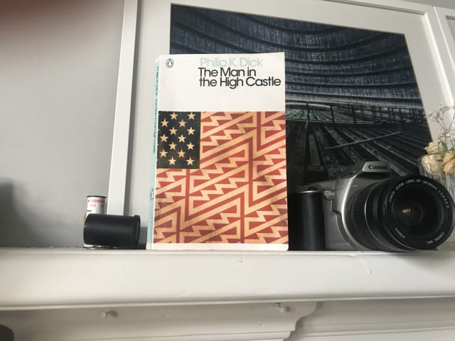
In this book, Dick protrays an alternate reality where the Axis powers have won the second world war and America is under the rule of Imperial Japan and Nazi Germany.
Interestingly, many of the characters use the ancient Chinese text the I Ching for guidance, and there’s also a clever “book within a book” subplot in which the novel The Grasshopper Lies Heavy depicts an alternate history in which the Allied forces prevailed.
Having now read a couple of Philip K. Dick books this year, I’m arriving at the conclusion that while I don’t love his writing style, this is counterbalanced by his creativity and the interesting ideas which stay with you long afterwards.
Design Better Forms (UX Collective)
As Andrew Coyle says, “Life is short. No one wants to fill out a form.”. Here, he presents a number of form design tips to make the user experience more bearable and increase completion rates.
Layered, Smooth box-shadow generator (on brumm.af)
Inspired by Tobias Bjerrome’s blog post Smoother & sharper shadows with layered box-shadows
Making a Better Custom Select Element (24 ways)
We want a way for someone to choose an item from a list of options, but it’s more complicated than just that. We want autocomplete options. We want to put images in there, not just text. The
optgroupelement is ugly, hard to style, and not announced by screen readers. I had high hopes for thedatalistelement, but it’s no good for people with low vision who zoom or use high contrast themes.selectinputs are limited in a lot of ways. Let’s work out how to make our own while keeping all the accessibility features of the original.
Julie Grundy argues here that despite us having greater ability to style the standard select in 2019 there are times when that element doesn’t quite meet modern expectations.
This is a lovely, full-featured and fully accessible component. It could perhaps be improved by not showing the down-arrow icon until JavaScript is loaded, but otherwise it’s great.
Julie’s code currently exists solely as a Github repo, but for ease I’ve created this editable version on Codepen.
Will I use this in place of the select element? Not if I can help it, because after years of experience working with form elements I still trust native elements to work better cross-platform than custom alternatives. However if a design requires dropdown options to employ custom patterns such as media objects, then I’ll definitely reach for this component.
When should you add the defer attribute to the script element? (on Go Make Things)
For many years I’ve placed script elements just before the closing body tag rather than in the <head>. Since a standard <script> element is render-blocking, the theory is that by putting it at the end of the document – after the main content of the page has loaded – it’s no longer blocking anything, and there’s no need to wrap it in a DOMContentLoaded event listener.
It turns out that my time-honoured default is OK, but there is a better approach.
Chris has done the research for us and ascertained that placing the <script> in the <head> and adding the defer attribute has the same effect as putting that <script> just before the closing body tag but offers improved performance.
This treads fairly complex territory but my general understanding is this:
Using defer on a <script> in the <head> allows the browser to download the script earlier, in parallel, so that it is ready to be used as soon as the DOM is ready rather than having to be downloaded and parsed at that point.
Some additional points worth noting:
- Only use the
deferattribute when thesrcattribute is present. Don’t use it on inline scripts because it will have no effect. - The
deferattribute has no effect on module scripts (script type="module"). They defer by default.
Carbon
Create and share beautiful images of your source code. Start typing or drop a file into the text area to get started.
I’ve noticed Andy Bell using a really lovely format when sharing code snippets on Twitter. Turns out that it was using this great tool.
(via @hankchizljaw)
Async and Await
My notes and reminders for handling promises with async and await In Real Life.
As I see it, the idea is to switch to using await when working with promise-returning, asynchronous operations (such as fetch) because it lends itself to more flexible and readable code.
async functions
The async keyword, when used before a function declaration like so async function f()):
- defines an asynchronous function i.e. a function whose processes run after the main call stack and doesn’t block the main thread.
- always returns a promise. (Its return value is implicitly wrapped in a resolved promise.)
- allows us to use
await.
The await operator
- use the
awaitkeyword withinasyncfunctions to wait for a Promise. - Example usage:
const users = await fetch('/users')). - It makes the
asyncfunction pause until that promise settles and returns its result. - It makes sense that it may only be used inside
asyncfunctions so as to scope the “waiting” behaviour to that dedicated context. - It’s a more elegant syntax for getting a promise‘s result than
promise.then. - If the promise resolves successfully,
awaitreturns the result. - If the promise rejects,
awaitthrows the error, just as if there were athrowstatement at that line. - That
throwcauses execution of the current function to stop (so the next statements won't be executed), with control passed to the firstcatchblock in the call stack. If nocatchblock exists among caller functions, the program will terminate. - Given this “continue or throw” behaviour, wrapping an
awaitin atry...catchis a really nice and well-suited pattern for including error handling, providing flexibility and aiding readability.
Here’s a try...catch -based example. (NB let’s assume that we have a list of blog articles and a “Load more articles” button which triggers the loadMore() function):
export default class ArticleLoader {
async loadMore() {
const fetchURL = "https://mysite.com/blog/";
try {
const newItems = await this.fetchItems(fetchURL);
// If we’re here, we know our promise fulfilled.
// We might add some additional `await`, or just…
// Render our new HTML items into the DOM.
this.renderItems(newItems);
} catch (err) {
this.displayError(err);
}
}
async fetchArticles(url) {
const response = await fetch(url, { method: "GET" });
if (response.ok) {
return response.text();
}
throw new Error("Sorry, there was a problem fetching additional articles.");
}
displayError(err) {
const errorMsgContainer = document.querySelector("[data-target='error-msg']");
errorMsgContainer.innerHTML = `<span class="error">${err}</span>`;
}
}Here’s another example. Let’s say that we needed to wait for multiple promises to resolve:
const allUsers = async () => {
try {
let results = await Promise.all([
fetch(userUrl1),
fetch(userUrl2),
fetch(userUrl3)
]);
// we’ll get here if the promise returned by await
// resolved successfully.
// We can output a success message.
// ...
} catch (err) {
this.displayError(err);
}
}Using await within a try...catch is my favourite approach but sometimes it’s not an option because we’re at the topmost level of the code therefore not in an async function. In these cases it’s good to remember that we can call an async function and work with its returned value like any promise, i.e. using then and catch.
For example:
async function loadUser(url) {
const response = await fetch(url);
if (response.status == 200) {
const json = await response.json();
return json;
}
throw new Error(response.status);
}
loadUser('no-user-here.json')
.then((json) => {
// resolved promise, so do something with the json
// ...
})
.catch((err) => {
// then() returns a promise, so is chainable.
// rejected promise, so do something with the json
document.body.innerHTML = "foo";
});References:
Modest JS Works
Pascal Laliberté has written a short, free, web-based book which advocates a modest and layered approach to using JavaScript.
I make the case for The JS Gradient, a principle whereby your app can have multiple coexisting modern JS approaches, starting from the global sprinkles to spot view-models to, yes, an SPA if that’s really necessary. At each point in the gradient, you’ll see when it’s a good idea to go a step further toward heavier JavaScript, or not.
Pascal’s philosophy starts with the following ideals:
- prefer server-generated HTML over JavaScript-generated HTML. If we need to add more complex JavaScript layers we may deviate from that ideal, but this should be the starting point;
- we should be able to swap and replace the HTML on a page on a whim. We can then support techniques like pjax (replacing the whole body of a page with new HTML such as with Turbolinks) and ahah (asynchronous HTML over HTTP: replacing parts of a page with new HTML, so as to make our app feel really fast while still favouring server-generated HTML;
- favour native Browser APIs over proprietary libraries. Use the tools the browser gives us (History API, Custom Event handlers, native form elements, CSS and the cascade) and polyfill older browsers.
He argues that a single application can combine the options along the JS Gradient, but also that we need only move to a new level if and when we reach the current level’s threshold.
He defines the levels as follows:
- Global Sprinkles: general app-level enhancements that occur on most pages, achieved by adding event listeners at
documentlevel to catch user interactions and respond with small updates. Such updates might include dropdowns, fetching and inserting HTML fragments, and Ajax form submission. This might be achieved via a single, DIY script (or something like Trimmings) that is available globally and provides reusable utilities viadata-attributes; - Component Sprinkles: specific page component behaviour defined in individual
.jsfiles, where event listeners are still ideally set on thedocument; - Stimulus components: where each component’s HTML holds its state and defines its behaviour, with a companion controller
.jsfile which wires up event handlers to elements; - Spot View-Models: using a framework such as Vue or React only in specific spots, for situations where our needs are more complex and generating the HTML on the server would be impractical. Rather than taking over the whole page, this just augments a specific page section with a data-reactive view-model.
- A single-page application (SPA): typically an all-JavaScript affair, where whole pages are handled by Reactive View-Models like Vue and React and the browser’s handling of clicks and the back button are overriden to serve different JavaScript-generated views to the user. This is the least modest approach but there are times when it is necessary.
One point to which Pascal regularly returns is that it’s better to add event listeners to the document (with a check to ensure the event occurred on the relevant element) rather than to the element itself. I already knew that Event Delegation is better for browser performance however Pascal’s point is that in the context of wanting to support swapping and replacing HTML on a whim, if event listeners are directly on the element but that element is replaced (or a duplicate added) then we would need to keep adding more event listeners. By contrast, this is not necessary when the event listener is added to the document.
Note: Stimulus applies event handlers to elements rather than the document, however one of its USPs is that it’s set up so that as elements appear or disappear from the DOM, event handlers are automatically added and removed. This lets you swap and replace HTML as you need without having to manually define and redefine event handlers. He calls this Automated Behaviour Orchestration and notes that while adding event listeners to the document is the ideal approach, the Stimulus approach is the next best thing.
Also of particular interest to me was his Stimulus-based Shopping Cart page demo where he employs some nice techniques including:
- multiple controllers within the same block of HTML;
- multiple Stimulus actions on a single element;
- controller action methods which use
document.dispatchEventto dispatch Custom Events as a means of communicating changes up to other components; - an element with an action which listens for the above custom event occurring on the
document(as opposed to an event on the element itself).
I’ve written about Stimulus before and noted a few potential cons when considering complex interfaces, however Pascal’s demo has opened my eyes to additional possibilities.
My first Christmas working at FreeAgent. Strong Christmas Jumper game!

Loading and Templating JSON Responses in Stimulus.js (by John Beatty)
Just because Stimulus.js is designed to work primarily with existing HTML doesn’t mean it can’t use JSON APIs when the need arises.
Here, John pimps up his Stimulus controller to get and use JSON from a remote API endpoint.
He triggers a fetch() from the connect() lifecycle callback, then iterates the returned JSON creating each HTML list item using a JavaScript template literal before finally rendering them into an existing <ul> via a Stimulus target.
Easy when you know how!
Building an accessible show/hide disclosure component with vanilla JS (Go Make Things)
A disclosure component is the formal name for the pattern where you click a button to reveal or hide content. This includes things like a “show more/show less” interaction for some descriptive text below a YouTube video, or a hamburger menu that reveals and hides when you click it.
Chris’s article provides an accessible means of showing and hiding content at the press of a button when the native HTML details element isn’t suitable.
The new dot com bubble is here: it’s called online advertising (The Correspondent)
Is online advertising working? We simply don’t know
This article reveals that despite $273bn being spent on digital ads globally (figures from 2018) the effectiveness of digital advertising is actually borderline impossible to measure. It is highly likely that any favourable figures suggested by marketers owe more to a combination of the “selection effect” and blind faith.
I don’t particularly enjoy being followed around the web by “targeted ads” – especially having discovered that the intrusion is relatively pointless!
(via @clearleft)
Subgrid for CSS Grid launches in Firefox 71
Subgrid for CSS Grid Layout has arrived in Firefox and it looks great. Here’s how I wrapped my head around the new concepts.
While MDN has some nice examples, I generally find I need a little extra time, trial and error and note-making in order to fully grasp CSS Grid concepts.
For example, I always need to remind myself that parts of the syntax – such as grid-template-columns selectors – refer to grid lines rather than columns.
So I created a Subgrid example pen with guideline notes for future reference. Note: make sure to open the pen in Firefox rather than any other browser, because at the time of writing only Firefox supports Subgrid!
Using CSS Custom Properties to streamline animation
Thanks to a great tip from Lucas Hugdahl on Twitter, here’s how to use CSS custom properties (variables) in your transforms so you don't need to rewrite the whole transform rule in order to transition (animate) a single property.
Let’s take the simple example of a button that we want to increase in size when hovered.
By using a custom property for the scale value, we can keep things DRYer in our :hover rule by only updating that variable rather than rewriting the entire transform rule.
The button HTML:
<button>Hover over me</button>CSS:
button {
transition: transform .5s ease-in-out;
transform: translateX(-50%) translateY(-50%) scale(var(--scale, 1));
}
button:hover {
--scale: 2;
}IndieWeb Link Sharing | Max Böck
A pain point of the IndieWeb is that it's sometimes not as convenient to share content as it is on the common social media platforms… That’s why I wanted to improve this process for my site.
This was a fantastic walkthrough by Max. And based on this, I’ve just finished implementing an easy-bookmarking feature on my own website.
I already use this site to save Bookmarks so I’m hooking into that. For the bookmark-saving form, I’ve used Stimulus rather than Preact. But otherwise this is very much based on Max’s superb tutorial.
Here’s my bookmarklet code so that future-me can create a new browser bookmark, edit it and paste this in.
javascript:(function(){var title = document.getElementsByTagName('title')[0].innerHTML;title = encodeURIComponent(title);var selection = '';if (window.getSelection) {selection = window.getSelection().toString();} else if (document.selection && document.selection.type != 'Control') {selection = document.selection.createRange().text;}selection = encodeURIComponent(selection);new_window=window.open('https://fuzzylogic.me/bookmarker/?title='+title+'&body='+selection+'&url='+encodeURIComponent(document.location.href),'Sharer','resizable,scrollbars,status=0,toolbar=0,menubar=0,titlebar=0,width=680,height=700,location=0');})();Incidentally, this process also provided a great way to dip my toes into the world of Netlify Functions and their supporting tools, netlify-dev and netlify-lambda.
There’s more to be done but I wanted the first bookmark created with my shiny new system to be a link to Max’s original tutorial – and this post is it.
Many thanks, Max!
Who Can Use
It's a tool that brings attention and understanding to how color contrast can affect different people with visual impairments.
What’s interesting about this resource is that sheds light on the many different types of visual impairment, from Protanomaly (trouble distinguishing reds) to Achromatopsia (complete colour blindness; only being able to see shades) and how your website’s colour scheme fares for each. (via paddyduke.com)
FS Split Sans and FS Split Serif (fontsmith.com)
Although FS Split started out as a project to create a fresh, modern new sans, it has developed into a broad type family that can bring so much variety to everything from magazines and packaging to websites and branding. The conflicting yet harmonising nature of sans and serif should give designers the tools they need to be both bold and subtle, eclectic and ordinary, contemporary and classic.
The Size of Space (on neal.fun)
This interactive, web-based tool which lets you swipe through various space objects to see their relative size is pretty cool, really nicely done, and handy whenever you could use a dose of perspective! (via @adactio)
Blue Note Records: Beyond the Notes (on BBC Four)
The story behind Blue Note Records, founded in New York in 1939 by two German Jewish refugees who allowed their musicians complete artistic freedom, revolutionising jazz in the process.
A great watch with a fantastic back story, great interviews and amazing music including this from Art Blakey:
You don’t need a media query for that: #1 Inline content separators
Create a more flexible component which allows the text to wrap based on the content rather than the viewport size.
Here, Mandy Michael explores similar territory to Every Layout in suggesting that not all responsive pattern challenges require, or indeed are best served by, media queries.
The example here is a pipe-separated text pair (I could imagine an author and publish date meta line) which Mandy wants to wrap (with pipe separator hidden) only when the content and container require it, rather than based on the less-relevant viewport width.
She uses a clever combination of flex-wrap:wrap, generated content, padding, transform and overflow-y:hidden to achieve her goal.
(Via @Mandy_Kerr)
“Long Shot” DJ mix by The Nuclear Family
A mix of electronic, house and techno records I recorded at home in November 2019.
2019 has been a fairly quiet year for my and Tom’s record label The Nuclear Family. However with a couple of winter events coming up I wanted to share a little teaser mix to whet the collective appetite.
Inspiration
Earlier in the year I joined a fine bunch of pals on a night out at 69 at The Club, Paisley to hear resident DJs Martin and Euan plus a live performance from guest John Heckle. It was a fantastic night and particularly memorable for a couple of stellar tracks played by Euan. I tried to describe them to him afterwards but wasn’t sure if I was making much sense. Cut to a few months later and a mysterious parcel containing records I’ve never heard of arrives at my door. I was convinced that someone must have sent them to me in error until dropping the needle on the grooves and realising they were the tracks from that night at 69! Channeling Sherlock Holmes, I deduced that Euan – being the all-round good guy that he is – had bought and posted them to me as a souvenir of the night. What a guy!
And they are brilliant.
The first is Ricochet by Bambooman (a new name on me) on Matthew Herbert’s label, Accidental Jnr. It features a stuttering, percussive riff complimented by searing synth stabs – proper machine funk but with a heart. The second is a double-pack by the more familiar name of i:cube, with my favourite track Fractal P a dark, winding, bass-heavy trip reminiscent of ’91 classic Pressure Dub by Ability 11 but with its own distinct flavour.
I knew I definitely wanted those tracks in the mix.
Around those touchstones I added recent favourites from Joy O (under his Sin Falta alias), Phillip McGarva (the artist formerly known as Microworld) and Dego, plus a few oldies including Isolée’s Hermelin and Modern Tribe by Jellybean (AKA Glenn Underground).
In terms of kit, I recorded the mix on a pair of Technics 1210s and an Isonoe 420 mixer.
WAVE Web Accessibility Evaluation Tool
The featured article in this week’s Accessibility Weekly newsletter was on recent improvements to the WAVE suite of accessibility testing tools.
I can’t remember using WAVE before, however just one quick test of fuzzylogic.me using their online tool revealed an accessibility issue with the linked SVG logo in the header. A great catch, now fixed, from which I learned something new. I’ll certainly be adding WAVE to my accessibility testing toolbox from here on in.
WAVE is a suite of evaluation tools that help authors make their web content more accessible to individuals with disabilities. WAVE can identify many accessibility and Web Content Accessibility Guideline (WCAG) errors, but also facilitates human evaluation of web content. Our philosophy is to focus on issues that we know impact end users, facilitate human evaluation, and to educate about web accessibility.
Why much of the internet is closed off to blind people – BBC News
Following the recent watershed Domino’s Pizza case, BBC News reports that retailers in the USA & Canada are struggling to make their websites accessible and consumers are taking them to court.
"We've even been told by businesses before that they understand, but the fact is blind people are not a very big market," Mr Danielson says. "That's what we are dealing with."
Colors – a nicer color palette for the web
Skinning your prototypes just got easier - colors.css is a collection of skin classes to use while prototyping in the browser.
They also provide ninety examples of “A11Y compliant color combos” which is really handy.
“Gil Scott-Heron Saved Me”
From The Guardian in 2011, shortly after Gil Scott-Heron’s sad death, here’s a beautiful and moving account of how the musical legend offered hope and mentorship to a young man from Liverpool and in so doing turned his life around.
Thanks to Nick Peacock for sharing.
“Your interview test for junior developer” (from Bruce Lawson on Twitter)
"Ok, as part of your interview test for junior developer, we want you to put some words, an image and some links onto a webpage. We use Node, Docker, Kubernetes, React, Redux, Puppeteer, Babel, Bootstrap, Webpack,
<div>and<span>. Go!"
Bruce Lawson nicely illustrates how ridiculous many job adverts for web developers are. This (see video) never fails to crack me up. It’s funny ‘cos it’s true!
(via @brucel)
Progressively Enhanced JavaScript with Stimulus
I’m dipping my toes into Stimulus, the JavaScript micro-framework from Basecamp. Here are my initial thoughts.
I immediately like the ethos of Stimulus.
The creators’ take is that in many cases, using one of the popular contemporary JavaScript frameworks is overkill.
We don’t always need a nuclear solution that:
- takes over our whole front end;
- renders entire, otherwise empty pages from JSON data;
- manages state in JavaScript objects or Redux; or
- requires a proprietary templating language.
Instead, Simulus suggests a more “modest” solution – using an existing server-rendered HTML document as its basis (either from the initial HTTP response or from an AJAX call), and then progressively enhancing.
It advocates readable markup – being able to read a fragment of HTML which includes sprinkles of Stimulus and easily understand what’s going on.
And interestingly, Stimulus proposes storing state in the HTML/DOM.
How it works
Stimulus’ technical purpose is to automatically connect DOM elements to JavaScript objects which are implemented via ES6 classes. The connection is made by data– attributes (rather than id or class attributes).
data-controller values connect and disconnect Stimulus controllers.
The key elements are:
- Controllers
- Actions (essentially event handlers) which trigger controller methods
- Targets (elements which we want to read or write to, mapped to controller properties)
Some nice touches
I like the way you can use the connect() method – a lifecycle callback invoked whenever a given controller is connected to the DOM - as a place to test browser support for a given feature before applying a JS-based enhancement.
Stimulus also readily supports the ability to have multiple instances of a controller on the page.
Furthermore, actions and targets can be added to any type of element without the controller JavaScript needing to know or care about the specific element, promoting loose coupling between HTML and JavaScript.
Managing State in Stimulus
Initial state can be read in from our DOM element via a data- attribute, e.g. data-slideshow-index.
Then in our controller object we have access to a this.data API with has(), get(), and set() methods. We can use those methods to set new values back into our DOM attribute, so that state lives entirely in the DOM without the need for a JavaScript state object.
Possible Limitations
Stimulus feels a little restrictive if dealing with less simple elements – say, for example, a data table with lots of rows and columns, each differing in multiple ways.
And if, like in our data table example, that element has lots of child elements, it feels like there might be more of a performance hit to update each one individually rather than replace the contents with new innerHTML in one fell swoop.
Summing Up
I love Stimulus’s modest and progressive enhancement friendly approach. I can see me adopting it as a means of writing modern, modular JavaScript which fits well in a webpack context in situations where the interactive elements are relatively simple and not composed of complex, multidimensional data.
How to manage JavaScript dependencies
Managing JavaScript dependencies is about as much fun as a poke in the eye. However even if—like me—you prefer to keep things lean and dependency-free as far as possible, it’s something you’re going to need to do either in large work projects or as your personal side-project grows. In this post I tackle it head-on to reduce the problem to some simple concepts and practical techniques.
In modern JavaScript applications, we can add tried-and-tested open source libraries and utilities by installing packages from the NPM registry. This can aid development by letting you concentrate on your application’s unique features rather than reinventing the wheel for already-solved common tasks.
A typical example might be to add axios or node-fetch to a Node.js project to provide a means of making API calls.
We can use a package manager such as yarn or npm to install packages. When our package manager installs a package it logs it as a project dependency which is to say that the project depends upon its presence to function properly.
It then follows that anyone who wants to run the application should first install its dependencies.
And it’s the responsibility of the project owner (you and your team) to manage the project’s dependencies over time. This involves:
- updating packages when they release security patches;
- maintaining compatibility by staying on package upgrade paths; and
- removing installed packages when they are no longer necessary for your project.
While it’s important to keep your dependencies updated, in a recent survey by Sonatype 52% of developers said they find dependency management painful. And I have to agree that it’s not something I generally relish. However over the years I’ve gotten used to the process and found some things that work for me.
A simplified process
The whole process might go something like this (NB install yarn if you haven’t already).
# Start installing and managing 3rd-party packages.
# (only required if your project doesn’t already have a package.json)
yarn init # or npm init
# Install dependencies (in a project which already has a package.json)
yarn # or npm i
# Add a 3rd-party library to your project
yarn add package_name # or npm i package_name
# Add package as a devDependency.
# For tools only required in the local dev environment
# e.g. CLIs, hot reload.
yarn add -D package_name # or npm i package_name --save-dev
# Add package but specify a particular version or semver range
# https://devhints.io/semver
# It’s often wise to do this to ensure predictable results.
# caret (^) is useful: allows upgrade to minor but not major versions.
# is >=1.2.3 <2.0.0
yarn add package_name@^1.2.3
# Remove a package
# use this rather than manually deleting from package.json.
# Updates yarn.lock, package.json and removes from node_modules.
yarn remove package_name # or npm r package_name
# Update one package (optionally to a specific version/range)
yarn upgrade package_name
yarn upgrade package_name@^1.3.2
# Review (in a nice UI) all packages with pending updates,
# with the option to upgrade whichever you choose
yarn upgrade-interactive
# Upgrade to latest versions rather than
# semver ranges you’ve defined in package.json.
yarn upgrade-interactive -—latestResponding to a security vulnerability in a dependency
If you host your source code on GitHub it’s a great idea to enable Dependabot. Essentially Dependabot has your back with regard to any dependencies that need updated. You set it to send you automated security updates by email so that you know straight away if a vulnerability has been detected in one of your project dependencies and requires action.
Helpfully, if you have multiple Github repos and more than one of those include the vulnerable package you also get a round-up email with a message something like “A new security advisory on lodash affects 8 of your repositories” with links to the alert for each repo, letting you manage them all at once.
Dependabot also works for a variety of languages and techologies—not just JavaScript—so for example in a Rails project it might email you to suggest bumping a package in your Gemfile.
Automated upgrades
Sometimes the task is straightforward. The Dependabot alert email tells you about a vulnerability in a package you explicitly installed and the diligent maintainer has already made a patch release available.
A simple upgrade to the relevant patch version would do the job, however Dependabot can even take care of that for you! Dependabot can automatically open a new Pull Request which addresses the vulnerability by updating the relevant dependency. It’ll give the PR a title like
Bump
lodashfrom4.17.11to4.17.19
You just need to approve and merge that PR. This is great; it’s really simple and takes care of lots of cases.
Note 1: if you work on a corporate repo that is not set up to “automatically open PRs”, often you can still take advantage of Github’s intelligence with just one or two extra manual steps. Just follow the links in your Github security alert email.
Note 2: Dependabot can also be set to do automatic version updates even when your installed version does not have a vulnerability. You can enable this by adding a dependabot.yml to your repo. But so far I’ve tended to avoid unpredictability and excess noise by having it manage security updates only.
Manual upgrades
Sometimes Dependabot will alert you to an issue but is unable to fix it for you. Bummer.
This might be because the package owner has not yet addressed the security issue. If your need to fix the situtation is not super-urgent, you could raise an issue on the package’s Github repo asking the maintainer (nicely) if they’d be willing to address it… or even submit a PR applying the fix for them. If you don’t have the luxury of time, you’ll want to quickly find another package which can do the same job. An example here might be that you look for a new CSS minifier package because your current one has a longstanding security issue. Having identified a replacement you’d then remove package A, add package B, then update your code which previously used package A to make it work with package B. Hopefully only minimal changes will be required.
Alternatively the package may have a newer version or versions available but Depandabot can’t suggest a fix because:
- the closest new version’s version number is beyond the allowed range you specified in
package.jsonfor the package; or - Dependabot can’t be sure that upgrading wouldn’t break your application.
If the package maintainer has released newer versions then you need to decide which to upgrade to. Your first priority is to address the vulnerability, so often you’ll want to minimise upgrade risk by identifying the closest non-vulnerable version. You might then run yarn upgrade <package…>@1.3.2. Note also that you may not need to specify a specific version because your package.json might already specify a semver range which includes your target version, and all that’s required is for you to run yarn upgrade or yarn upgrade <package> so that the specific “locked” version (as specified in yarn.lock) gets updated.
On other occasions you’ll read your security advisory email and the affected package will sound completely unfamiliar… likely because it’s not one you explicitly installed but rather a sub-dependency. Y’see, your dependencies have their own package.json and dependencies, too. It seems almost unfair to have to worry about these too, however sometimes you do. The vulnerability might even appear several times as a sub-dependency in your lock file’s dependency tree. You need to check that lock file (it contains much more detail than package.json), work out which of your top-level dependencies are dependent on the sub-dependency, then go check your options.
Update: use yarn why sockjs (replacing sockjs as appropriate) to find out why a module you don’t recognise is installed. It’ll let you know what module depends upon it, to help save some time.
When having to work out the required update to address a security vulnerability in a package that is a subdependency, I like to quickly get to a place where the task is framed in plain English, for example:
To address a vulnerability in
xmlhttprequest-sslwe need to upgradekarmato the closest available version above4.4.1where its dependency onxmlhttprequest-sslis>=1.6.2
Case Study 1
I was recently alerted to a “high severity” vulnerability in package xmlhttprequest-ssl.
Dependabot cannot update
xmlhttprequest-sslto a non-vulnerable version. The latest possible version that can be installed is1.5.5because of the following conflicting dependency:@11ty/eleventy@0.12.1requiresxmlhttprequest-ssl@~1.5.4via a transitive dependency onengine.io-client@3.5.1. The earliest fixed version is1.6.2.
So, breaking that down:
xmlhttprequest-sslversions less than1.6.2have a security vulnerability;- that’s a problem because my project currently uses version
1.5.5(via semver range~1.5.4), which I was able to see from checkingpackage-lock.json; - I didn’t explicitly install
xmlhttprequest-ssl. It’s at the end of a chain of dependencies which began at thedependenciesof the package@11ty/eleventy, which I did explicitly install; - To fix things I want to be able to install a version of Eleventy which has updated its own dependencies such there’s no longer a subdependency on the vulnerable version of
xmlhttprequest-ssl; - but according to the Dependabot message that’s not possible because even the latest version of Eleventy (0.12.1) is indirectly dependent on a vulnerable version-range of
xmlhttprequest-ssl(~1.5.4); - based on this knowledge, Dependabot cannot recommend simply upgrading Eleventy as a quick fix.
So I could:
- decide it’s safe enough to wait some time for Eleventy to resolve it; or
- request Eleventy apply a fix (or submit a PR with the fix myself); or
- stop using Eleventy.
Case Study 2
A while ago I received the following security notification about a vulnerability affecting a side-project repo.
dot-prop < 4.2.1 “Prototype pollution vulnerability in dot-prop npm package before versions 4.2.1 and 5.1.1 allows an attacker to add arbitrary properties to JavaScript language constructs such as objects.
I wasn’t familar with dot-prop but saw that it’s a library that lets you “Get, set, or delete a property from a nested object using a dot path”. This is not something I explicitly installed but rather a sub-dependency—a lower-level library that my top-level packages (or their dependencies) use.
Github was telling me that it couldn’t automatically raise a fix PR, so I had to fix it manually. Here’s what I did.
- looked in
package.jsonand found no sign ofdot-prop; - started thinking that it must be a sub-dependency of one or more of the packages I had installed, namely
express,hbs,requestornodemon; - looked in
package-lock.jsonand via a Cmd-F search fordot-propI found that it appeared twice; - the first occurrence was as a top-level element of
package-lock.jsons top-leveldependenciesobject. This object lists all of the project’s dependencies and sub-dependencies in alphabetical order, providing for each the details of the specific version that is actually installed and “locked”; - I noted that the installed version of
dot-propwas4.2.0, which made sense in the context of the Github security message; - the other occurrence of
dot-propwas buried deeper within the dependency tree as a dependency ofconfigstore; - I was able to work backwards and see that
dot-propis required byconfigstorethen Cmd-F search forconfigstoreto find that it was required byupdate-notifier, which is turn is required bynodemon; - I had worked my way up to a top-level dependency
nodemon(installed version1.19.2) and worked out that I would need to updatenodemonto a version that had resolved thedot-propvulnerability (if such a version existed); - I then googled “nodemon dot-prop” and found some fairly animated Github issue threads between Remy the maintainer of
nodemonand some users of the package, culminating in a fix; - I checked nodemon’s releases and ascertained that my only option if sticking with
nodemonwas to installv2.0.3—a new major version. I wouldn’t ideally install a version which might include breaking changes but in this casenodemonwas just adevDependency, not something which should affect other parts of the application, and a developer convenience at that so I went for it safe in the knowledge that I could happily remove this package if necessary; - I opened
package.jsonand withindevDependenciesmanually updatednodemonfrom^1.19.4to^2.0.4. (If I was in ayarncontext I’d probably have done this at the command line). I then rannpm i nodemonto reinstall the package based on its new version range which would also update the lock file. I was then prompted to runnpm audit fixwhich I did, and then I was done; - I pushed the change, checked my Github repo’s security section and noted that the alert (and a few others besides) had disappeared. Job’s a goodun!
Proactively checking for security vulnerabilities
It’s a good idea on any important project to not rely on automated alerts and proactively address vulnerabilities.
Check for vulnerabilities like so:
yarn audit
# for a specific level only
yarn audit --level critical
yarn audit --level high
Files and directories
When managing dependencies, you can expect to see the following files and directories.
package.jsonyarn.locknode_modules(this is the directory into which packages are installed)
Lock files
As well as package.json, you’re likely to also have yarn.lock (or package.lock or package-lock.json) under source control too. As described above, while package.json can be less specific about a package’s version and suggest a semver range, the lock file will lock down the specific version to be installed by the package manager when someone runs yarn or npm install.
You shouldn’t manually change a lock file.
Choosing between dependencies and devDependencies
Whether you save an included package under dependencies (the default) or devDependencies comes down to how the package will be used and the type of website you’re working on.
The important practical consideration here is whether the package is necessary in the production environment. By production environment I don’t just mean the customer-facing website/application but also the enviroment that builds the application for production.
In a production “build process” environment (i.e. one which likely has the environment variable NODE_ENV set to production) the devDependencies are not installed. devDependencies are packages considered necessary for development only and therefore to keep production build time fast and output lean, they are ignored.
As an example, my personal site is JAMstack-based using the static site generator (SSG) Eleventy and is hosted on Netlify. On Netlify I added a NODE_ENV environment variable and set it to production (to override Netlify’s default setting of development) because I want to take advantage of faster build times where appropriate. To allow Netlify to build the site on each push I have Eleventy under dependencies so that it will be installed and is available to generate my static site.
By contrast, tools such as Netlify’s CLI and linters go under devDependencies. Netlify’s build prorcess does not require them, nor does any client-side JavaScript.
Upgrading best practices
- Check the package CHANGELOG or releases on Github to see what has changed between versions and if there have been any breaking changes (especially when upgrading to the latest version).
- Use a dedicated PR (Pull Request) for upgrading packages. Keep the tasks separate from new features and bug fixes.
- Upgrade to the latest minor version (using
yarn upgrade-interactive) and merge that before upgrading to major versions (usingyarn upgrade-interactive -—latest). - Test your work on a staging server (or Netlify preview build) before deploying to production.
References
Jank-free Responsive Images
Here’s how to improve performance and prevent layout jank when browsers load responsive images.
Since the advent of the Responsive Web Design era many of us, in our rush to make images flexible and adaptive, stopped applying the HTML width and height attributes to our images. Instead we’ve let CSS handle the image, setting a width or max-width of 100% so that our images can grow and shrink but not extend beyond the width of their parent container.
However there was a side-effect in that browsers load text first and images later, and if an image’s dimensions are not specified in the HTML then the browser can’t assign appropriate space to it before it loads. Then, when the image finally loads, this bumps the layout – affecting surrounding elements in a nasty, janky way.
CSS-tricks have written about this several times however I’d never found a solid conclusion.
Chrome’s Performance Warning
The other day I was testing this here website in Chrome and noticed that if you don’t provide images with inline width and height attributes, Chrome will show a console warning that this is negatively affecting performance.
Based on that, I made the following updates:
- I added width and height HTML attributes to all images; and
- I changed my CSS from
img { max-width: 100%; }toimg { width: 100%; height: auto; }.
NB the reason behind #2 was that I found that that CSS works better with an image with inline dimensions than max-width does.
Which dimensions should we use?
Since an image’s actual rendered dimensions will depend on the viewport size and we can’t anticipate that viewport size, I plumped for a width of 320 (a narrow mobile width) × height of 240, which fits with this site’s standard image aspect ratio of 4:3.
I wasn’t sure if this was a good approach. Perhaps I should have picked values which represented the dimensions of the image on desktop.
Jen Simmons to the rescue
Jen Simmons of Mozilla has just posted a video which not only confirmed that my above approach was sound, but also provided lots of other useful context.
Essentially, we should start re-applying HTML width and height attributes to our images, because in soon-to-drop Firefox and Chrome updates the browser will use these dimensions to calculate the image’s aspect ratio and thereby be able to allocate the exact required space.
The actual dimensions we provide don’t matter too much so long as they represent the correct aspect ratio.
Also, if we use the modern srcset and sizes syntax to offer the browser different image options (like I do on this site), so long as the different images are the same aspect ratio then this solution will continue to work well.
There’s no solution at present for the Art Direction use case – where we want to provide different aspect ratios dependent on viewport size – but hopefully that will come along next.
I just tested this new feature in Firefox Nightly 72, using the Inspector’s Network tab to set “throttling” to 2G to simulate a slow-loading connection, and it worked really well!
Lazy Loading
One thing I’m keen to test is that my newly-added inline width and height attributes play well with loading="lazy". I don’t see why they shouldn’t and in fact they should in theory all support each other well. In tests so far everything seems good, however since loading="lazy" is currently only implemented in Chrome I should re-test images in Chrome once it adds support for the new image aspect ratio calculating feature, around the end of 2019.
Beyond Automatic Testing (matuzo.at)
Six accessibility tests Viennese Front-end Developer Manuel Matusovic runs on every website he develops, beyond simply running a Lighthouse audit.
Includes “Test in Grayscale Mode” and “Test with no mouse to check tabbing and focus styles”.
Do Androids Dream of Electric Sheep? by Philip K. Dick
In my ongoing quest to catch up on books I should have read years ago, I recently finished reading “Do Androids Dream of Electric Sheep?” – the book on which Bladerunner was based.
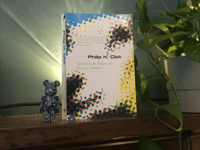
I’m a big Bladerunner fan – and also loved last year’s follow up movie, Bladerunner 2049 – but for me, the book was a mixed bag.
It illuminated some of the parts of the film that in retrospect hadn’t fully sunk in – like why animals (such as Tyrell Corp’s owl) were so important in post-apocalyptic San Fransisco, due to most species being endangered or extinct.
It also went much deeper into the question of whether empathy and similar social emotions were solely human abilities or could be felt by androids too. And I can see now see why this was explored further with lead character Joe in Bladerunner 2049.
On the downside, the techno-religious angle of Mercerism didn’t really work for me – although maybe I didn’t pick up properly on the metaphor. Also, I was kind of disappointed to learn that there actually is an electric sheep in the story! I had always loved the title and thought it was just a really clever reference to counting sheep in your dreams, rather than something so literal. Never mind!
All of the downsides were worth it, however, for the detailed parts about Voight-Kampff empathy tests. I have always loved the ideas and language around this, such as measuring androids for their Blush Response and other signs of empathy when asked questions which would normally elicit a reaction in humans.
All in, I’m glad I read it to gain the additional background to the movies.
I’m now off to watch Bladerunner again.
Original 1979 copies of Garden of Eden’s Everybody’s on a Trip regularly sell for £200+ so I was pretty happy to hear that it had just been reissued on Backatcha records… and even happier when I managed to snag a copy.

I first heard this stellar slice of deep funk a few years back on Kon and Amir’s compilation Off Track Volume One: The Bronx, and have been hankering after a proper copy ever since.
Check it out!
U.S. Supreme Court Favors Digital Accessibility in Domino’s Case
Digital products which are a public accommodation must be accessible, or will be subject to a lawsuit (and probably lose).
This US Supreme Court decision on October 7, 2019 represents a pretty favourable win for digital accessibility against a big fish that was trying to shirk its responsibilities.
Replicating Jekyll’s markdownify filter in Nunjucks with Eleventy
Here, Ed provides some handy code to convert a Markdown-formatted string into HTML in Nunjucks via an Eleventy shortcode.
This performs the same role as the markdownify filter in Jekyll.
I’m now using it on this site in listings, using the shortcode to convert blog entry excerpts written in markdown (which might contain code or italics, etc) into the target HTML.
Semantic Commit Messages
A fairly rigid commit format (chore, fix, feat etc) which should lead to your git log being an easy-to-skim changelog.
I’d noticed that my git commit messages could benefit from greater consistency. So I’ve started adopting Sparkbox’s approach.
Here’s how to use the different commit types:
chore: add Oyster build script
docs: explain hat wobble
feat: add beta sequence
fix: remove broken confirmation message
refactor: share logic between 4d3d3d3 and flarhgunnstow
style: convert tabs to spaces
test: ensure Tayne retains clothing
The Testament of Gideon Mack by James Robertson
A strange, otherwordly and often pretty funny tale of a Scottish minister’s dance with The Devil.
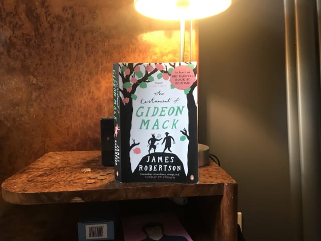
Cheers for the recommendation, Mick!
Lazy load embedded YouTube videos (CSS-Tricks)
This is a very clever idea via Arthur Corenzan. Rather than use the default YouTube embed, which adds a crapload of resources to a page whether the user plays the video or not, use the little tiny placeholder webpage that is just an image you can click that is linked to the YouTube embed.
Here’s a performance-enhancing trick for embedding youtube videos which eschews the default YouTube embed (and all the resources it adds to a page whether the video plays or not) in favour of rendering a tiny placeholder webpage in the srcdoc attribute.
Importantly, the user experience with the video remains the same.
Relearn CSS layout: Every Layout
Every now and then something comes along in the world of web design that represents a substantial shift. The launch of Every Layout, a new project from Heydon Pickering and Andy Bell, feels like one such moment.
In simple terms, we get a bunch of responsive layout utilities: a Box, a Stack, a Sidebar layout and so on. However Every Layout offers so much more—in fact for me it has provided whole new ways of thinking and talking about modern web development. In that sense I’m starting to regard it in terms of classic, game-changing books like Responsive Web Design and Mobile First.
Every Layout’s components, or primitives, are self-governing and free from media queries. This is a great step forward because media queries tie layout changes to the viewport, and that’s suboptimal when our goal is to create modular components for Design Systems which should adapt to variously-sized containers. Every Layout describe their components as existing in a quantum state: simultaneously offering both narrow and wide configurations. Importantly, the way their layouts adapt is also linked to the dynamic available space in the container and the intrinsic width of its contents, which leads to more fluid, organic responsiveness.
Every Layout’s approach feels perfect for the new era of CSS layout where we have CSS Grid and Flexbox at our disposal. They use these tools to suggest rather than dictate, letting the browser make appropriate choices based on its native algorithms.
Webfont loading strategies
When it comes to webfonts, if you want to serve an accessible and high performance experience across device types it’s not as straightforward as just specifying your fonts in CSS then hoping for the best.
We likely have goals such as the following:
- avoid Flash of Invisible Text (FOIT). Flash of Unstyled Text (FOUT) is preferable.
- provide a good experience for users on slow connections.
- while favouring FOUT over FOIT, take care to minimise jarring reflows.
Browser support is also a factor. For example font-display: swap seems like a great option however as Chris Ferdinandi pointed out in Why use the vanilla JS fontfaceset.load method instead of CSS font-display: swap it doesn’t have comprehensive mobile support. Since mobile users are regularly on slower connections they are likely to be hit hard by load times incurred due to custom fonts, therefore a solution which doesn’t cater to them is less attractive.
I tend to go for FOUT with a class—an approach that is reliable and good enough for most use cases. The idea is to use JavaScript to detect when a font has loaded successfully, and only then add a fonts-loaded class to the HTML element causing CSS scoped to that class to take effect. To date I’ve handled the detection using Bram Stein’s Font Face Observer to benefit from greater browser support (it handles IE) than I’d get using the native FontFaceSet.load() however I expect to gravitate toward the native API solution soon.
I’ve also experimented with pre-loading fonts in the <head> in combination with font-display: swap on this, my personal website. This was inspired by the font-loading approach Zach Leatherman took with CSS-Tricks. However due to the fonts I’m using right now I’d currently be preloading too heavy a load for slow connections (thus temporarily blocking initial page render) so I’d need to go further and introduce two-stage loading into that mix.
I’ve also found that your choice of font and font host can really influence (constrain) the flexibility and options you have for font features and loading.
font-display: swapcan only be applied on a self-hosted font or one hosted on Google Fonts (via a special querystring parameter on the font URL). So this CSS-only approach is not available with (for example) fonts hosted on Adobe Fonts or fonts.com.link rel=preloadis only available for self-hosted fonts because you need to be able to rely on the URL not changing, and you can’t rely on that for externally hosted fonts.- You might want to use the opentype features of a font but are they available in your font hosting/loading solution? Some of the fonts hosted on Google Fonts have nice OpenType features but by default these features are pruned out.
- Getting access to the source
.ttffile is beneficial as it allows you to subset the font, including special features and characters but also cutting out any your website does not require. Google Fonts have an open license which means we don’t need to lean on their hosting but can instead download fonts in.ttf, subset them (I use Glyphhanger) and self-host them.
This is all a work in progress and I’m still working this stuff out.
Animating the underlining of multi-line text
Cassie Evans shows us how to combine background–size, a linear-gradient based background-image and a keyframe animation (all in HTML and CSS) for a lovely progressive underline effect on multi-line text.
Here’s the gist of it:
<h2>This is a multi-line spanning animated underline. This took an annoyingly long time to figure out.</h2>body {
padding: 40vh 30vw;
font-family: cursive;
text-align: left;
font-size: 130%;
}
h2 {
line-height: 1.5;
display: inline;
background-image: linear-gradient(
transparent 50%,
#e1fffe 50%,
#b0f8ff 85%,
transparent 85%,
transparent 100%
);
background-repeat: no-repeat;
background-size: 0% 100%;
animation: animatedBackground 2s cubic-bezier(0.645, 0.045, 0.355, 1) 0.5s forwards;
}
@keyframes animatedBackground {
to {
background-size: 100% 100%;
}
}Thanks, Cassie!
Native lazy-loading for the web
Now that we have the HTML attribute loading we can set loading="lazy" on our website’s media, and the loading of non-critical, below-the-fold media will be deferred until the user scrolls to them.
This can really improve performance so I’ve implemented it on images and iframes (youtube video embeds etc) throughout this site.
This is currently only supported in Chrome, but that still makes it well worth doing.
Fringe Making
Last Tuesday, 20/8/19 I made the train trip east for a day at the Edinburgh Festival Fringe.
There are always a variety of interesting shows to catch in the month-long festival and this year I was particularly looking foward to Darren McGarvey AKA Loki’s Scotland Today. Having read and enjoyed McGarvey’s book Poverty Safari last year I was keen to see and hear him in the flesh.
Another reason for the trip was that during a recent stint working with Bright Signals I developed the FringeMaker web app – a Pokémon Go style game where you win points by “checking into” Fringe gig venues – so I was excited to hit the Edinburgh streets to give it a spin for real.
First port of call was to meet my friends Mick and Laura at George Square for a catch up and pre-gig beer. Having made it through the festival crowds and pouring rain to find them, we took temporary refuge with a pint and some tasty pizza from the nearby stalls, before setting off for our first gig: Tony Slattery’s Slattery Will Get You Nowhere.
Slattery will get you nowhere
In the early nineties I enjoyed watching Tony on Whose Line is it Anyway? and I was moved by a recent Guardian interview which revealed that in the years following the show ending he fell off the rails somewhat due to his bipolar disorder allied to alcohol and drug addictions, and was now looking for an agent and new opportunities.
The format of this show was just Tony and comedy historian Robert Ross sat at a table, with Tony answering a series of unscripted questions. Over the course of an hour he stepped through his career, from winning the Fringe’s inaugural Perrier Award with Cambridge Footlights pals Stephen Fry, Hugh Laurie and Emma Thompson (“yeah but where are they now?”), to pant-splitting (literally) and deleted scenes on Whose Line is it Anyway?, to acting roles in films such as Peter’s Friends. It was filled with funny anecdotes involving the likes of Rik Mayall and Kenneth Branagh, plus a few might-have-been stories such as when he narrowly missed out (to Sylvester McCoy) on the role of Doctor Who.
Overall I really enjoyed this. Despite having problems which have taken their toll, Tony Slattery is still a funny and engaging performer and is also doing his bit to help raise awareness of bipolar disorder. He seems like a good egg.
Scotland Today
Onwards to Darren McGarvey’s show at The Stand’s New Town Theatre, and he unexpectedly begins with a TED Talk style discussion on space and quantum mechanics, setting up the idea that there are two contradictory versions of himself.
There’s the pre- Poverty Safari, lower working class CDE2 Darren; and the new, “poster child for working class politics”, middle-class, ABC1 Darren.
During the show he mostly speaks as the “new Darren”, describing how his situation has improved and priorities changed since no longer having to constantly worry about financial security. He is still angry about the injustices of life in the UK – citing the inadequate response to the Grenfell Tower Disaster as an example – but also realises that he has become a contradiction given his new status.
He moves on to suggest that the ABC1 group are in a privileged position, uniquely placed to get ahead in life while others can’t; and that because they don’t properly understand the circumstances of the CDE2s they are therefore not in a position to be making the decisions that affect them.
He contrasts the comfortable lives of the ABC1s with those of the CDE2s who live in quicksand – constantly being dragged down by financial and other societal problems, with no prospect of getting out and a feeling that by attempting to escape you only make matters worse.
McGarvey finishes by switching to his angry, in-your-face, baseball cap wearing alter-ego from another possible timeline; not blessed with the fortune of middle-class Darren and furious about the injustices of his situation and life in Tory-led Britain.
Again, I really enjoyed this show, and felt that McGarvey was just as powerful in the flesh as on paper, if not more so. There were maybe a few too many narrative devices and gimmicks going on than necessary, but he’s a really interesting voice and continually says things which make me think and challenge myself.
I think his new BBC show, Darren McGarvey's Scotland will definitely be one to watch.
Flexible tag-like functionality for custom keys in Eleventy
I have an open-source, Eleventy-based project where the posts are restaurants, each of which is located in a particular city, and contributors to the repo can add a new restaurant as a simple markdown file.
I just had to solve a conundrum wherein I wanted a custom front matter key, city, to have similar features as tags, namely:
- it takes arbitrary values (e.g. Glasgow, or London, or Cañon City, or anything a contributor might choose);
- there is a corresponding cityList collection;
- there is a page which lists all cities in the cityList collection as links; and
- there’s a page for each city which lists all restaurants in that city (much like a “Tagged Glasgow” page).
You could be forgiven for asking: why didn’t I just implement the cities as tags? I could have tagged posts with “glasgow”, or “edinburgh” for example. Well, here was my rationale:
- for cities, I need the proper, correctly spelled, spaced and punctuated name so I can display it as a page title. A lowercased, squashed together “tag” version wouldn’t cut it;
- I list “all tags” elsewhere and wouldn’t want the cities amongst them. Although Eleventy allows you to filter given tag values out, in this case that would be a pain to achieve because the city values are not known up front;
- Lastly it just felt right for ease of future data manipulation that city should be a separate entity.
This task was a bit of a head-scratcher and sent me down a few blind alleys at first. Rightly or wrongly, it took me a while to realise that only all posts for tag values are automatically available as collections in Eleventy. So any other collections you need, you have to DIY. Once I worked that out, I arrived at a strategy of:
implement all the requisite functionalty on tags first, then emulate that functionality for my custom key.
First port of call was the Eleventy Tag Pages tutorial. That showed me how to use the existing “collection for each tag value” to create a page for each tag value – the “All posts tagged with X” convention. (Here’s an example on this site.)
I then referenced the eleventy-base-blog repo which takes things further by creating a page which lists “all tags”. To achieve this you first need to create a custom tagList collection, then you create a page which accesses that new collection using collections.tagList, iterates it and displays each tag as a link. Each tag link points to its corresponding “All posts tagged with X” page we created in the step above.
So now I had everything working for tags. Next step: emulate that for cities.
Here’s what I ended up doing:
Create new file _11ty/getCityList.js
module.exports = function(collection) {
  let citySet = new Set();
  collection.getAll().forEach(function(item) {
    if( "city" in item.data ) {
      let city = item.data.city;
      citySet.add(city);
    }
  });

  return [...citySet];
};
Then add the following to .eleventy.js
// Create a collection of cities
eleventyConfig.addCollection("cityList", require("./_11ty/getCityList"));

// Create "restaurants in city" collections keyed by city name
eleventyConfig.addCollection("cityCollections", function(collection) {
  let resultArrays = {};
  collection.getAll().forEach(function(item) {
    if(item.data["title"] && item.data["city"]) {
      if( !resultArrays[item.data["city"]] ) {
        resultArrays[item.data["city"]] = [];
      }
      resultArrays[item.data["city"]].push(item);
    }
  });
  return resultArrays;
});
Next, create new file cities-list.njk:
---
permalink: /cities/
layout: layouts/home.njk
---
<h1>All Cities</h1>

<ul>
{%- for city in collections.cityList -%}
  {% set cityUrl -%}/cities/{{ city }}/{% endset %}
  <li><a href="{{ cityUrl | url }}">{{ city }}</a></li>
{%- endfor -%}
</ul>
Finally, create new file posts-in-city.njk:
---
renderData:
title: Restaurants in “{{ city }}”
pagination:
data: collections.cityList
size: 1
alias: city
permalink: /cities/{{ city | slug }}/
---
<h1>Restaurants in {{ city }}</h1>
{% set postslist = collections.cityCollections[ city ] %}
{% include 'postslist.njk' %}And that’s a wrap! Eleventy will do the rest when it next runs, creating for each city a page which lists all restaurants in that city.
Footnote: I should acknowledge this 11ty Github issue in which Ed Horsford was trying to do something similar (create a separate tags network) leading to Zach Leatherman pitching in with how he created noteTags for his website’s Notes section. That led me to Zach’s website’s repo on Github, specifically .eleventy.js and tag-pages.njk, without which I wouldn’t have found my way.
Get Waves
I’ve been admiring the wave effect at the foot of banners on Netlify’s website and had noted that they were achieved using SVG. So this tool which helps you “make waves” is pretty timely!
In second year a nice school pal introduced me to The Cure when I was on an otherwise strict diet of rave tapes. Mixed Up with its dubby extended mixes sealed the deal. Shamefully haven’t yet seen them live so I’m at fever pitch for tomorrow’s gig at Bellahouston Park. Hopefully see some of you there!
Must have missed this track (from the LP The Sorrow of Derdriu) on previous listens. A Bladerunner-esque beauty!
From dynamic to static
“I’ll just make a few small tweaks to my website…” said I. Cut to three sleep-deprived days later and I’ve rebuilt it, SSG/JAMstack-stylee with Eleventy and Netlify and entirely re-coded the front-end. Silly, but so far so good, and it’s greasy fast!
So yes, I’ve just updated my website from being a dynamic, LAMP-stack affair which used Perch CMS and was hosted on Linode to being statically-generated using Eleventy and hosted on Netlify.
It mostly went smoothly. And the environmental and continuous deployment boilerplate that Netlify provide are fantastic, and will be a real time-saver over my current “set up and maintain a Linode server” approach.
In terms of challenges and troubleshooting, I did have to find a solution to the issue of FOUT on repeat visits. It seems this was happening as a result of Netlify’s interesting approach to asset caching which works well for most requirements but wasn’t so great for self-hosted webfonts. My solution was to add specific headers for .woff and .woff2 files in my application’s Netlify config file.
Resources for special typographic characters
A collection of resources for finding that curly quote or em dash character quickly.
Saying bye-bye to autoprefixer
For a while now I’ve been using gulp-autoprefixer as part of my front-end build system. However, I’ve just removed it from my boilerplate. Here’s why.
The npm module gulp-autoprefixer takes your standard CSS then automatically parses the rules and generates any necessary vendor-prefixed versions, such as ::-webkit-input-placeholder to patch support for ::placeholder in older Webkit browsers.
I’ve often felt it excessive—like using a hammer to crack a nut. And I’ve wondered if it might be doing more harm than good, by leading me to believe I have a magical sticking plaster for non-supporting browsers when actually (especially in the case of IE) the specific way in which a browser lacks support might be more nuanced. Furthermore I’ve never liked the noise generated by all those extra rules in my CSS output, especially when using the inspector to debug what would otherwise be just a few lines of CSS.
But I always felt it was a necessary evil.
However, I’ve just removed gulp-autoprefixer from my boilerplate. Why? Because:
- Browsers are no longer shipping any new CSS with prefixes, and as at 2019, they haven’t been for years;
- With the browsers that do require prefixed CSS now old and in the minority, it feels like progressive enhancement rather than “kitchen sink” autoprefixing should take care of them. (Those browsers might not get the enhanced experience but what they’ll get will be fine.)
Jen Simmons’ tweet on this topic was the push I needed.
So I’ve removed one layer of complexity from my set-up, and so far nothing has exploded. Let’s see how it goes.
Cookie Consent by Osano
The most popular drop-in solution to the EU Cookie Law requirements.
Over the last year I’ve been successfully using Cookie Consent by Osano on a number of commercial websites. Essentially this is a banner which appears at the bottom (or top) of your website and asks the visitor to explicitly give (or decline to give) consent for the cookies your website uses. It’s a great free resource which handles the requisite GDPR requirements (and more) and offers a number of customisation options.
it’s very simple to include and use – you just step through their WYSIWYG generator, include the generated JavaScript-based settings in your site, and point to their CSS and JavaScript libraries. I like self-hosting my own static assets so I integrate the libraries into my code rather than linking to their externally hosted files, but that’s just my personal preference.
Why do we need this?
It’s because In 2018, the European Union’s General Data Protection Regulation (GDPR) went into effect, establishing a number of principles governing the collection of personal information. Any company or individual that processes personal information of European Union citizens must comply with the GDPR, regardless of where data is stored or processed.
Cookies often collect information about their users that is not specifically identified with one individual, but if that information, combined with other data, can be used to identify an individual, it becomes “personal information” for the purposes of the GDPR and must be treated as such.
The clearest and most effective way to notify a user in advance of the collection of information using cookies is to provide a web banner or “pop-up” cookie notice that appears automatically when the home page is accessed for the first time, and requires some affirmative action.
Real Favicon Generator
Knowing how best to serve, size and format favicons and other icons for the many different device types and operating systems can be a minefield. My current best practice approach is to create a 260px × 260px (or larger) source icon then upload it to Real Favicon Generator.
This is the tool recommended by CSS-Tricks and it takes care of most of the pain by not only generating all the formats and sizes you need but also providing some code to put in your <head> and manifest.webmanifest file.
Everybody in the place
Enjoyed this acid house history lesson from Jeremy Deller – especially some of the footage from the early Manchester scene which I hadn’t seen before.

Bookshelf - daverupert.com
Just saw this – https://daverupert.com/bookshelf/ – and now I really need to up my book-logging game!
(via @davatron5000)
A Visit from the Goon Squad, by Jennifer Egan
I really enjoyed this book, recommended to me by Gillian and Tom.
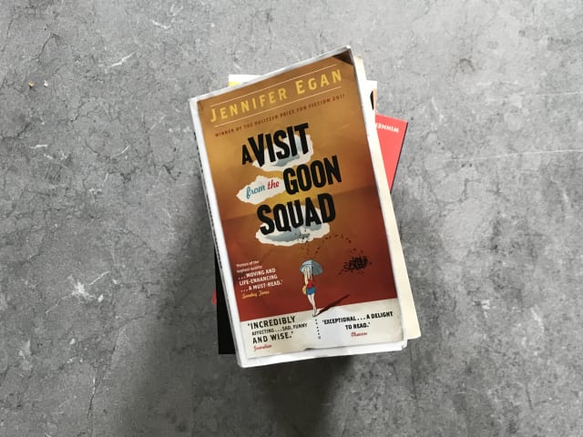
It’s set primarily in New York and tells the stories of a cast of interconnected characters (and their children) linked by the music industry, taking in themes of youth and ageing, loss and regret, insecurity, celebrity and image.
There are some great moments including Rob’s story which called to mind The Talented Mr Ripley; Jules’s unpublished and unhinged newspaper article on the celebrity interview which sent him to jail; and the dystopian final chapter which suggests where the internet and the world of influencers might be headed if we don’t watch out.
I loved author Jennifer Egan’s storytelling, dark humour and also the way she switched her writing style dependent on the era or character.
Recommended!
Intrinsically Responsive CSS Grid with minmax and min
Evan Minto notes that flexible grids created with CSS Grid’s repeat, auto-fill, and minmax are only intrinsically responsive (responsive to their container rather than the viewport) up to a point, because when the container width is narrower than the minimum width specified in minmax the grid children overflow.
Applying media queries to the grid is not a satisfactory solution because they relate to the the viewport (hence why Every Layout often prefer Flexbox to CSS Grid because it allows them to achieve intrinsic responsiveness).
However we’ll soon be able to suggest grid item width as a percentage of the parent container, avoiding the overflow problem. The new “CSS Math functions” to help us achieve this are min(), max() and clamp(). At the time of writing, these are only supported in Safari however Chrome support is in the pipeline.
GOV.UK Design System
Use this design system to make your service consistent with GOV.UK. Learn from the research and experience of other service teams and avoid repeating work that’s already been done.
Intro to CSS 3D transforms
Excellent tutorials by David DeSandro. I’ve already used the card flip and it worked really well.
Flickity – touch, responsive, flickable carousels
This slider/carousel certainly looks nice, and I like author David DeSandro’s work, having taken inspiration from his 3d Card Flip tutorial for a recent project. I’d just like to dig into it a little further to see how it fares in terms of accessibility before using it in the wild.
The Guardian Digital Design Style Guide
This is a nice whistle-stop tour of the the Guardian’s current digital design system. Apart from looking great, some of the terminology is interesting (fronts, kickers and thrashers) and I like the way they have different Card types for different types of article, “each having its own flavour and tone”.
Katherine Kato’s personal website
Some simple but inspiring work here from Seattle-based web developer Katherine Kato. I really like the use of space, the typography, the colour palette and the use of CSS grid for layout.
8 Days: To the Moon and Back (on BBC iPlayer)
Previously classified cockpit audio, recorded by the astronauts themselves, gives a unique insight into their fears and excitement as they undertake the mission. And dramatic reconstruction brings those recordings to life, recreating the crucial scenes that were never filmed - the exhilarating launch, the first sight of the moon, the dramatic touchdown and nail-biting journey home.
Original archive footage from the Apollo programme is combined with newly shot film and cinematic CGI to create the ultimate documentary of the ultimate human adventure.
This can only be described as a stunning audiovisual experience and a fantastic tribute on the 50-year anniversary of the Apollo 11 mission!
Rutger Hauer R.I.P.
Farewell Rutger Hauer; famous for his roles in Bladerunner, The Hitcher and the Guinness ads. And those were undoubtedly great, however… in 1989, for 13-year-old me at the height of my ninja obsession, he was the man as Nick Parker in Blind Fury, a film about a blind war veteran who is implausibly handy with a samurai sword and goes on to defeat Sho Kuzugi in the final showdown. It was daft, but I loved it.
Project Apollo Archive (on Flickr)
Over 8,400 NASA Apollo moon mission photos, online, in high-resolution.
CSS pointer-events to the rescue
Sometimes, for reasons unknown, we find that clicking or tapping an element just isn’t working. Here’s a CSS-based approach that might help.
I’ve recently encountered the scenario – usually in reasonably complex user interfaces – where I have an anchor (or ocassionally, a button) on which clicks or taps just aren’t working, i.e. they don’t trigger the event I was expecting.
On further investigation I found that this is often due to having an absolutely positioned element which is to some extent overlaying (or otherwise interfering with) our target clickable element. Alternatively, it may be because we needed a child/nested element inside our anchor or button and it is this element that the browser perceives as being the clicked or tapped element.
I’ve found that setting .my-elem { pointer-events: none; } on the obscuring element resolves the problem and get you back on track.
I’ll tell you wot – that woz a propa’ poolside page-turner and no mistake. Nice work Russ Forman.

Polypane: The browser for responsive web development and design
Polypane is a browser built specifically for developing responsive websites. It can present typical device resolutions side-by-side (for example iphone SE next to iphone 7 next to iPad) but also has some nice features such as automatically creating views based on your stylesheet’s media query breakpoints.
It’s a subscription service and at the moment I’m happy using a combination of Firefox Nightly and Chrome so I think I’ll wait this one out for the time being. But I’ll be keeping my eye on it!
Using aria-current is a win-win situation
The HTML attribute aria-current allows us to indicate the currently active element in a sequence. It’s not only great for accessibility but also doubles as a hook to style that element individually.
By using [aria-current] as your CSS selector (rather than a .current class) this also neatly binds and syncs the way you cater to the visual experience and the screen reader experience, reducing the ability for the latter to be forgotten about.
As Léonie Watson explains, according to WAI-ARIA 1.1 there are a number of useful values that the aria-current attribute can take:
pageto indicate the current page within a navigation menu or pagination section;stepfor the current step in a step-based process;datefor the current date.timefor the current time.
I’ve been using the aria-current="page" technique on a couple of navigation menus recently and it’s working well.
Also: my thanks go to Ethan Marcotte, David Kennedy and Lindsey. Ethan recently suggested that the industry should try harder regarding accessibility and recommended subscribing to David Kennedy’s a11y Weekly newsletter. I duly subscribed (it’s great!) and one of the issues linked to Lindsey’s article An Introduction to ARIA states in which I learned about aria-current.
Solar Design System by Bulb
It’s a collection of shared patterns and practices that allow our team to build quality user interfaces consistently and quickly.
My Sketch Cheatsheet
Here’s a list of useful (Mac-based) Sketch tips for my reference and yours.
Commands Quick Reference
| Task | Command | Notes |
|---|---|---|
| Add an artboard | a | or Insert > Artboard |
| Insert text element | t | |
| Insert rectangle | r | |
| Centre screen on current element | Command-2 | |
| Zoom out, centred on artboard | Escape then Command-2 then Command-0 | |
| Zoom in on current element to 100% of screen size | Command-0 | |
| Show and hide rulers | Control-R | or use “View” dropdown at top-right |
| Duplicate element | Hold Option while drag from original. Hold Shift for alignment | |
| Check distances | Select one layer then hold down Option then hover over the other layer | |
| Adjust text size by decimal increments | Hold Option while adjust size via right-hand panel | |
| Resize an image | Drag from sides or corners to your target size, holding shift to maintain aspect ratio | |
| Crop an image | Select then double-click image to go into image mode. Draw the rectangular shape you want to crop over the image, then select “crop” from top-right |
Key Concepts
Starting with an Artboard
The initial canvas is infinite so we need a fixed frame (representing a device screen) on which to work.
Steps:
- Add an artboard.
- From the top-right choose one of the options (presets) e.g. Responsive Web > Desktop (1024 × 1024) or select “Custom”.
- Rename your layer to something appropriate for the overall task, e.g. News Article.
Creating something
- Show rulers.
- Add markers by clicking in the horizontal ruler at the top to provide gutters. Create them at, say, 32px from each side.
- Add a text element, with lateral boundaries snapped to your markers. If it’s for body text, type my lorem0 shortcut 1.
Appendix
- the
lorem0shortcut accesses “lorem ipsum” text which I previously saved into Mac > Preferences > Keyboard > Text.
Bram Stein’s personal website
Bram Stein, a software architect at Adobe, wrote the book on Webfonts, so it’s no surprise that his own website showcases some pretty beautiful typography.
Type is set in Expo Serif Pro, Expo Sans Pro and Source Code Pro.
webmention.app: automate your outgoing webmentions
webmention.app is a great new project by Remy Sharp. He created it because he noticed that while adding webmentions to your site is relatively straightforward, sending outgoing webmentions is less so.
At the moment my personal website is Perch-based and I have webmentions enabled, so let’s see what happens when I .
Unsplash – Beautiful free images and pictures
The internet’s source of freely usable images. Powered by creators everywhere.
I’ve seen a couple of other developers use photos from Unsplash in their demos, and it just came in handy for me recently when needing some free food photography for a website.
It’s choc-full of lovely – and free – high-res photographs, offers a simple URL-based pattern for embedding, and has an API so will be really useful.
Guest reggae and dub mix on Vic’s Sunday Soundclash
A couple of weeks ago I was kindly asked to provide a guest DJ mix for the Vic’s Sunday Soundclash show on Radio Magnetic.
You can listen to the show on demand.
Here’s the tracklist for my mix:
- Black Uhuru - Chill Out
- Jackie Mittoo - Oboe
- Joe Higgs - There’s A Reward For Me
- UBrown - Me Chat You Rock
- Riddim Tuffa ft OBF - Food Dub Ninja
- Mosca - Prento
- The Royals - My Sweat Turns To Blood
- Tatham/Ranks/Lord/Mensah - Private Life
- Freddie McGregor w/ Sound Dimension - Africa Here I Come
- Carlton Patterson w/King Tubby - King At The Controls
- King Tubby - Herbal Dub
- Carlton Coffie - Chant Away
- Fabian - Prophecy
- Prophecy Dub
I really enjoyed the chance to pull together reggae, dub and dancefloor favourites (old and new) for the mix. Cheers for the invite, Vicky!
You can catch Vic’s Sunday Soundclash on the first Sunday of each month at 2pm on Radio Magnetic.
Codrops CSS Reference
Here’s a comprehensive and great-looking CSS reference featuring lots of examples.
While these days I normally reach for MDN Web Docs to keep me right on any given CSS feature, I’ve been thinking that with the recent explosion of new CSS features and syntax it’d be great to do a refresher course by working my way through a structured list of features—just like I did with Eric Meyer’s CSS: The Definitive Guide back in the day—and Codrops’ reference could be the perfect place.
In a similar vein, the CSS-Tricks Almanac looks good and cssreference.io is worth bookmarking, too.
Making a slider with just HTML and CSS (on CSS-Tricks)
Sliders (or carousels) are a fairly common practical requirement in web projects. Here, Chris Coyier shows us how far we can get in 2019 with HTML and CSS alone.
'Easy Sass' extension for Visual Studio Code (from wojciechsura on GitHub)
Automatically compiles SASS/SCSS files to .css and .min.css upon saving. You may also quickly compile all SCSS/SASS files in your project.
As I consider different ways in which to simplify my development stack and avoid excess tooling (much like Michelle Barker did), this might be worth a look.
(via @MicheBarks)
Fading out siblings on hover in CSS (by Trys Mudford)
Here’s a nice CSS-only hover technique from Trys Mudford incorporating scale transforms, opacity transitions and mouse pointer events.
Don’t set cursor: pointer on buttons
For many years I’ve been applying cursor: pointer to buttons because it felt right and would improve the user experience.
As Florens Verschelde explains, that approach is probably best avoided. I was going against the W3C’s spec that cursor: pointer should be reserved for links, and was adding to the usability antipattern where “everything resembles a link”.
I’ll leave button cursor behaviour as it is from here on in.
Using CSS display: contents to snap grandchild elements to a grid
I realised last night while watching a presentation by Lea Verou that I could streamline my CSS Grid layouts.
I’d been creating an overall page grid by setting body { display: grid; } then some grid areas but realised that this only worked for direct children and didn’t help with aligning more deeply nested elements to that outer grid.
For example in the case of the main header if I wanted its child logo, nav and search elements to snap to the body grid then I found myself having to duplicate the display: grid and grid-template-areas again on the header.
It didn’t feel very DRY but my understanding was that while we await subgrid, it was a necessary evil.
What I should have been using is display: contents.
If you set your header to display: contents then the parent (body) grid layout will apply to the header’s contents (logo, nav, etc) as if the header element (the “real” direct child of the grid) wasn’t there. This gives us good semantics without the need to redefine the grid on the header.
Here’s a codepen to illustrate.
I was aware of the existence of display: contents but somehow it hadn’t sunk in because I’d only read about it in the abstract. Lea Verou’s explanation made all the difference. Cheers, Lea!
Update 4/5/2019
Frustratingly, I’ve learned that although we can apply this technique, we shouldn’t… or at least not for a while.
Due to a bug in all supporting browsers the property will currently also remove the element (header in our case) from the accessibility tree meaning that its semantics will be lost.
For reference, see:
Update 11/4/2021
Thanks to Rachel Andrew for the heads-up that this issue is now fixed in both Firefox and Chrome.
We’re now just waiting for Edge and Safari to roll out fixes before we can regard this as a safe option.
The Art of DJing: Jeff Mills (on Resident Advisor)
Fair play, Jeff – once this interview gets going it’s pretty damn good.
Amongst other ground, it covers:
- The technique of “Subtraction”;
- the last quarter of records being the best;
- the bar for electronic music being set too low;
- the complexity of the art form of DJing; and
- thinking about other things while DJing in front of 2000 people…
Plenty of good bits to chew over!
How to control SVG icon size and colour in context
A while back I read a great SVG icon tip from Andy Bell which I’d been meaning to try and finally did so today. Andy recommended that for icons with text labels we set the width and height of the icons to 1em since that will size them proportionately to the adjacent text and additionally lets us use font-size to make any further sizing tweaks.
As previously mentioned, I’ve recently been working on my SVG skills.
Andy Bell’s SVG icon-sizing technique is really clever and feels like it adds lots of flexibility and future-friendliness so I was keen to try it out.
Here’s how it works.
The HTML:
<a class="call-to-action" href="/">
  <span>I’m a link</span>
    <svg
    class="cta-icon"
    aria-hidden="true"
    width="1em"
    height="1em"
    viewBox="0 0 14 13"
      xmlns="http://www.w3.org/2000/svg">
      <path
      fill="currentColor"
      fill-rule="evenodd"
        d="M3.49.868l7.683 3.634a2 2 0 0 1 .052 3.59l-7.682 3.913a2 2 0 0 1-2.908-1.782V2.676A2 2 0 0 1 3.49.868z">
    </path>
  </svg>
</a>

<a class="call-to-action call-to-action-alt" href="/">
  <span>I’m a large link</span>
    <svg
    class="cta-icon" aria-hidden="true"
    width="1em" height="1em"
    viewBox="0 0 14 13"
      xmlns="http://www.w3.org/2000/svg">
      <path
      fill="currentColor"
      fill-rule="evenodd"
        d="M3.49.868l7.683 3.634a2 2 0 0 1 .052 3.59l-7.682 3.913a2 2 0 0 1-2.908-1.782V2.676A2 2 0 0 1 3.49.868z">
    </path>
  </svg>
</a>
The CSS:
a { color: rgb(183, 65, 14); }

a:hover { color: #6A2000; }

.call-to-action {
  display: inline-flex;
  align-items: center;
  font-weight: bold;
}

.call-to-action-alt {
  font-size: 2rem;
}

.cta-icon {
  margin-left: .5em;
  font-size: .8em;
}
Here are my key takeaways:
- By applying
widthandheightof1emto our icon it is predictably sized by default. - It can now have its size further tweaked in CSS using
font-size, for example with ems (where1em= the font-size of the parent anchor element). - This technique requires the
viewboxattribute being present on the svg. - Apply the width and height =1em as inline attributes on the svg. We could apply them using CSS, however the inline approach avoids potentially massive icons showing in cases where CSS doesn’t load.
- To get the colour matching, apply
fill="currentColor"as an inline attribute on the svg’s path. - Now, when you apply a hover colour to the anchor in CSS, the icon will just pick that up. Nice!
- Applying
inline-flexto the anchor makes the vertical-alignment of text and icon easier. - Apply
aria-hiddento the icon because it’s mainly decorative so we don’t want it read out by screen readers.
$$ in the DevTools Console
I learned something new today when developing in the Firefox Dev Tools console (although this applies to Chrome too)—something which was really useful and which I thought I’d share.
Basically, type $$('selector') into the console (replacing selector as desired) and it’ll give you back all matching elements on the page.
So for example, $$('script') or $$('li').
Similarly you can select a single element by instead using one dollar sign ($).
These seem to be console shortcuts for document.querySelector() (in the case of $) and document.querySelectorAll() (in the case of $$).
The other really cool thing is that the resultant nodeList is returned as an array, so you could do e.g. $$('li').forEach(…) or similar.
via @rem (Remy Sharp)
Check localhost development on your iPhone
Here’s how to check the application you’re running locally on your MacBook on your iPhone.
It’s pretty much a case of connecting your iPhone to your MacBook by USB, tweaking some settings, then browsing to the application via a given IP in iOS Safari.
Stuffing the front end
Here’s Bridget Stewart, a developer from Ohio, with some thoroughly enjoyable “curmudgeonly” thoughts on why your website doesn’t necessarily need a Javascript framework.
With websites taking a median time of 5.8 seconds to show primary content (source: HTTPArchive) and Google warning us that 53% of mobile visits leave pages that take longer than three seconds to load, it’s hard to justify stuffing the front-end unnecessarily.
Bridget’s article also contains this quote which I love:
First, solve the problem. Then, write the code.
Essentially, don’t select the tooling first—a principle I fully endorse.
Accessible modal dialogues in 2019
I previously noted Keith J Grant’s article on the HTML dialog element which promised a native means of handling popups and modal dialogues. I’ve not yet used dialog in production, partly because of spotty browser support (although there is a polyfill) but also partly because—for reasons I couldn’t quite put my finger on after reading the spec—it just didn’t feel like the finished article.
Fast forward to March 2019 and Scott O’Hara has written an excellent piece describing why it’s still not ready. There are a combination of factors: lack of browser support, reliance on JavaScript; and multiple accessibility issues.
The good news is: having dug deeper into Scott’s work I see that among the many accessible components he has shared with the world is a custom, accessible modal dialogue. So next time the need arises, I think I’ll start there.
Thanks, Scott!
Box Shadow around the full box
Sometimes when coding a UI element you want a shadow around the whole box. However, most CSS box-shadow examples/tutorials tend to show inset box-shadows or ones that otherwise sit off to the side.
Here’s how to apply box-shadow to the whole box for a simple but nice effect.
.box-with-shadow {
  box-shadow: 0 0 4px #ccc;
}
And here’s how it looks:
Details and summary for no-JavaScript disclosure widgets
The fairly-recently added <details> element is a great, native HTML way to toggle content visibility.
Certbot Troubleshooting
When taking the DIY approach to building a new server, Certbot is a great option for installing secure certificates. However, sometimes you can run into problems. Here, I review the main recurring issues I’ve encountered and how I fixed them.
When creating new servers for my projects I use Certbot as a means of installing free Let’s Encrypt secure certificates.
It’s great to be able to get these certificates for free and the whole process is generally very straightforward. However, since working with Let’s Encrypt certificates over the last few years I’ve found that the same recurring questions tend to plague me.
This is a note to “future me” (and anyone else it might help) with answers to the questions I’ve pondered in the past.
How do I safely upgrade from the old LE system to Certbot?
For servers where you previously used the 2015/2016, pre-Certbot Let’s Encrypt system for installing SSL certs, you can just install Certbot on top and it will just work. It will supersede the old certificates without conflict.
How do I upgrade Certbot now that Let’s Encrypt have removed support for domain validation with TLS-SNI-01?
Essentially the server needs Certbot v0.28 or above. See Let’s Encrypt’s post on how to check your Certbot version and steps to take after upgrading to check everything is OK. To apply the upgrade I performed apt-get update && apt-get upgrade -y as root although depending on when you last did it this might be a bit risky as it could update a lot of packages rather than just the Certbot ones. It might be better to just try sudo apt-get install certbot python-certbot-apache.
To what extent should I configure my 443 VirtualHost block myself or is it done for me?
When creating a new vhost on your Linode, DigitalOcean (or other cloud hosting platform) server, you need only add the <VirtualHost *:80> directive. No need to add a <VirtualHost *:443> section, nor worry about pointing to LE certificate files, nor bother writing rules to redirect http to https like I used to. When you install your secure certificate, certbot will automatically add the redirect into your original file and create an additional vhost file (with extension -le.ssl.conf) based on the contents of your existing file but handling <VirtualHost *:443> and referencing all the LE SSL certificate files it installed elsewhere on the system.
How should I manage automated renewals?
There’s no longer any need to manually add a cron job for certiticate renewal. Auto-renewal of certificates is now handled by a cron job which comes bundled with the certbot package you initially install – in my case usually a certbot ppa package for Ubuntu 16.04 or 18.04. However you won’t find that cron job in the crontab for either your limited user, nor the root user. Instead, it is installed at a lower level (/etc/cron.d) and should just work unless you’ve done something fancy with systemd in your system which in my case is unlikely.
How can I tell if renewals are working and what should I do if they’re not?
If you notice that the SSL certificate for your domain is within 30 days of expiry and hasn’t yet auto-renewed, then you know that something has gone wrong with the auto-renewal process. You can test for problems by running sudo certbot renew --dry-run. You may find that there is, for example, a syntax error in your apache2.conf or nginx config file which needs corrected – not that I’ve ever been guilty of this, you understand…
W3C HTML Element Sampler
In all my years of spinning up “HTML Typographic Elements” lists or pages as a reference for designers, I didn’t realise that the W3C provide the very thing I needed in their HTML Element Sampler. These pages provide comprehensive dummy content covering all the main typographic elements which is really handy when designing a website’s typographic styles and pattern library.
Newspaper Terminology (from The Guardian)
The web and print are different media, however I still find some of print’s time-honoured terminology useful for naming things.
For example I use standfirst to identify intro paragraphs on Greenhill Journal Entries. This Guardian resource is a useful reference.
Styling a Select Like It’s 2019 (Filament Group, Inc.)
Recently, we’d seen some articles suggest that things haven’t changed a great deal with select's styling limitations, but I decided to return to the problem and tinker with it myself to be sure. As it turns out, a reasonable set of styles can create a consistent and attractive select across new browsers, while remaining just fine in older ones too.
Here’s a breakthrough in the always-frustrating field of styling form elements. Scott Jehl of Filament Group introduces a new technique for styling the select element in a modern way without the need for a parent element, pseudo-elements, or javascript. Thanks, Scott!
(via @scottjehl)
Promises in JavaScript
A brief explainer (for future-me and anyone else it helps) on what promises are and how to use them. Note: this is not an official definition, but rather one that works for me.
In the normal run of things, JavaScript code is synchronous. When line 1 has run (perhaps defining a new variable) and the operation has completed, line 2 runs (perhaps operating on the variable we just defined). However sometimes in line 1 we need to do something which will take longer – maybe an unknown length of time – for example to call a function which fetches data from an external API. In many cases we don’t mind that taking a while, or even eventually failing, but we want it to execute separately from the main JavaScript thread so as not to hold up the execution of line 2. So instead of waiting for the task to complete and return its value, our API-calling function instead returns a promise to supply that value in the future.
A Promise is an object we use for asynchronous operations. It’s a proxy for the success value or failure reason of the asynchronous operation, which at the time the promise is created is not necessarily yet known.
A promise is in one of three states:
- pending
- fulfilled (the operation completed successfully)
- rejected (the operation failed)
We say a pending promise can go on to be either fulfilled with a value, or rejected with a reason (error).
We also talk about a promise being settled when it is no longer pending.
One memorable analogy was provided in Mariko Kosaka’s The Promise of a Burger Party. In it she describes the scenario of ordering a burger from, say, Burger King. It goes something like this:
- you place your order for a Whopper;
- they give you a tray with a buzzer. The tray is a promise that they will provide your burger as soon as it has been cooked, and the buzzer is the promise‘s state;
- the buzzer is not buzzing to start with: it’s in the pending state;
- the buzzer buzzes: the promise is now settled;
- they might inform you that their flame-grill broke down half-way through. The cooking operation failed, and the promise of a burger has been rejected with that reason. You’ll likely want to act on that (by getting a refund);
- alternatively all goes to plan, you go the counter and they fulfil their promise of a tasty burger placed onto your tray.
- you decide you want to act on the success of getting your tasty burger by doing another thing, namely buying a coke. In code you’ll be within the
.then()method which is the success handler for your promise and in there you can just callbuyCoke(). (Note: thebuyCoke()operation might be synchronous; the real life analogy being that it’s so quick to pour a coke that the assistant does it and serves it on a tray immediately rather than giving you a tray as a promise for it.) At the end of yourthen()you might choose to return amealobject which combines your burger and coke. - You could then chain a further
.then()to the original.then()to work with your snowballing data value. This is becausethen()methods always return a promise (even if the operation within was not asynchronous), and we already know that promises are thenable (i.e. have athen()method) hence our ability to keep chaining.
Promise syntax
There are two things we need to be able to do with promises:
- create and return them;
- work with a returned promise.
Create and return a promise
When you create a promise you pass a function known as the executor to it, which runs instantly. Its arguments resolve and reject are callbacks provided by JavaScript. Our code goes inside the executor.
let examplePromise = new Promise(function(resolve, reject) {
  // do a thing, possibly async, then…

  if (/* everything turned out fine */) {
    resolve("Stuff worked!");
  } else {
    reject(Error("It broke"));
  }
});
Work with a returned promise
examplePromise.then(function(response) {
  console.log("Success!", response);
})
.catch(function(error) {
  console.log("Failed!", error);
})
References
My Git Cheatsheet
I’ve used Git for many years but it can still trip me up. At times I’ve worked primarily in a GUI (like Sourcetree or Fork), and other times directly on the command line. I’ve worked on projects where I’ve been the sole developer and others where I’m part of a large team. Regardless of the tools or context, I’ve learned there are certain need-to-knows. Here’s a list of useful Git concepts and commands for my reference and yours.
Note: the following is not an exhaustive list but rather the thing I keep coming back to and/or regularly forget. For deeper explanations, see the list of resources at the foot of the article.
Table of contents
- Starting work
- Remotes
- Committing updates
- Branches
- Save changes temporarily
- Staying current and compatible
- Reviewing your activity
- Fixing things
- Miscellaneous handy things
- Useful GitHub stuff
- Useful external resources
Starting work
Create a remotely-hosted repo
Option 1: Create a new repo in your Github account
This generates a new, empty repo (optionally initialised with a README).
Do this when you will be working on a new, dedicated project rather than contributing changes to a pre-existing one.
Option 2: Create repo from a “template repository” (owned by you or someone else)
This generates a new repo with the same directory structure and files as the template. It’s a good option for starting your own new, potentially long-lived project from a solid starting point.
Unlike a fork it does not include the entire commit history of the parent repository. Instead it starts with a single commit.
Github Reference: Creating a repository from a template
Option 3: Fork an existing repo (usually owned by someone else)
This generates a new repo which is a copy of another repo, including its commit history. Your commits will update your copy rather than the original repo.
Do this by clicking the Fork button in the header of a repository.
This is good for (often short-lived) collaboration on an existing repo. You can contribute code to someone else’s project, via PRs.
Github Reference: Working with forks
Start locally by cloning
clone creates a local copy on your computer of a remote (Github-hosted) repo.
cd projects
git clone https://github.com/githubusername/projectname.git optionallocaldirectoryname
You might be cloning a repo you own, or one owned by someone else (to use its features in your project).
Your local copy will, by default, have its origin remote set to the Github repo you cloned.
I cloned an empty new project
We’re in easy streets. The default remote is set exactly as you want it. Just write code, push at your leisure, and pull if/when you need to.
I cloned a pre-existing project (owned by me or someone else):
I plan to use it in my own, separate project
You might want to cut all ties and have a clean slate, git-wise.
rm -rf .git
git init
git remote add origin https://github.com/mygithubusername/mynewproject.git
git push -u origin master
Alternatively you might want to keep the original remote available so you can pull in its future project updates, but reset the origin remote to your new/target repo.
git remote rename origin upstream
git remote add origin https://github.com/mygithubusername/mynewproject.git
git push origin master
git pull origin master
# in the future the original repo gets an update
git pull upstream master
The source repo is my fork of a project to which I want to contribute
See Working with forks for how best to stay in sync and open PRs.
Duplicating (also knows as “duplicate without forking”)
This is a special type of clone. I know this is an option, but it‘s not one I’m familiar with or have had call to use. I can refer to Duplicating a repository if need be.
Start locally from a blank slate
Although cloning is the easiest way to get started locally, ocassionally I start by coding from scratch instead.
mkdir myproject && cd myproject
echo "# Welcome to My Project Repo" >> README.md
git init
git add README.md
git commit -m "first commit"

# go to Github and create an empty repo, if you haven’t already.
# then add as a remote
git remote add origin https://github.com/mygitusername/myproject.git

# push up, passing -u to set the remote branch as the default upstream branch our local branch will track
# this saves typing out ‘origin master’ repeatedly in future.
git push -u origin master
Remotes
Remove a remote from your local settings:
git remote rm <name>Rename a remote:
git remote rename oldname newnameConfiguration
Configure your favourite editor to be used for commit messages:
git config --global core.editor "nano"Use git st as a shortcut for git status (to stop me mistyping as “statsu”):
git config --global alias.st statusConfigure any setting:
git config [--global] <key> <value>

git config --global user.email "myname@domain.com"
Staging, unstaging and deleting files
# stage all unstaged files
git add .

# stage individual file/s
git add filename.txt
Unstage with reset (the opposite of git add):
# unstage all staged files
git reset .

# unstage individual file/s
git reset filename.txt
Delete a physical file and stage the deletion for the next commit:
git rm folder/filename.txtCommitting updates
Commit with a multi-line message:
git commitCommit with short message:
git commit -m "fix: typo in heading"Stage and commit all changes in a single command (note: doesn’t work with new, untracked files):
git commit -am "fix: typo in heading"Branches
Show all local branches:
git branchShow all local and remote branches:
git branch -aShow branches you last worked on (most recently commited to):
git branch --sort=-committerdateSave current state to new branch but don’t yet switch to it (useful after committing to wrong branch):
git branch newbranchnameCreate and switch to new branch (main or whatever branch you want to branch off):
git checkout -b mynewbranchNote that if you branch off foo_feature then when creating a PR in GitHub for your changes in mynewbranch you can change the Base branch from the default of main to foo_feature. This specifies that you are requesting your changes be merged into foo_feature rather than main and makes the comparison of changes relative to foo_feature rather than main.
Switch to an existing branch:
git checkout branchnameSave typing by setting the upstream remote branch for your local branch:
# git branch -u remotename/branchname
git branch -u fuzzylogic/v3

# now there’s no need to type origin master
git pull
Delete local branch:
git branch -d name_of_branch

# need to force it because of some merge issue or similar?
git branch -D name_of_branch
Save changes temporarily
stash is like a clipboard for git.
# Before changing branch, save changes you’re not ready to commit
git stash

# change branch, do other stuff. Then when return:
git stash pop
Staying current and compatible
fetch remote branch and merge simultaneously:
git pull remotename branchname

# common use case is to update our local copy of master
git pull origin master

# shorthand when a default upstream branch has been set
git pull

# an alternative is to update (fetch) which does not auto-merge, then 'reset' to the latest commit on the remote
# https://stackoverflow.com/questions/55731891/effects-of-git-remote-update-origin-prune-on-local-changes
git checkout master
git remote update --prune
git reset --hard origin/master
Merge another branch (e.g. master) into current branch:
git merge otherbranch

# a common requirement is to merge in master
git merge master
Rebasing
git rebase can be used as:
- an alternative to merge; and
- a means of tidying up our recent commits.
As an alternative to merge its main pro is that it leads to a more linear therefore easier-to-read history. Note however that it is potentially more disruptive therefore not right for every situation.
Say I’ve been working on a feature branch and I think it’s ready.
I might want to just tidy up my feature branch’s commits and can do this with an “interactive rebase”. This technique allows me to tidy my feature branch work to remove trivial, exploratory and generally less relevant commits so as to keep the commit history clean.
I might also want to bring in master to ensure synchronicity and compatibility. rebase sets the head of my feature branch to the head of master then adds my feature branch’s commits on top.
While it’s a good idea to rebase before making a PR, don’t use it after making a PR because from that point on the branch is public and rebasing a public branch can cause problems for collaborators on the branch. (The only exception to the previous rule is if you’re likely to be the only person working on the PR branch)
Rebuild your feature branch’s changes on top of master:
git checkout master
git pull origin master
git checkout myfeaturebranch
git rebase master
Force push your rebased branch (again, only when you’re unlikely to have/require collaborators on the PR):
git push --force origin myfeaturebranchTidy a feature branch before making a PR:
git checkout myfeaturebranch
git rebase -i master

# just tidy the last few (e.g. 3) commits
git rebase -i HEAD~3

# this opens a text editor listing all commits due to be moved, e.g.:
pick 33d5b7a Message for commit #1
pick 9480b3d Message for commit #2
pick 5c67e61 Message for commit #3

# change 'pick' to 'fixup' to condense commits, say if #2 was just a small fix to #1
pick 33d5b7a Message for commit #1
fixup 9480b3d Message for commit #2
pick 5c67e61 Message for commit #3

# alternatively if use 'squash', after saving it will open an editor
# and prompt you to set a new commit message for the combined stuff.
pick 33d5b7a Message for commit #1
squash 9480b3d Message for commit #2
squash 5c67e61 Message for commit #3
More on squash including a handly little video if I forget how it works.
Undo a rebase:
git reset --hard ORIG_HEADFor more detail, read Atlassian’s guide to rebasing.
Reviewing your activity
Show commit history (most recent first; q to quit):
git log

# compact version
git log --oneline

# limit scope to commits on a branch
git log branchname
Check if your feature branch is trailing behind:
# show commits in master that are not yet in my feature branch
git log --oneline my-feature..master

# show commits on remote branch that are not yet in my local branch
git log --pretty='format:%h - %an: %s' new-homepage..origin/new-homepage

# show commits by me that included “heroku” and that changed file Gemfile
git log --author=Demaree --grep=heroku --oneline Gemfile
Show changes that occurred in the most recent commit or a given commit.
git show

# show changes in a given commit
git show 591672e
Review differences between staged changes and last commit:
git diff --cachedReview changes between a given version/commit and the latest:
git diff 591672e..masterFixing Things
Discard all your as-yet uncommitted changes:
git restore .Get your local feature branch out of a problem state by resetting to the state it is on the remote (e.g. at last push).
git reset --hard origin/my-branchUndo all the changes in a given commit:
git revert 591672eAlter the previous commit (change the message and/or include further updates):
# we are amending the previous commit rather than creating a new commit.
# if file changes are staged, it amends previous commit to include those.
# if there are no staged changes, it lets us amend the previous commit’s message only.
git commit --amend
Move current branch tip backward to a given commit, reset the staging area to match, but leave the working directory alone:
git reset 591672e

# additionally reset the working directory to match the given commit
git reset --hard 591672e
See what the app/site was like (e.g. whether things worked or were broken) at a given previous commit, noting the following:
- You’re now “detatched”, in that your computer’s HEAD is pointing at a commit rather than a branch.
- You’re expected to merely review, not to make commits. Any commits you make would be “homeless”, since commits are supposed to go in branches. (However you could then branch off.)
git checkout 591672eReturn one or more files to the state they were in at a previous commit, without reverting everything else.
git checkout 3aa647dac9a8a251ca223a693d4c140fd3c1db11 /path/to/file.md /path/to/file2.erb

# if happy you then need to commit those changes
git commit
When git st reveals a list of staged files including lots of strange files you don’t want there mixed with others you do…
# add those you want to stay modified and staged
git add path/to/file-I-want-1.rb path/to/file-I-want-2.md

# this will clear all others out of the stage
git checkout .
Grab one or more commits from elsewhere and drop into your current branch:
git cherry-pick 591672e

# grab the last commit from a branch e.g. master
git cherry-pick master
Fix a pull that went wrong / shouldn’t have been done:
git pull origin branchname
# whoops!

git reflog
# shows a list of every thing you've
# done in git, across all branches!
# each one has an index HEAD@{index}
# find the one before you broke everything

git reset HEAD@{index}
# magic time machine
Miscellaneous handy things
Revert to the previous branch you were on
git checkout -Useful GitHub stuff
- Review your branches on a repo
- Review PRs and issues you’re subscribed to, i.e. ones on which you were active or mentioned
- Review your or another user’s PRs
- If you are fixing something that was raised in a GitHub issue, link that issue in your fix PR’s sidebar under Linked Issues (rather than just mentioning it in the PR) and it will automatically close the issue when you merge.
Useful external resources
- Tips, tutorials and Cheat Sheets from Atlassian
- Need to undo an old commit? Committed to master by mistake? Get out of trouble with Oh Shit, Git!
- More getting out of trouble: Git Flight Rules
- Oh-my-zsh Git aliases and how to add your own
- The original Pro Git reference
- Git for Humans by David Demaree from A List Apart is a great intro to the concepts and basic commands.
Definitive web font @font-face syntax
These days, whenever I’m about to use a web font on a new site I generally find myself running a google search for the latest “definitive @font-face syntax” that covers all modern browser/device needs.
For a long time I headed straight for Paul Irish’s Bulletproof @font-face Syntax but I noted a few years back that he’d stopped updating it.
When buying web fonts from type foundries such as Fontsmith the foundries do tend to provide their own guidelines. However, I’m not convinced that these are sufficiently cross-platform compatible.
Recently I’ve been reading Flexible Typesetting by Tim Brown and in it he recommends Webfont Handbook by Bram Stein. That’s now next on my reading list, however in the meantime I found an excerpt on A List Apart which specifically covers the best modern @font-face syntax.
Based on Stein’s advice, here’s what I’m now using.
@font-face {
    font-family: Elena;
    src: url(elena.woff2) format("woff2"),
         url(elena.woff) format("woff"),
         url(elena.otf) format("opentype");
}
Soon, when all browsers support the woff format we’ll be able to reduce this to simply:
@font-face {
    font-family: Elena;
    src: url(elena.woff2) format("woff2"),
         url(elena.woff) format("woff");
}
Surface Noise
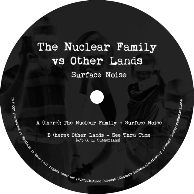
It’s taken a few years, but me and Tom are excited to be releasing a new record on our label, The Nuclear Family.
Titled Surface Noise, our third release will be available on both 12″ vinyl and digital, hitting all good record stores in early November ‘18.
You can pre-order it now from our Bandcamp page.
Here's what our press release says:
Artist: The Nuclear Family vs Other Lands Title: Surface Noise Label: The Nuclear Family A: The Nuclear Family - Surface Noise B: Other Lands - See Thru Time
Did you miss us? The Nuclear Family - Tom Churchill and Laurence Hughes - are back after a three-year hiatus, and this time we’ve roped in one of our good buddies, Other Lands, to help us deliver a double-header of deep delights for discerning DJs and dancers, cut nice and loud over a full side each.
Surface Noise, on side A, is the first of the Family’s recent studio jams to see the light of day, with its classic 808 drums and analogue bass underpinning warm pads, twinkling melodies and some subtle vocoder flourishes.
On the flipside, we’re honoured to present a killer track from Other Lands - aka Edinburgh’s veteran DJ/producer Gavin Sutherland, fresh from the success of his recent Pattern Transform 12” for Firecracker and all manner of other exciting studio and live projects. See Thru Time is a masterclass for the heads, with mellifluous chord progressions and a timeless groove.
TNF 003 will be available on vinyl via Rubadub in November, along with a digital version via Bandcamp.
Rise by Gina Miller
I’ve just read Rise by Gina Miller.
In 2016 Miller took the UK government to court for attempting to force through Article 50—the mechanism for starting Brexit—which would have lead to the nation leaving the EU without parliamentary consent.
Its title a reference to the Maya Angelou poem Still I Rise, the book is partly the author’s story of how she has been shaped by the successes and failures in her life, and partly a personal manifesto stating that every person can stand up and make a positive difference, even in the face of adversity.
Miller begins with her fight, in the aftermath of the Brexit vote and the “festering wounds” it exposed, to ensure that the UK’s democratic process and constitution be upheld. She traces her background as a child born in Guayana, a British colony at the time. As the daughter of a self-made man who became the country’s attorney general, she and her family saw Great Britain as the promised land, “a culture where the rule of law was observed and decency was embedded in the national fabric.” Since moving to the UK, forging a successful career and speaking up for her beliefs, that notion of justice and decency has come under scrutiny as she has been met with racist and sexual prejudice and abuse from all walks of society.
The author goes on to describe some of the specific challenges she has faced in her life including vicious hate mail, attacks by the press, being in an abusive marriage, and raising a daughter with special needs. In the end however, as a successful businesswoman with a happy family, hers is a story of strength and survival and a message of hope.
As a man, at times I felt that the book—which often returned to themes of female empowerment—perhaps wasn’t intended for me. Then on other occasions I felt that it was as important (if not more important) for me and other men as for anyone else to absorb these stories of sexist bullying, discrimination and abuse told from the female perspective.
Other core messages of the book were universal: finding your voice, speaking up when it is important to do so, overcoming adversity, and demonstrating tolerance in a divided society.
This was a book I picked up on a whim as a departure from my usual reading subjects, and I’m glad I did.
Cloudinary
Cloudinary is a very handy tool for image and video upload, storage, optimisation and CDN.
Store, transform, optimize, and deliver all your media assets with easy-to-use APIs, widgets, or user interface.
This was brought to my attention by Jason Grigsby at An Event Apart. We were discussing his article series on Responsive Images and I asked if he could recommend a tool which auto-generated all of the images you needed for your responsive image code, if you provide a single source image.
I’ve been trying Cloudinary out and so far, so good.
(via @grigs)
Atomic Design by Brad Frost
The original call-to-arms and manual for Design Systems.
Brad Frost explains why Design Systems are necessary, provides a methodology for Pattern Library creation, discusses Design System benefits and offers strategies for maintenance.
Image Color
A handy tool for identifying colours – provided in numerous different CSS-ready formats – and creating a complimentary colour palette from an image you upload or provide as a URL.
Small Victories
No CMS, no installation, no server, no coding required.
Another quick and clever way of creating a website; this time by collecting a bunch of files (HTML, video, images, bookmarks) into a folder, connecting Dropbox and Small Victories to that, choosing a theme and Hey Presto, you have a website.
I could see this as maybe being useful for some sort of transient campaign idea that doesn’t need a CMS and that you want others to be able to collaborate on.
Note: to get a custom domain and host CSS and JS files, you need to sign up to a paid plan, but at $4/month or $36/year it’s pretty cheap.
Carrd - simple, free, fully responsive one-page sites for pretty much anything
These days when friends tell me they want a personal website, it’s often just a single-page profile that they’re really after rather than something pricier and more complicated.
In the past there were services like http://flavors.me/ but it seems to have fallen by the wayside. This looks like a decent option to point friends toward if they’re not looking for a blog or want to take baby steps toward that. Incidentally, I came across Carrd through Chris Ferdinandi’s Vanilla JS List which features organisations which favour Vanilla JavaScript over JS frameworks.
Pendulum Sidespin Serve
Great video (in German with subtitles) which shows and tells the most important elements of this serve, namely:
- Brush the ball sideways extremely fast;
- Swing your wrist about 90° extremely fast when touching the ball; and
- The third bounce should be close to the side-edge of the table so that the opponent cannot easily attack and your spin has the strongest effect.
1984 by George Orwell
I’ve just read 1984 by George Orwell. I know, I know… I should have done this a long time ago. Anyway, here’s what I thought.
I remember a copy of 1984 being around the house when I was growing up but for some reason I never got around to reading it. I did, however, see the film when I was young – the “Room 101” scene in particular being unforgettable – and have always known the general plot.
On a recent work trip I realised while in the airport shop that I’d left a book at home so it seemed like as good a time as any to pick up a copy of 1984 and scratch this particular itch.
As a book about a dystopian future, I knew it would be dark, but it was even darker that I imagined. The constant sense of dread was really palpable.
I loved the concepts Orwell created – the Two Minutes Hate, doublethink, Thought Crime, Room 101 to name but a few.
I also loved the language in general and the appendix, The Principles of Newspeak.
And even though it was heart-wrenching and pretty harrowing, I loved the final descent into brainwashing (or “re-education”) and ultimately, betrayal.
This was an amazing book that I loved reading, while not necessarily always being ”enjoyable”.
Gifox 2 for Mac - Delightful GIF Recording and Sharing App
When watching presentations recently I’ve noticed that a few speakers use this tool to generate animated images for their slides.
Gifox is a menu bar app that records your screen into animated GIFs – a great compromise between static images and full-size videos.
TunnelBear – VPN Software for Bears
I was introduced to this smile-inducing website by Val Head’s An Event Apart Talk “Building more expressive projects”.
TunnelBear describes itself as “A more secure way to browse the web” and it does this by encrypting your internet connection to keep your online activity private on any network.
More interestingly to me, it succeeds at making a techy subject friendly by the use of illustrated and animated bears. And who doesn’t like bears?
Chicago 2018

I just made a first visit to Chicago. It was primarily to attend An Event Apart but I was lucky enough to have a little time to check out the city, too.
Firstly I want to thank all the friends who provided tips for things to do and see in The Windy City – Aleks, Susan, Jenny, Lucy, Alan and Karen, Collette etc – cheers!
Thanks also to Davie for jetting in from NYC to join me and Liam for a couple of days. I doff my cap to your knowledge of beautifully designed restaurants with really expensive menus 😉.
I also got the chance to catch up with old friend Nick Calingaert AKA Common Factor, a lovely guy and talented producer who DJed for me and my friends at a couple of our club nights back in the early 00s.
We only had a few days, but I felt we managed to cram in some good stuff. Here’s a summary of the highlights.
Eating out
- Swift & Sons
- Momataro
- Chicago Athletic Club (with its appropriately posh tag-line “Dine and Libate”…)
Bars
Record Shopping
- Gramaphone Records
- Dusty Groove
- Shuga Records, 1272 N. Milwaukee Ave
- Reckless Records
Cool Neighbourhoods
Culture / History
Things to do
And if we’d had more time…
Into The Outer feat. Other Lands, 27th October 2018 on NTS
Magical sounds in the mix, from Auld Reekie’s finest.
Other Lands consistently plays amazing records.
He’s also been cultivating a quirky but cuddly radio voice which, combined with the heartfelt electronic sounds, makes for a warm and fuzzy listen.
This two hour show is notable for featuring lots of amazing music from Glasgow and Edinburgh, including tracks by Being, Lord of the Isles, a cut from the Off-World Transmissions LP on Invisible Inc, and a preview of the forthcoming Mac-Talla Nan Creag sequel on Firecracker.
Gav also plays both sides of the new Nuclear Family EP and I'm chuffed for our record to feature in this company.
Namecheap
I’ve heard a couple of people mention that when they buy domain names, they use Namecheap because they are cheap and trustworthy.--- I tend not to have any particular favourites but I’ll maybe give Namecheap a go next time.
When in Chicago, buy #house

DJ Gig at Max’s Bar, Glasgow with Jamie Porter (21-07-18)

Jamie (aka Bud Burroughs of Stirling’s Jelly Roll Soul crew) kindly invited me to DJ with him at Max’s Bar last Saturday night (21st July ‘18).
We played from 9pm–3am. Max’s was rammed to the rafters as usual and it was fun to have six hours to play with, going through the gears and playing different styles and tempos. We also had some friendly faces for company – not only was it Jason Brunton’s birthday but we also had Chris Reid over from Italia and on the birras!
Music-wise, it was cool to mix on the DJR-400 and I particularly enjoyed playing EXU, the new one from Patrick Pulsinger & Irl:
Jamie played lots of tracks I liked, including an upbeat version of Space Jungle Luv by Oneness-Of-Juju that I would post but can’t find anywhere!
Thanks to Jamie for the invite, and if you don’t already know his productions, check out:
- The Mail Art EP by Bud Burroughs on Seventh Sign Recordings
- Jelly Roll Soul record label
- Too Many Voices by Dam-Ru on Temporize Recordings
Rubadub App
Rubadub have a new mobile app that delivers the RaD crew’s top vinyl recommendations (the best around) direct to your phone.
At a time when lots of vinyl releases are highly limited, this gets you early access to the latest heat before it disappears. It should also generally save untold hours browsing/searching since in their recommendations Rubadub have already done the job of separating the wheat from the chaff.
The app was developed by me and the team at Greenhill.
It was quite tricky, because aside from developing the mobile app itself there was a lot of API work needed to integrate it with Rubadub’s stock and e-commerce systems. We also built middleware specifically for machine-learning customer tastes.
The current v1 app handles the core feature of letting people listen to, save and buy records but there’s a lot of cool stuff vis-a-vis personalised messaging and taste-based recommendations on the roadmap. I’ve written about this in more detail over on Greenhill’s site.
The long-term idea is that it becomes the app equivalent of the actual record shop experience...i.e. going into Rubadub on Howard St and one of the guys/gals handing you a pile of tunes with a side of witty repartee.
If you’re a vinyl junkie like me or into electronic music in general, I recommend checking it out.
Stasiland
I've just finished reading Stasiland by Anna Funder, having received the recommendation from a friend.
It tells a series of extraordinary and often heart-wrenching stories from the underbelly of the former East Germany. I thought it was fantastic and highly recommend it.
Releasing early, releasing often… and avoiding paralysis by analysis
My name is Laurence Hughes and I’m a perfectionist. But I’m working on it.
I’ve suffered from the painful affliction of perfectionism for as long as I can remember (I blame the mother…) and although I’m much better than I used to be, I don’t think it ever fully leaves you.
Good things undoubtedly come from sweating the details, but a perfectionist streak left unchecked can cause creative endeavours to take longer than they otherwise would, sucking out the initial spark and motivation.
A related affliction – and this particularly applies to coding – is spending so long considering the many different ways to tackle a problem that you end up at a temporary standstill… i.e. paralysis by analysis.
At work, developing software for Greenhill, the perfectionist streak is kept in check because we follow the release early, release often philosophy and our development sprints just don’t allow time for it.
Release early, release often works well when we’re building applications for clients because it leads to a tighter feedback loop between the customers, the client and ourselves; and also leads to new features being released more regularly.
On this, my own website, I’m going to take that principle further and hopefully release even earlier and more often.
So – things may look rough and ready or even broken (temporarily) when you visit this site now or in the future. And in this case I’m OK with that. This isn’t a client’s site – it’s mine. The Minimum Viable Product (or baseline before progressive enhancement) is that visitors can read and navigate the content. Right now, at re-launch, it’s as simple as that. There’s no stylesheet as yet. It was more important for me to get the ball rolling than anything else. Hopefully as you read this, if the site in a state of flux (read: looks like a riot) you’ll still be able to enjoy the content! I have plenty of nice features in the pipeline but they’ll happen bit-by-bit, one step at a time.
This site is a work in progress – a bit like myself!
I’m just back from a fantastic couple of days in Brighton attending Ampersand – The Web Typography Conference – and also a Responsive Web Typography workshop with Richard Rutter at Clearleft.

Museum of the Moon at Mackintosh Queen’s Cross
Today I and my brother Martin and two nieces Sophie and Mia, made a first visit to the Mackintosh Church in Maryhill, Glasgow.
We were there to visit Museum of the Moon, a new touring artwork by UK artist Luke Jerram. I’d first heard about this exhibition when watching the BBC documentary Wonders of the Moon.
The installation is a fusion of lunar imagery, moonlight and surround sound composition created by BAFTA and Ivor Novello award winning composer Dan Jones. Measuring seven metres in diameter, the sculpture features 120dpi detailed NASA imagery of the lunar surface. At an approximate scale of 1:500,000, each centimetre represents 5km of the moon’s surface.
We all really enjoyed seeing this striking artwork in such a beautiful setting and learning a little more about the moon, too.
A Dao of Web Design (on A List Apart)
John Allsopp’s classic article in which he looks at the medium of web design through the prism of the Tao Te Ching, and encourages us to embrace the web’s inherent flexibility and fluidity.
It’s time to throw out the rituals of the printed page, and to engage the medium of the web and its own nature.
It’s choc-full of quotable lines, but here are a few of my favourites:
We must “accept the ebb and flow of things.”
Everything I’ve said so far could be summarized as: make pages which are adaptable.
…and…
The web’s greatest strength, I believe, is often seen as a limitation, as a defect. It is the nature of the web to be flexible, and it should be our role as designers and developers to embrace this flexibility, and produce pages which, by being flexible, are accessible to all. The journey begins by letting go of control, and becoming flexible.
Grid by Example
Great resource from CSS Grid expert Rachel Andrew, with the Patterns and Examples sections which provide quick-start grid layouts being particularly handy.
Meet the New Dialog Element
Introducing dialog: a new, easier, standards-based means of rendering a popup or modal dialogue.
The new element can be styled via CSS and comes with Javascript methods to show and close a dialog. We can also listen for and react to the show and close events.
Although currently only supported in Chrome, the Google Chrome dev team have provided a polyfill which patches support in all modern browsers and back to IE9.
Using the tabindex attribute | TPG
Léonie Watson explains how the HTML tabindex attribute is used to manage keyboard focus. Of particular interest to me was a clarification of what tabindex="-1" does (because I always forget).
tabindex="-1"
The element becomes programmatically focusable but isn’t included in the tab order. It can’t be reached by someone using the tab key to navigate through content, but it can be focused on with scripting via the focus() method.
We might use this because we want to be able to set focus to a particular element via a script. Léonie offers the example of a list of form errors.
Alternatively we might use this because we want to prevent a normally tabbable element from being tabbable. Sara Souidean uses this technique (in combination with aria-hidden=true) on e-commerce product teaser “media objects” in order to limit the number of duplicate links that keyboard users must tab through.
Tabindex on page targets to assist with keyboard focus
I’ve often seen tabindex="-1" used as a companion to the id attribute on elements of a page intended to be directly accessible via links. Examples include a main element that should be directly accessible from a “Skip to content” link, or the headings in a blog article to support sharing direct links to page sections.
Before HTML5, creating an internal “link target” required creating an anchor element that used the name attribute. In HTML5 this use of anchor was deprecated with authors instead encouraged to add the id attribute to any element they wish. The reason why developers added tabindex="-1" to their main and h2 (etc) “targets” is because some older browsers, when responding to a link to such a resource, would move visual focus to the target element (i.e. scroll to it) but not programatically set focus to it if the target element was not focusable. Including tabindex="-1" solved that problem.
Modern browsers move the focus correctly and so using tabindex for this purpose is no longer necessary.
tabindex="0"
Applying tabindex="0" to an element inserts it into the tabbing order based on its position in the source. It is not necessary to apply this to an interactive element such as a button or checkbox since they are focusable by default. You should use it sparingly (because it requires care to ensure accessibility) but you might use it on a custom element which needs to be interactive under certain circumstances such as the horizontally scrollable container in a Data Table.
tabindex="1+"
This imposes a tab order on the content that bears no resemblance to the expected tab order. It’s an antipattern. Don’t do it.
The best way to Install Node.js and NPM on a Mac
In modern front-end development, we tend to use a number of JavaScript-based build tools (such as task runners like Gulp) which have been created using Node.js and which we install using NPM. Here’s the best way I’ve found for installing and maintaining Node and NPM on a Mac.
To install and use NPM packages, we first need to install Node.js and NPM on our computer (in my case a Mac).
I’ve found that although the Node.js website includes an installer, using Homebrew is a better way to install Node and NPM on a Mac. Choosing the Homebrew route means you don’t have to install using sudo (or non-sudo but with complicated workarounds) which is great because it presents less risk of things going wrong later down the line. It also means you don’t need to mess around with your system $PATH.
Most importantly, it makes removing or updating Node really easy.
Installation
The whole process (after you have XCode and Homebrew installed) should only take you a few minutes.
Just open your Terminal app and type brew install node.
Updating Node and NPM
First, check whether or not Homebrew has the latest version of Node. In your Terminal type brew update.
Then, to Upgrade Node type: brew upgrade node.
Uninstalling Node and NPM
Uninstalling is as easy as running brew uninstall node.
Credits
This post was based on information from an excellent article on Treehouse.
See all tags.