
Tagged “browsers”

What the Spec episode 01: How Keith got super into browsers

Keith Cirkel shares his journey to contributing to web browsers as a web developer. If you’re curious about the learning curve, the standards process or simply, how to contribute to a browser without past experience, this episode is for you.

After attending Web Day Out and just missing Lola at the end, I read more about her and checked out her podcast.

Native CSS Nesting

I’ve started reading some entries from Manuel Matuzovic’s 100 days of (more or less) modern CSS series, and began with the excellent Day 99: Native Nesting. It clearly explains how to use the now-agreed syntax for various common scenarios.

The syntax is pretty close to what we’re used to doing with Sass, which is great!

Also, I’m now also clear that nested selectors must always start with a symbol rather than a letter. Often they would naturally do so anyway, for example when nesting a class since that already starts with a symbol (a full stop). But in cases where they wouldn’t – essentially only when nesting an “element selector” – we start it with an “&”. So:

main { & article { ... } }

Straightforward enough!

Regarding browser support for CSS nesting, at the time of writing it is available in Chrome and Safari Technology Preview only.

I would therefore only use it for demos and for the most non-essential enhancements. We’ll need to hold off any full-scale switch from Sass nesting to CSS nesting for large and important production websites until this is in Firefox and standard Safari, and until a sufficient percentage of users has the up-to-date versions. So a little while away yet, but given the current rate of browser updates, likely sooner than we might think!

Saving CSS changes in DevTools without leaving the browser

Scott Jehl recently tweeted:

Browser devtools have made redesigning a site such a pleasure. I love writing and adjusting a CSS file right in the sources panel and seeing design changes happen as I type, and saving it back to the file. (…) Designing against live HTML allows happy accidents and discoveries to happen that I wouldn't think of in an unconstrained design mockup

I feel very late to the party here. I tend to tinker in the DevTools Element Styles panel rather than save changes. So, inspired by Scott, I’ve just tried this out on my personal website. Here’s what I did.

  1. started up my 11ty-based site locally which launches a localhost URL for viewing it in the browser;
  2. opened Chrome’s DevTools at Sources;
  3. checked the box “Enable local overrides” then followed the prompts to allow access to the folder containing my SCSS files;
  4. opened an SCSS file in the Sources tab for editing side-by-side with my site in the browser;
  5. made a change, hit Cmd-S to save and marvelled at the fact that this updated that file, as confirmed by a quick git status check.
  6. switched to the Elements panel, opened its Styles subpanel, made an element style change there too, then confirmed that this alternative approach also saves changes to a file.

This is a really interesting and efficient way of working in the browser and I can see me using it.

There are also a couple of challenges which I’ll probably want to consider. Right now when I make a change to a Sass file, the browser takes a while to reflect that change, which diminishes the benefit of this approach. My site is set up such that Eleventy watches for changes to the sass folder as a trigger for rebuilding the static site. This is because for optimal performance I’m purging the compiled and combined CSS and inlining that into the <head> of every file… which unfortunately means that when the CSS is changed, every file needs rebuilt. So I need to wait for Eleventy to do its build thing until the page I’m viewing shows my CSS change.

To allow my SCSS changes to be built and reflected faster I might consider no longer inlining CSS, or only inlining a small amount of critical stuff… or maybe (as best of all worlds) only do the inlining for production builds but not in development. Yeah, I like that latter idea. Food for thought!

How to debug event listeners with your browser’s developer tools (on Go Make Things)

On the page, right-click the element you want to debug event listeners for, then click Inspect Element. In chromium-based browsers like MS Edge and Google Chrome, click the Event Listeners tab in Developer Tools. There, you’ll see a list of all of the events being listened to on that element. If you expand the event, you can see what element they’re attached to and click a link to open up the actual event listener itself in the JavaScript.


Comparing Browsers for Responsive Design (on CSS-Tricks)

Chris Coyier checks out Sizzy, Polypane et al and decides which suits him best.

There are a number of these desktop apps where the goal is showing your site at different dimensions all at the same time. So you can, for example, be writing CSS and making sure it’s working across all the viewports in a single glance.

I noticed Andy Bell recommending Sizzy so I’m interested to give it a go. Polypane got Chris’s vote, but is a little more expensive at ~£8 per month versus ~£5, so I should do a little shoot-out of my own.

My DevTools Cheatsheet

Here’s a (work in progress) list of useful (Mac) Browser DevTools tips, tricks and keyboard shortcuts for my reference and yours. This is a work in progress and I’ll update it as I go.

Console Panel

Return currently selected element to work with

$0

Then you can execute its methods or inspect its attribute values, for example:

$0.offsetParent

Debug event-based behaviour

In Chrome, right-click on the relevant element (e.g. a button) and select “Inspect Element”. By default, the Styles panel is selected but instead select the Event Listeners panel. In there you can see all events (e.g. click) currently being listened for on that element (and its parent elements so as to include instances of event delegation).

Each event can be expanded to show which element has the event listener attached – for example it might be the current element or might be document. From here you can get to the script containing the code. Click a line number within the code to add a breakpoint. This will pause code execution on that line until you click the play button to continue. You might also log the current value of a variable here.

Pause JavaScript execution

Cmd + backslash

Firefox

Get responsive img element’s currentSrc

Inspect the element, right click and select Show DOM Properties from the context menu.

Google Chrome

Open the Command Menu

Command+Shift+P

Disable JavaScript

Open the Command Menu then type “disable” and you’ll see the option.

Get responsive img element’s currentSrc

Inspect the element, click the properties tab, toggle open the top item.

Throttle network/bandwidth

Go to tab Network then change Throttling to your desired setting, for example “Slow 3G”, or “offline”.

References
Saying bye-bye to autoprefixer

For a while now I’ve been using gulp-autoprefixer as part of my front-end build system. However, I’ve just removed it from my boilerplate. Here’s why.

The npm module gulp-autoprefixer takes your standard CSS then automatically parses the rules and generates any necessary vendor-prefixed versions, such as ::-webkit-input-placeholder to patch support for ::placeholder in older Webkit browsers.

I’ve often felt it excessive—like using a hammer to crack a nut. And I’ve wondered if it might be doing more harm than good, by leading me to believe I have a magical sticking plaster for non-supporting browsers when actually (especially in the case of IE) the specific way in which a browser lacks support might be more nuanced. Furthermore I’ve never liked the noise generated by all those extra rules in my CSS output, especially when using the inspector to debug what would otherwise be just a few lines of CSS.

But I always felt it was a necessary evil.

However, I’ve just removed gulp-autoprefixer from my boilerplate. Why? Because:

  1. Browsers are no longer shipping any new CSS with prefixes, and as at 2019, they haven’t been for years;
  2. With the browsers that do require prefixed CSS now old and in the minority, it feels like progressive enhancement rather than “kitchen sink” autoprefixing should take care of them. (Those browsers might not get the enhanced experience but what they’ll get will be fine.)

Jen Simmons’ tweet on this topic was the push I needed.

So I’ve removed one layer of complexity from my set-up, and so far nothing has exploded. Let’s see how it goes.

Polypane: The browser for responsive web development and design

Polypane is a browser built specifically for developing responsive websites. It can present typical device resolutions side-by-side (for example iphone SE next to iphone 7 next to iPad) but also has some nice features such as automatically creating views based on your stylesheet’s media query breakpoints.

It’s a subscription service and at the moment I’m happy using a combination of Firefox Nightly and Chrome so I think I’ll wait this one out for the time being. But I’ll be keeping my eye on it!

WorldWideWeb Rebuild

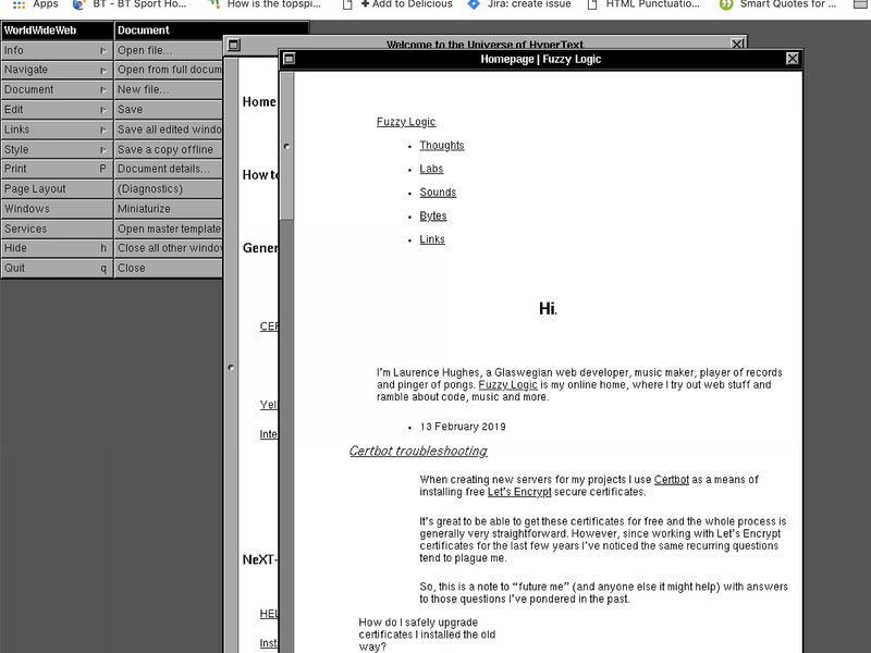
fuzzylogic.me rendered on the WorldWideWeb browser
fuzzylogic.me rendered on WorldWideWeb – not pretty, but readable!

This February, a team of intrepid developers and designers flew into CERN on a mission to recreate WorldWideWeb – the original web browser from 1990 – within a contemporary browser. This would allow all of us to “experience the rather humble origins of this transformative technology”.

What a fantastic project and fitting celebration of 30 years of the web.

And just for fun, see above for a screenshot of how fuzzylogic.me renders on WorldWideWeb.

See all tags.