Two lovely new websites (or website updates) appeared on my radar this last week that I wanted to note here for future front-end inspiration.
Vitaly Friedman’s Smart Interface Patterns has had some lovely animation and component work from Clearleft alumni Cassie Evans and Trys Mudford. Given Vitaly’s obsession with creating accessible, user-friendly components and the collaborators he has on board, I expect this site to be choc-full of well crafted nuggets for reference! It looks ace, too.
I noted a while ago that the W3C had a new Design System, and now the W3C has a new website in beta too. I imagine it might use components from that Design System alongside other carefully-considered patterns of markup, style and behaviour.
SVG is an amazing technology which I regularly use for icons and occasionally for logos and illustrations. I’ve also dipped my toe into animated SVG. But if I’m honest I still find some SVG concepts confusing so I’ve gathered some useful tips here for future reference. Note: this is a living document which I’ll expand over time.
It’s an image format (like jpg and png) but also an XML-based markup language. So it’s a bit like HTML in that you can “compose a whole from a bunch of parts” – but it is focused on graphics. As a web graphics technology it has many benefits, for example:
scalable,
manipulable by CSS and JS,
has a small file-size if well-optimised, and
can be made accessible.
It’s built for drawing in a way HTML and CSS are not.
It can guide users, reduce their cognitive load, and provide personality and moments of fun.
Let’s break down the key elements of the SVG coordinate system.
Canvas
The canvas is the area where the SVG content is drawn. It’s infinite in both dimensions therefore the SVG can be any size.
Viewport
Although the canvas is infinite, the SVG is rendered on the screen relative to a finite region known as the viewport. Areas of the SVG that lie beyond the boundaries of the viewport are not visible. This is similar to a browser viewport. On a long page you don’t see all the content; just a portion of it.
Specify the viewport size by giving your <svg> element a width and height, e.g.:
We could specify units (such as em or px) but don’t need to. Unitless values are regarded as being set in user space using user units which effectively equate to pixels so our example above renders a 600px by 400px viewport.
The width of the viewport can also be set in CSS. Setting width:100% makes the SVG viewport fluid in a given container.
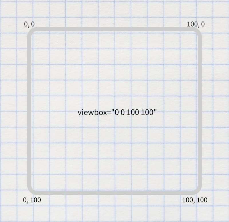
Viewbox
The viewport coordinate system starts at the top left (0, 0) corner of the SVG viewport. The user coordinate system is by default identical to that of the viewport, starting in the same place and with equal dimensions and units, however it can be modified using the viewBox attribute.
viewBox takes a value in the format: x y width height. The first two values set the upper-left corner of the viewbox and the second two its dimensions.
You can set the aspect ratio of the viewbox to the same as for the SVG viewport, or differently.
You might (optionally) use the viewBox attribute to transform the SVG graphic by scaling or translating it, or to crop it.
Specifying a smaller viewbox than viewport results in cropping the graphic to those dimensions and then zooming it in i.e. scaling it up so that it fills the entire viewport area.
Arranging elements on a grid
Cassie Evans recommends that when planning an arrangement of elements it’s nice to start with a simple grid using nice round numbers such as 100×100 – per the following <svg> – making it easy to then plot elements on top. You might even start by sketching with paper and pencil.
Having tried various icon systems including using <symbol> and <use>, Chris Coyier advocates that it’s perhaps simpler and better to just include the icons inline. Perhaps use the appropriate include technique for your stack to keep the code maintainable.
Choose an SVG embedding technique that suits the task
There are a variety of flavours and uses of SVG, including:
icons
infographics
illustrations
SVG that include text
SVG that include animation.
As Sara Souidean covers in her talk “A Smashing Case Study”, your choice of SVG embedding technique depends on the nature of the project and the specific use case.
To do: summarise Sara’s technique for SVG with illustration and accessible text.
Choose the best-performing format
When you’re tasked with coding an illustration-based image, it’s tempying to automatically see that as a job for SVG. However keep in mind that for some images the SVG file size will be massive and PNG will perform much better, so compare the two options.
Exporting and optimising SVG in design tools
To export an SVG in Figma, right-click it (or select it on the left hand side) then select “copy as SVG”. There’s also an “export as SVG” option on the right.
A new animation library, built on the Web Animations API for the smallest filesize and the fastest performance.
This JavaScript-based animation library—which can be installed via npm—leans on an existing web API to keep its file size low and uses hardware accelerated animations where possible to achieve impressively smooth results.
For fairly basic animations, this might provide an attractive alternative to the heavier Greensock. The Motion docs do however flag the limitation that it can only animate “CSS styles”. They also say “SVG styles work fine”. I hope by this they mean SVG presentation attributes rather than inline CSS on an SVG, although it’s hard to tell. However their examples look promising.
The docs website also contains some really great background information regarding animation performance.
SVG Gobbler is a browser extension that finds the vector content on the page you’re viewing and gives you the option to download, optimize, copy, view the code, or export it as an image.
This is a pretty handy Chrome extension that grabs all the SVGs on a webpage and lets you see them all in a grid.
Here’s a smart and comprehensive tutorial from Andy Bell on how to create a progressively enhanced narrow-screen navigation solution using a custom element. Andy also uses Proxy for “enabled” and “open” state management, ResizeObserver on the custom element’s containing header for a Container Query like solution, and puts some serious effort into accessible focus management.
One thing I found really interesting was that Andy was able to style child elements of the custom element (as opposed to just elements which were present in the original unenhanced markup) from his global CSS. My understanding is that you can’t get styles other than inheritable properties through the Shadow Boundary so this had me scratching my head. I think the explanation is that Andy is not attaching the elements he creates in JavaScript to the Shadow DOM but rather rewriting and re-rendering the element’s innerHTML. This is an interesting approach and solution for getting around web component styling issues. I see elsewhere online that the innerHTML based approach is frowned upon however Andy doesn’t “throw out” the original markup but instead augments it.
A lovely post by Cassie Evans in which she demonstrates that SVG is not just for icons and illustrations. You might also reach for it to create a responsive, animated grid of images.
we have another grid at our disposal. SVG has its own internal coordinate system and it's responsive by design.
There are lots of interesting techniques in here such as:
layering an <image> on top of a shape such as a <rect>;
using preserveAspectRatio to make the image fully cover and fit the shape when their aspect ratios differ;
using <clipPath> as a custom-shaped window to an image (for example a <circle>);
giving the <clipPath>’s nested shape a solid fill to hide the <image> to which it’s applied;
animating a rectangular <clipPath> applied to an image to give the effect of the image “sliding into view”; and
using Greensock to make sequencing multiple animations easy and to ensure they work consistently across browsers.
However I also loved this simple piece of practical advice to help picture the SVG’s viewbox and plot shapes on top:
I usually get a pen and paper out at this point and doodle it out.
Here’s how I’d handle various common SVG icon scenarios with accessibility in mind.
Just an icon
So this is an icon that’s not within a link or button and has no adjacent text. This might be, for example, an upward-pointing arrow icon in a <td> in a “league table” where the arrow is intended to indicate a trend such as “The figure has increased” or “Moving up the table”.
The point here is that in this scenario the SVG is content rather than decoration.
<svgrole="img"focusable="false"aria-labelledby="arrow-title"><titleid="arrow-title">Balance has increased</title><path…>…</path
</svg>
Note: Fizz Studio’s article Reliable valid SVG accessibility suggests that the addition of aria-labelledby pointing to an id for the <title> (as Léonie originally recommended) is no longer necessary. That’s encouraging, but as it does no harm to keep it I think I’ll continue to include it for the moment.
The same article also offers that maybe we should not use the SVG <title> element (and use aria-label to provide an accessible name instead) due to the fact that it leads to a potentially undesirable tooltip, much like the HTML title attribute does. To be honest I’m OK with this and don’t see it as a problem, and as I mention later have heard probably even more problematic things about aria-label so will stick with <title>.
Button (or link) with icon plus text
This is easy. Hide the icon from Assistive Technology using aria-hidden to avoid unnecessary repetition and rely on the text as the accessible name for the button or link.
In this case the design spec is for a button with no accompanying text, therefore we must add the accessible name for Assistive Technologies ourselves.
Here’s a neat trick. You can use an emoji as a favicon! I’ve written previously about how to do favicons properly, but for a short-lived hack project you tend to just need something quick and dirty. Chris Coyier has also shared a nice lil’ Codepen website showing the technique in action.
Now that all modern browsers support SVG favicons, here's how to turn any emoji into a favicon.svg:
I wanted to see if it was possible to create SVG charts that would work without JS. Well, it is. I've also created an experimental Svelte component library called Pancake to make these techniques easier to use.
A lovely modern, progressively-enhanced approach to data visualisation that uses primarily SVG, HTML and CSS but can be enhanced with JavaScript for Node-based generation or client-side interactivity, if required. (via @jamesmockett)
I’ve been admiring the wave effect at the foot of banners on Netlify’s website and had noted that they were achieved using SVG. So this tool which helps you “make waves” is pretty timely!
A while back I read a great SVG icon tip from Andy Bell which I’d been meaning to try and finally did so today. Andy recommended that for icons with text labels we set the width and height of the icons to 1em since that will size them proportionately to the adjacent text and additionally lets us use font-size to make any further sizing tweaks.
By applying width and height of 1em to our icon it is predictably sized by default.
It can now have its size further tweaked in CSS using font-size, for example with ems (where 1em = the font-size of the parent anchor element).
This technique requires the viewbox attribute being present on the svg.
Apply the width and height =1em as inline attributes on the svg. We could apply them using CSS, however the inline approach avoids potentially massive icons showing in cases where CSS doesn’t load.
To get the colour matching, apply fill="currentColor" as an inline attribute on the svg’s path.
Now, when you apply a hover colour to the anchor in CSS, the icon will just pick that up. Nice!
Applying inline-flex to the anchor makes the vertical-alignment of text and icon easier.
Apply aria-hidden to the icon because it’s mainly decorative so we don’t want it read out by screen readers.