Journal
Jank-free Responsive Images
Here’s how to improve performance and prevent layout jank when browsers load responsive images.
Since the advent of the Responsive Web Design era many of us, in our rush to make images flexible and adaptive, stopped applying the HTML width and height attributes to our images. Instead we’ve let CSS handle the image, setting a width or max-width of 100% so that our images can grow and shrink but not extend beyond the width of their parent container.
However there was a side-effect in that browsers load text first and images later, and if an image’s dimensions are not specified in the HTML then the browser can’t assign appropriate space to it before it loads. Then, when the image finally loads, this bumps the layout – affecting surrounding elements in a nasty, janky way.
CSS-tricks have written about this several times however I’d never found a solid conclusion.
Chrome’s Performance Warning
The other day I was testing this here website in Chrome and noticed that if you don’t provide images with inline width and height attributes, Chrome will show a console warning that this is negatively affecting performance.
Based on that, I made the following updates:
- I added width and height HTML attributes to all images; and
- I changed my CSS from
img { max-width: 100%; }toimg { width: 100%; height: auto; }.
NB the reason behind #2 was that I found that that CSS works better with an image with inline dimensions than max-width does.
Which dimensions should we use?
Since an image’s actual rendered dimensions will depend on the viewport size and we can’t anticipate that viewport size, I plumped for a width of 320 (a narrow mobile width) × height of 240, which fits with this site’s standard image aspect ratio of 4:3.
I wasn’t sure if this was a good approach. Perhaps I should have picked values which represented the dimensions of the image on desktop.
Jen Simmons to the rescue
Jen Simmons of Mozilla has just posted a video which not only confirmed that my above approach was sound, but also provided lots of other useful context.
Essentially, we should start re-applying HTML width and height attributes to our images, because in soon-to-drop Firefox and Chrome updates the browser will use these dimensions to calculate the image’s aspect ratio and thereby be able to allocate the exact required space.
The actual dimensions we provide don’t matter too much so long as they represent the correct aspect ratio.
Also, if we use the modern srcset and sizes syntax to offer the browser different image options (like I do on this site), so long as the different images are the same aspect ratio then this solution will continue to work well.
There’s no solution at present for the Art Direction use case – where we want to provide different aspect ratios dependent on viewport size – but hopefully that will come along next.
I just tested this new feature in Firefox Nightly 72, using the Inspector’s Network tab to set “throttling” to 2G to simulate a slow-loading connection, and it worked really well!
Lazy Loading
One thing I’m keen to test is that my newly-added inline width and height attributes play well with loading="lazy". I don’t see why they shouldn’t and in fact they should in theory all support each other well. In tests so far everything seems good, however since loading="lazy" is currently only implemented in Chrome I should re-test images in Chrome once it adds support for the new image aspect ratio calculating feature, around the end of 2019.
Beyond Automatic Testing (matuzo.at)
Six accessibility tests Viennese Front-end Developer Manuel Matusovic runs on every website he develops, beyond simply running a Lighthouse audit.
Includes “Test in Grayscale Mode” and “Test with no mouse to check tabbing and focus styles”.
Do Androids Dream of Electric Sheep? by Philip K. Dick
In my ongoing quest to catch up on books I should have read years ago, I recently finished reading “Do Androids Dream of Electric Sheep?” – the book on which Bladerunner was based.
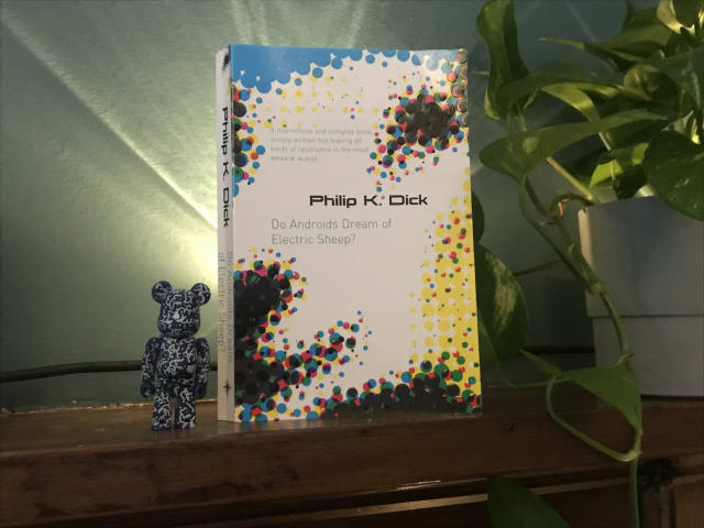
I’m a big Bladerunner fan – and also loved last year’s follow up movie, Bladerunner 2049 – but for me, the book was a mixed bag.
It illuminated some of the parts of the film that in retrospect hadn’t fully sunk in – like why animals (such as Tyrell Corp’s owl) were so important in post-apocalyptic San Fransisco, due to most species being endangered or extinct.
It also went much deeper into the question of whether empathy and similar social emotions were solely human abilities or could be felt by androids too. And I can see now see why this was explored further with lead character Joe in Bladerunner 2049.
On the downside, the techno-religious angle of Mercerism didn’t really work for me – although maybe I didn’t pick up properly on the metaphor. Also, I was kind of disappointed to learn that there actually is an electric sheep in the story! I had always loved the title and thought it was just a really clever reference to counting sheep in your dreams, rather than something so literal. Never mind!
All of the downsides were worth it, however, for the detailed parts about Voight-Kampff empathy tests. I have always loved the ideas and language around this, such as measuring androids for their Blush Response and other signs of empathy when asked questions which would normally elicit a reaction in humans.
All in, I’m glad I read it to gain the additional background to the movies.
I’m now off to watch Bladerunner again.
Original 1979 copies of Garden of Eden’s Everybody’s on a Trip regularly sell for £200+ so I was pretty happy to hear that it had just been reissued on Backatcha records… and even happier when I managed to snag a copy.
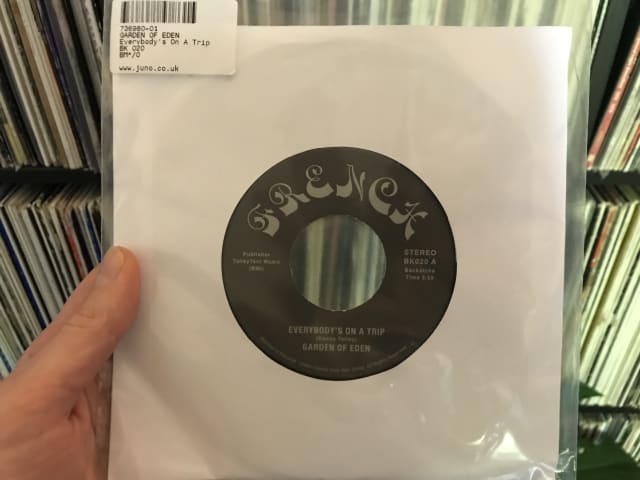
I first heard this stellar slice of deep funk a few years back on Kon and Amir’s compilation Off Track Volume One: The Bronx, and have been hankering after a proper copy ever since.
Check it out!
U.S. Supreme Court Favors Digital Accessibility in Domino’s Case
Digital products which are a public accommodation must be accessible, or will be subject to a lawsuit (and probably lose).
This US Supreme Court decision on October 7, 2019 represents a pretty favourable win for digital accessibility against a big fish that was trying to shirk its responsibilities.
Replicating Jekyll’s markdownify filter in Nunjucks with Eleventy
Here, Ed provides some handy code to convert a Markdown-formatted string into HTML in Nunjucks via an Eleventy shortcode.
This performs the same role as the markdownify filter in Jekyll.
I’m now using it on this site in listings, using the shortcode to convert blog entry excerpts written in markdown (which might contain code or italics, etc) into the target HTML.
Semantic Commit Messages
A fairly rigid commit format (chore, fix, feat etc) which should lead to your git log being an easy-to-skim changelog.
I’d noticed that my git commit messages could benefit from greater consistency. So I’ve started adopting Sparkbox’s approach.
Here’s how to use the different commit types:
chore: add Oyster build script
docs: explain hat wobble
feat: add beta sequence
fix: remove broken confirmation message
refactor: share logic between 4d3d3d3 and flarhgunnstow
style: convert tabs to spaces
test: ensure Tayne retains clothing
The Testament of Gideon Mack by James Robertson
A strange, otherwordly and often pretty funny tale of a Scottish minister’s dance with The Devil.
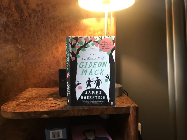
Cheers for the recommendation, Mick!
Lazy load embedded YouTube videos (CSS-Tricks)
This is a very clever idea via Arthur Corenzan. Rather than use the default YouTube embed, which adds a crapload of resources to a page whether the user plays the video or not, use the little tiny placeholder webpage that is just an image you can click that is linked to the YouTube embed.
Here’s a performance-enhancing trick for embedding youtube videos which eschews the default YouTube embed (and all the resources it adds to a page whether the video plays or not) in favour of rendering a tiny placeholder webpage in the srcdoc attribute.
Importantly, the user experience with the video remains the same.
Relearn CSS layout: Every Layout
Every now and then something comes along in the world of web design that represents a substantial shift. The launch of Every Layout, a new project from Heydon Pickering and Andy Bell, feels like one such moment.
In simple terms, we get a bunch of responsive layout utilities: a Box, a Stack, a Sidebar layout and so on. However Every Layout offers so much more—in fact for me it has provided whole new ways of thinking and talking about modern web development. In that sense I’m starting to regard it in terms of classic, game-changing books like Responsive Web Design and Mobile First.
Every Layout’s components, or primitives, are self-governing and free from media queries. This is a great step forward because media queries tie layout changes to the viewport, and that’s suboptimal when our goal is to create modular components for Design Systems which should adapt to variously-sized containers. Every Layout describe their components as existing in a quantum state: simultaneously offering both narrow and wide configurations. Importantly, the way their layouts adapt is also linked to the dynamic available space in the container and the intrinsic width of its contents, which leads to more fluid, organic responsiveness.
Every Layout’s approach feels perfect for the new era of CSS layout where we have CSS Grid and Flexbox at our disposal. They use these tools to suggest rather than dictate, letting the browser make appropriate choices based on its native algorithms.