As I got on my usual bus from Stockwell St to Vic Rd this eve, I noticed it was the same driver whose bus I’d taken twice last week and both times it had broken down – that’s two days in a row – leaving me to walk home in the usual January post-apocalyptic shitstorm. I got on his bus today and no sooner was it 200 yards down the road than it crashed into a taxi, across from Marks and Sparks. Everybody out – again. That’s 3 times I’ve been on his bus, and three times it’s broken down for one reason or another. The shittest hat-trick ever 😂. I need to find out this guy’s name so I can never get on a plane with him.
Journal
Not every Design System Pattern should be represented by a component (CSS-Tricks)
My point with all this is that it’s easy to see every problem or design as a new component or a mix of currently existing components. But instead, we should make components that can slot into each other neatly, rather just continue to make more components.
An interesting observation from Robin Rendle who leads Gousto’s design system.
Not every design pattern in a Design System should be represented by a code-based component.
His example is of the common link-with-icon pattern (but the theory could be applied elsewhere).
Gousto already had <Link /> and <Icon /> components, each with their own relevant props (e.g name etc) but because the designs often featured links-with-icons they decided to build an <IconLink /> component too.
This new component introduced new, repetitious but slightly divergent prop/attribute names.
Robin’s point is that the new component essentially:
- just duplicated what the existing components did, and thus
- created margin for divergence and error, and
- added additional maintenance overhead.
So Gousto eventually realised that an additional coded component didn’t make sense. Instead, just combine the existing components by nesting an <Icon /> inside a <Link />, e.g.:
<Link>
    <Icon />
<Link>
I like his thinking!
Basically there doesn’t need to be (and shouldn’t be, to avoid coding error and UX inconsistency) a 1:1 relationship between design patterns and coded components, so long as the pattern can be created by composition using existing components.
Note that I think it’s still key to document how to recreate the design pattern in code – for example we could have a section at the bottom of the component docs for the Icon component detailing how to create a link-with-icon by combining it with a Link component.
Basically I like the idea of reducing the amount of
- “which component do I use?” head-scratching; and
- margin for divergence/inconsistency
…by having less components.
A Modern Typographic Scale (on 24 ways)
Here’s Rob Weychert advocating a combination of CSS custom properties, calc() and Sass to automate the construction of a flexible typographic scale in CSS.
Awesome Stock Resources
A collection of links for free stock photography, video and illustration websites
In case I need more stock photography than I currently get from Unsplash, this Github-hosted list could be useful.
Aside from photography it also lists resources for free illustrations, video, CSS background tiles and more.
Responsive Type and Zoom (by Adrian Roselli)
When people zoom a page, it is typically because they want the text to be bigger. When we anchor the text to the viewport size, even with a (fractional) multiplier, we can take away their ability to do that. It can be as much a barrier as disabling zoom. If a user cannot get the text to 200% of the original size, you may also be looking at a WCAG 1.4.4 Resize text (AA) problem.
I already tend to avoid dynamic, viewport-width-based fluid typography techniques in favour of making just one font-size adjustment – at a desktop breakpoint – based on the typographic theory that suggests we adjust type size according to reading distance. I learned this in Richard Rutter’s excellent book Web Typography.
While the ideas and code behind the fluid typography approach are nice, Adrian’s discovery that it can hinder users who need to zoom text only strengthens my feeling that it’s not the best way to handle responsive type.
The Man in the High Castle by Philip K. Dick
The second Phillp K Dick I’ve read this year is his alternative-history sci-fi classic.
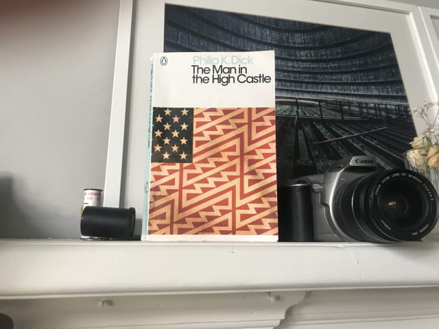
In this book, Dick protrays an alternate reality where the Axis powers have won the second world war and America is under the rule of Imperial Japan and Nazi Germany.
Interestingly, many of the characters use the ancient Chinese text the I Ching for guidance, and there’s also a clever “book within a book” subplot in which the novel The Grasshopper Lies Heavy depicts an alternate history in which the Allied forces prevailed.
Having now read a couple of Philip K. Dick books this year, I’m arriving at the conclusion that while I don’t love his writing style, this is counterbalanced by his creativity and the interesting ideas which stay with you long afterwards.
Design Better Forms (UX Collective)
As Andrew Coyle says, “Life is short. No one wants to fill out a form.”. Here, he presents a number of form design tips to make the user experience more bearable and increase completion rates.
Layered, Smooth box-shadow generator (on brumm.af)
Inspired by Tobias Bjerrome’s blog post Smoother & sharper shadows with layered box-shadows
Making a Better Custom Select Element (24 ways)
We want a way for someone to choose an item from a list of options, but it’s more complicated than just that. We want autocomplete options. We want to put images in there, not just text. The
optgroupelement is ugly, hard to style, and not announced by screen readers. I had high hopes for thedatalistelement, but it’s no good for people with low vision who zoom or use high contrast themes.selectinputs are limited in a lot of ways. Let’s work out how to make our own while keeping all the accessibility features of the original.
Julie Grundy argues here that despite us having greater ability to style the standard select in 2019 there are times when that element doesn’t quite meet modern expectations.
This is a lovely, full-featured and fully accessible component. It could perhaps be improved by not showing the down-arrow icon until JavaScript is loaded, but otherwise it’s great.
Julie’s code currently exists solely as a Github repo, but for ease I’ve created this editable version on Codepen.
Will I use this in place of the select element? Not if I can help it, because after years of experience working with form elements I still trust native elements to work better cross-platform than custom alternatives. However if a design requires dropdown options to employ custom patterns such as media objects, then I’ll definitely reach for this component.
When should you add the defer attribute to the script element? (on Go Make Things)
For many years I’ve placed script elements just before the closing body tag rather than in the <head>. Since a standard <script> element is render-blocking, the theory is that by putting it at the end of the document – after the main content of the page has loaded – it’s no longer blocking anything, and there’s no need to wrap it in a DOMContentLoaded event listener.
It turns out that my time-honoured default is OK, but there is a better approach.
Chris has done the research for us and ascertained that placing the <script> in the <head> and adding the defer attribute has the same effect as putting that <script> just before the closing body tag but offers improved performance.
This treads fairly complex territory but my general understanding is this:
Using defer on a <script> in the <head> allows the browser to download the script earlier, in parallel, so that it is ready to be used as soon as the DOM is ready rather than having to be downloaded and parsed at that point.
Some additional points worth noting:
- Only use the
deferattribute when thesrcattribute is present. Don’t use it on inline scripts because it will have no effect. - The
deferattribute has no effect on module scripts (script type="module"). They defer by default.