In cases of emergency, many organizations need a quick way to publish critical information. But existing (CMS) websites are often unable to handle sudden spikes in traffic.
Fantastic effort by Max Böck here, stepping up during the COVID-19 pandemic to provide this Eleventy template for organisations to use to publish critical information as lean, resilient, static HTML pages.
Check whether or not a CSS property is a good candidate for smooth animation based on whether updates to its value trigger expensive changes (to, for example, “element geometry”) causing layout updates and repaints.
width and height are both poor candidates whereas transform is good.
Let’s create a pure CSS effect that changes the color of a text link on hover – but slide that new color in instead of simply swapping colors.
Katherines post explores four different techniques to achieve the effect, and their comparative pros and cons with regard to accessibility, performance, and browser support.
Technique 4, which uses a CSS transform seems to be the most flexible, best-performing and has best cross-browser support, however because it requires adding a semantically redundant <span> into the anchor I would use it sparingly rather than on all links by default.
In this post we have seen that with just a sprinkling of HTML attributes we can improve the login experience for our users, particularly on mobile devices.
By adding certain attributes to the HTML input element – such as inputmode, pattern and autocomplete="current-password" – we can improve the user experience when logging in.
You have a “card” component which includes a heading, some text, an image, and a link to the full article, and it’s working great. Then along comes a UX requirement that the full card (not just the button or link) should be clickable. This is where things get complicated.
TL;DR
I was recently faced with this challenge while building a component at work and opted to implement a tailored version of Heydon Pickering’s Redundant Click Trick. This felt like the best approach, or perhaps more accurately “the lesser of three evils”. I’ll be monitoring how that performs, but in light of the knowledge and experience gained carrying out this task I’m also starting to think that – like Chris Coyier recently suggested – maybe full-card clickable regions are a bad idea.
Setting the Scene
Let’s say our starting HTML is this:
<divclass="card"><h2>Card Title</h2><imgsrc="/path/to/img.jpg"/><p>This is the body copy for the card. It it is comprised of a few sentences.</p><ahref="/">Read more</a></div>
And the requirement we’ve been given is to make the whole card clickable rather than just the “Read more” link.
Option 1: Stuff everything inside an anchor
Here’s the thing – since the dawn of HTML5 we’ve been able to wrap the inline anchor (<a>) element around block-level content such as headings, paragraphs, and <div>s… so isn’t the answer just to do that?
<ahref="/"><divclass="card"><h2>Card Title</h2><imgsrc="/path/to/img.jpg"/><p>This is the body copy for the card. It it is comprised of a few sentences.</p></div></a>
Well, as with many HTML challenges, just because you can do something doesn’t mean you should. I always had a nagging doubt about stuffing all that disparate content inside a single anchor, and Adrian Roselli has recently confirmed that for screen reader users this approach is harmful.
Perhaps the worst thing you can do for a block link is to wrap everything in the <a href>… for a screen reader user the entire string is read when tabbing through controls… taking about 25 seconds to read before announcing it as a link.
Furthermore, images nested in this way are not clearly announced as they normally would be.
So if you care about the user experience for those people, this feels like a no-no.
Option 2: Stretch a standard anchor using pseudo-content
An alternate approach that’s gained traction over the last couple of years involves leaving the anchor or button in its initial position within the card (thereby avoiding the above mentioned accessibility problem) and using pseudo-content to stretch it to cover the entire card. This CSS-only trick involves setting the card to position:relative then giving the anchor (or button) :after pseudo-content and absolutely positioning that to the card’s four corners. This makes the whole card clickable like a button.
The problem with this approach is that any text in the card is no longer selectable.
Some might say that this is OK. Personally I feel that it is a fundamental usability requirement that text on a web page be selectable. Not being able to do so calls to mind the bad old days before web fonts where we used images for headings, and I like to think we’ve evolved from those kind of practices. Also, I feel any statement by us developers and designers that “losing the ability to select text is OK” lacks validity because we are biased; happy to justify taking away something fundamental from our users because we’re more concerned with getting a (frankly non-essential) feature over the line.
If we don’t like this compromise but are still determined to make the full card clickable, there’s one further option.
Option 3: The Redundant Click Trick
This technique, conceived by Heydon Pickering, uses JavaScript rather than CSS to make the card clickable.
Essentially we add an EventListener for a click on the Card and when one is detected, trigger a faux click on the inner anchor or button.
One challenge inherent in this approach is that a user attempting to select text would unintentionally trigger our faux link click. However we can again use JavaScript (using the onmousedown and onmouseup events) to detect the length of their press to infer whether they are selecting text or clicking, then take appropriate action.
The pros of this approach are that we avoid the screen reader problems and the inability to select text.
The cons are i) that it requires a more complicated, JavaScript-based approach; and ii) that the need for a “check how long the mouse has been pressed down” part isn’t ideal.
With this approach, if Analytics tracking is part of your mix I’d make sure to check that that works as expected across browsers and devices.
Summing up
So there we go – three ways to achieve a “block link” or button. But given the compromises they involve, perhaps the question should be – is it worth it? And given the tools we currently have available, I lean towards “no”.
February ‘20 proved to be a challenging month on a number of fronts. As if storms Ciara and Dennis weren’t enough to contend with, life chucked in some additional turbulence just for good measure.
So with nothing else for it than to batten down the hatches, I reached for some immersive ambience, restorative reggae and mood-enhancing electronics to help weather the storm.
As it turns out, records really are good for the soul and the forecast now looks much brighter.
So without further ado, let’s dig into last month’s haul.
Shida Shahabi – Shifts (LP)
Amidst the rocky parts, February also provided a couple of nice moments. On a visit to Edinburgh’s Timberyard (Clair’s birthday present – thanks pals!) we were treated not only to amazing food but also this memorable musical accompaniment; the perfect antidote to the arctic conditions outside. Swedish-Iranian pianist Shida’s melodies are hauntingly beautiful in their own right but interestingly she also overlays sounds from the inner mechanics of the piano. Modern classical isn’t normally my bag, but I love this (and the cover art, too).
Okay, I’m late with this one – it was released in April ‘19 – but who cares. Ribbons has been a Spotify staple of my morning commute for some time; its pastoral vibes setting the perfect laid-back mood before a day writing code. Eventually I had to own a physical copy. The vibe is pretty folky and in places you can imagine being at a live jam session in your favourite traditional pub. Stephen Wilkinson is a fantastic musician with a lovely voice but if all this is sounding too nice then rest assured that, being on Warp Records, it’s served with a generous side-helping of analogue synths and quirky electronics to steer things left of centre.
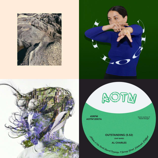
Who knew there was a reggae version of The Gap Band’s early eighties classic, Outstanding? Not me, anyway. This has been lovingly reissued by Edinburgh’s Athens of the North and features a great squelchy bassline, shimmering synths, dub FX and that killer, hooky vocal. And now I’ll hand over to Discogs legend midnightrunner whose review puts it much better than I ever could:
Quite simply, "outstanding" reggae funk fusion! My mam's toyboy, Gavin, likes to play this one after I have gone to bed, when he smokes his special pipe full of jazzy cabbage.
Sydney–born, Melbourne–based producer Samantha Poulter aka Logic1000 is a new name on me. Her sound is a spacey, percussive blend of hip-hop, Bass, Dancehall and House, with all sorts of other interesting samples and influences thrown into the pot. Lots of great stuff on here.
I loved Glaswegian Perko’s first release, NV Auto; its blend of dubbed out synth chords, deep sub-bass and tough broken-electro beats really hitting the spot. His latest release, also on Numbers, ploughs a similar furrow. It spans 8 tracks including moments when he ratchets up the BPMs into Drum ‘n’ Bass territory and others offering respite in the form of delicate ambient interludes.
This is the dub remix version of the Texas band’s second LP, Con Todo El Mondo. Released in 2019, I don’t know why I didn’t pick it up sooner given that I love Khruangbin and I love dub, except perhaps that records ain’t cheap and I wasn’t sure a remix LP constituted an essential purchase. However, after a few months of blissful headphone listening I realised the error of my ways. The band’s sound lends itself perfectly to this treatment and the addition of two mixes by legendary engineer Scientist seals the deal. Also – check this band live if you ever get the chance. I did a couple of years back and they were amazing.
This has been on my wants list for an age but every time I tried to get a copy last year, I couldn’t find one. I’m not sure if the original release was maybe delayed? Fortunately on a recent visit to Rubadub (all too infrequent these days which I mean to rectify) the guys hooked me up. This is on the slow, low and out-there electronic tip with little Kraftwerkian influences in amongst the haze of dub. Apparently it’s also from the south side of Glasgow so if I ever see this dude in the Allison Arms I should jolly well like to buy him a pint. Lovely sleeve art too.
Here’s Dave Rupert, frustratedly rounding up the accessibility shortfalls in browser implementations of native HTML elements.
I’ve always abided in the idea that “HTML is accessible by default and then we come along and mess it up”. But that’s not always the case. There are some cases where even using plain ol’ HTML causes accessibility problems.
Since November 2019 my day job has involved working on a “Majestic Monolith” coded in Ruby on Rails. I loved this conversation with Rails’ creator DHH in which he speaks with great passion and makes interesting points about finding a programming language that speaks to you; why single page apps and microservices are not for him; and how our working days have too many interruptions.