How was 2023 for you? For me, it was like this.
Music gigs
In welcome contrast to the Covid years I went to a variety of in-person events, including seven gigs:
- Apiento in London,
- Melting Pot at Queen’s Park Rec (where I saw Luke Una and Odyssey),
- Melting Pot vs Let’s Go Way Back at BAAD,
- Om Unit at Sleazy’s,
- Robert Henke at Tramway,
- A Certain Ratio at Stereo in November, and
- Sleaford Mods in December.
Of those, my highlights were definitely Robert Henke and A Certain Ratio.
Music buying, listening and playing
I’m still buying music on vinyl and more, albeit at a slightly reduced rate. My taste continues to shift organically and I really enjoy exploring. My highlights included Skinshape’s Craterellus Tubaeformis, A Certain Ratio’s 1982 and Jamma-Dee’s Perceptions.
I recorded three radio shows and was pretty pleased with them, on the whole.
Seeing friends
My April trip to London with Tom was a real highlight of the year. We went record and clothes shopping, caught up with friends, listened to great music in brilliant venues, and enjoyed some lovely food and drinks. If Carlsberg did weekends, they’d struggle to top that one.
There were lots of other fun get-togethers.
When I look back, I realise that I’ve done not too badly at keeping in touch with friends in 2023. Obviously there are those that I saw too rarely or not at all, and I’ll try to rectify that in the new year.
One sadder entry: in late August, my close pal Simon’s mum died. It was a beautiful ceremony for an inspirational lady.
Travel
Abroad
I travelled to six different countries, if you include England.
First stop was Amsterdam in June for work: I attended the CSS Day conference for the second year running.
Also in June. Clair and I went to Sicily for Fiona’s 40th birthday, staying in Palermo then Taormina.
In August Clair and I enjoyed ten days in Geneva and Annecy.
In November I took my parents for a week in Marbella.
In Scotland
I enjoyed a couple of trips around Scotland.
There was our March weekend at Banchory Farm in Fife.
Then in July I had an overnight stay in Alyth.
Eating out
While in London, Tom and I enjoyed a nice breakfast at Fallow on Clair’s recommendation. (Although she was subsequently horrified at me missing the foodie opportunity by only ordering scrambled eggs on toast! My excuse is I was hungover and needed comfort food). On the same trip we had amazing sushi at Brilliant Corners in Dalston. It really is my happy place.
In Spring, Clair and I had an overdue catchup with Charlie over a lovely lunch at Inver.
I made a first visit to Dishoom in Edinburgh, alongside two good pals, and it lived up to the hype.
In autumn I enjoyed a lovely Saturday afternoon at Crabshakk on Byres Road with Gillian, Tom and Nessa.
On Hogmanay, Clair and I ate at Brett and loved it.
Special mention has to go to our evening at Café du Soleil in Geneva where we both had our first taste of fondue. Cheese heaven.
Family
All the major family-related activity seemed to happen in June. Sadly, my Aunt Elsie died. She was in her nineties and the last ten years had seen a steep decline.
On a happier note my niece Caitlin married her partner Ross in June in a beautiful wedding at Lochside House Hotel.
My niece Charlotte had her second child – Mason, a brother for Marc.
That eventful June aside, everything seems to be ticking along. My mum and dad are well. Clair had a challenging year with work, but the work she does is brilliant and with fantastic clients. She’s generally doing well and happy in her new fitness groove, which makes me happy too.
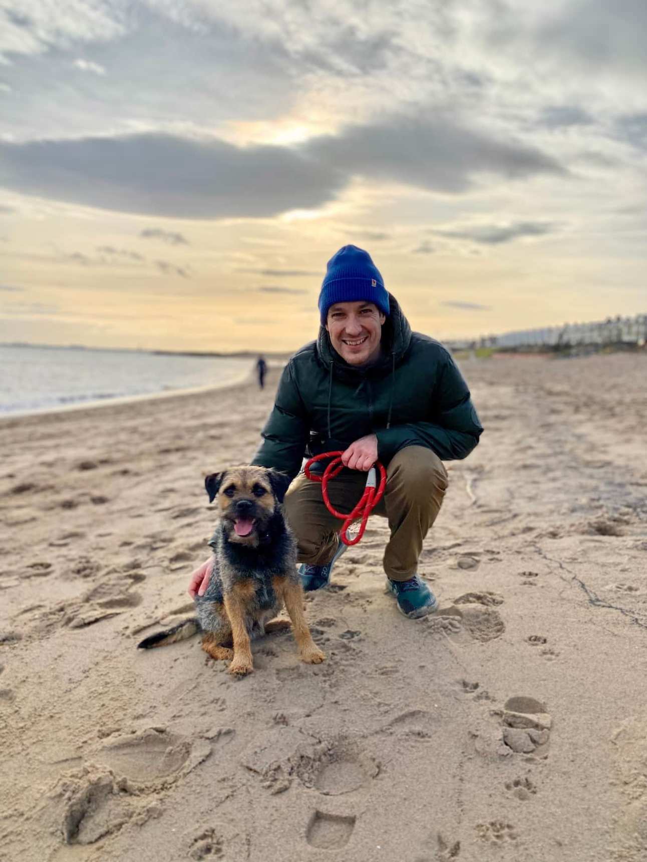
Rudy, our nervous border terrier, has been a mixed bag behaviour-wise, but mostly good. There are lots of signs of improvement. And regardless of the behavioural issues he is just a wee legend who’s full of love and we adore him.
Books
It wasn’t a productive year for reading; I just couldn’t find the motivation. Still, I read a few.
- Possibilities, Herbie Hancock’s autobiography
- Open, Andre Agassi’s autobiography
- Join the Future
- The Islander
And I started The Candy House.
The good news is that they are all great, and recommended.
Films
Of note were Aftersun and Oppenheimer, the latter of which I saw at the GFT in July.
I also saw Captain Fantastic which isn’t new but is… fantastic!
Other arts
In January we visited the Tramway theatre and checked out two exhibitions. The first was a selection of works by Glasgow artist Norman Gilbert, and the second the installation The Rumble of a Tireless Land by Iza Tarasewicz.
In July I went to Banksy’s Cut and run exhibition at the GOMA, which I loved. Later that month I saw the excellent Moorcroft at the Tron theatre.
In September I went to the Armadillo to see the updated version of The Celtic Story with Marty and Michael (with thanks to Gillian for the tickets). I had first seen this thirty years previous and it was nice to revisit the club’s history.
TV
Back in January I loved Mystery Road – Origin.
Later in the year, the Succession finale really lived up to its billing – a fitting end to a brilliant show.
Latterly I really enjoyed Mr Inbetween. Scott Ryan, the lead, is a talent.
Other noteworthy stuff
I learned to make coffee from whole beans.
I’ve been learning Spanish, using Language Transfer’s course and am enjoying that.
Work
I’m lucky – I have a good job with great benefits. I work with smart and lovely people. Even still, me and my job don’t always see eye to eye.
In the positive column for 2023:
- our team was instrumental in implementing a brand refresh
- we made material progress in promoting company-wide accessible practices
- I began learning how to write documentation more formally, and we have made strides on that front
- at scoring I seem to be progressing and had some nice feedback
- I’m trying to get better at empowering others. I’m having some success but have lots of room for improvement
- I went to three inspiring conferences: CSS Day, Design Systems Day in Edinburgh, and my employer’s own internal staff conference which was excellent.
In the negative column:
- I had at least one mental blowout. It was caused by thinking too deeply about a complex and frustrating area. It left me in pretty bad shape mentally, and needing time off.
- latterly I lost energy and focus. I couldn’t find energy to read the various articles I receive by subscription, nor write on my blog. This marked a change for me – I’m usually pretty motivated in that regard.
Health
My physical health was fine. I’m doing enough exercise to keep my weight in check. I can’t remember being ill very often, although being stuck in bed with the cold on my birthday was no fun. I could always be fitter but generally speaking I’m physically fit and well.
A couple of small but impactful changes of note: after Clair told me about Tim Spector and how we shoud avoid spiking our blood sugar, I cut out the large glass of Tropicana orange juice I drank daily for years. I also cut down the amount of granola I eat at breakfast and swapped in nuts and seeds, or a breakfast of brown toast and eggs. This is no doubt having a positive impact on my weight but also, I hope, keeping me healthier long-term. On a similar note, I now try hard to go to sleep earlier and avoid feeling the need to snooze the alarm.
As for mood and mental stability, that’s less straightforward. Firstly I’ve noticed changes to preferences and comfort zones. There are situations I used to enjoy – such as larger gatherings – and now don’t. Generally I’m OK with this. It could be a post-pandemic effect, or a symptom of ageing. Regardless it feels natural so I’m adapting. As long as I find time to see the important people in my life one way or another, it’s fine.
More concerning were the too-regular occurences of low mood, low energy, frustration and mental fatigue. Working on a Design System team can feel overwhelming or futile or both. Working primarily from home saves time and money but can feel claustrophobic, and mixes parts of life that should be separate. I also generally find too many things vying for my attention and struggle to focus. A big, noticeable change is that my mental resilience isn’t what it was.
While low mood has a significant negative impact on me, it can impact others too. At times I’ve struggled to see the bigger picture and dropped the ball, forgetting people I should prioritise.
In summary my mental health wasn’t always great and it was time to acknowledge that properly. Since then I’ve done this and I feel better for it. There’s a journey ahead. Maybe I’ll write about it more soon.
Let’s go round again
So long, 2023 – you were mostly pretty good and I’m grateful. Even the bad bits have given me helpful pause for thought. I’ve been making positive change already, so onwards and upwards.