Journal
Tables and pseudo-tables: lessons and tactics
At work I have to think about complex HTML tables a lot. The challenge with doing tables well is that 99% of online table tutorials use fairly simple examples… whereas in reality design and product teams often want to squeeze in lots more. It’s really hard to balance those needs against accessibility, systemisation, styling and responsiveness.
Heads up: I’ve published this post early while it’s still a work in progress because it’s better for me to have it available for reference than languishing in drafts and forgotten. Apologies if you read it in a temporarily rough state.
Following a lot of work on tables I’ve recently gained additional insight into the possibilities and constraints, thanks to an accessibility review by Tetralogical and some great articles by Adrian Roselli.
Here are my new rules of thumb.
Avoid complex recreations of tables with alternate elements
In addition to developing a component wrapping the HTML table element to handle simple data tables, I recently created an alternate component for “tables with bells and whistles”. It used a combination of the HTML description list element plus CSS Grid plus some display: contents in lieu of the currently poorly supported subgrid. This approach allowed recreating a table-like appearance but facilitating much more responsive layout flexibility, amongst other benefits.
Unfortunately this resulted in an accessibiliy fail around using the description list in this way. Popular combinations of browsers and assistive technologies do not support description lists sufficiently to convey the intended crucial relationships between the faux table headers and faux table cells.
Note: I think it’s OK to use the description list element in general – just not for such an unconventional and complex use case.
ARIA Grid role: an alternative in theory (if not in practice)
I noted that Github handle their “repository directory indexes” using the ARIA grid role. Their HTML is like this (I’ve abbreviated it a touch):
<div role="grid" aria-labelledby="files" class="…">
<div class="sr-only" role="row">
<div role="columnheader">Type</div>
<div role="columnheader">Name</div>
<div role="columnheader" class="d-none d-md-block">Latest commit message</div>
<div role="columnheader">Commit time</div>
</div>
<!-- interesting 'fake' row here -->
<div role="row" class="…">
<div role="rowheader" class="…">
<a rel="nofollow" title="Go to parent directory" class="…" href="…"><span class="…" style="…">. .</span></a>
</div>
<div role="gridcell" class="…"></div>
<div role="gridcell"></div>
</div>
<!-- first real row -->
<div role="row" class="Box-row Box-row--focus-gray py-2 d-flex position-relative js-navigation-item navigation-focus">
<div role="gridcell" class="…"><svg …></svg></div>
<div role="rowheader" class="…">
<span class="…"><a class="…" href="…">my-file-name.md</a></span>
</div>
<div role="gridcell" class="…">
<span class="…"><a href="…">The commit message</a></span>
</div>
<div role="gridcell" class="…">
<time-ago datetime="2021-06-17T16:45:42Z">11 months ago</time-ago>
</div>
</div>
<!-- more rows go here -->
</div>I like the idea of looking at alternatives to tables but don’t think I’d take this approach right now. Where there are lots of focusable elements it turns those multiple tab-stops into one (the grid is a single widget) which is perhaps useful for some cases, but I’ve yet to encounter them. It’d also require you to do manual focus management within the widget.
It’s an interesting approach though, and one I’ll keep in the back of my mind.
You can achieve “bells and whistles” within a table accessibly
Here are some handy techniques – done accesibly – courtesy of Adrian Roselli:
- Accessibly including inputs in tables
- Under-engineered responsive tables
- Responsive accessible tables – this more complex approach employs JavaScript to i) apply appropriate ARIA roles to existing table HTML, and ii) create clever alternate labelling using pseudo elements. It uses CSS to change the
displayof the table and its children to create a small-screen-friendly layout. The JS-applied roles serve to maintain the necessary semantics that would otherwise be lost when applying the radical CSS changes. - Charlie Cathcart’s responsive table is similar to the above although perhaps less comprehensive. However it might have other interesting aspects.
- Clip long, overflowing content
- Expandable rows
- Fixed headers
References
- Grids pt1: To grid or not to grid by Sarah Higley
- ARIA Grid as an anti-pattern by Adrian Roselli
Layering elements with Grid rather than positioning
A while back I bookmarked Michelle Barker’s CSS Grid based overlay technique which neatly allows layering one element atop another using CSS Grid rather than absolute positioning. Now, Stephanie Eckles has taken the idea a step further with her Smol Stack Layout which offers a more flexible markup structure, some intuitive grid area naming and a neat aspect-ratio API.
Stephanie’s component is feature-packed and opinionated to the extent that it took me a while to understand all the moving parts. So for simplicity I’ve created a pared-back version on CodePen: see Layering utility with CSS Grid.
While Michelle’s utility kept the markup really simple with the container doubling-up as the first visual “layer in the cake”, I think for flexibility and robustness I prefer Stephanie’s approach where the container only serves to set the aspect ratio, with the layers represented by two or more child elements.
Layering text upon images
In Smol background picture, Stephanie goes further, leaning on her layering utility to cleverly layer text upon images. This is a modern alternative to the type of effect we previously achieved with background images. It uses a content image marked up using <picture> to progressively enhance the format (heavier-weight jpg for old browsers, lightweight webp for new browsers) and is styled with object-fit: cover in order to perfectly span its container.
This modern approach is great because often from an accessibility perspective our background images should really be content, described properly with alt, to provide equivalent visual and non-visual experiences. Furthermore using a content image tends to be better for performance with there now being so many new image techniques and attributes at our disposal when compared to background images. Lastly, handling the image as content makes it more flexible for styling.
Using Grid for a “Hero” Banner
Another noteworthy member of this family of techniques from Stephanie is her Hero with CSS Grid. Here she uses the same idea of a single grid-template-area with child content and image stacked up in layers, alongside some nifty use of grid positioning properties to align elements within that. This one is very flexible, very responsive, and super-useful.
Summing up
I really like this move away from absolute positioning because it always felt brittle. It doesn’t play well with responsive layouts, and isn’t resilient to cases where adjacent elements could overlap. Furthermore you often see absolute positioning used in conjunction with pseudo elements and while I’ve occasionally taken this approach (and appreciate the creativity behind these techniques) I’ll admit I find it much easier to read and maintain CSS that relates to actual structural elements rather than “magical” CSS elements. I much prefer these simple, modern and fit-for-purpose CSS Grid based approaches.
Improved focus indicators for keyboard navigation (on GitHub’s blog)
GitHub have recently done some good work on improving keyboard navigation for (and general usability of) their focusable elements such as links, buttons and form controls by improving focus indication. And then they wrote a short-but-sweet article about it, then tweeted to share that and their work is getting lots of positive recognition from all the right people. Nice job all round, GitHub!
Incidentally, that article they wrote really is very short. Maybe they’ll add to it later. The animated gif they include is very descriptive, mind you. And I noticed that they added the following alt text to it:
Animated gif of a customer using their keyboard to navigate a pull request, interactive UI elements receive a blue focus outline to show current location on the page. Key presses are shown in the bottom center of the image.
That feels like a good non-visual alternative description to me.
Web components as progressive enhancement, by Cloud Four
By enhancing native HTML instead of replacing it, we can provide a solid baseline experience, and add progressive enhancement as the cherry on top.
Great article by Paul Herbert of Oregon’s Cloud Four. Using a web component to enhance an existing HTML element such as <textarea> (rather than always creating a custom element from scratch) feels very lean, resilient and maintainable.
Off the top of my head I could see this being a nice approach for other custom form controls.
Zach Leatherman also took this approach with the <details> element in quite exciting ways and is using it in production on Netlify’s marketing websites. I’m a bit cautious of jumping on that one just yet, though, because it’s plays more fast-and-loose with the intended purpose of the element and in so doing probably might present some accessibility issues. Still really interesting though.
A front-end developer’s job
Recently I’ve been reflecting on what we front-end developers do in the modern era. Working on a design system in 2022, I feel now more than ever that my job represents a convergence of a range of interesting disciplines, goals, skills and experiences. These include UX knowledge and usability testing, a degree of design savvy, systems and atomic thinking, accessibility knowledge and strong skills with the core web standards. That’s my understanding of front-end development.
Yet not long ago a colleague recalled the time a teammate teased him that front-end developers “put the froth on the cappuccino”. While this gave us all a laugh, I imagine it also reflects one common misunderstanding and undervaluing of our role.
Meanwhile there’s another image of front-end development that’s very engineering rather than user experience oriented. This focuses on JavaScript and tooling and arose in the era of NPM and JavaScript frameworks. In this definition, front-end developers spend their time wrangling JavaScript, configuring build tools and manipulating API data.
I’m conscious of the great divide and while my career has straddled that divide, I’ll freely admit that at heart I’m a front of the front-ender.
Here’s a description of a “Design System engineer” that I recently compiled during while my team were recruiting for a software engineer:
- Very strong knowledge and understanding of the core web standards: HTML, CSS and JavaScript
- Strong appreciation of the need for appropriate HTML semantics to achieve resilience and accessibility
- Understands component-based architecture and delivery including concepts like atomic design, composition, variants and versioning
- Advanced understanding of web accessibility including how to create accessible interactive components
- Excellent attention to detail in implementing designs in code
- Strong appreciation of responsive / multi-device considerations
- Comfortable in modern CSS including BEM-like methodologies, ITCSS architecture, and modern approaches such as Flexbox, CSS Grid, custom properties
- Some experience in testing JavaScript and/or server-side components - Comfortable with Git
- Committed to constantly learning and improving technical knowledge and skills
Something else I remember noting down was that:
User interfaces should be user-centric, purpose-driven, appropriate, accessible and consistent (not arbitrary).
I guess my point there was that good front-end developers build user interfaces in a very considered manner.
Areas of interest
Here are some of the key areas I find myself thinking about or working on regularly.
Accessibility
I list this first not due to alphabetical order, but because it’s arguably the cornerstone of our job. That’s for two reasons. Firstly, because the web was designed to be accessible to all therefore it’s incumbent on us to uphold that. (Of course it’s not just our job, however we tend to be both the primary evangelists and last line of defence). Secondly, so many other aspects of front-end development can only be done well when you start from an accessible foundation. This is something that becomes clearer and clearer the longer you do this job.
Resilience
I might add more about this later.
Performance
I might add more about this later.
UX
I might add more about this later.
Documentation
I might add more about this later.
Adaptability
I might add more about this later.
Design System considerations
- Componentization
- Creating component APIs
- Composition
- Documentation
Scalability
At scale, you can’t just write new code for everything. You have to focus on creating reusable things.
Maintainability and sustainability
I might add more about this later.
Integration into the company’s language framework
This can be challenging. I might add more about this later.
Adding interactivity
I might add more about this later.
Adherence to designs, and making things look good.
I might add more about this later.
April 2022 mixtape
I put together a fairly spacey and mellow selection of laidback electronic sounds with a little nod to summer.

Download my April 2022 mixtape.
Here’s the tracklist:
- Nale Sinephro - Space 1
- Culross Close - To Belong
- Other Lands - Matter (Reshaped)
- Mato – Summer Madness
- Desmond Chambers – Haly Gully
- Tom Churchill – Cast adrift
- Bright & Findlay — Slow Dance
- Quiet Force — Listen To The Music (Apiento & Tepper Mix)
- Fuga Ronto – Columbo De Domingo
- dreamcastmoe — l foot right
- Lord of the isles — Novwo
- Kofi B - Mmobrowa (Hagan Edit)
- State of grace — That’s when we’ll be free
This was a nice opportunity to get back into the rhythm of programming music of varying styles and tempos. Kit-wise, I used two Technics 1210s, a Pioneer XDJ-700, an Isonoe 420 mixer and an Eventide Timefactor delay.
I’ve started reading The 15 Minute City, by Natalie Whittle.
Improving alternative text for images
Some colleagues at work have recently been asking interesting questions about “good/appropriate alternative text for images”. I definitely reckon it’s a topic worth revisiting because it feels like the landscape has changed a bit on this front over the years.
I think the web design industry has traditionally been:
- lacking knowledge of how to write good alternative text.
- too quick to decide which images are “purely decorative”, or accurately described by a matter-of-fact short label when maybe they actually should convey their inherent tone and emotion to all users rather than only those with no visual impairments.
But as inclusion-centric practioners we can probably do better. In his blog post Writing great alt text Jake Archibald breaks down the considerations. I reckon it’d be useful for us to dissect this post and try to boil it down to some practical rules-of-thumb for our teams.
But also, I’ve just noticed a couple of interesting developments at the big players. Firstly, Twitter have upped their image alt game and are encouraging their users to try doing so, too.
And hot on the heels of Twitter’s announcement, I now see in Slack an Edit file details option for adding image descriptions. It’s great that Twitter and Slack are doing this… and also serves as a reminder that tools such as Slack and Twitter are consumed on the web and so accessible best practices apply when you’re writing content on them, too!
SVG: collected tips
SVG is an amazing technology which I regularly use for icons and occasionally for logos and illustrations. I’ve also dipped my toe into animated SVG. But if I’m honest I still find some SVG concepts confusing so I’ve gathered some useful tips here for future reference. Note: this is a living document which I’ll expand over time.
Table of contents
- Introduction to SVG
- Canvas, viewport and viewbox
- Arranging elements on a grid
- Inline SVG for icons
- Choose an SVG embedding technique that suits the task
- Choose the best-performing format
- Exporting and optimising SVG in design tools
Introduction to SVG
It’s an image format (like jpg and png) but also an XML-based markup language. So it’s a bit like HTML in that you can “compose a whole from a bunch of parts” – but it is focused on graphics. As a web graphics technology it has many benefits, for example:
- scalable,
- manipulable by CSS and JS,
- has a small file-size if well-optimised, and
- can be made accessible.
- It’s built for drawing in a way HTML and CSS are not.
- It can guide users, reduce their cognitive load, and provide personality and moments of fun.
Here’s a classic example: Log-in Avatar
Canvas, viewport and viewBox
Let’s break down the key elements of the SVG coordinate system.
Canvas
The canvas is the area where the SVG content is drawn. It’s infinite in both dimensions therefore the SVG can be any size.
Viewport
Although the canvas is infinite, the SVG is rendered on the screen relative to a finite region known as the viewport. Areas of the SVG that lie beyond the boundaries of the viewport are not visible. This is similar to a browser viewport. On a long page you don’t see all the content; just a portion of it.
Specify the viewport size by giving your <svg> element a width and height, e.g.:
<svg width="600" height="400">
  <!-- svg content -->
</svg>
We could specify units (such as em or px) but don’t need to. Unitless values are regarded as being set in user space using user units which effectively equate to pixels so our example above renders a 600px by 400px viewport.
The width of the viewport can also be set in CSS. Setting width:100% makes the SVG viewport fluid in a given container.
Viewbox
The viewport coordinate system starts at the top left (0, 0) corner of the SVG viewport. The user coordinate system is by default identical to that of the viewport, starting in the same place and with equal dimensions and units, however it can be modified using the viewBox attribute.
viewBox takes a value in the format: x y width height. The first two values set the upper-left corner of the viewbox and the second two its dimensions.
You can set the aspect ratio of the viewbox to the same as for the SVG viewport, or differently.
You might (optionally) use the viewBox attribute to transform the SVG graphic by scaling or translating it, or to crop it.
Specifying a smaller viewbox than viewport results in cropping the graphic to those dimensions and then zooming it in i.e. scaling it up so that it fills the entire viewport area.
Arranging elements on a grid
Cassie Evans recommends that when planning an arrangement of elements it’s nice to start with a simple grid using nice round numbers such as 100×100 – per the following <svg> – making it easy to then plot elements on top. You might even start by sketching with paper and pencil.
<svg viewBox="0 0 100 100">
  <!-- svg content, perhaps <rect>s -->
</svg>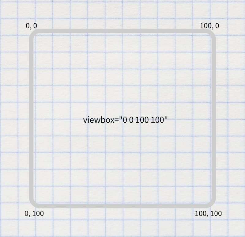
Inline SVG for icons
Having tried various icon systems including using <symbol> and <use>, Chris Coyier advocates that it’s perhaps simpler and better to just include the icons inline. Perhaps use the appropriate include technique for your stack to keep the code maintainable.
Choose an SVG embedding technique that suits the task
There are a variety of flavours and uses of SVG, including:
- icons
- infographics
- illustrations
- SVG that include text
- SVG that include animation.
As Sara Souidean covers in her talk “A Smashing Case Study”, your choice of SVG embedding technique depends on the nature of the project and the specific use case.
To do: summarise Sara’s technique for SVG with illustration and accessible text.
Choose the best-performing format
When you’re tasked with coding an illustration-based image, it’s tempying to automatically see that as a job for SVG. However keep in mind that for some images the SVG file size will be massive and PNG will perform much better, so compare the two options.
Exporting and optimising SVG in design tools
To export an SVG in Figma, right-click it (or select it on the left hand side) then select “copy as SVG”. There’s also an “export as SVG” option on the right.
References
- Understanding SVG Coordinate Systems by Sara Soueidan
- Swipey image grids by Cassie Evans
- A pretty good icon system by Chris Coyier
- A Smashing Case Study recorded presentation by Sara Souidean
Web Components with Declarative Shadow DOM via Lit and Eleventy
Here’s a new development in the Web Components story, and one that may have positive implications for resilience, performance and progressive enhancement.
Declarative Shadow DOM is a new way to implement and use Shadow DOM directly in HTML rather than by constructing a shadow root in JavaScript.
But some people including Chris Coyier and Brad Frost) reckon that writing that looks horrible. Brad said:
Declarative Shadow DOM always looked gross to me and I felt it almost defeats the purpose of web components.
And Chris added:
the server-side rendering story for Web Components, Declarative Shadow DOM, doesn’t feel very nice to me if you have to do it manually.
However Lit, a library which makes working with Web Components easier, are now providing ways to make this easier when Lit is used with Eleventy.
With tools like this (especially this @lit-labs/ssr project), we can have our cake and eat it too: use web components in a dev-friendly way, and then have the machines do the heavy lifting to convert that into a grosser-yet-progressive-enhancement-enabled syntax that ships to the user.
using JavaScript frameworks in an entirely-client-side rendered way isn’t nearly as good for anything (users, SEO, performance, accessibility, etc) as server-side rendering (the effects of hydration are still debatable, but I view as largely worth it) … [but] the server-side rendering story for Web Components, Declarative Shadow DOM, doesn’t feel very nice to me if you have to do it manually. So… don’t do it manually! Let Eleventy do it!
As an additional footnote, perhaps we can make frameworks other than Eleventy (such as Rails) create server-rendered custom elements with Declarative Shadow DOM in a similar way. One to explore.